Sketching with Shari, iv

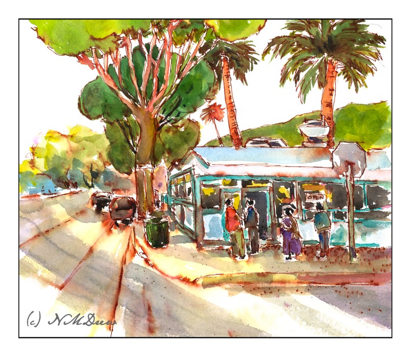
The very last lesson in this delightful class on ink and color sketching by Shari Blaukopf. As soon as I saw it I knew it was La Super-Rica Taqueria on Milpas Street in Santa Barbara, CA. Excellent food – it opened years ago and was a walking dinner destination when I lived in the area.

Anyway, this drawing is a culmination of drawing people and buildings, learning a bit about perspective and thoughts about how to do things. I enjoyed this one a lot even in my moments of frustration. Rather than using Bristol paper, I used 140# CP watercolor paper. The first frustration was the texture of the paper and my pencil – a lot of smudges. Still, I continued and laid down the ink lines after I had it limned out. Then, erasing all that smudging with the kneaded rubber eraser, and it cleaned up very well.

As you can tell by the shadows, this is either early morning or late afternoon – and it is late afternoon. The sun is to the left, which is in the west toward the Pacific. This is an older section of Santa Barbara, and because it is not filled with new and modern buildings, it is charming and pleasant, and certainly a break from modern suburban architecture.

When I started inking the outlines, I began with the stop sign on the right. Can you see how stupidly out of proportion it is? You could knock an elephant out with it! The people and the rest of the drawing are in decent relationships to each other. Unfortunately, I used colors which are rather saturated and did not pay attention to the fact that the ink bleeds a lot. When I painted the major tree to the left of the building, the trunk should have been very light. The same with the mountains above the taqueria itself. Despite that, I like the way it turned out overall. A word of caution – don’t drive the cars as they look quite unsafe.

Ancient Copper ink; fountain pen; 140# CP watercolor paper; brush and watercolors. About 11×13.

In the Style of Urban (Not the Pope)

In a number of circles, there is an “urban sketch” style done with ink and watercolor.  Drawing and painting are combined.  Some people are masters of it, in my opinion, having a good balance of ink and clear watercolor, with one or the other predominating, and the other not overwhelming its partner.  (I hope that made sense!)

I am trying to find that balance.  I’d say I am okay with ink, but heavy-handed with color.

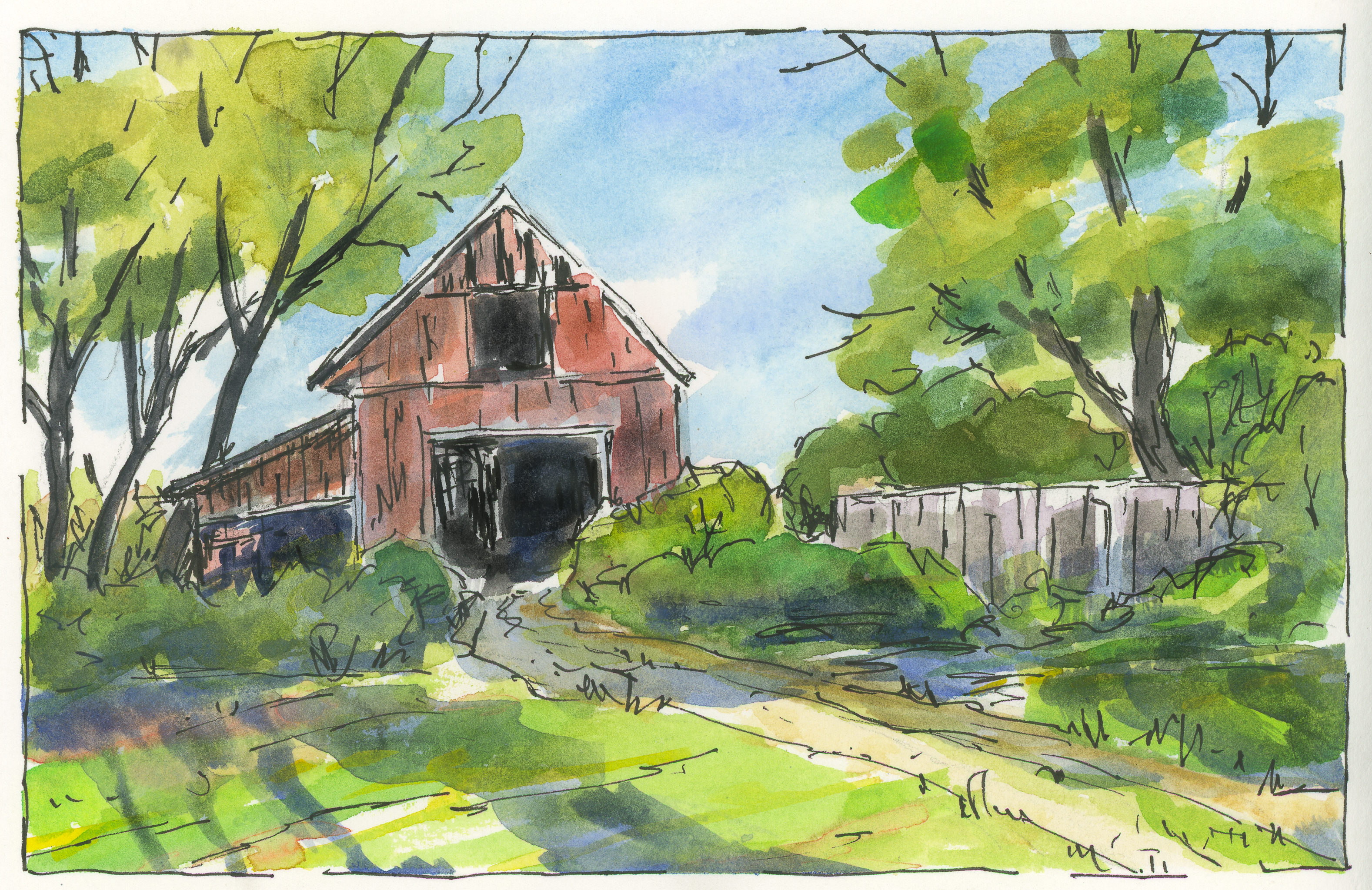
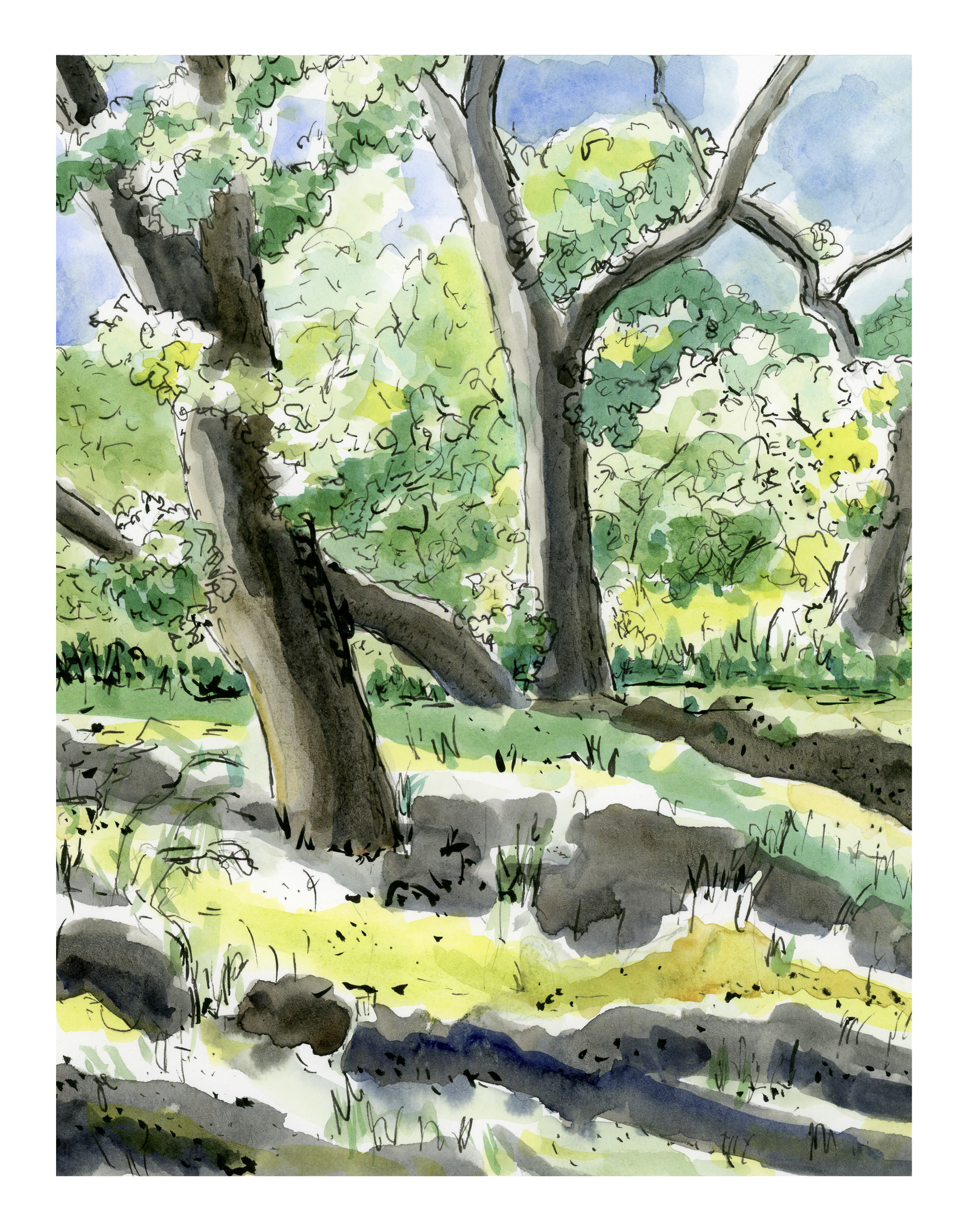
Today I decided to try two things.  The first is above – a simple “country” scene with trees (and green!  remember yesterday?), a fence, and a building.  The idea was for the sun – the light source – to be coming from the left, behind the barn.  I’m not so sure what that big blue thing is to the right of the (obvious) three shadows of the trees, but it’s too late to do anything about that!

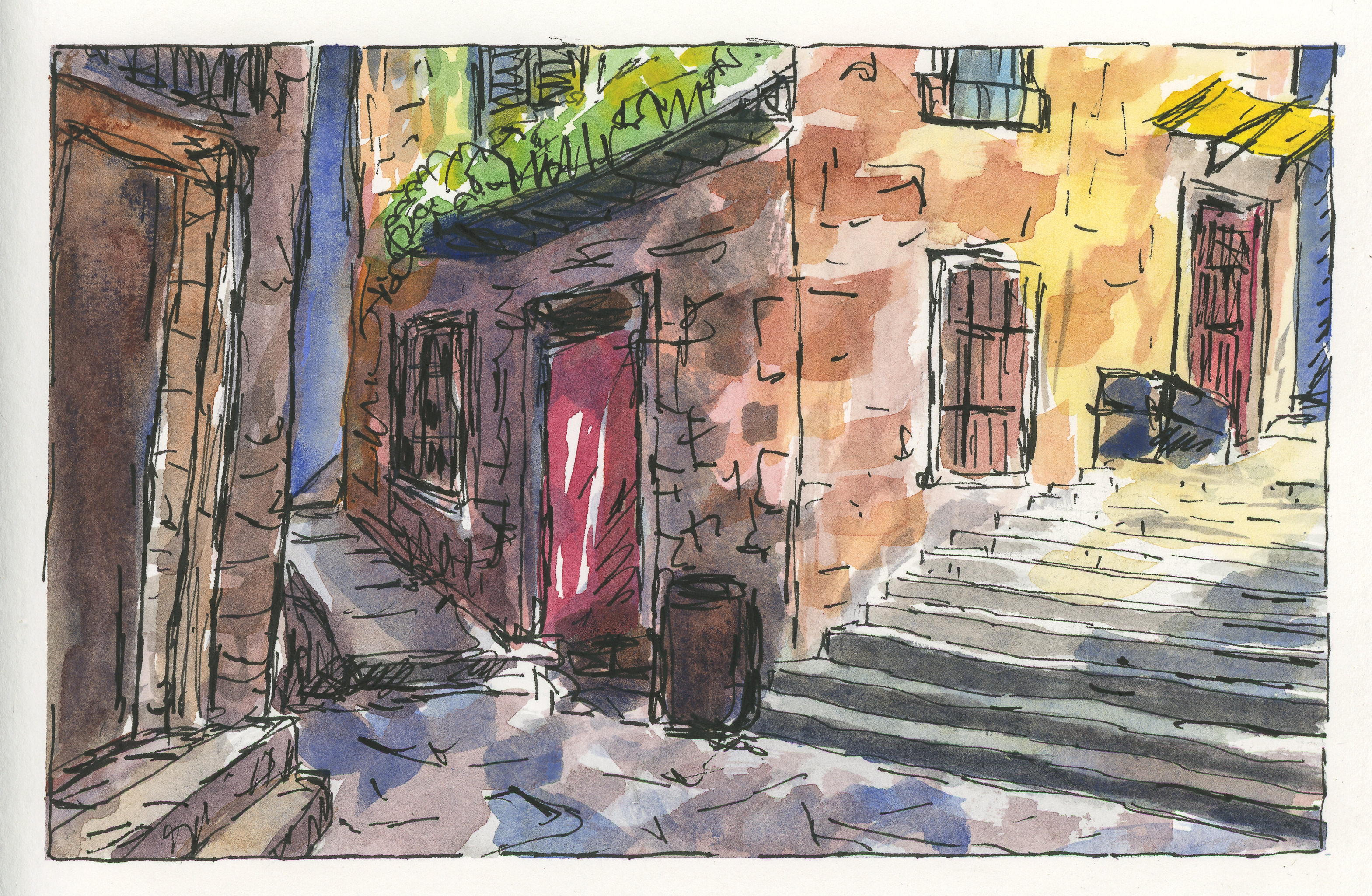
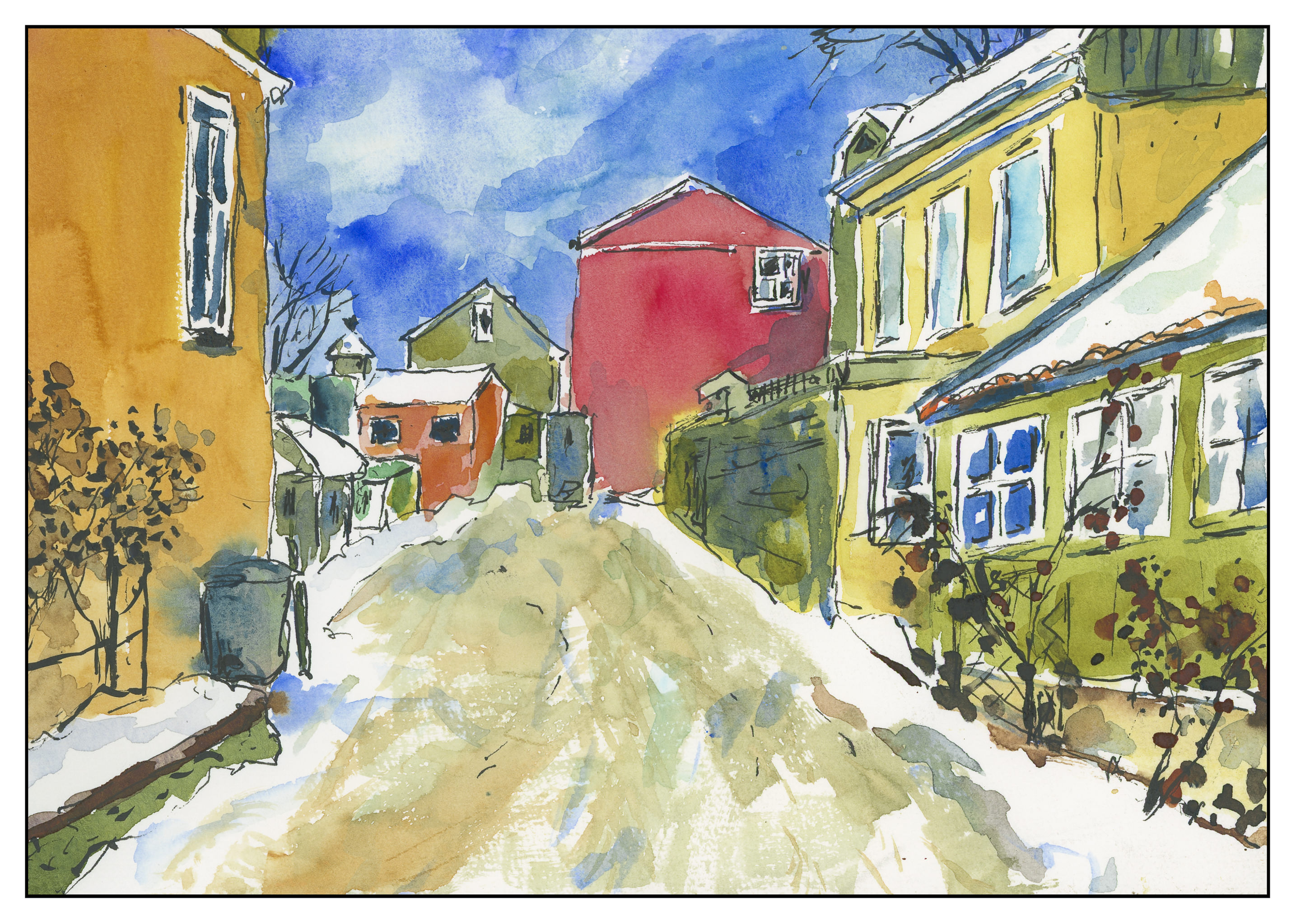
This one is an urban scene, one obviously not in downtown Los Angeles, but in some older part of the world.  Here, the light is coming from the right, perhaps, but the alleys and buildings create their own logic.  Shadows are broken up with bright spots.  One can only imagine that to find the light, looking up will reveal a world much different than the one on the ground.  I think this one was fairly successful; there are parts which seem to work, and others that make no sense at all – like, what is that thing?  Scribble more ink on it and let the viewer guess!

Light Industry, with Nil Rocha

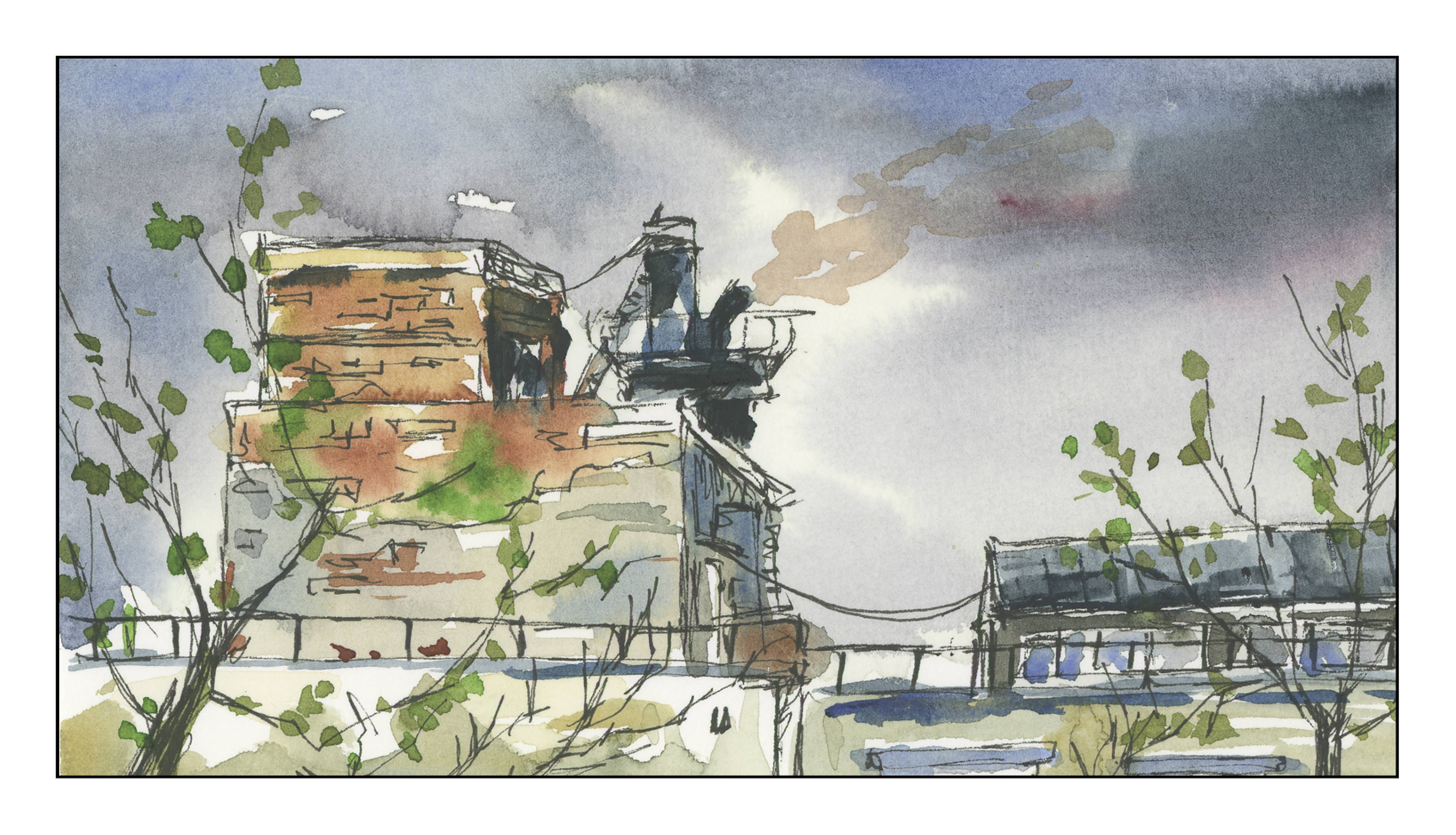
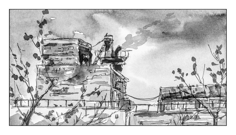
I did another study, using a video produced by Nil Rocha.  As you can see, he has a style similar to Peter Sheeler – and a lot of other urban sketchers:  ink and watercolor.  Although it looks easy, it is deceptive.  It is far more difficult to achieve a good contrast study, meaning, a good light-dark balance.  I found that out with yesterday’s study with Peter Sheeler, and especially with this one.  I think I need to work out the values before I begin inking in lines.  Blah is far too easy to achieve!

Above, in color.  Below, converted to black and white in Lightroom to check out contrast.  Sadly lacking!

I’ve had a cold for the past week and it’s really hard to get creative with sniffles and a fever!  Following videos is a good way to learn, but more importantly they have helped me realize that I must push, push, push to show good contrast.  Middle tones are easy to create, as are lighter ones, but getting the truly dark ones is far more challenging for me than seems logical.  Something to think about . . .

Ink, Color, Paper

For some time now I have been practicing “urban sketching,” which is a fun way to record what you see around you.  Sit down, have a cup of coffee, take out the ink, color, and paper.  Go to a park, visit a zoo.  The world is around you!

Ink and wash in Stillman & Birn sketchbook. Light washes are more successful than heavy washes as far as I can tell.

Part of the process of this style of sketching is to realize the essentials of what you see in front of you.  It is a good way to evaluate and decide what to keep, what to discard.  By the same token, you learn about your materials.  To me, one of the most important elements is the paper – how it responds, how it reacts.  After a bit, paper becomes like an old friend – you know its nuances, when it’s in a good mood, when you are having difficulties.  And, like people, you find you like some paper better than others.

Painted with multiple glazes in a Hand Book. There is some blooming, which can be annoying, but the paper holds up well to repeated washes.

I’ve picked up a number of sketchbooks, many with heavy paper to handle watercolors and ink.  Handling a wash is critical.  However, learning what a paper can and cannot do is also important, and part of that is just using it.

The Pentalic sketchbook holds up really well to repeated wetting. The sky is a good example of this – I went in about 5 times, just because I could, to see how it worked. There isn’t too much blooming with this paper. As well, the paper has a pleasant texture. Both wet-in-wet and dry brush work on this paper. I painted all of this with a flat water brush to get a sense of how to use it more successfully than I have in the past. Ink is both Carbon Ink and pigmented markers.

To date, I have a Stillman & Birn, Hand Book and Pentalic watercolor sketchbooks.  Stillman & Birn doesn’t respond quite like I would like it to for wet washes, but it holds lines well.  I need to practice with it more to get a sense of its personality.  Hand Book seems to have better wash-handling qualities.  Pentalic, so far, appears to be the best.  I also have decided I like spiral bound vs. signatures.