Walking in the early evening on a summer’s night – need I say more?

Walking in the early evening on a summer’s night – need I say more?
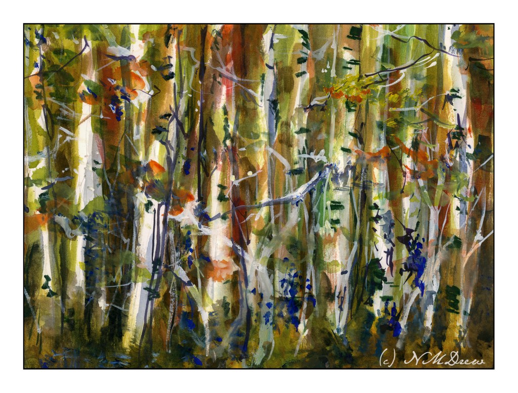
Another adventure in negative painting. As I have mentioned earlier, trees are a very good way to practice negative painting.
Here, I painted around the white trunks, and then more tinted trunks. I couldn’t find myself getting rigidly graphic with this, and just did a splish-splash approach. I also think I did a fairly decent job of moving from a dark, shady forest floor to a more sunlit canopy.
In the end, I used some white gouache, too, and rather like the vibrational energy of it all.
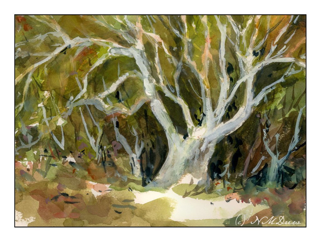
Negative painting is painting around a shape. Positive painting is painting an actual shape. The first is hard to do. The second less so, but the skill of negative painting is necessary and can produce some pretty dramatic results. It is also a skill if you don’t want to use liquid frisket to block off areas to keep white. Positive painting sounds easy, but it ain’t. (My flower paintings are evidence of this!)
A common exercise to show the learner how to do negative space is to paint a tree, paint around it in a light wash, draw another tree on the colored wash, and then paint around this, until you have a lot of trees ranging from white to the varying values of the wash. Sterling Edwards has a lengthy but very good video about this method:
While I know about negative painting, and have stated it as one of my goals, along with flowers (which benefit from the skill of negative painting), I thought this was a good one of the many I watched. What I liked was how he blends his paint inward.
Anyway, I did trees. Rick Surowicz is also a master at negative painting, and if you look at Edwards’ paintings, and those of Surowwicz, you will see both apply the same techniques. In my painting, I used Arches 140# CP, 9×12. I outlined the tree, and then painted around it. At some point I was frustrated and decided to do some painting with white gouache, on both the primary tree and then adding others.
Overall, I rather like the effect, particularly after adding the gouache. I think it enhanced the painting rather than making it just another annoying experience! I used to be quite rigid about not using gouache, much less gel pens or diluted acrylics in my watercolors, but rules exist to be broken, and I expect purists would call this “mixed media” – but that no longer bothers me as much as it used to. Watercolors they are (water soluble), so watercolors these remain.
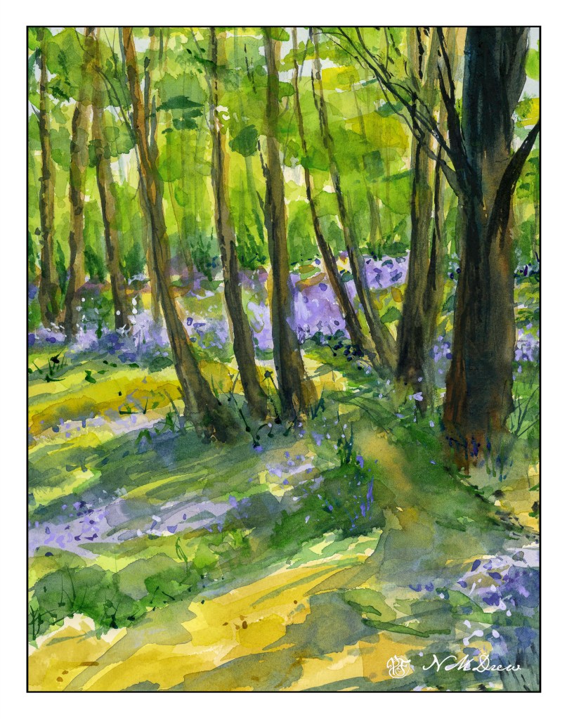
Whenever I think of “bluebell wood” I always think of Eeyore!
Finally had to paint – been so busy with classes, I did this one as it has been on the back of my mind for ages.
Watercolor, Kilimanjaro CP 140#, 9×12.
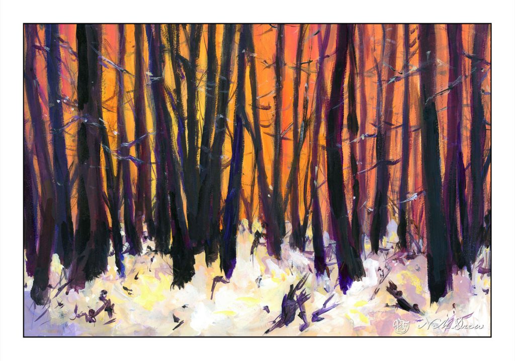
For the past several weeks I have been immersed in painting classes – 2 or 3 a week, and too many hours to count. I finally decided I was doing more than was good for the rest of my life, and decided to cap it to a few hours a day. That balanced things out as I was getting rather nutso.
This is based off a Pixabay photo of trees and snow, at sunset or dawn. I am not sure if this one is “finished” yet, but think it is done enough to scan and put online. It is acrylic paint on a piece of 11×15 watercolor paper. I decided to use it as the paper is 100% cotton but the sizing is not good. As I bought the paper a long time ago, I cannot return it.
One thing about painting in acrylic, you can paint on a lot of different surfaces. I like the feel of paper beneath my brush more than a canvas panel that I have gessoed. Maybe it is because I am used to its surface texture, but there is more of a connection there with its surface – smoother than a cotton canvas panel, but with some tooth. I do plan to learn more about oils later this summer but need to play with it a lot more and figure out where to paint as oil solvents, while now often odorless, are still volatile and not exactly something to be breathing in a closed space.
As I work on learning how to paint I also explore different artists. Right now I have been looking at a lot of the Russian artists of the Impressionist variety along with ones from the 1930s, such as Nikolai Timkov and his fellow painters. Impressionists and more modern painters appeal to me because their sense of color and brushwork, as well as subject matter, are more to my liking than any other era. I like abstraction, too, so a bit of all of these appeal to me. Strong graphics, elegant composition, good colors get my eye. Art is really a personal thing anyway. What I want to hang on my walls may be nothing you would even consider . . .
All this painting is also making me think about brushwork. It expresses so much. Smoothly blended or broken? I think the next exploration will be broken brush strokes and trying to choose a color and put it down – paint it and leave it, as Ian Roberts is telling us!

