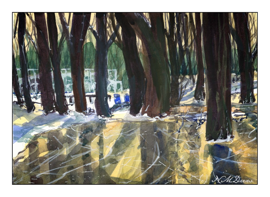
I was never any good at skating, but I did try it out a lot when I was a kid. We moved from a really cold place in the midwest to a warmer climate on the east coast, leaving rural farmland with ponds and lakes for a bit of suburbia in New Jersey. Every year the neighbors would get together and scrape the snow off the nearby lake, test the ice, and create a skating pond. We were never allowed to go by ourselves because of the chance of falling through the ice, but it seems there was always a dad or mom to supervise a dozen kids in snow suits, wipe away our tears, keep us generally under control.
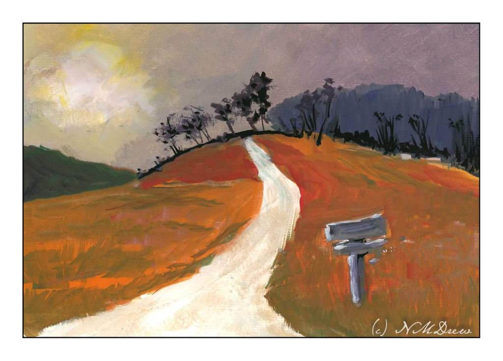
I’ve spent the last two afternoons following along with an online class in gouache. It’s been fun. The main focus has been skies and their moods as shown by clouds and color and time of day and weather. For some reason the dark and stormy sky stayed in my mind’s eye, and visual memories of days of yore came back.
I don’t know about where you live, but here in California where I am, the clouds are seldom domineering and frightening like they can be in the tropics or midwest. I remember one day when I was about 9 coming home from school and the sky was nearly black with clouds. It was still daylight, but it was in the fall of the year and cold. It was eerie and scary and beautiful. All the colors in the surrounding fields and meadows and trees were brighter than usual, almost to the point of being unreal.
That is what I have tried to catch here – intense light, strange light and colors, a wildness waiting to happen.
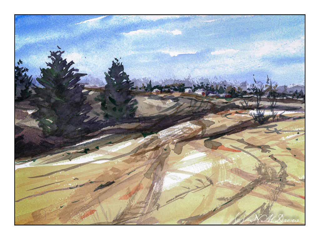
I do love the bleak look of winter. With watercolor, a limited palette of 3 or 4 colors can express so much. Admittedly I used more, but I usually like alizarin, ultramarine, burnt sienna, and Hooker’s green for the colder time of the year.
Following through on points for some of the classes I have been taking, I am working to simplify subject matter, colors, and lead the eye. I think I managed to do this here, leading through the fields to the houses on the hilly horizon. I tried to contrast warm and cool colors, with a bit of warm on the buildings with the hope it will draw the viewer in. I also used wet in wet and dry brush, working from general shapes to more specifics; light to dark in general.
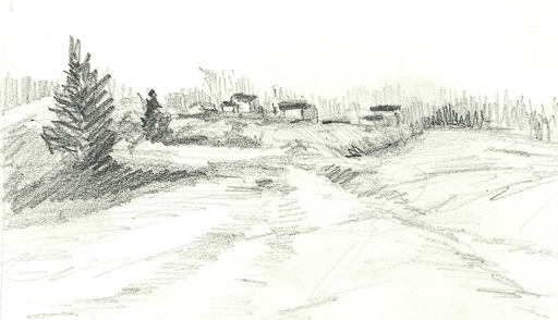
In addition to the painting, I am trying to make myself do a preliminary drawing before I touch brush to paint to paper. I did this one today. Lesson – it is actually worth the time, and I have been a silly bunt not to take on this fine habit sooner!
Watercolor, 9×12 CP Extra White Fabriano Artistico 100% cotton paper.
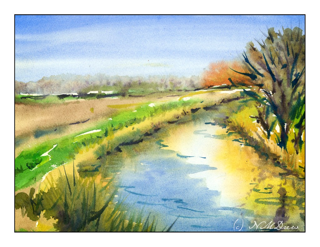
It is really important that if you study art that you make studies! I’ve been following along in my haphazard manner a number of teachers I like, online, and am trying to implement what I am learning. Or what is being taught – and then working conscientiously to absorb some of it. Being a magpie doesn’t help as I am so easily distracted by this and that. Focusing on one thing really helps bring mastery, but I get bored with doing only one thing. I know a lot of single-minded people, and I rather envy them. However, we all have to follow our own drummer.
The focus here is to lead the eye to the orangish, autumny trees in the distance. The water does it primarily, but I hope the curves of the field do, too, as well as the lines along the horizon. I am not too thrilled with the trees on the right, but c’est la vie.
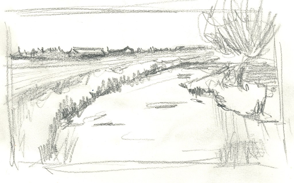
So many artists say a value sketch is important. I like to think I can create the values in my head as I become more sophisticated in my abilities. I have decided to create some kind of preliminary sketch before painting as a habit and that is not an easy task for me – even if it only takes a few minutes. Well, the one below is not really a value study, but it did help me work on some compositional elements. Hmmm.
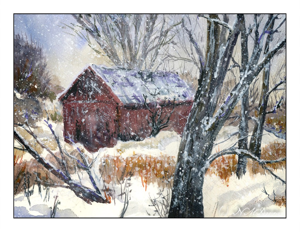
Well, this one sure had me going for a while! The idea was to avoid angles, and look squarely into the building, and so I did . . . and then came along the Esposo who said, “Nay! This does not work!” And, damn, if he wasn’t right! So, I had to pull out some gouache to overlay a roof on the tree in the background, and make the roof look rather beat up and weathered, with beams and such visible. Sort of a success.
And, I wanted to paint falling snow. Falling snow in a photograph varies from white, sharp dots to elongated shapes. Time to experiment. I used some gouache, diluted, and applied some streaks – I wanted a sense of wind blowing from upper left to lower right, with snow pushed by the wind. It was okay. So, I got a fan brush and made a wet mess of the white paint and splattered and splattered and splattered. I even got it my coffee. Luckily the paint isn’t poisonous, so I shall return.
Overall, this is not a great success as a painting, but it was fun. I rather like the composition with the tree in the very front of the painting. The barn is w-a-a-y off as far as believable perspective, but such is life. But, I have been sticking to my snow themes, and perhaps it is time to do one more and then move to a different season different subject, or put it away for a few days and get back to sewing or doing photography. I can now hobble forth on my partly healed broken toe.
Arches rough, 140#, 10×14. Watercolor with a splash (well, several splashes) of gouache.