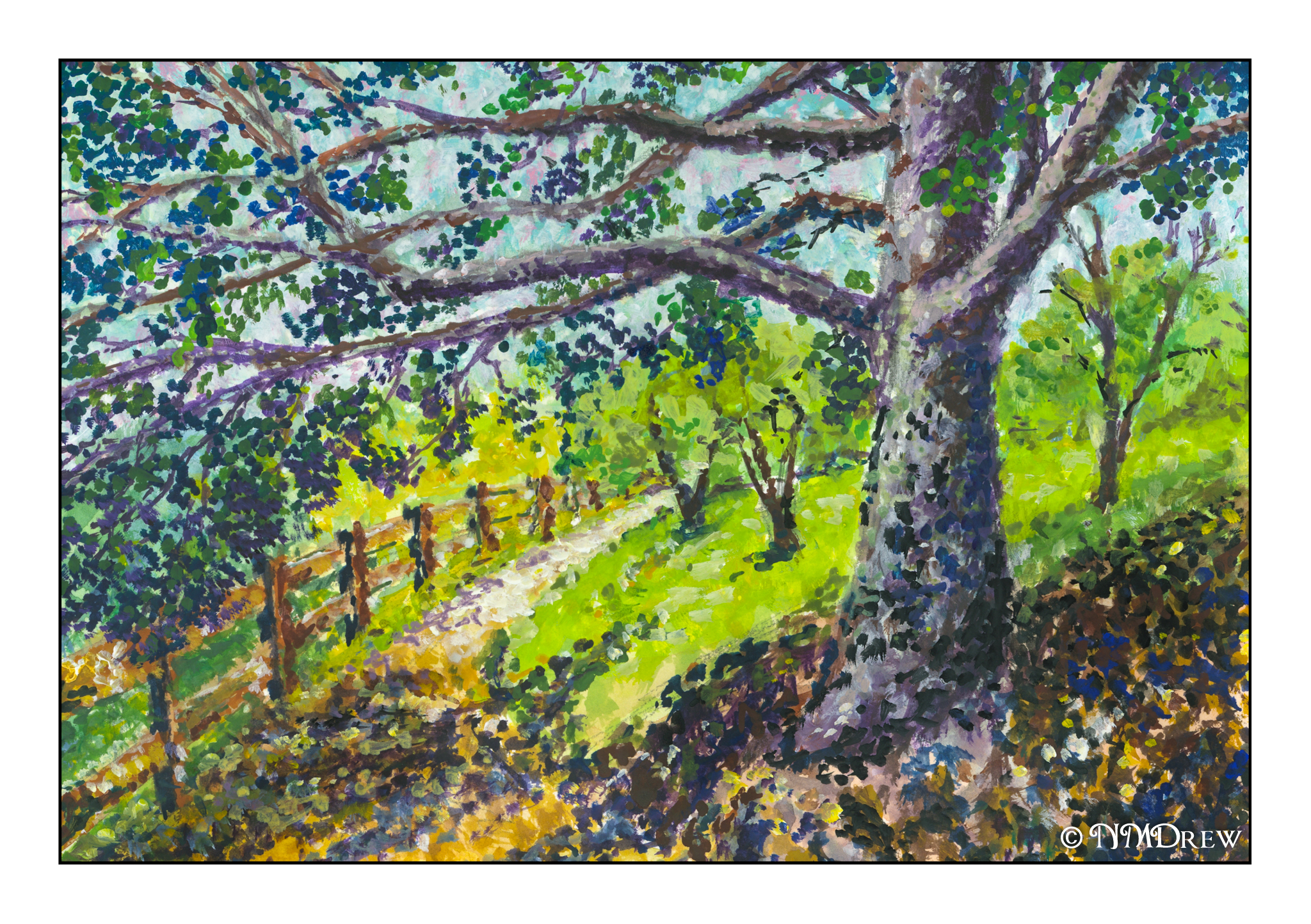
Another wet-into-wet painting, but this time with more challenges and a longer painting period. As before, 140# Arches CP paper.
The goal of this painting was to get away from trees and aim for seeing how using a very wet piece of paper could be worked for skies and water along with plant life, from rushes and grasses to distant trees. The style itself lends itself more to softness in general, but with judicious brushwork and glazes, more defined areas were achieved. I also used white gouache to represent a tasseled top to the tall reeds (or whatever) in the middle right of the painting; I realized I might have achieved an airier effect by splattering some frisket in the areas I wanted white.
I painted the majority of the picture last night, working glazes over areas more defined to blend them in more harmoniously. Dry brush was used for the the foreground and in areas where a rough edge was needed to show plants.
I don’t think this painting is as good as the one I did previously. The contrast is not good enough to convey distance – too strong of colors were used to paint the reeds and trees in the horizon. I do like the colors and softness, though. Another point of focus was to create a point of focus! I tried to use birds, warm colors in the center of the painting, a bit of a vignette around the edges, and other visual tricks to lead the eye somewhere. Again, I don’t think I had much success. As well, the sky and land do not seem to match.
I did accomplish a few things I set out to do – wet-into-wet with some control for sky and plants and water. Doing it is a lesson in itself, and each painting teaches something. I worked on the painting last night and then refined it this morning. I had more patience than I usually demonstrate when painting in watercolor. Why is that? Is it because watercolor is wet and watery and seems to demand a bit of speed?
Anyway, more to come, more to learn.