Pen, Ink, and Watercolor with Claudia Nice

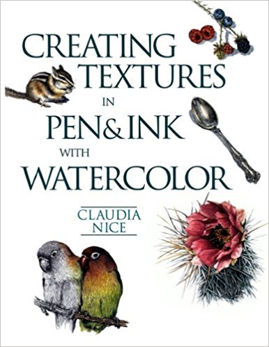
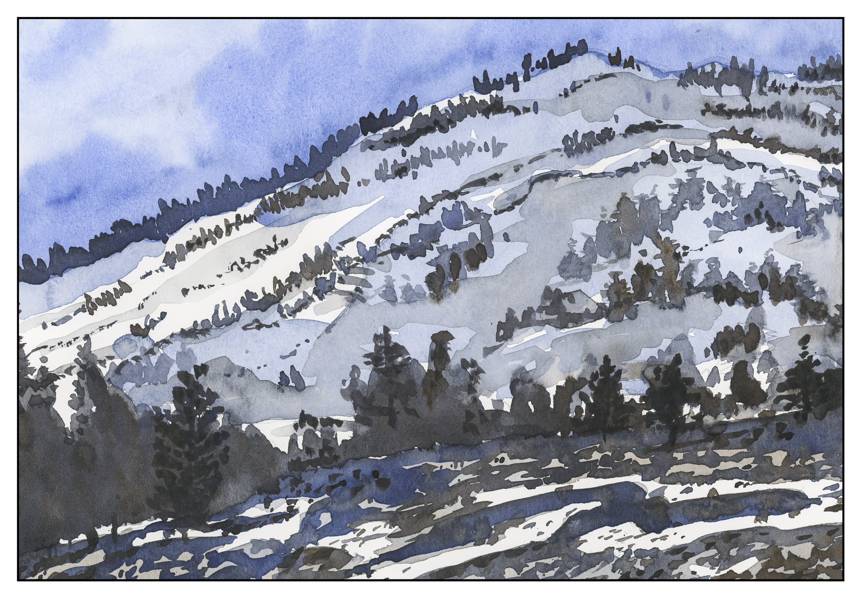
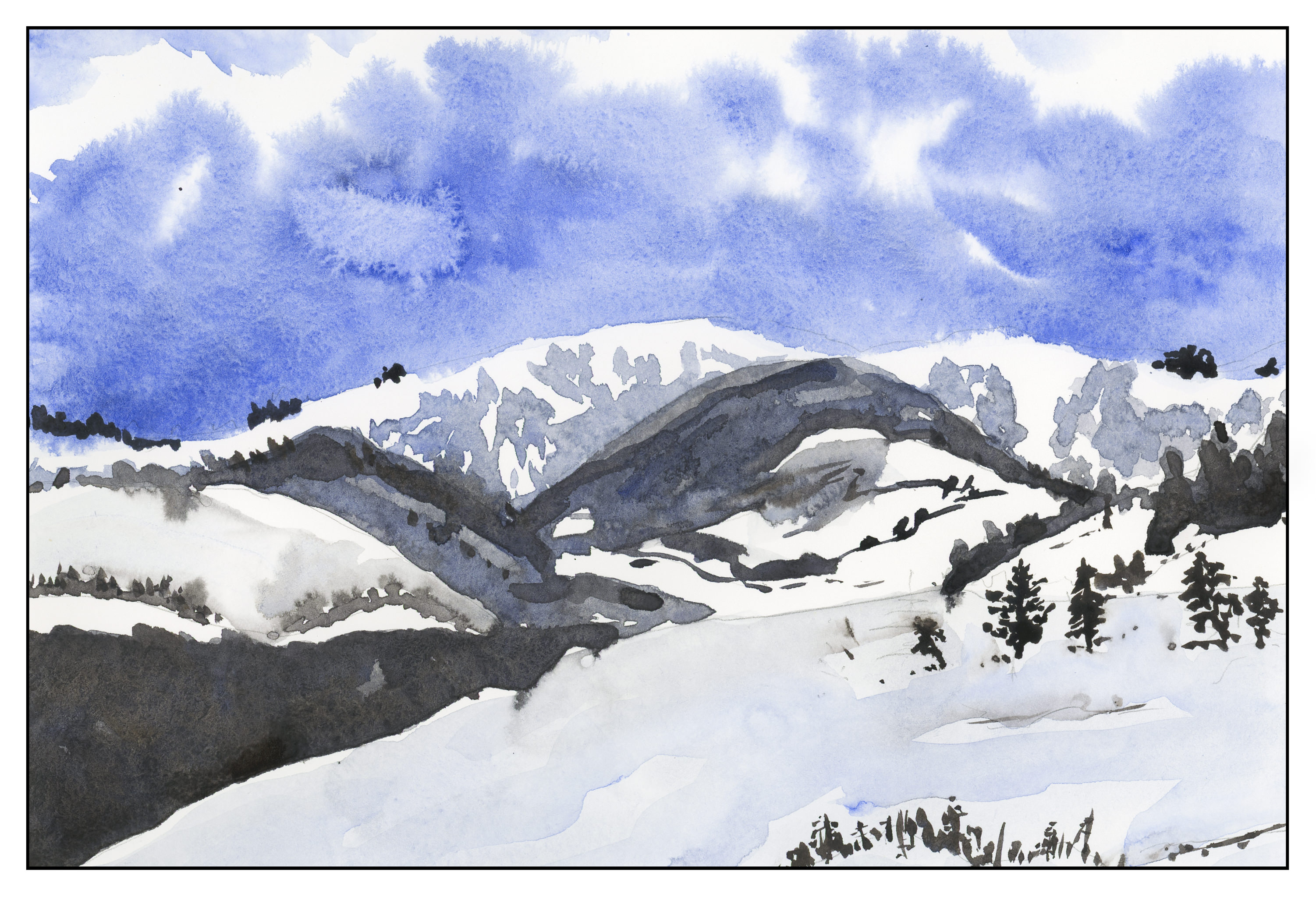
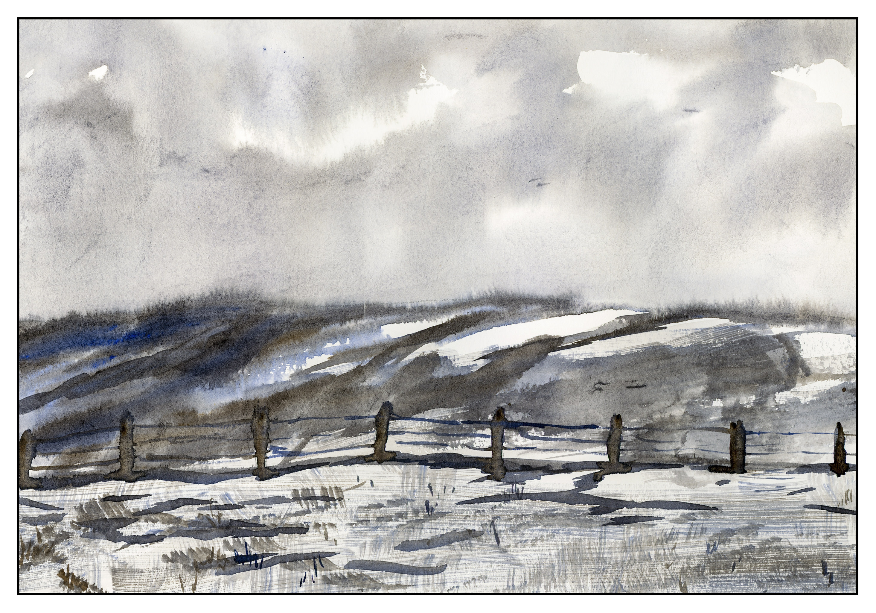
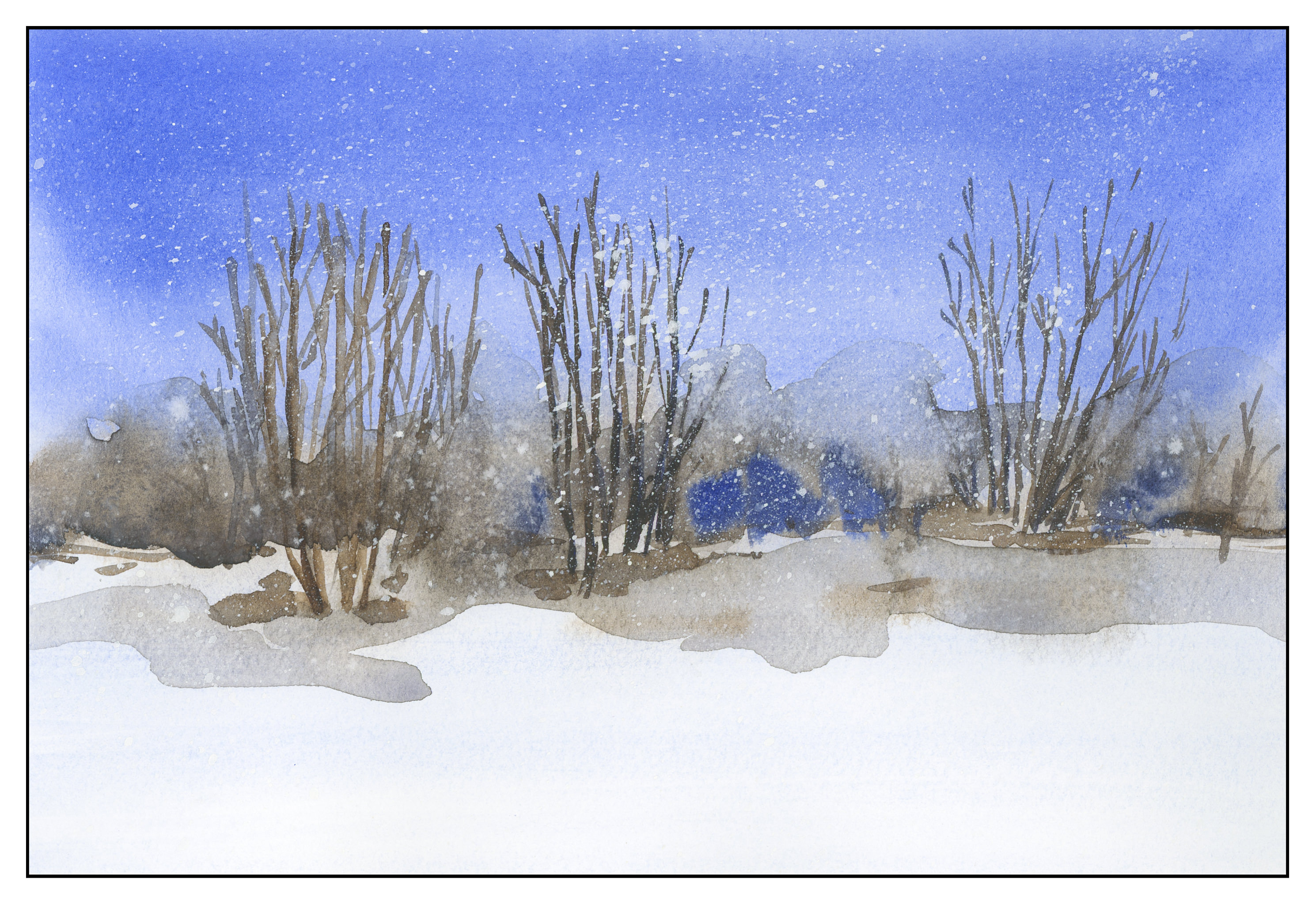
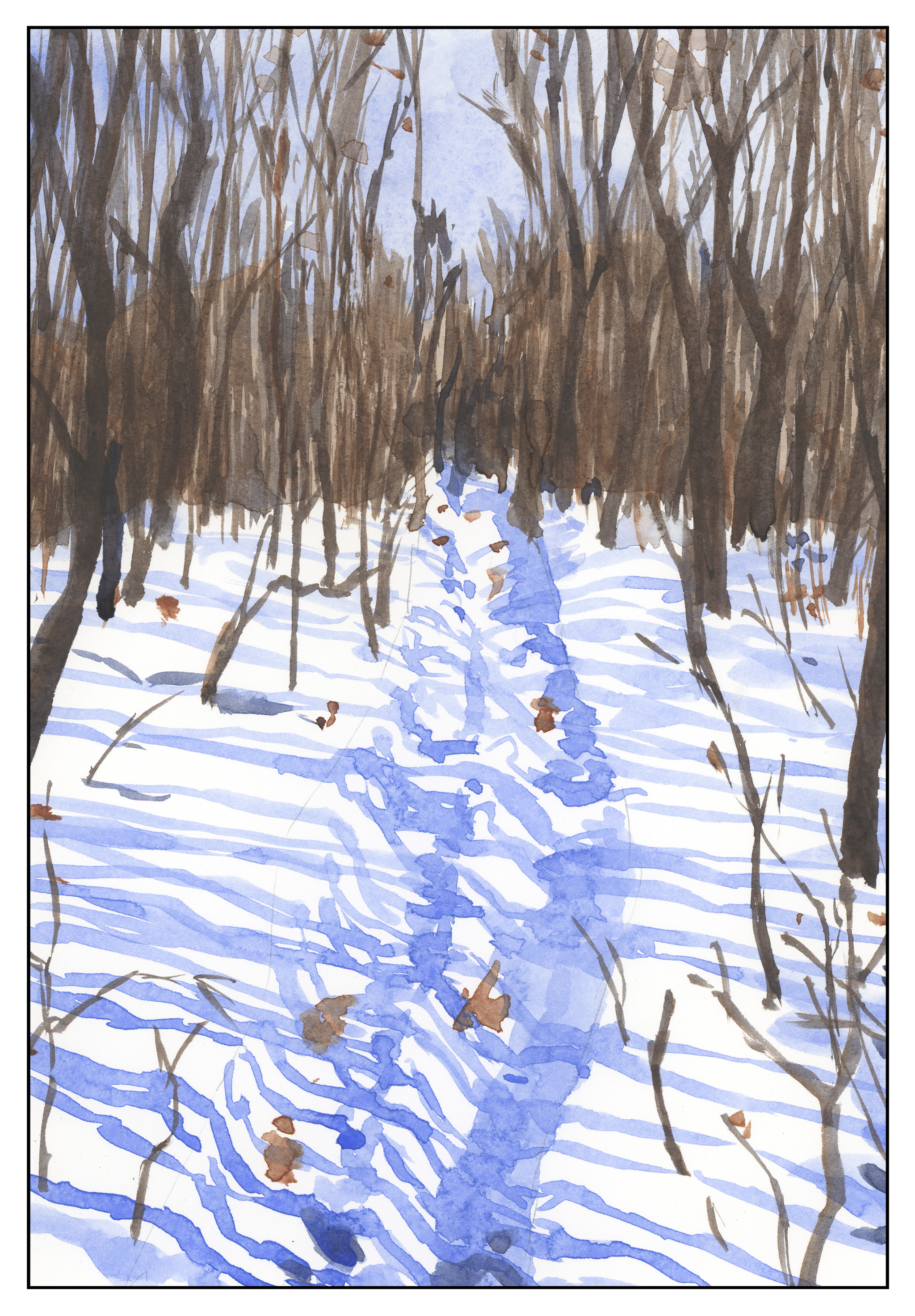
I have always liked pen and ink combined with watercolor.  The contrast between the two can be art in itself, or the two can work together, each enhancing the other.  I came across this book by Claudia Nice, Creating Textures in Pen & Ink with Watercolor, quite some time ago.  It’s detailed and it has some exercises with suggestions as to what to do and notes as to what she did to create the effects.  Some are just ink and colors, others involve traditional “helpers” such as alcohol or salt to achieve results.

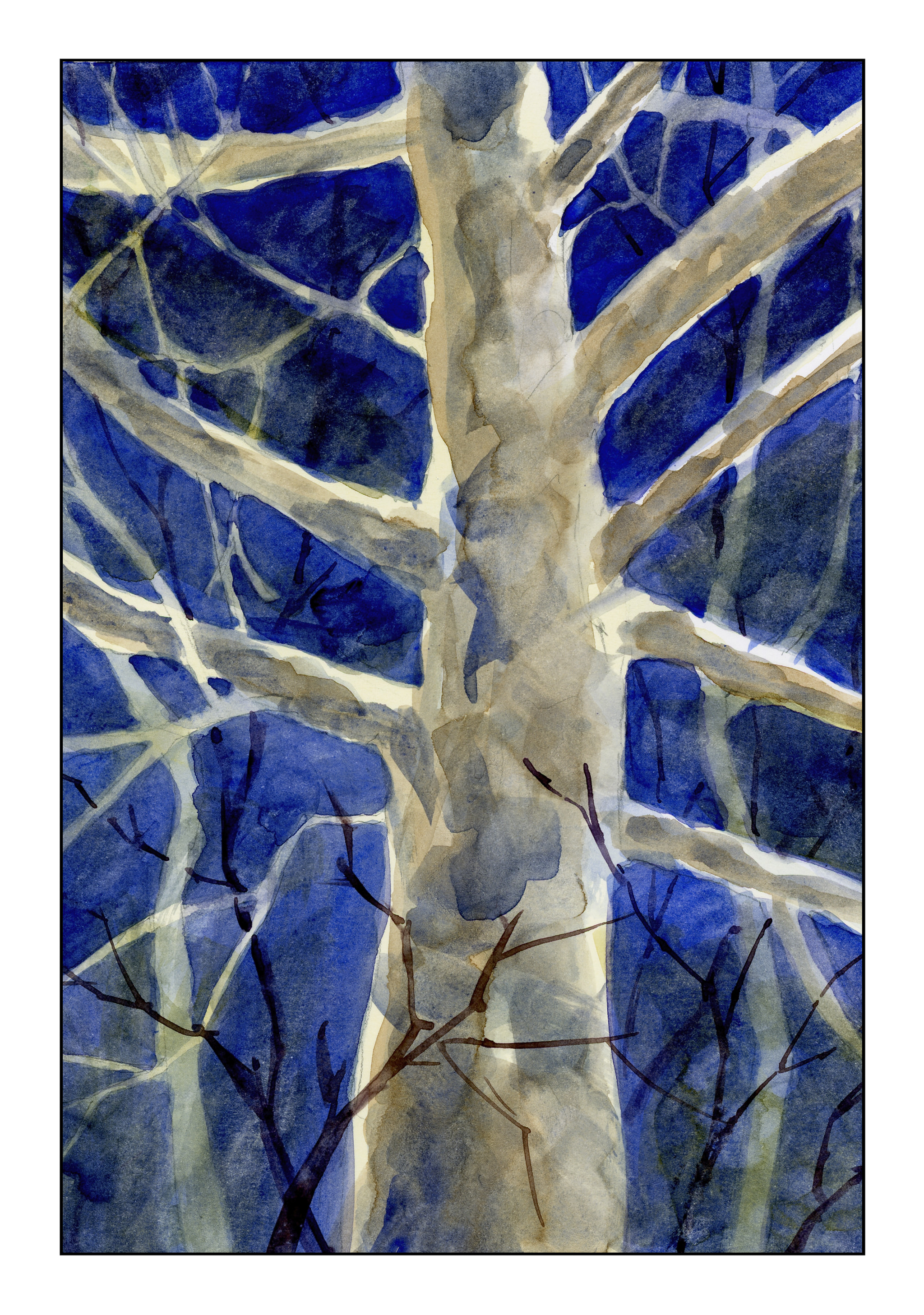
Yesterday afternoon I was in an antsy mood, but didn’t want to paint in my usual splashy style, but wanted some “containment” if that makes sense.  I wanted something requiring a degree of precision.  Ink is always the answer there.  Realism, too, is not where I wander naturally, so Nice’s work and exercises always have a magic to them.

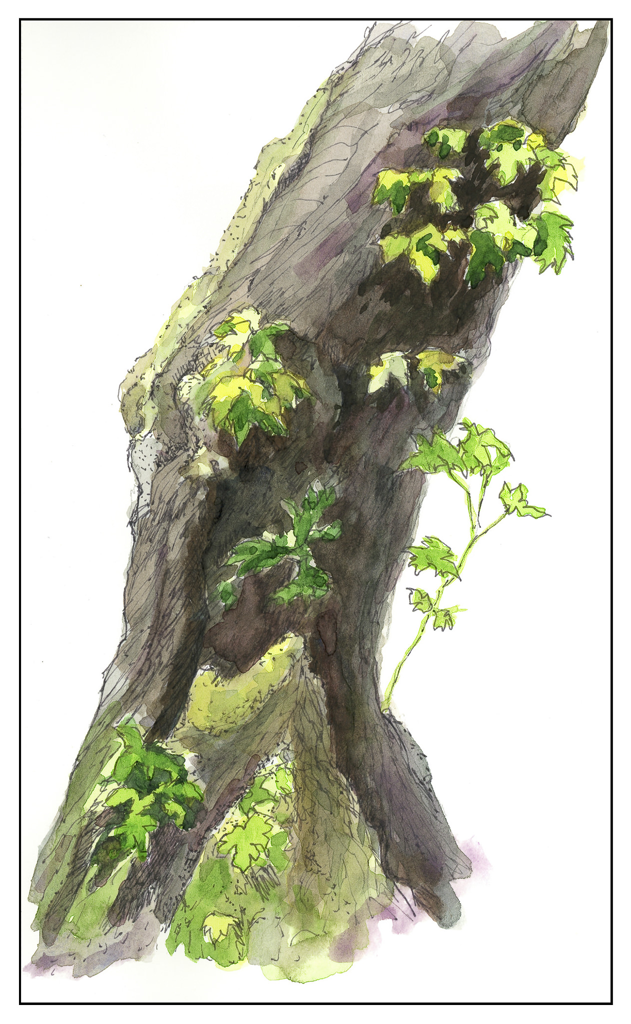
The first I chose was her “Old Broadleaf Maple” – detailed, subtle.  And a tree.  I love trees!  This is my rendering of her example.


The second one I chose was a fly agaric mushroom.  I have seen only one like it in my entire life – and even then I am not sure it was the same mushroom.  I was hiking up in the Rockies in Colorado, up high, and came across some huge, red mushrooms, the kind you see in fairy tales.  Wanting more colors than the tree, the red hues of the mushroom were perfect.

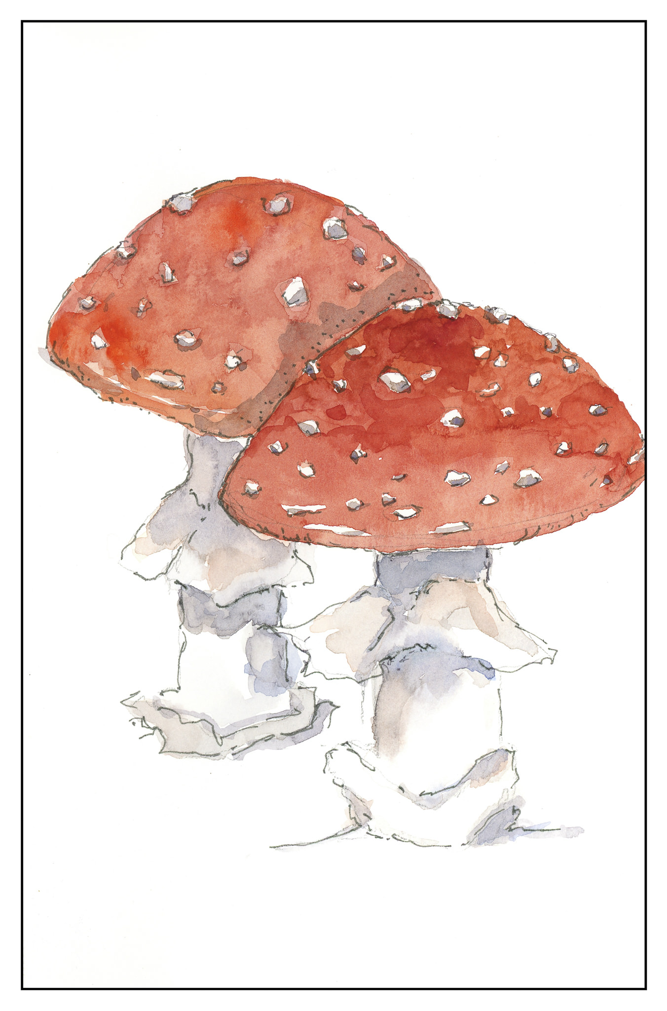
The beauty of Nice’s work is that while it appears easy, if you are doing the study, you focus on the small things as well as the overarching picture.  By nature, I am not detailed oriented, and for me, it is a different way of seeing and doing something.  I am always pleased with the results when I take my time.  The biggest challenge is to take these studies to my own world, outside the pages of the book, and look for the details on a plant or whatever, decide what to keep, what to discard, and so on.  It is hard work worth every minute!

Studies in Two Colors

Over the weekend, I worked on numerous simple watercolors, inspired by the 2-color studies found in Ted Kautzky’s classic book Ways With Watercolor.  He suggests beginning with just two colors, Burnt Umber and Ultramarine Blue.  From his book, I did the exercise below.

The umber and ultramarine are considered to be “warm” colors from what I have read, but they work to make wonderfully cold winter scenes!  Here are some I did after the one above, to continue the study.

The beauty of using only two colors is there is little likelihood of making mud.  That’s a good thing!  Instead, I got to focus on value, which is not an easy thing for me.

Values are not just light and dark, but everything in between.  For instance, above, there is bright white, a light grey, a darker grey, and so on, moving into essentially black.

Besides working on value / contrast, the above painting was a work done with a lot of wet-in-wet, particularly at the horizon line, to blur the plant growth into a hazy atmosphere.

From there, another wet-in-wet, accompanied by a gradated wash, in the above painting.  I started with pure Ultramarine Blue, and then worked it lighter and lighter until I reached the bottom of the sheet.  Then, with a dry brush, I worked upward to remove the blues.  You can see some blue streaks left behind.  After the picture was finished, I used white gouache and a toothbrush to spatter snow onto the painting.

After all these umber-and-ultramarine paintings, I have moved onto ultramarine and Burnt Sienna.  The sienna is much warmer, to my mind, as long as it is not mixed with the ultramarine.  With ultramarine, the color can be as deep as you want – nearly black – as you can see in the trees.

The shadows across the snow, and the ruts, were painted with plain ultramarine, as was the sky.  It’s a great color for shadows, on snow or otherwise.  You will see that the dark colors, such as on the trees to either side in the foreground, are blackish, but of a very different hue than the darks in the paintings above.

This study has been worthwhile.  I may do more in just two colors, or add a green.  Varying just one color produces considerably different results.  I also did the same pictures over again, in different browns or blues, or both; this is also a good way to become familiar with colors and how they interact.

Neighborhood Tree

By nature, I am quite impatient.  Maybe just not patient enough?  What I mean is that sometimes I work too fast, rather than thinking ahead.  In watercolor, timing is important, as is speed, but with patience thrown in.  If I look at what I am doing, some are tight-ass line drawings, and others are just messy and rather free form, without lines.  Here, I used a basic tree shape with cutouts to remind me where to not have leaves, so as to have room for sky and branches.  I also worked for shadows.

Altogether, I worked too fast.  I wanted to make some nice washes of the leaves, to show the color shifts from green to the glows of autumn.  I also need to test out colors on a piece of paper.  This is painted in a notebook, so the back of the previous page is a good place to do this (I keep trying to remind myself).   Accomplishment, though, is no mud.

Colors were fun to use, too.  I mixed together an especially interesting mix of Payne’s Grey, Carbazole Violet, and Burnt Sienna.  That is part of the pleasure of a sketch book – playtime and exploring.

I will be doing a lot of trees as I move along, but will need to do some stilllifes as well.

Moonlight

Night is always mysterious and exciting.  The moon overhead – clouds – wind- the creaking of branches – the rustles in the undergrowth.  This is what I decided to try, using an old sycamore tree as the subject, and a bit of my imagination.

First step was to decide on colors, and approach.  I decided warm undertones for the tree and the sky.  I used a bit of Quinacridone gold and Yellow Ochre for a thin wash.  From there, successive glazes in Ultramarine Blue, Indrathene Blue, and Carbazole Violet.  As things progressed, some Burnt Sienna.  You can see the different layers below.

At times I used a hair dryer to dry the layers . . . other times I painted as I held the hair dryer.  I used rounds, flats, and finally a rigger brush (for the very first time!)  It was okay to use the rigger in the background, but crossing it along the bottom of the tree – I don’t know – I think it detracts from the rest of the tree – hard to say at the moment.