The Happiness of Trees

Trees always make me happy, and it makes me sad if I have to remove them for any reason. In particular, I like oak trees, and where I live, it is against the law to cut any oak tree down without permission. California is dotted with beautiful oak trees across the hills; from a distance, I always think that this is what a herd of buffaloes must have looked like in the 1800s as they grazed across the prairies. (Technically, the American buffalo is a bison.)
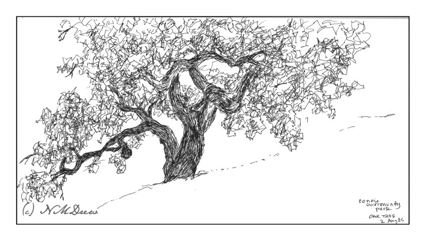
Mid-morning I headed out to a local park next to the botanical garden. The park is on a gentle slope upon which are several grand oaks. Many are supported by metal tubing as their branches can sprawl far from the trunk, often breaking and falling from the stress.

My goal this morning was to simply get out and sketch plein air. Rummaging through my stash of sketchbooks and paper, I found a 6×12 spiral-bound Pentalic watercolor journal, unused. Perfect for landscapes! And for the broad sprawl of the oak tree.

I think I did a decent job here!

Pen, waterproof ink, 6×12.

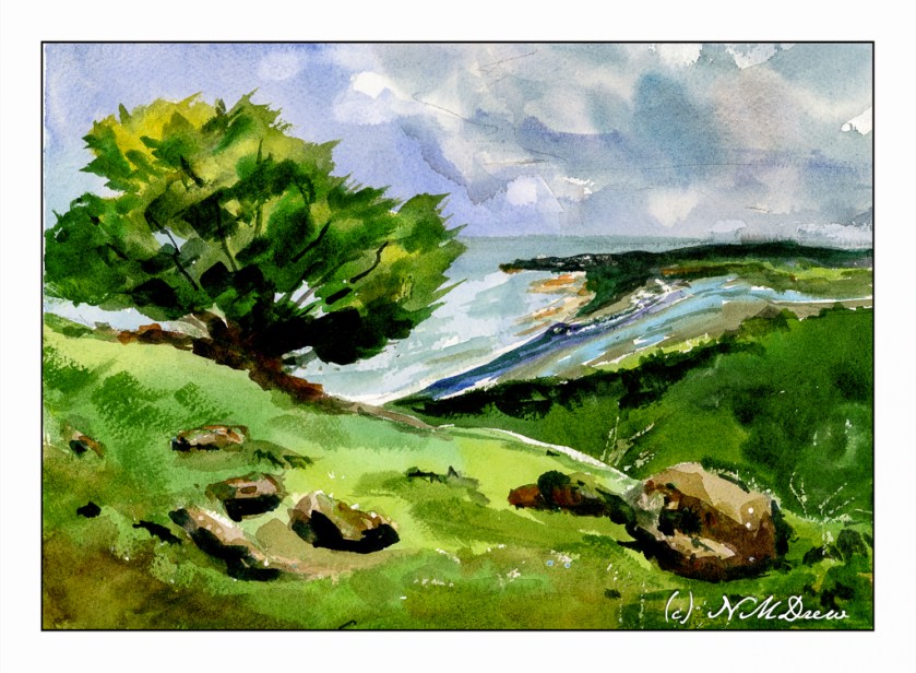
Incoming Storm – Mt. Tamalpais

I do love the views and hills of Mt. Tamalpais year round! The views are amazing, the ocean not too far away, and the sky and weather always different throughout the seasons.

The sky in this painting was sort of an area to play with. Sky in watercolor is done with as soon as you lay it down. For the most part, that is!

Painting a sky is usually thought about and then laid in with a fair amount of water and color, avoiding areas for clouds, letting colors bleed, and all sorts of tricks such as blotting up color with cotton or tissue to make clouds. It’s a lot of fun! Here, I did go back in and lift some paint in the right side of the sky, re-wet it, and then laid in more color. It is okay but did not really work. Still, I did salvage it more to my liking.

Next, the foreground. I like my tree and grasses and rocks. The mid-ground with the trees is also to my liking. The land between the mid-ground and the horizon is too colorful and too bright – it should be a bit lighter and perhaps a bit more neutral.

Overall, I am fairly pleased with the results here. I tried to work as directly with color and water as possible. I used a bit of frisket in the rocks and in the foreground to maintain a bit of white.

As I said above, I try to paint with my colors very directly. This means mixing up large puddles of color and painting from that puddle, adding other colors as I move along with my wash to create variety. It requires a bit of thought as well as knowing what colors work together and so on. I mix these colors on my palette often before applying any to the paper.

Many people lay down glazes and work with layers in their watercolors, but I find that, while pretty, those methods of painting create a rather tame look. A lack of freshness is the only way I can describe it. On the other hand, my approach is quite challenging as I don’t build up colors but try to work with thick, rich colors and pray a lot. As a result, my watercolors tend to by quite gaudy, I think!!

Watercolor, Arches 140# Rough, 11×14.

A Palm Tree, i

A Palm Tree

Sometimes I get obsessed with certain things I want to paint. Palm trees always fascinate me. I wonder why they evolved in the first place. To a midwest gal, palm trees are always going to be strange and mysterious and weird even though they have been part of my daily life since I was in my early teens. I expect anyone raised in a desert without any hardwood trees probably feels the same about oak trees.

Canon G7X Mark II, palm tree.

Sketching with Shari, iv

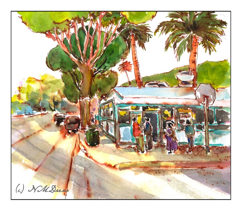
The very last lesson in this delightful class on ink and color sketching by Shari Blaukopf. As soon as I saw it I knew it was La Super-Rica Taqueria on Milpas Street in Santa Barbara, CA. Excellent food – it opened years ago and was a walking dinner destination when I lived in the area.

Anyway, this drawing is a culmination of drawing people and buildings, learning a bit about perspective and thoughts about how to do things. I enjoyed this one a lot even in my moments of frustration. Rather than using Bristol paper, I used 140# CP watercolor paper. The first frustration was the texture of the paper and my pencil – a lot of smudges. Still, I continued and laid down the ink lines after I had it limned out. Then, erasing all that smudging with the kneaded rubber eraser, and it cleaned up very well.

As you can tell by the shadows, this is either early morning or late afternoon – and it is late afternoon. The sun is to the left, which is in the west toward the Pacific. This is an older section of Santa Barbara, and because it is not filled with new and modern buildings, it is charming and pleasant, and certainly a break from modern suburban architecture.

When I started inking the outlines, I began with the stop sign on the right. Can you see how stupidly out of proportion it is? You could knock an elephant out with it! The people and the rest of the drawing are in decent relationships to each other. Unfortunately, I used colors which are rather saturated and did not pay attention to the fact that the ink bleeds a lot. When I painted the major tree to the left of the building, the trunk should have been very light. The same with the mountains above the taqueria itself. Despite that, I like the way it turned out overall. A word of caution – don’t drive the cars as they look quite unsafe.

Ancient Copper ink; fountain pen; 140# CP watercolor paper; brush and watercolors. About 11×13.