
 Books abound about colors to use and to choose and why and wherefore. The fact is that to understand them you have to use them. Years ago, my palette was filled with the traditional cadmiums and earth tones and blues and such, and I am very comfortable with them. I still love those colors as they are old friends with history and familiarity.
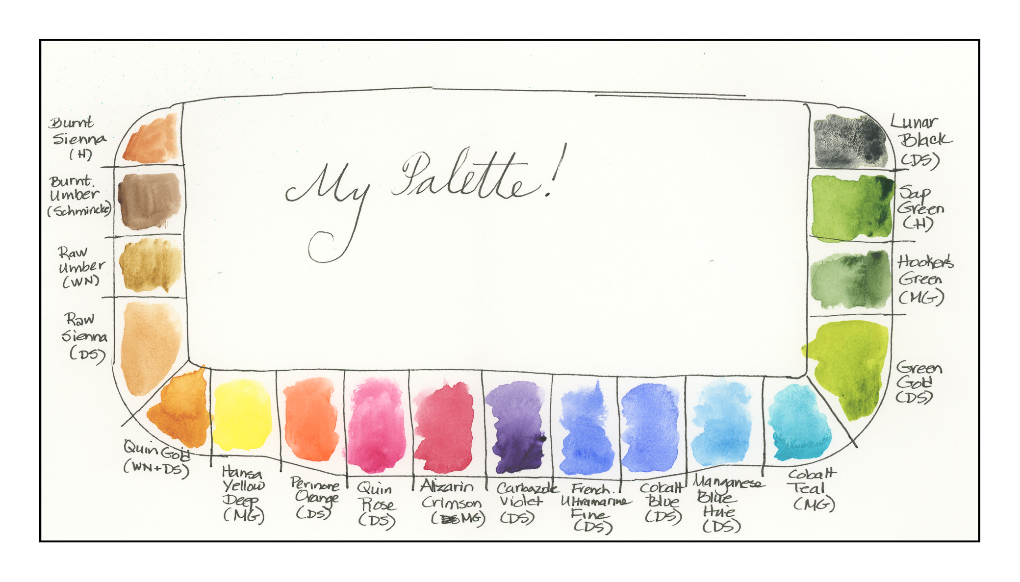
Today I decided to choose 18 colors. Some are new-to-me (like quinacridones) in the past year, and some are old buddies, like the earth tones. Here they are, as arranged on the palette:
- Burnt Sienna (Holbein)
- Burnt Umber (Schmincke)
- Raw Umber (Winsor & Newton)
- Raw Sienna (Daniel Smith)
- Quinacridone Gold (Winsor & Newton – last bit, along with Daniel Smith)
- Hansa Yellow Deep (M. Graham)
- Perinone Orange (Daniel Smith)
- Quinacridone Rose (Daniel Smith)
- Alizarin Crimson (M. Graham)
- Carbazole Violet (Daniel Smith)
- French Ultramarine Blue Fine (Daniel Smith)
- Cobalt Blue (Daniel Smith)
- Manganese Blue Hue (Daniel Smith)
- Colbalt Teal (M. Graham)
- Green Gold (Daniel Smith)
- Hooker’s Green (M. Graham)
- Sap Green (Holbein)
- Lunar Black (Daniel Smith)
Some of these paints are old and little is left in the tubes. I took a chance and mixed two different brands of Quin Gold together – it might be interesting to see their differences when I use them on paper.
All of these colors sit really nicely in the wells except the Cobalt Teal, which is very runny and puddles. I want to use it up and try a different brand – I have a tube of DS sitting in the wings – but it produces an extraordinarily beautiful green when mixed with Quin Gold. Having used neither color in the past, that was a fun surprise.
Other new colors include Green Gold, Perinone Orange, and Carbazole Violet. I’ve never had a violet on my palette until this past year!
When you think about it, modern chemistry and color chemistry affect us everywhere we are, from the colors of our clothes, to neon signs (replaced now with LEDs), to food, to who knows what! Thus, it makes sense to use modern colors in a more modern watercolor palette. Additionally, many of the colors made today are much more lightfast, which means less if any fading, compared to the more traditional colors. A watercolor of 100 years ago was probably far more vibrant then than it is today.
Old friends include Burnt Sienna, Burnt Umber, Raw Umber, Raw Sienna, Alizarin Crimson, French Ultramarine Blue, Cobalt Blue, Manganese Blue (now a hue)), Hooker’s Green, Sap Green, and Lunar Black.
It was really difficult to choose these colors – like a lot of painters, I read about or see a color and go off to buy a tube. There are some that are incredibly beautiful – but for a travel palette, even 18 colors may be a bit much. For myself, I prefer to have a stable of greens rather than mixing them a lot. I haven’t really taken the time to do it as the Sap and Hooker’s have been in the color stable for a long time. Green Gold is totally new to me this year, so I thought I would include it. This forced me to narrow down my blues and reds to a degree, as well as the addition of the Perinone Orange and Carbazole Violet.
Over the next several days I plan to use these colors, perhaps make some swatches and grids to see how they react to each other. A “good” artist is inclined to do that . . . me, I get antsy unless I make it a goal!

