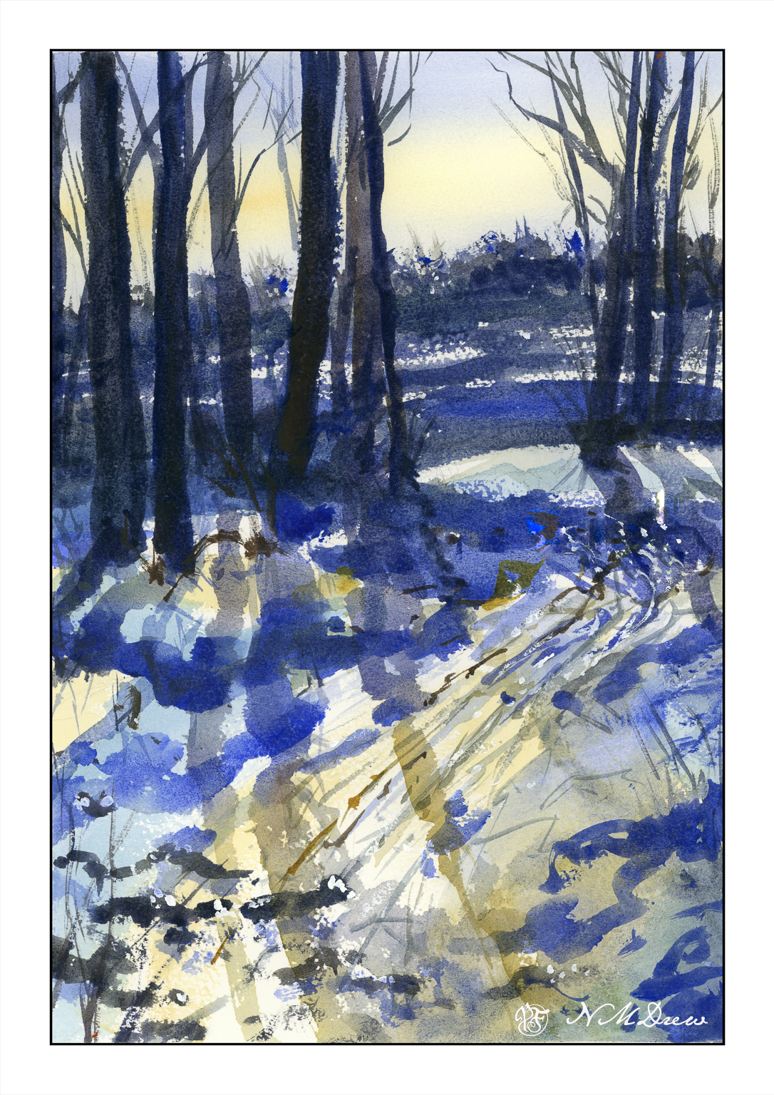
When I lived in upstate New York, the winters were marvelous! Hardwood forests and pine trees all worked together to create a magical land of light and shadow, rolling snow banks, and winter streams frozen and thawed and frozen again. The skies, too, were amazing in their coldness of light that could reflect so brilliantly on the snowy landscape.
As an adult, snow as a place to live, work, and travel in no longer holds much allure – great to visit, but don’t ask me to wade through it, chisel ice off my windshield, or shovel it just to get out of my house. Still, the memories of those magical winter days in deep winter always hold a spot in my heart for their crisp and intense beauty.
10×14″ Arches Rough, watercolor limited palette of umbers, quin gold, ultramarine blue, and a touch of titanium white gouache.
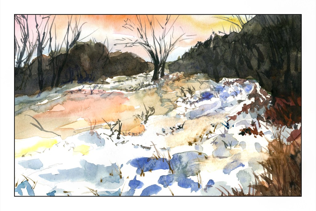
Nothing great . . . 6×9 on Strathmore Vision 140# paper.
What is the purpose of this sketch? First, trying to lead the eye to the two trees on the opposite river bank. Second, trying to reflect warm and cool light on the snow and ice of the river.
Problems? Paper is not great, but good for these kind of studies. Also using different paints – Schmincke pan paints, which are more saturated than the travel paints I used the past two days. And, as always, my sense of perspective is off. I am not quite sure why and it really bugs me!! Oh, well, perhaps one day I will find the answer to that problem.
Thinking about the atmospheric perspective, it seemed I needed softer edges in the distance. So, I wet the paper, blurred it a bit, and smeared a light mess of a blue-grey to give some distance. Then I took the painting into LR and decided to adjust the vertical perspective a bit, tilting the picture back a bit, and then doing a “smart fill” in the areas left white by that adjustment.
Don’t know if it improved the picture, but I think it might have as I often feel as if I am falling into my painting from above – sort of like a bad dream.
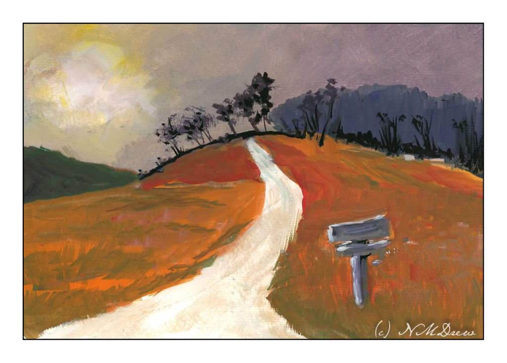
I’ve spent the last two afternoons following along with an online class in gouache. It’s been fun. The main focus has been skies and their moods as shown by clouds and color and time of day and weather. For some reason the dark and stormy sky stayed in my mind’s eye, and visual memories of days of yore came back.
I don’t know about where you live, but here in California where I am, the clouds are seldom domineering and frightening like they can be in the tropics or midwest. I remember one day when I was about 9 coming home from school and the sky was nearly black with clouds. It was still daylight, but it was in the fall of the year and cold. It was eerie and scary and beautiful. All the colors in the surrounding fields and meadows and trees were brighter than usual, almost to the point of being unreal.
That is what I have tried to catch here – intense light, strange light and colors, a wildness waiting to happen.
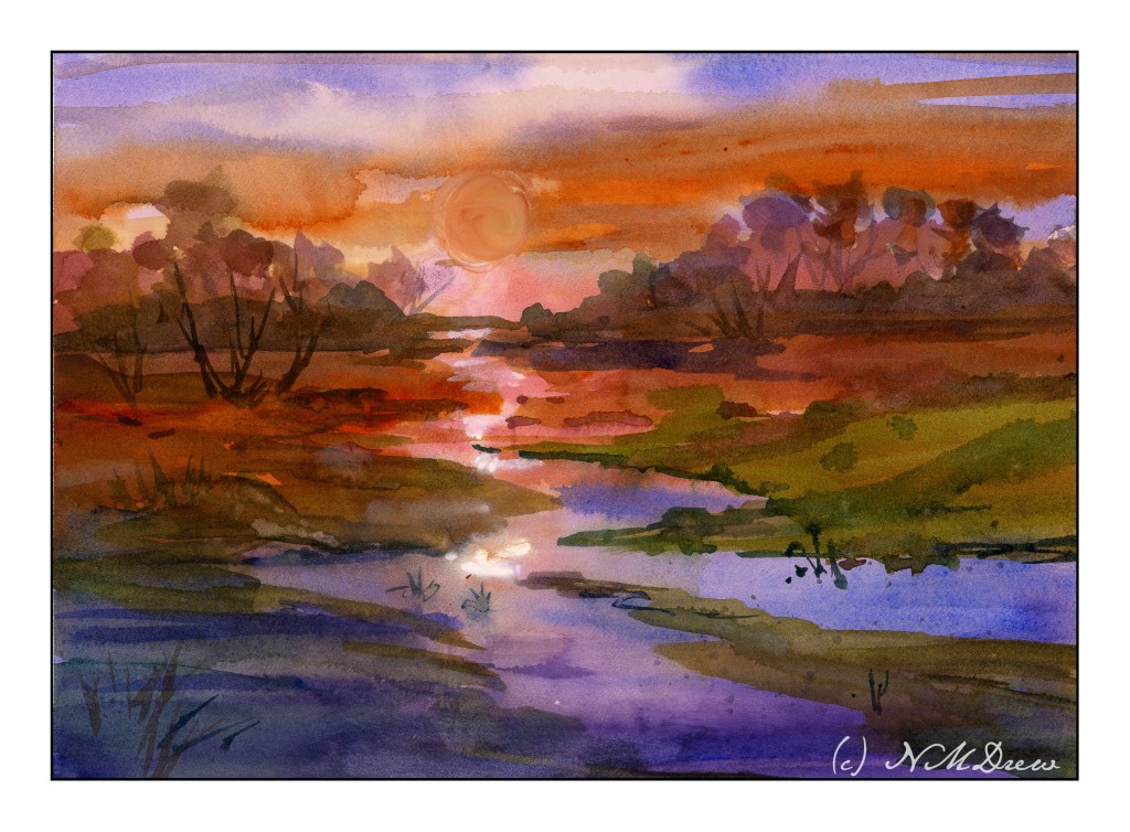
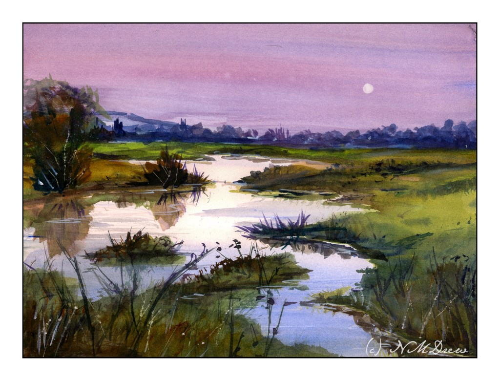
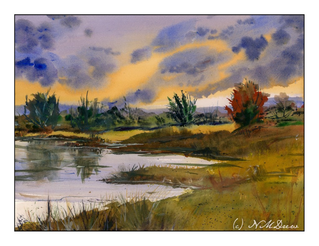
More practice paintings. Negative painting will return in the not-too-distant future. Before all those negative painting exercises came in, I ran across the watercolors of Javid Tabatabaei. He has a wonderful way of painting skies reflected in water. His YouTube channel shows his tricks – definitely watch him if you want to see what magic he creates with a very simple method.
Normally, I paint the sky first, and then I do the distant hills. Water on the ground is left to last. Tabatabaei strokes in the sky and the water where the colors of the sky are reflected, but he leaves areas of bright water white or with a light tint of gold or yellow or blue, depending on his needs. For the sun, he paints around the circular shape of the sun; he does the same for the moon. Other times he will lift the paint. This technique creates a lot of drama.
Below are a couple of studies I followed on YouTube as well as a copy of a painting from Tabatabaei’s Instagram account, to see if I had learned from his demonstrations. I did. And to tell you the truth, this is one of the most fabulous ways I have ever seen for painting water and sky in watercolor – a big thanks to Mr. Tabatabaei for sure! Very simple, very elegant.
The above is my first attempt to follow Tabatabaei’s technique; this is from a YouTube study I seem to be unable to find at present. This is also on HP paper by Fabriano, and I was not really in a comfort zone as far as using it. Still, it worked out quite nicely. Here, I tried to lift out the image of the sun, but it really didn’t work. White gouache failed too. So, a painting lacking in success in a lot of ways but that water and reflections are yummy!
The one above is also from a YouTube video by Tabatabaei. He has a couple of YouTube channels, come to think of it. That may be why I am having problems finding them! This one and the one below are on Arches CP paper.
Finally, my version of one of Tabatabaei’s paintings using his water / sky technique. It worked out pretty good, I think, and I can see I am going to have a lot of fun painting water! Expect a monsoon or flood . . . of watery watercolor paintings.