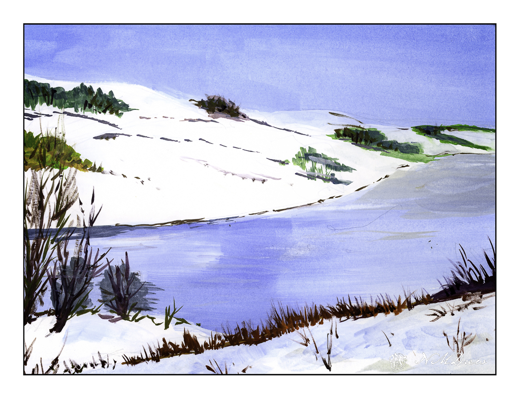
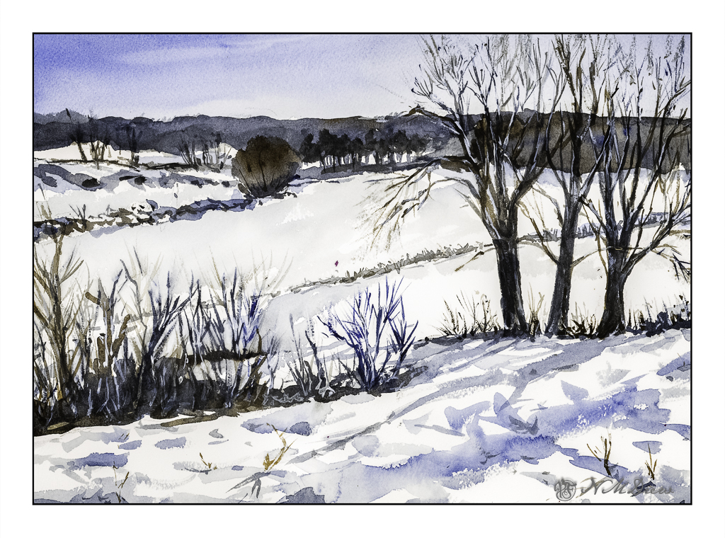
As always, I can never fail to but enthusiastically recommend the short watercolor courses by Shari Blaukopf! Her most recent one is called “Peaks and Valleys.” It is inspired by her trip into the Alps while teaching a class. Having lived near the Rocky Mountains in Colorado and driven through them many times, I found this course especially fun to do. Shari’s instruction is clear and to the point, but her lovely personality shows through to make the lessons personable and friendly.
I am not going to show you the subject matter I have done so far in the course. Instead, I am going to show you what I learned to put into my own painting. My reference for this watercolor was a mountain peak photo found on Pixabay – the best resource for public domain, royalty free photos (and other things, too!).
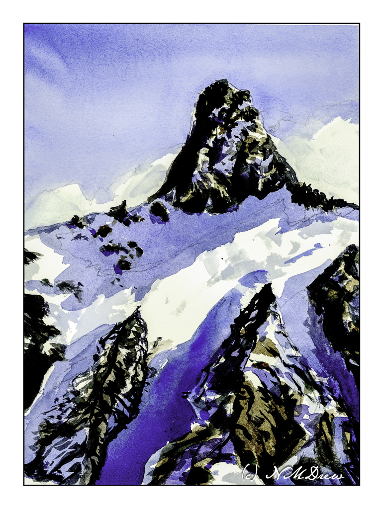
Mont Blanc was the first mountain top study in this course. At 14,000 feet, it is way above the timberline, covered in snow, and nothing else than barren rock and clouds. At this elevation, the view across the Alps must have been amazing with ridges of more and more mountains before and beyond Mont Blanc itself. To paint it, essentially blues and browns were used in the class – cobalt, ultramarine, burnt sienna – with the addition of Payne’s grey, some organic viridian, and yellow ochre to neutralize of brighten the colors. Myself, for this painting, I stayed pretty much with these colors, but threw in some dioxazine purple as well.
It seems that the one most important lesson I fail to really retain when I watercolor is to be patient and think ahead on what I want to do. Taking a class such as this make me remember to plan ahead.
On the other hand much of my color mixing is automatic because I am familiar with how my colors look and blend, but my natural impatience is sorely tested. This is where 99% of my mishaps occur – rushing. With this painting, not so much because I started playing a game with myself – how will I plot my next step? I didn’t do a value study, but I want to try to do that more often. Here, the strong contrasts of light and dark, warm and cold, made the values and contrast easy to perceive.
I am rather pleased with this painting. It is cold and starkly beautiful, and that was the whole point of this painting.
Watercolor, Arches 140# CP, 9 x 12.