Studies: Roadside

Last summer we drove through a lot of the wild west.  The loneliness of Wyoming always gets me – vistas of open space, few cars, fewer people.  Taking a picture during the summer is much different than what you see in winter, so I looked at some of the photos I took out of the window as we drove from Laramie to the Tetons.  I tried to imagine how barren and cold it could be.  Always the sky, always the distance, always the barbed wire fences.  Again, in Ultramarine Blue and Burnt Sienna.

Besides trying to imagine a scene, I also tried out a new brush.  It is a Cosmotop flat, by DaVinci brushes of Germany; it’s about 3/4″ wide.  I wanted to see how it would do on the Canson XL paper I use for practice, in particular to see if I could get a “sparkly” effect with a dry brush.  The paper is too smooth for that to work successfully, which is why there are fine lines in the foreground.  (Sigh.)  It did a pretty good job for wet-in-wet sky, and along the horizon line.

Two Color Studies: Incoming Storm

Another study in Ultramarine Blue and Burnt Umber.  These are really good colors for portraying cold and wintry conditions.  Brr!  Where I live, we have had weather in the 80s for much of January and February, so a break from the heat is much needed.  Today, though, it’s a whopping 52 F.

Holiday Cards: Winter Stream

I used six of Peter Sheeler’s videos to create cards for my sister-in-law’s Christmas present, along with using them for practice.  Doing all of these has proven to be more thought-provoking than I realized.  Copying by watching a video is really informative.

In many ways, this was perhaps the most deceptively simple in appearance, but in reality the most complex.  The reason for this is the stream.  Water is never easy to express (at least for me).  There are ripples, reflections, shifting colors to reflect the sky and scenery above.  Besides all this, there is the snow.  It also reflects along the banks of the stream, which you can see in Peter’s video, but which never made it into mine – this is on the center left of the stream.

Mine below has some good areas – certainly there is white! – but bits of it are a tad overworked.  The scan is not as subtle as the painting, either, but I am not really sure how to deal with that.  I decrease some areas of saturation in the image using Lightroom . . . and I am not sure if I am going to include this card in the set because of the smudges and such.


Practice Present Presented

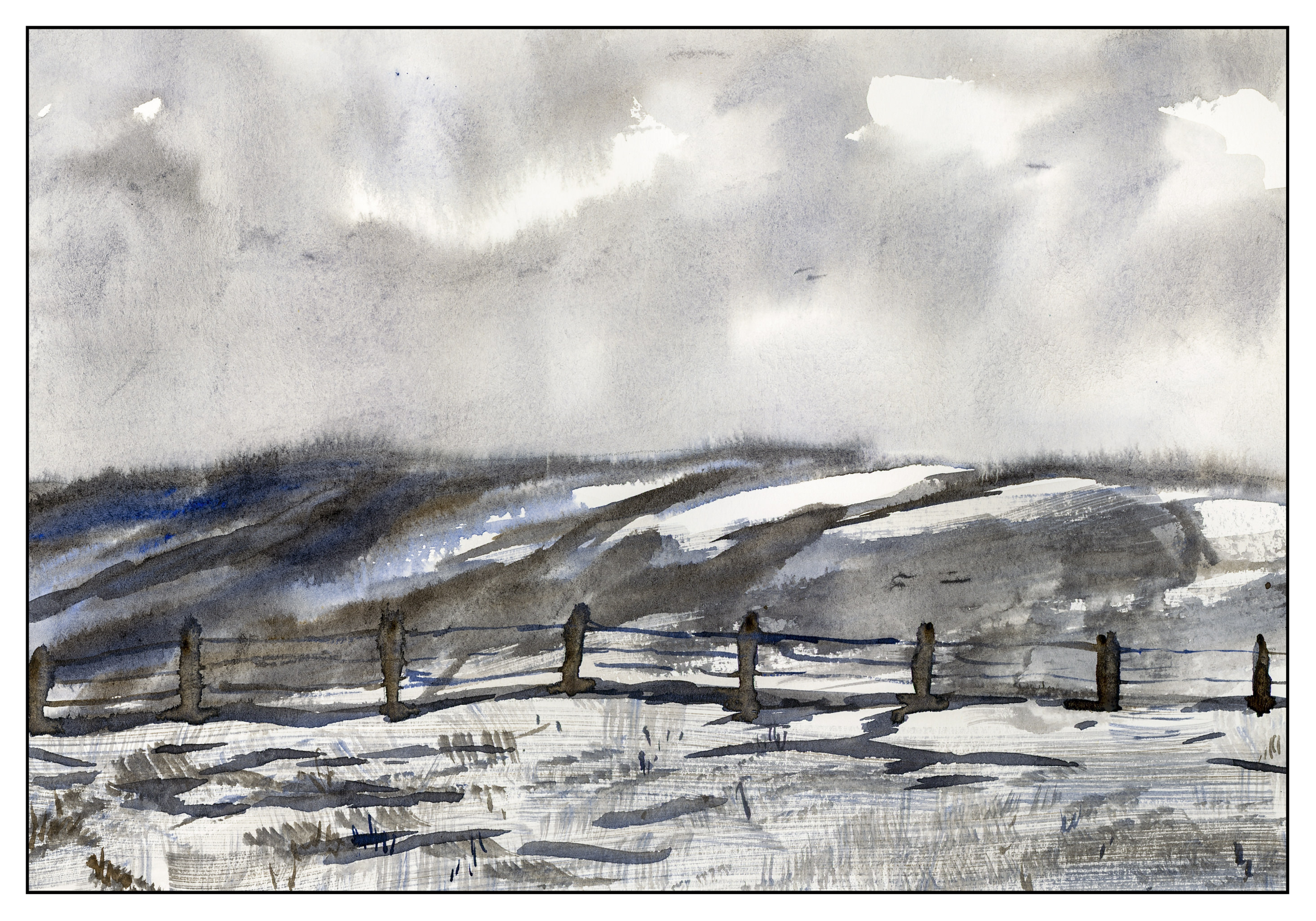
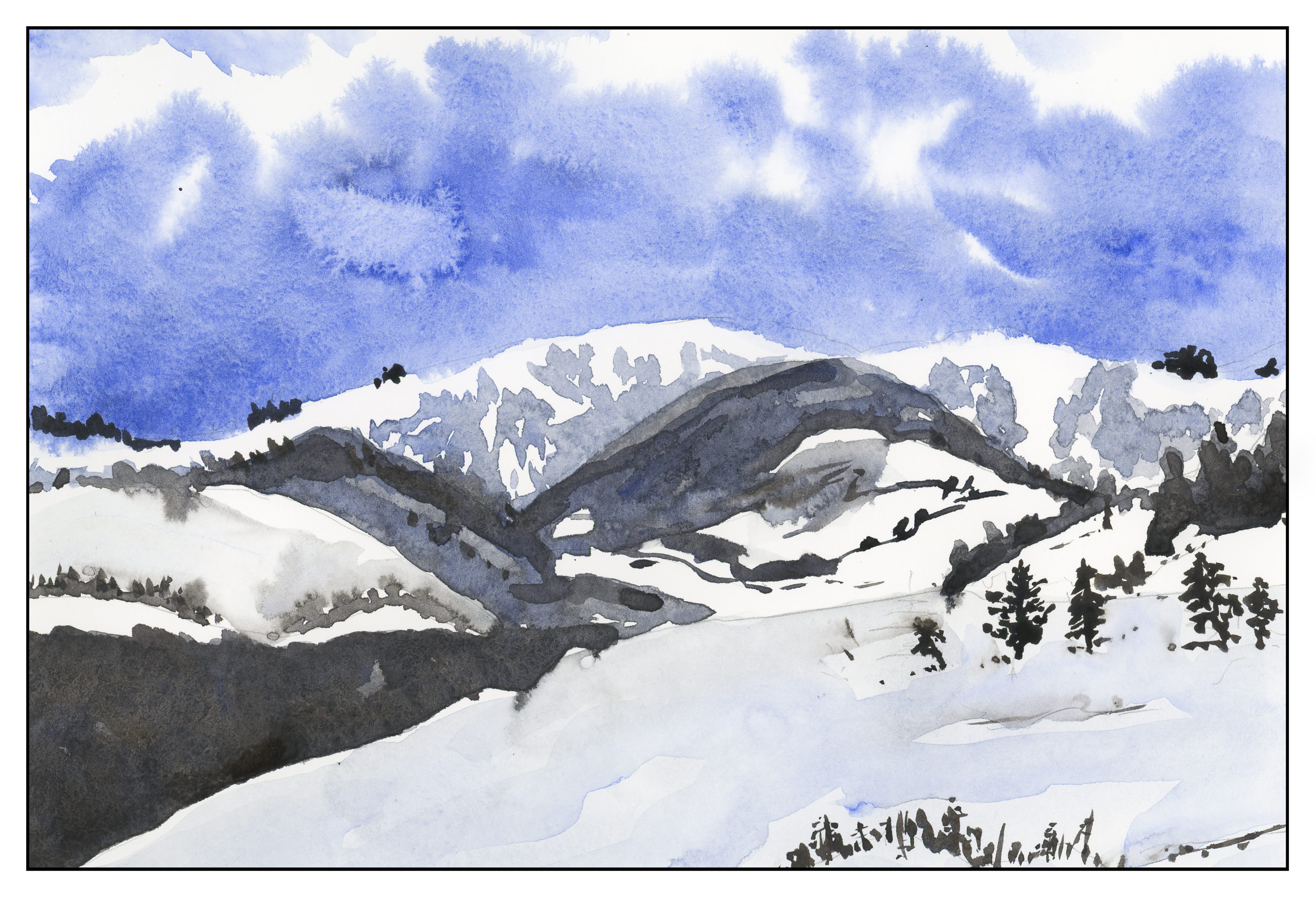
My sister-in-law requested hand-painted cards for a Christmas present.  She’s getting them!  Out of all of these, 6 were from exercises I did following Peter Sheeler’s YouTube painting tutorials.  What made them particularly useful, to me, was that many of them had a lot of white space in them, such as white snow or flowers.  The other thing was the simplicity of composition – a few trees, a stream, some flowers.  While they look easy, I did need to focus on the videos to follow the sequence of painting, as well as to focus on what I was seeing.  Of all of them, I think the stream was the most challenging.

From using Peter’s videos to practice with, and to create cards, I went on to do two based upon photos I have taken.  One is a prickly pear which really does sit on a heart-shaped paddle, and the California poppy fields at the State Preserve.  The latter made me think of Monet’s painting of a woman in a poppy field – the brilliant colors against a sea of green.  Our poppies in California are orange and yellow, so no reds, but mixed in with these colors are blues and whites and so many other colors it is hard to imagine that much of California once looked like that in the springtime!

Below are the different cards I did.  Click on one of them to start the slide show.

Trees, Shadow, Snow

This morning, in a room only lit by the light of my monitors, and a half-drunk cup of coffee at hand, I decided to go ahead and watch Peter Sheeler’s video above, and try to do a painting.  I dragged out a bowl for water, a few brushes, and my travel palette.  I sort of know where my colors are, so what the heck – paint and draw away.

I pretty much followed what Peter did, but obviously his work is better than mine.  Despite that, I did learn a few more things.  One thing I have always liked – and will continue to like – is ink with color.  Using a limited palette is also fun as it really helps you keep yourself under control.  I think – remember, it was dark, and I was only half of cup of coffee into my morning! – I used yellow ochre, quin gold, a bit of viridian, a bit of alizarin, indathrene and ultramarine blues, and burnt sienna.  Some of these were just little dabs because I couldn’t see very well, but the main colors were the sienna and blues.

That said, below is a scan of my painting before putting in the final lines.

Objectively, it’s okay.  There are some nice areas, and there certainly is some white space (yay!  white space!), which is why I am focusing on snow painting practices.  Some good light – dark areas.  A nice bleed or two.  Other areas are dreadful, such as that greenish area on the mid-right side.

Below, the inked in version.

Frankly, I like the final one better as there is more definition.  Now – finish that coffee and jet off to work.

Have a fun day!