
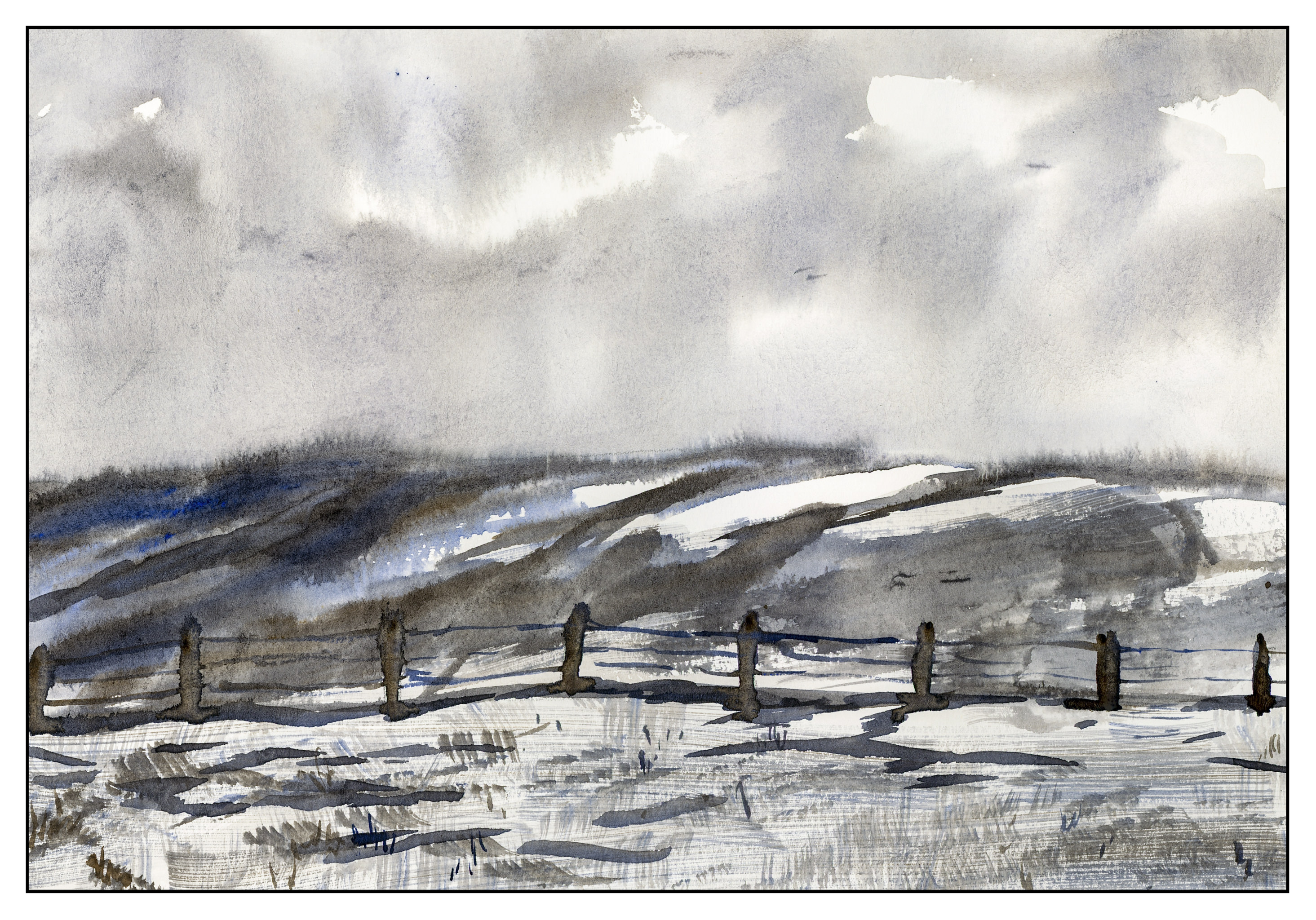
In keeping with my winter themes and white space, here is another “I wish I lived in the snow!” picture!

In keeping with my winter themes and white space, here is another “I wish I lived in the snow!” picture!

After a fresh snow, an icy snow or blizzard, the day is filled with sparkles when you look against the sky. In photography, it’s easy to capture – line up the sun, the light, move around, and you get it. In painting, though, it’s a totally different thing. How to express that sparkle? I tried to capture it in the upper left corner by dabbing in colors of blue and black and bits of ink – did it work? I don’t know. On the bits of snow in the lower left, small dots of blue to represent shadows on the white snow. Perhaps that is a bit more successful.
Pen, ink, watercolor, limited palette. Wet on dry. Ink on paper. Ink on painted paper. Wet into wet. A morning mish-mash, but every day I am trying to do something with ink or watercolor. Not always successful, but an everyday activity from which a lot can be learned!
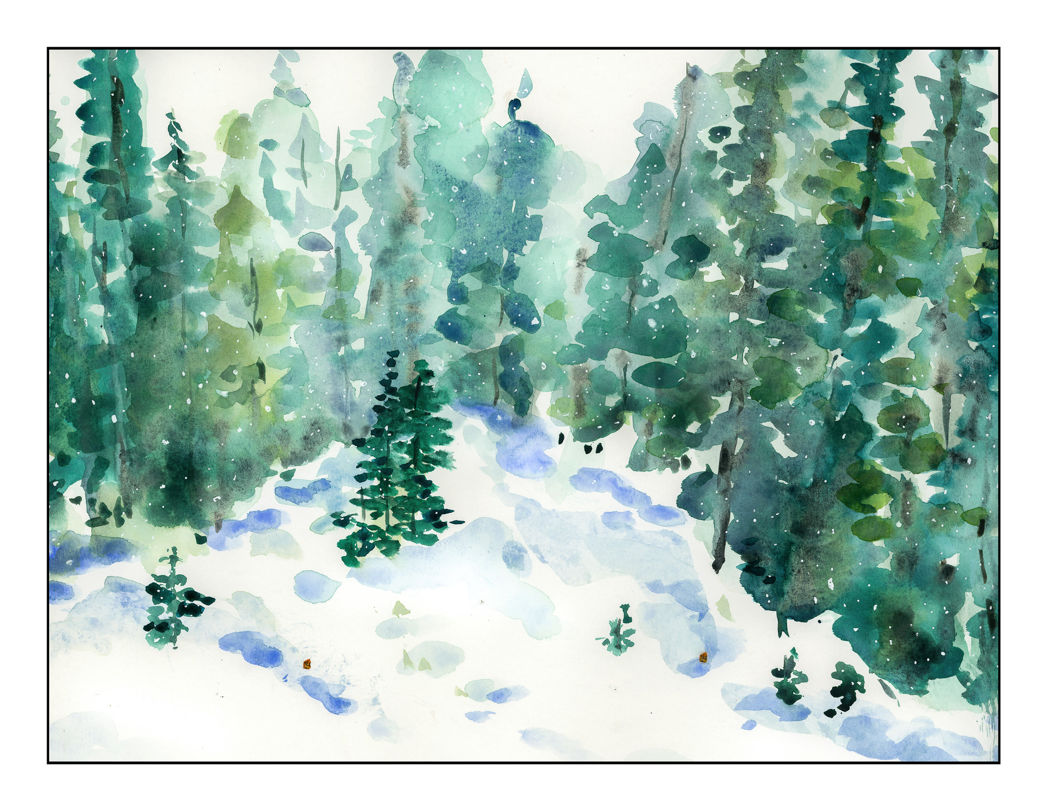
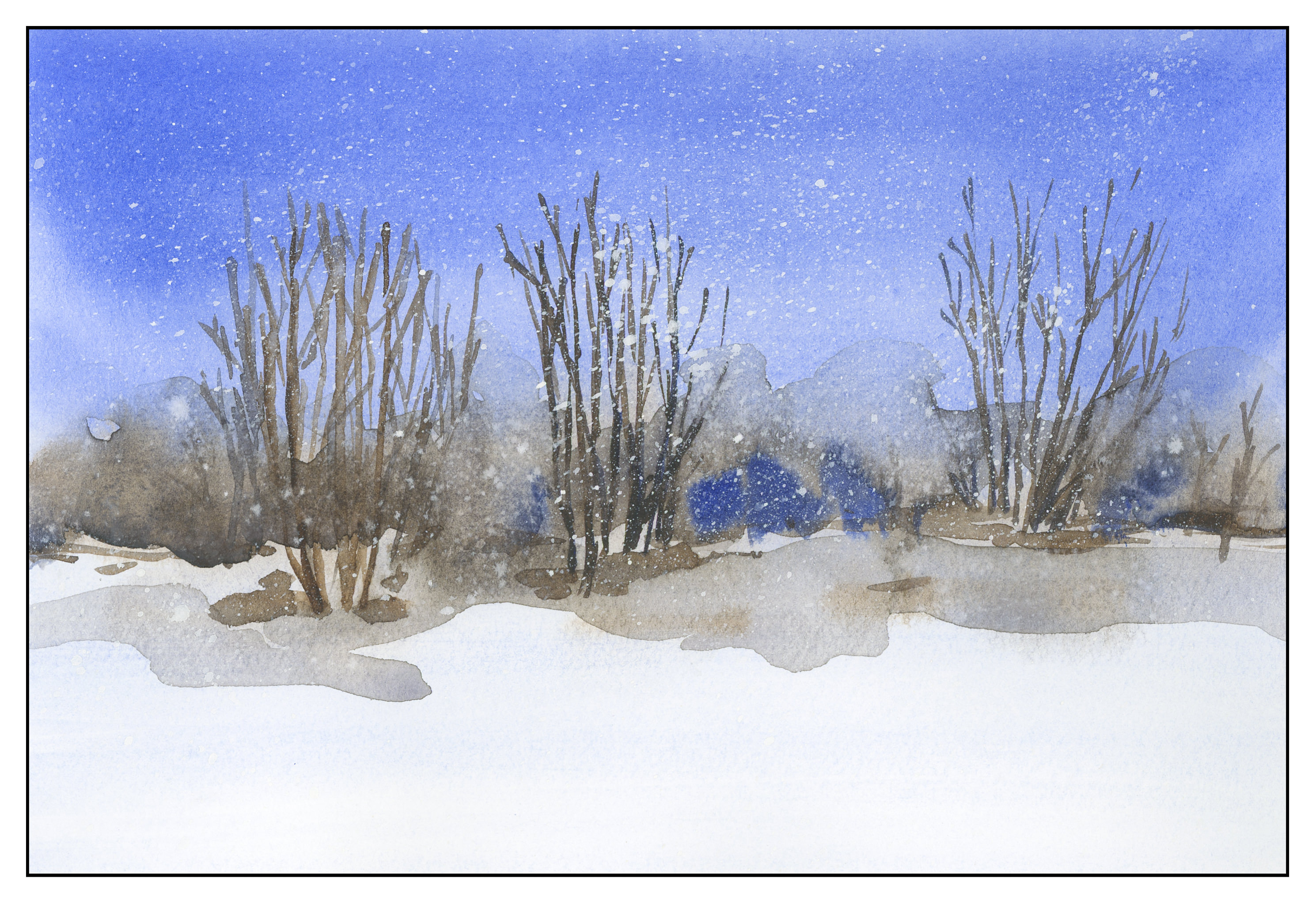
This morning we are experiencing rain – a rare event in Southern California. Strange as it may sound, it made me think about painting something without lines, wetting the paper first, and working wet-in-wet, just to see what would happen. As a kid, I lived in upstate New York, out where pine woods and lakes were more common than people. I miss that solitude – walking in a snowy woods, flakes falling, listening to the silence, all alone in a cold, lonely, and intensely beautiful environment.
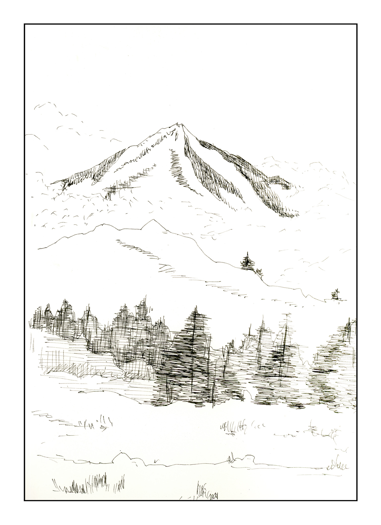
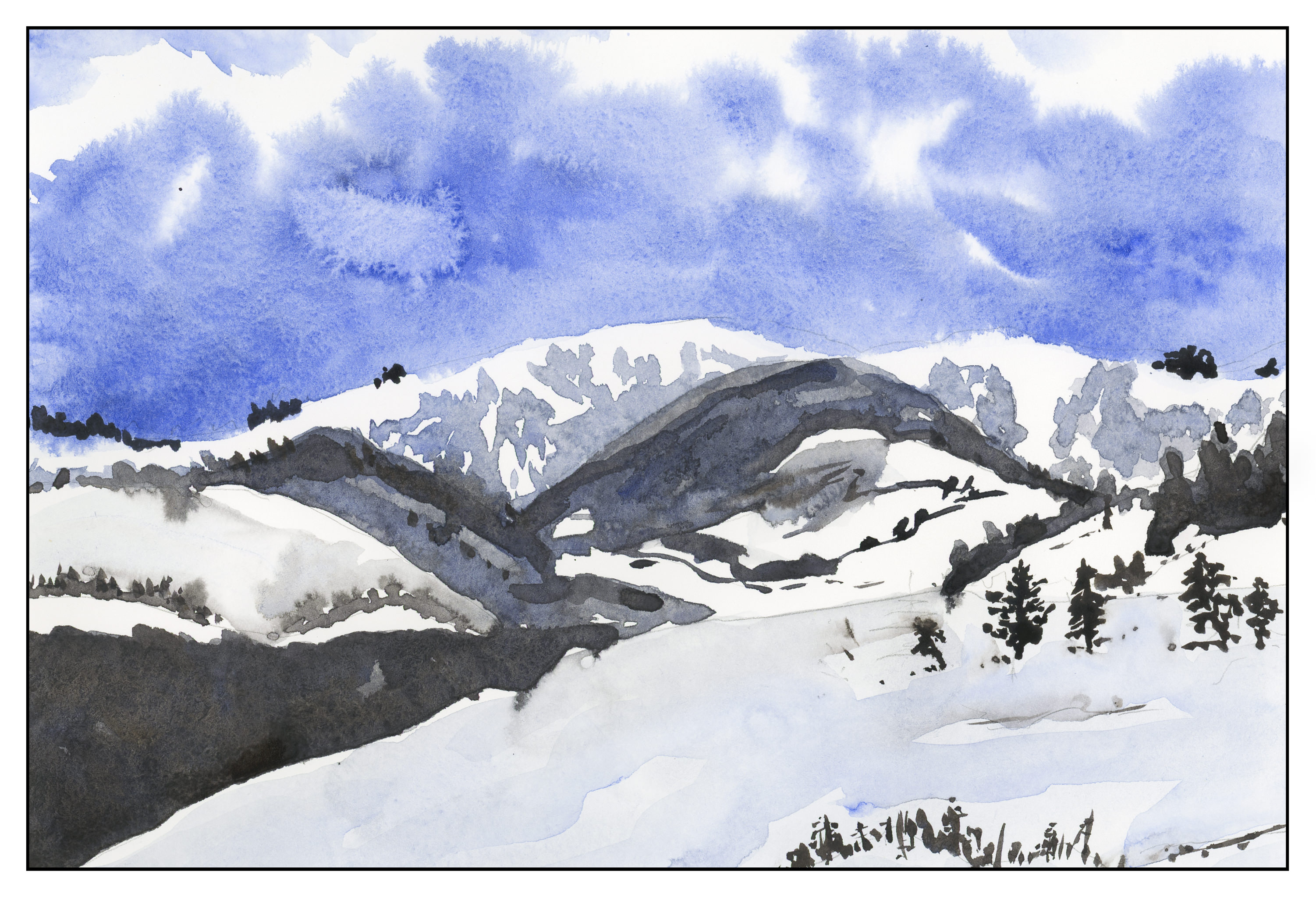
Inktober continues apace, but I have been going 100 mph for the past week. No time to focus on a theme. This morning, though, I thought about cold mountains and winter – where I live, it’s in the mid-80s to low-90s, and I could use a bit of blustery weather.
Here is a mountain – inky for Inktober
And here is the same scene, in cold and wintry colors.
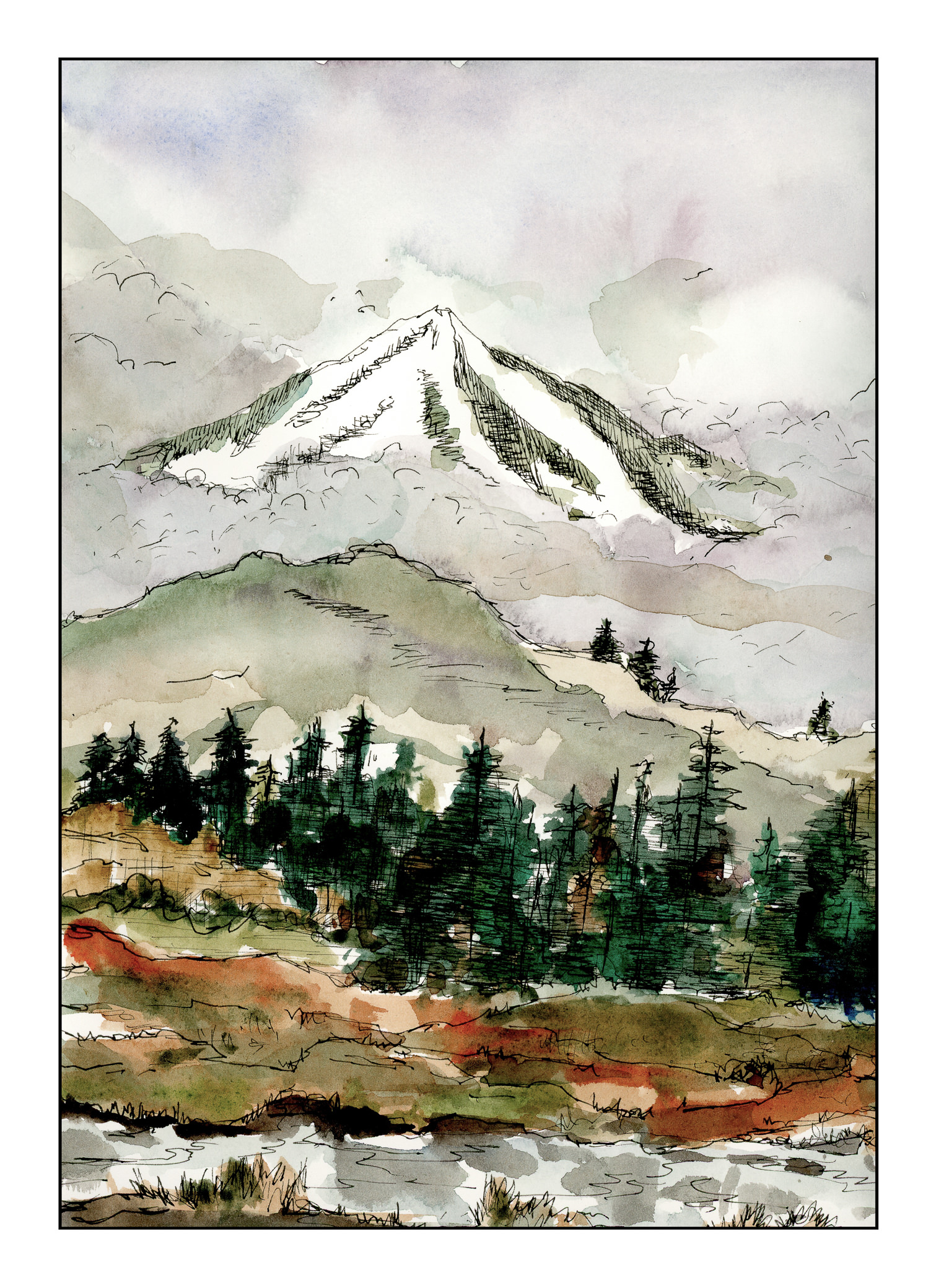
I used to do a lot of Chinese painting, and I tried to incorporate the clouds in a rather Chinese-painting fashion, in ink and watercolor. Hints, not direct; subtlety rather than blatant. I’m not sure if it worked for the clouds between the mountains, but I definitely like the chilliness and fogginess of the scene overall.
Over the weekend, I worked on numerous simple watercolors, inspired by the 2-color studies found in Ted Kautzky’s classic book Ways With Watercolor. He suggests beginning with just two colors, Burnt Umber and Ultramarine Blue. From his book, I did the exercise below.

The umber and ultramarine are considered to be “warm” colors from what I have read, but they work to make wonderfully cold winter scenes! Here are some I did after the one above, to continue the study.
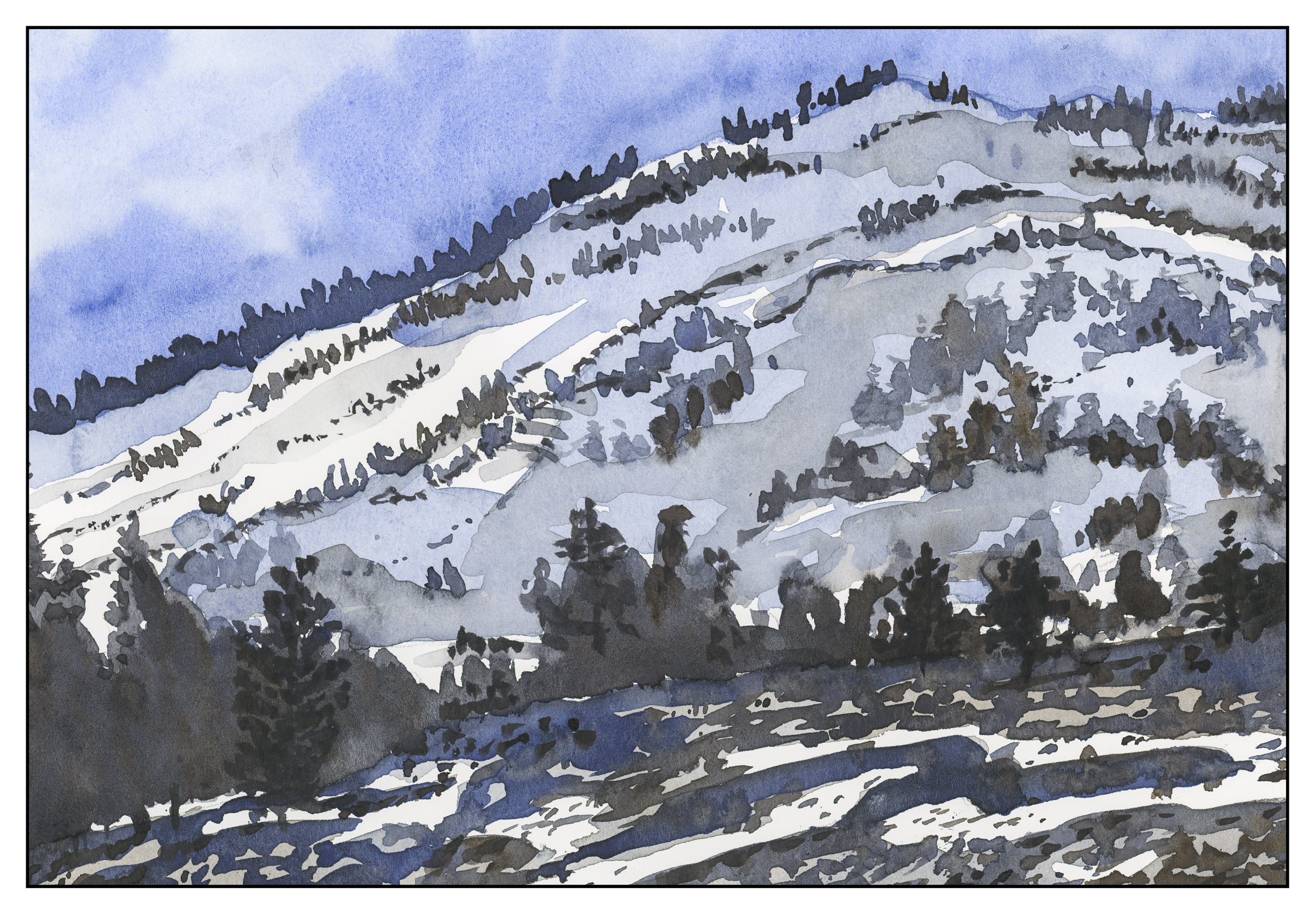
The beauty of using only two colors is there is little likelihood of making mud. That’s a good thing! Instead, I got to focus on value, which is not an easy thing for me.
Values are not just light and dark, but everything in between. For instance, above, there is bright white, a light grey, a darker grey, and so on, moving into essentially black.
Besides working on value / contrast, the above painting was a work done with a lot of wet-in-wet, particularly at the horizon line, to blur the plant growth into a hazy atmosphere.
From there, another wet-in-wet, accompanied by a gradated wash, in the above painting. I started with pure Ultramarine Blue, and then worked it lighter and lighter until I reached the bottom of the sheet. Then, with a dry brush, I worked upward to remove the blues. You can see some blue streaks left behind. After the picture was finished, I used white gouache and a toothbrush to spatter snow onto the painting.
After all these umber-and-ultramarine paintings, I have moved onto ultramarine and Burnt Sienna. The sienna is much warmer, to my mind, as long as it is not mixed with the ultramarine. With ultramarine, the color can be as deep as you want – nearly black – as you can see in the trees.
The shadows across the snow, and the ruts, were painted with plain ultramarine, as was the sky. It’s a great color for shadows, on snow or otherwise. You will see that the dark colors, such as on the trees to either side in the foreground, are blackish, but of a very different hue than the darks in the paintings above.
This study has been worthwhile. I may do more in just two colors, or add a green. Varying just one color produces considerably different results. I also did the same pictures over again, in different browns or blues, or both; this is also a good way to become familiar with colors and how they interact.
