3 Pears: A Study in Simplification

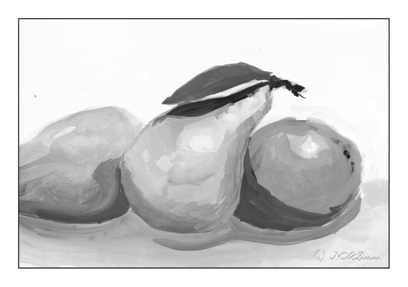
Pretty fancy title for an attempt to 1) take a color photo of pears, 2) reduce the colors in the photo to 16 so that fields of color appear, thus allowing an easier visualization of values, and 3) painting observed fields.

First, let’s put this out there: I really do not like painting outside at this point. I used my gouache paints for this study and had to take the following out to the table on the patio in multiple trips – paints, brushes, water, paper towels, image on a tablet, palette. Of course I forgot this and then forgot that, and it really just riles me up! If I ever want to have a plein air experience, everything needs to be consolidated in one thing to take all the little things out at the same time. Inefficient usage of my art supplies really makes me crazy. It is soooooo much easier to have everything in one place on a shelf rather than having to traipse hither, thither, and yon.

Okay, gripe session over. Using gouache on hot press paper, I used green in different values to depict light and shadow, somewhat successfully. I referred to my simplified image (which kept turning itself off on the tablet – another reason why painting from a reference photo indoors is so much nicer), and worked from there. Some areas of the pears were more yellow, as pears can be, and other areas were a colder green. This did end up showing in the simplified photo, and you can see it in the above painting.

I like to desaturate color photos or paintings to see how they read in black and white. This way I can get a sense of values in the colors I used. In the above painting, you can see that, overall, it worked in the pears. The shadows beneath the pears were nothing special and honestly not something I paid much attention to. Using desaturation, I see faults and areas for improvement. For example, the neck of the middle pear would benefit from more dark shades – middle values – to create a sense of the cylindrical nature of that part of the pear.

This was actually fun once I got into it, despite my frustrations with the outdoor set up. I have to think more about how I go about painting outdoors. The fact is the day was beautiful and nearly 70F for a bit of the afternoon. No wind to fight with. Later this week the rains will return (hooray!), so getting outside was probably the main point! Painting was just something to do . . .

The Outgoing Tide

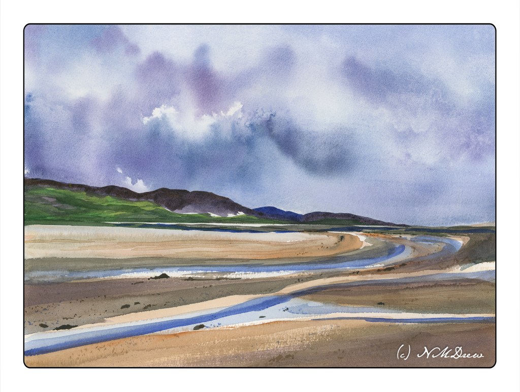
Yesterday’s painting got rather fussy when I looked at it this morning. So, determined to work on simplification, I decided to use a huge brush for the most part. Again, Kilimanjaro 300# 11×15 paper from Cheap Joe.

To keep myself in a “logical” sequence, I worked top to bottom after taping off the horizon line to keep it straight. (Yesterday’s painting needed to be straightened up when scanned – it was going uphill!) It worked with very little seepage into the other half. So, sky first, wet into wet, blotting as necessary, using a spray bottle to coax color and water, tilting the paper this way and that. Then the blow dryer.

One the sky was to my liking, I did the islands in the distance, again focusing on simplicity and distance. Not gonna get fussy! It worked. Then, the blow dryer.

I didn’t draw the water or sand. Instead, I used the big brush to delineate the sand and rivulets of water from the sea. To pull the painting together, I used glazes and washes, mixing in colors from sky and islands into the sand. I put a few details in with a very fine brush, using some tiny dots to represent sand, and larger blobs of brown / blue to make stones and pebbles and other bits of detritus.

While this is not my favorite painting of late, it is perhaps one of my more successful watercolors. It doesn’t feel overworked and the colors reflect the overcast, wet day. Wet, wet skies are always fun and a crap shoot, but a delight because watercolor is not predictable and has its own beauty. I think I would like to wander here a bit more . . . .

Simplified Details

Anyone who does watercolor or painting or drawing is well aware of the need to simplify details, especially in masses of color.  Every leaf does not need to be painted.  When we look, we see these details, and the effort to simplify them into areas of light and dark and midtones can be – and often is – very challenging.  Good artists make it look so easy!

The other day I was napping on the patio (I live in a warm part of the world).  When I woke up, I looked at the podocarpus trees along the back wall, and suddenly got the idea.  I saw the details of the leaves – each leaf – but I also saw the light and the dark areas.  That is when I realized I could do it – but it had never been in the front of my mind before.

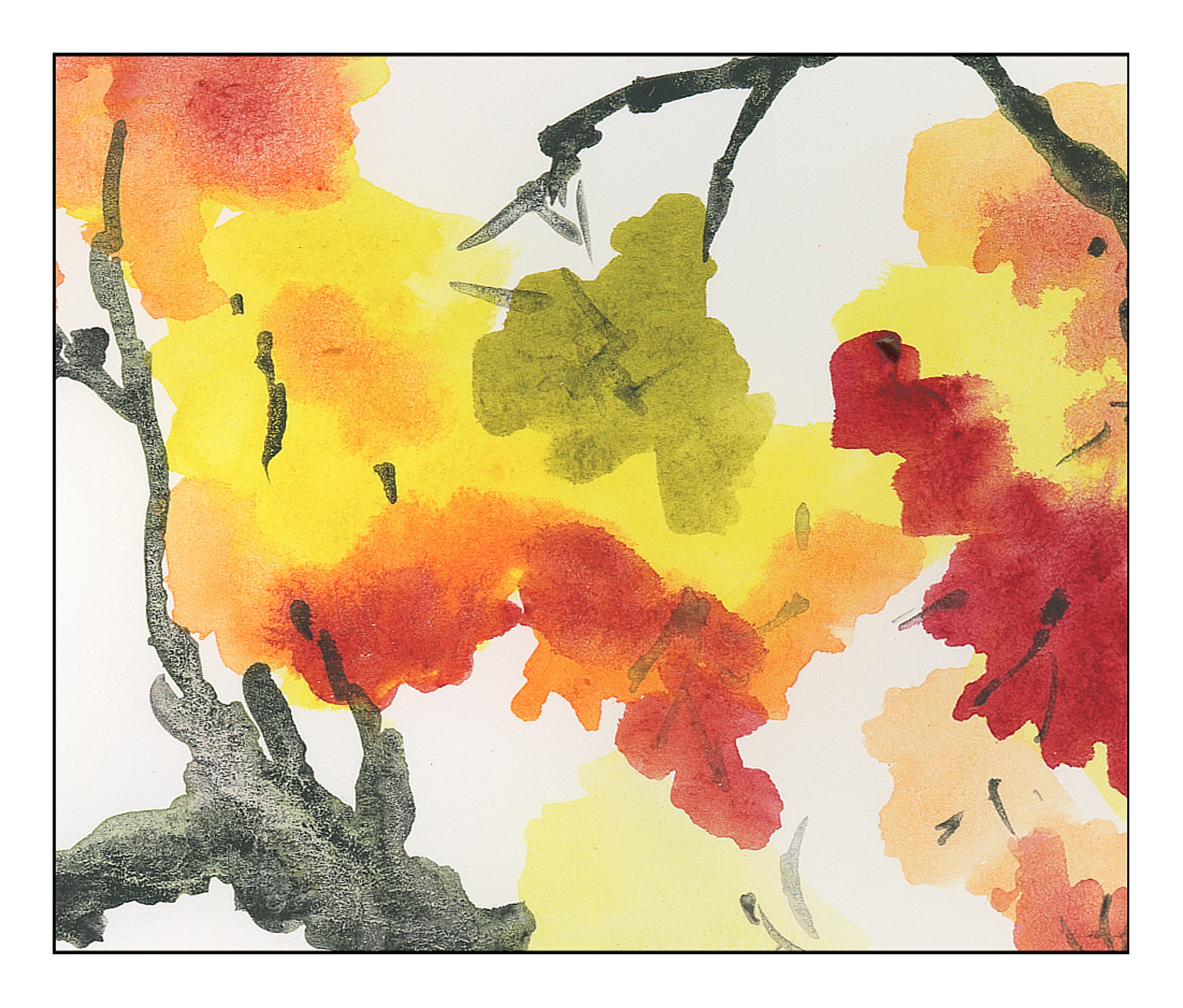
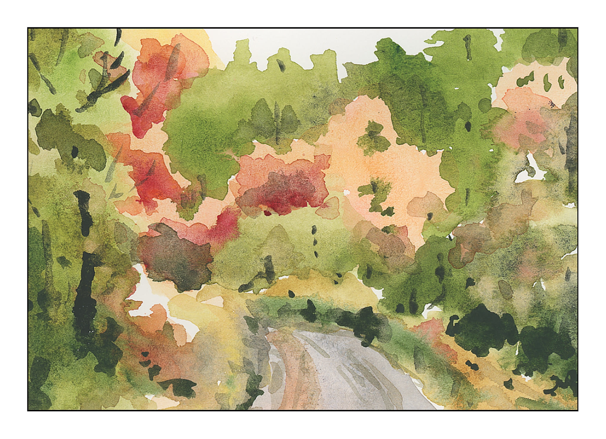
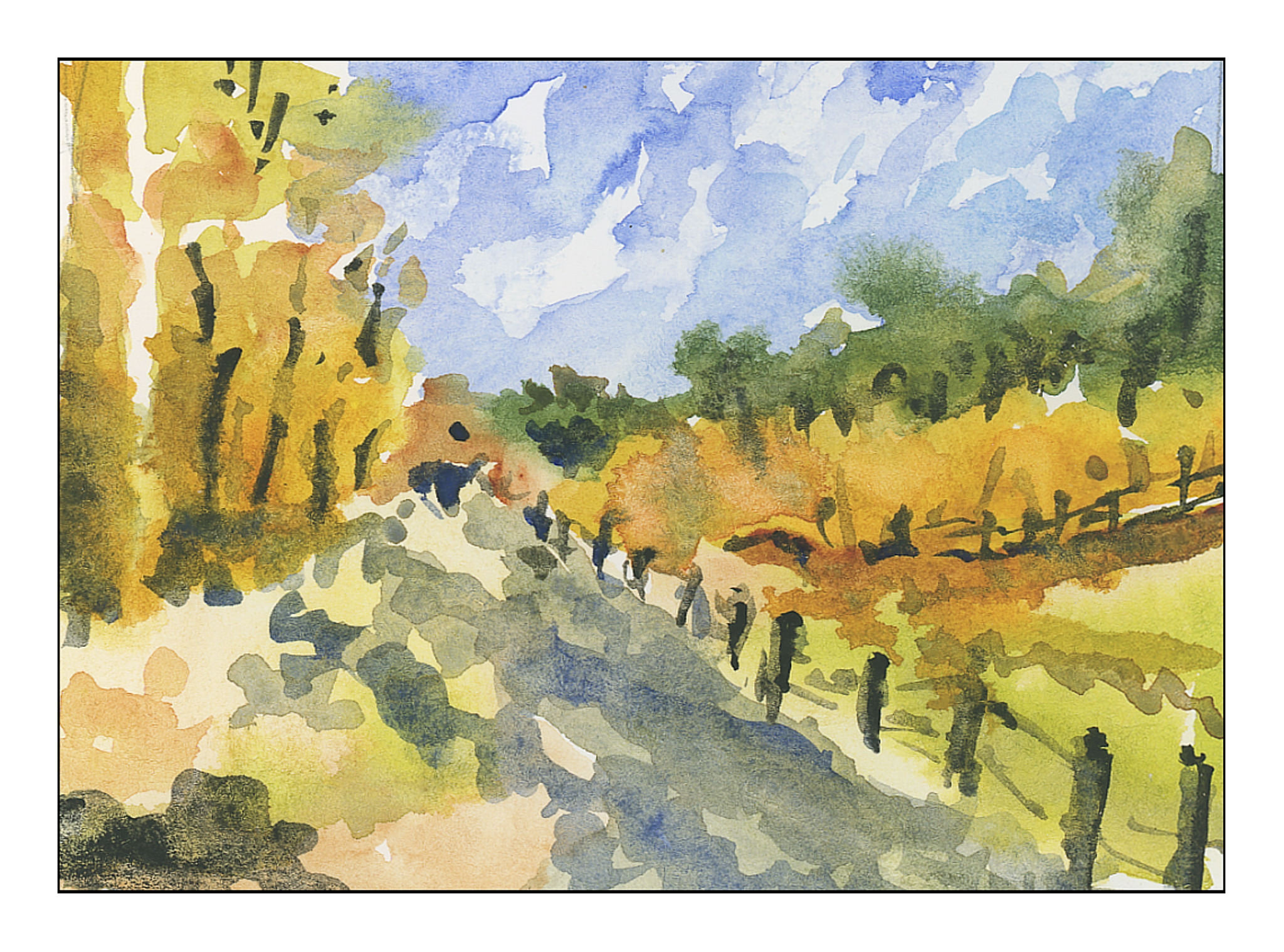
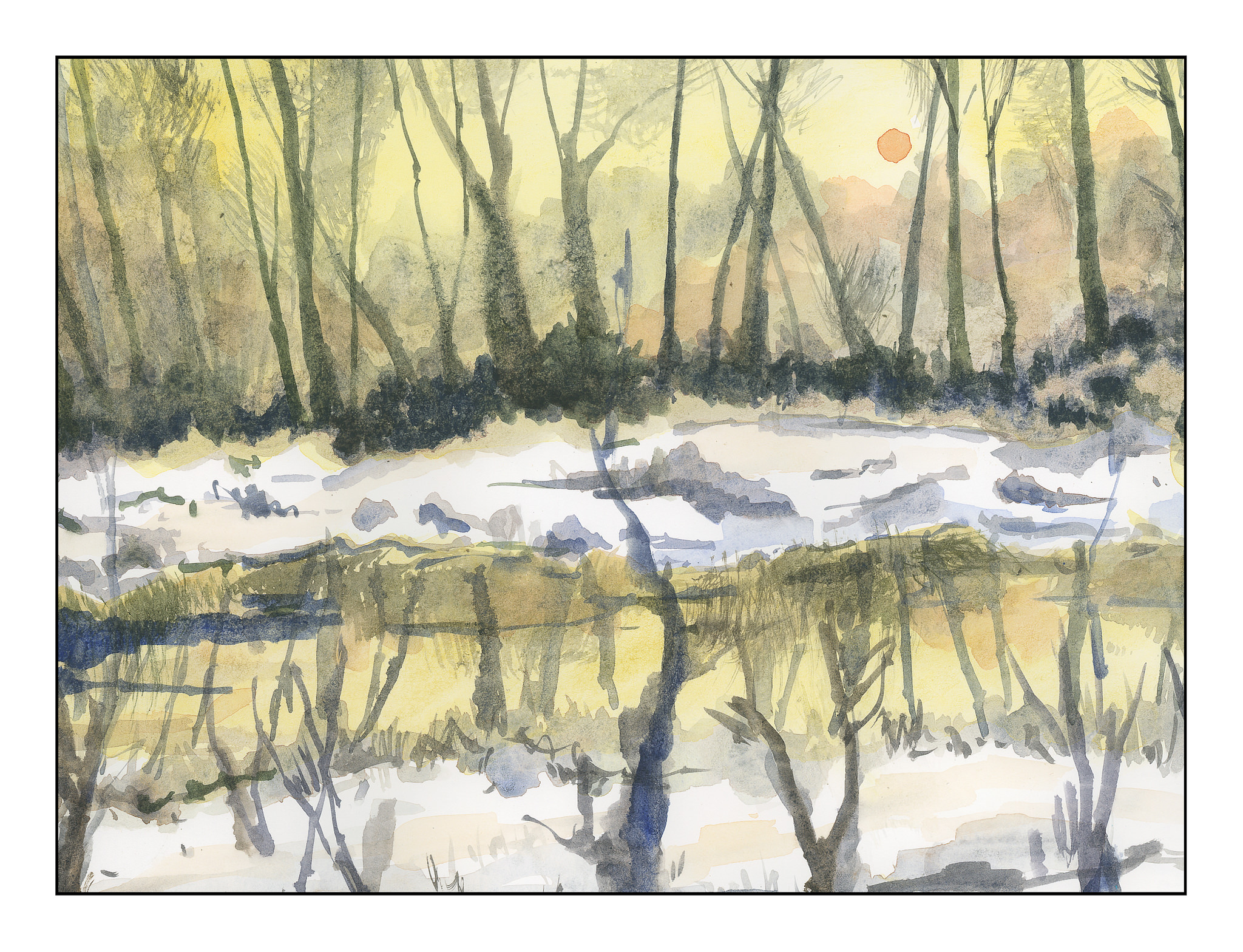
I went to work.  No outlines by pencil, just some reference photos labeled “foliage” in a search.  Varied pictures showed up, and here are my studies of simplified details.

These first three are thumbnails, about 3×4 inches in the order I painted them.

I did the above paintings yesterday.  This morning, applying the same tactic of no lines drawn, I used a 9×12 inch sheet of paper and painted out to the edges.  Again, the focus is on simplification of details into masses of color.

Success?  I don’t think any of the paintings are particularly good, but I do think I am getting that element of simplification I find so elusive in my own painting.

Keep It Simple!

I have been so focused on buttonholes that I am getting a bit nutso.  Painting is a totally different experience, and was a welcome break yesterday and this morning from the analytics of buttonholes!  If I do anything with sewing today, it will be later on.  In a bit, we are headed out to collect our supplies for Thanksgiving dinner, and that will certainly be another pleasant break.  I don’t know about you, but too much of any one thing becomes almost an obsession with me – analyzing and studying whatever.  Painting does require a bit of analysis, but it also has an element of sheer doing that makes it very different.  It’s very relaxing, and because it just has a life of its own, watercolor is a challenge and a tease as well as a very creative experience.

Anyone who does watercolor or painting or drawing is well aware of the need to simplify details, especially in masses of color.  Every leaf does not need to be painted.  When we look, we see these details, and the effort to simplify them into areas of light and dark and midtones can be – and often is – very challenging.  Good artists make it look so easy!

The other day I was napping on the patio (I live in a warm part of the world).  When I woke up, I looked at the podocarpus trees along the back wall, and suddenly got the idea.  I saw the details of the leaves – each leaf – but I also saw the light and the dark areas.  That is when I realized I could do it – but it had never been in the front of my mind before.

I went to work.  No outlines by pencil, just some reference photos labeled “foliage” in a search.  Varied pictures showed up, and here are my studies of simplified details.

These first three are thumbnails, about 3×4 inches in the order I painted them.

I did the above paintings yesterday.  This morning, applying the same tactic of no lines drawn, I used a 9×12 inch sheet of paper and painted out to the edges.  Again, the focus is on simplification of details into masses of color.

Success?  I don’t think any of the paintings are particularly good, but I do think I am getting that element of simplification I find so elusive in my own painting.

Between Seasons

As we move into winter, I think of the places I lived when I was a kid, where 6 feet of snow was a “mild” winter.  Today, the low was about 56 F, and the high about 78 F.  Very different – and as an adult, I admit to preferring a lack of snow to an abundance!  Nonetheless, the seasonal changes are apparent here, just more subtle – the shift in light, the change in the blue.  Even the air smells different.

Working with Inktober, I can feel a shift in how I am approaching drawing, and painting.  I am simplifying but being more specific about the brush or pen size I choose and how to deploy a line or a brush stroke.  While there is a lot to be desired here – such as a sense of architectural reality and non-topsy-turvey houses – I had a lot of fun looking at areas of color as a suggestion, not a reality, as a plane rather than the detail I normally hone in on.

Maybe there is some hope after all!