From the archives; may have posted something similar years ago. This is a fresh edit from a photo taken 1/13/2011. Panasonic DMC-ZS5.

From the archives; may have posted something similar years ago. This is a fresh edit from a photo taken 1/13/2011. Panasonic DMC-ZS5.
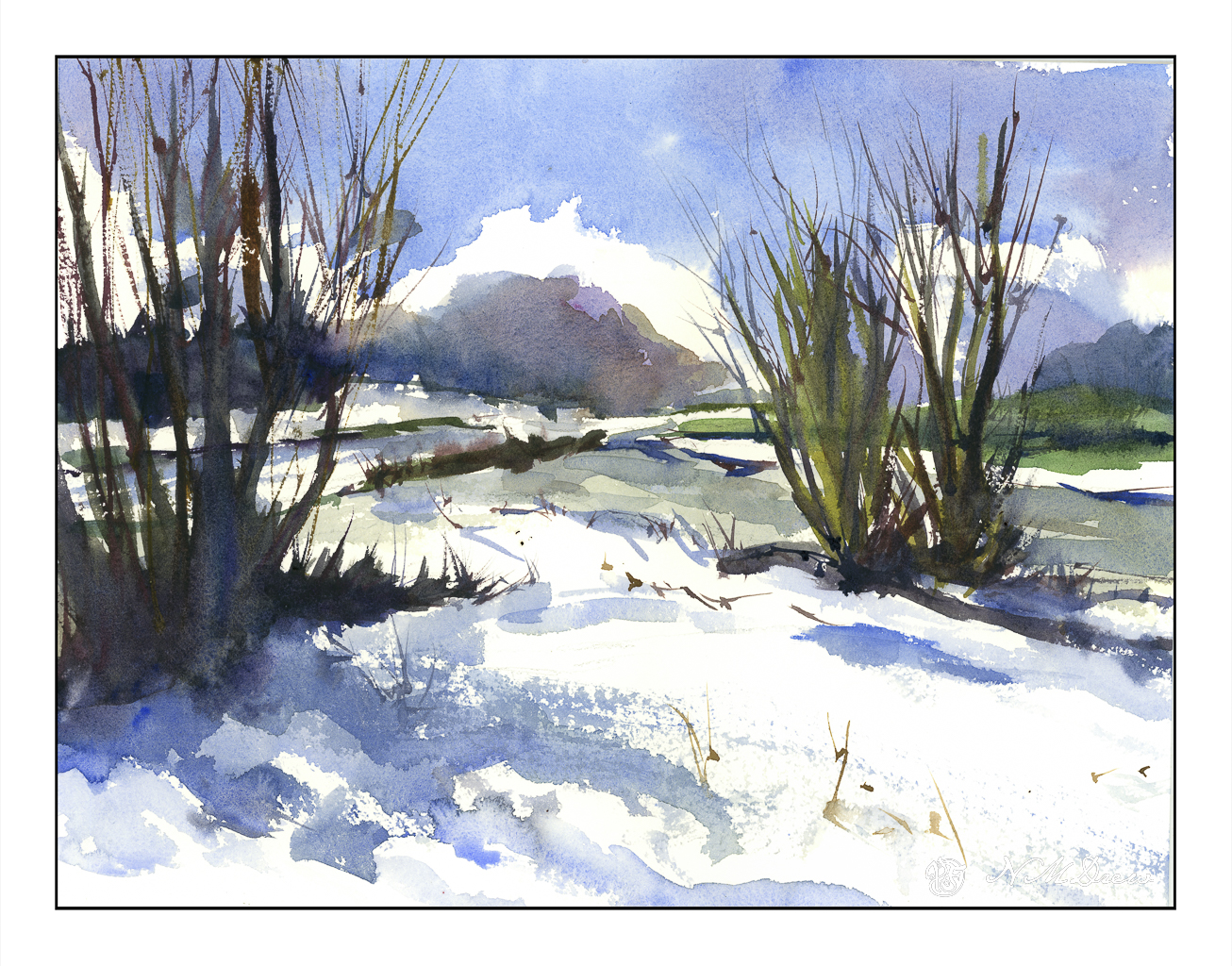
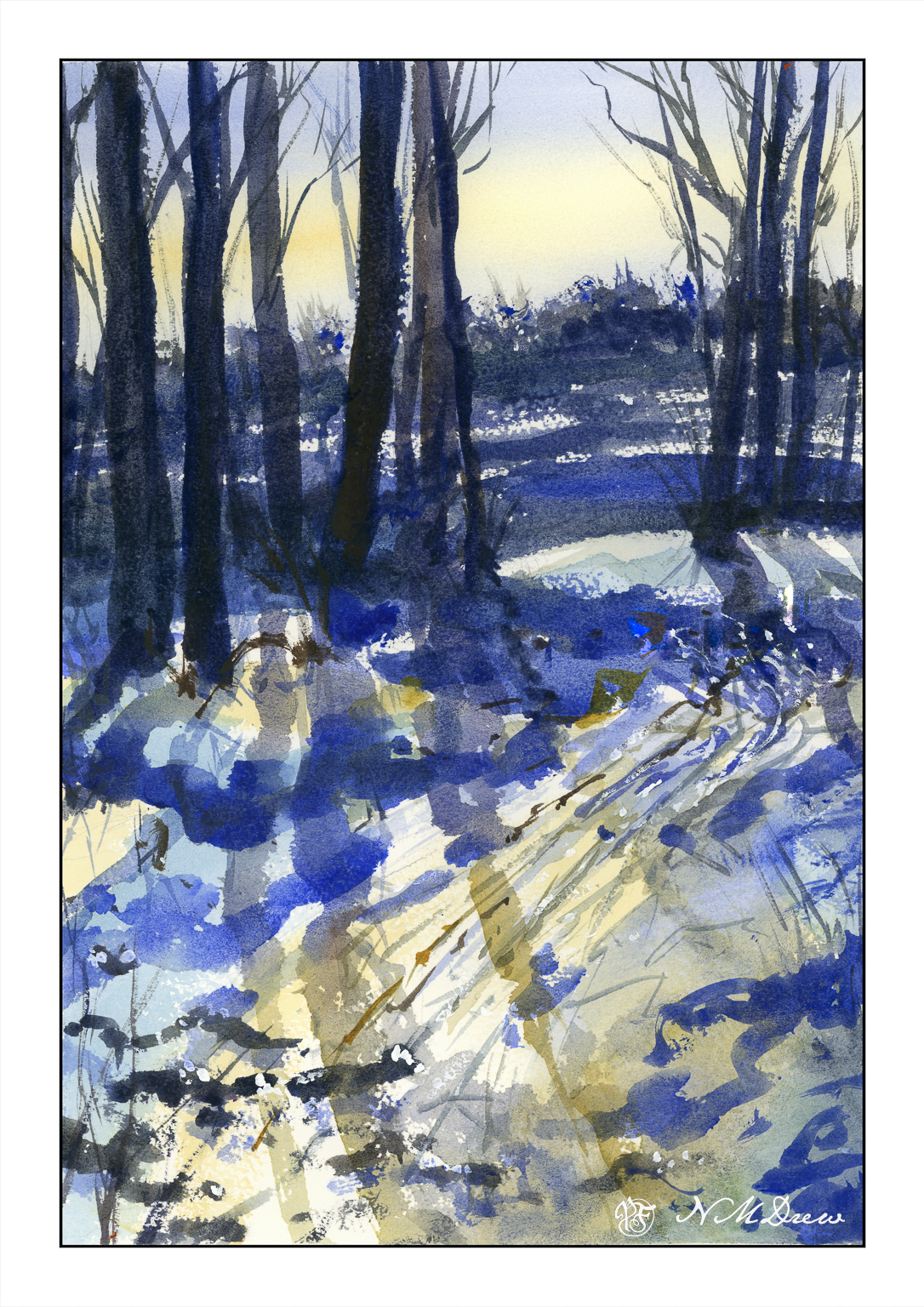
Heavy rains and foreboding skies give way to ragged clouds and brilliant blues as the storms recede. No snow here, but memories will do! I tried to express this sky in the distance, beneath the blue and white with the dark clouds moving away. Not so sure how it reads, but you can decide that. Could be trees, could be clouds, could be space ships. And there is a river behind the trees and the snow across the way.
Kilimanjaro Natural White Rough, 300#, Rough, 12×16.
When I lived in upstate New York, the winters were marvelous! Hardwood forests and pine trees all worked together to create a magical land of light and shadow, rolling snow banks, and winter streams frozen and thawed and frozen again. The skies, too, were amazing in their coldness of light that could reflect so brilliantly on the snowy landscape.
As an adult, snow as a place to live, work, and travel in no longer holds much allure – great to visit, but don’t ask me to wade through it, chisel ice off my windshield, or shovel it just to get out of my house. Still, the memories of those magical winter days in deep winter always hold a spot in my heart for their crisp and intense beauty.
10×14″ Arches Rough, watercolor limited palette of umbers, quin gold, ultramarine blue, and a touch of titanium white gouache.
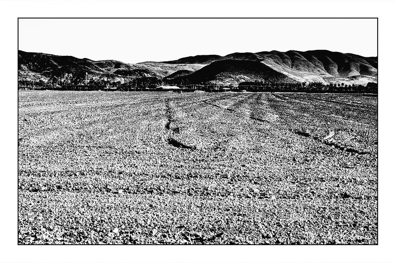
Yesterday afternoon a friend invited me out to a family member’s small farm – ranch – to enjoy it, harvest some food, and take some photos. We got out there about 4:45 pm and stayed an easy 3 hours.
To the south, seen here, is a vast plowed field, ready for the next crop. We plant year-round here, varying crops with the season and the need. My friend’s family farm is just a few acres of organically grown vegetables and herbs, but surrounding it are larger commercial fields.
The flatness of the earth and the small hillocks and gouges made the lowering sun cast shadows in the dirt. I pushed the photo in contrast to see the extremes to show off textures not just in the soil, but also in the hills beyond.
More to come!
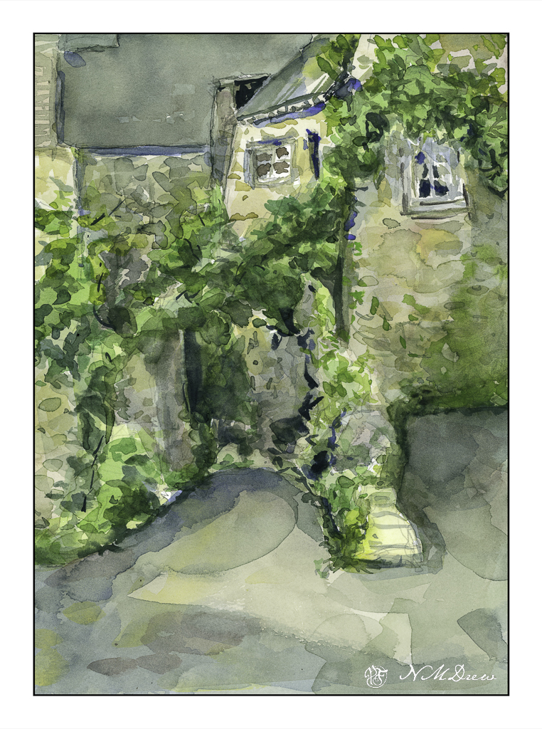
Anyone who paints from real life and then references a photo of the same knows that photos do not get all the information. This is even more evident when you paint from a photograph of something or someplace totally unfamiliar. Such is the case here – stone buildings from somewhere in Brittany, downloaded from a royalty-free site for the primary purpose of trying to render stone buildings in a painterly fashion, not a nit-pickingly detailed fashion.
First round – colors applied to a pencil sketch in a very wet and general way. As color and paper dried, some details added and attempts at creating contrast done. It took awhile as I didn’t use my trusty hair dryer to speed things up.


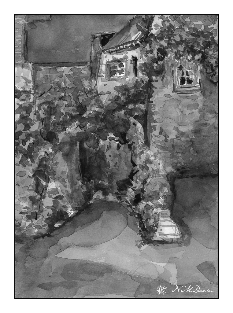
I like to desaturate my color scans to see how the picture I am painting works with contrast. IMHO, not too bad, but still in need of stronger contrast. I used my brush in LR to get an idea of where to make things darker, and using that as a reference worked on the arching greenery in the middle and other areas, as well as choosing a source of light – the sun – from the left somewhere.
As I looked at the reference photo, I noticed a window I had not seen in the tunnel below the arching greenery, as well as shapes and areas of light and dark. Was there space without greenery beyond that arch? Was there a turn to the left at the end of the tunnel? How did all these buildings all interconnect? The fact is – I don’t know! So, artistic license as you will, reality is also important as I would like to figure out what I am dealing with, especially when painting the challenging and unfamiliar – old, stone buildings.
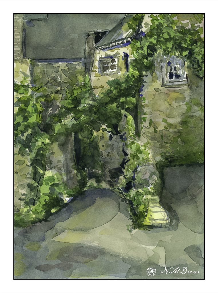
Wonky perspective, inappropriate contrast, but I rather like the stone buildings and interplay of shadows, such as in the foreground. The shadows lead the eye (good question where!) and add some interest to an otherwise dull foreground. The light in the reference photo was very flat, so I made up my shadows. As the focus was on the buildings and rendering them in a way I liked (which I do to a degree) I was not especially concerned with the plants.
Looking at the paintings, I am rather pleased with them, but think that perhaps the center upper roof might need some horizontal texture, or do I need to use some ink to define some of the shapes better?
Your thoughts would be appreciated . . . .

Anne said she liked the first one better – it is lighter. In LR I increased the exposure a little bit.