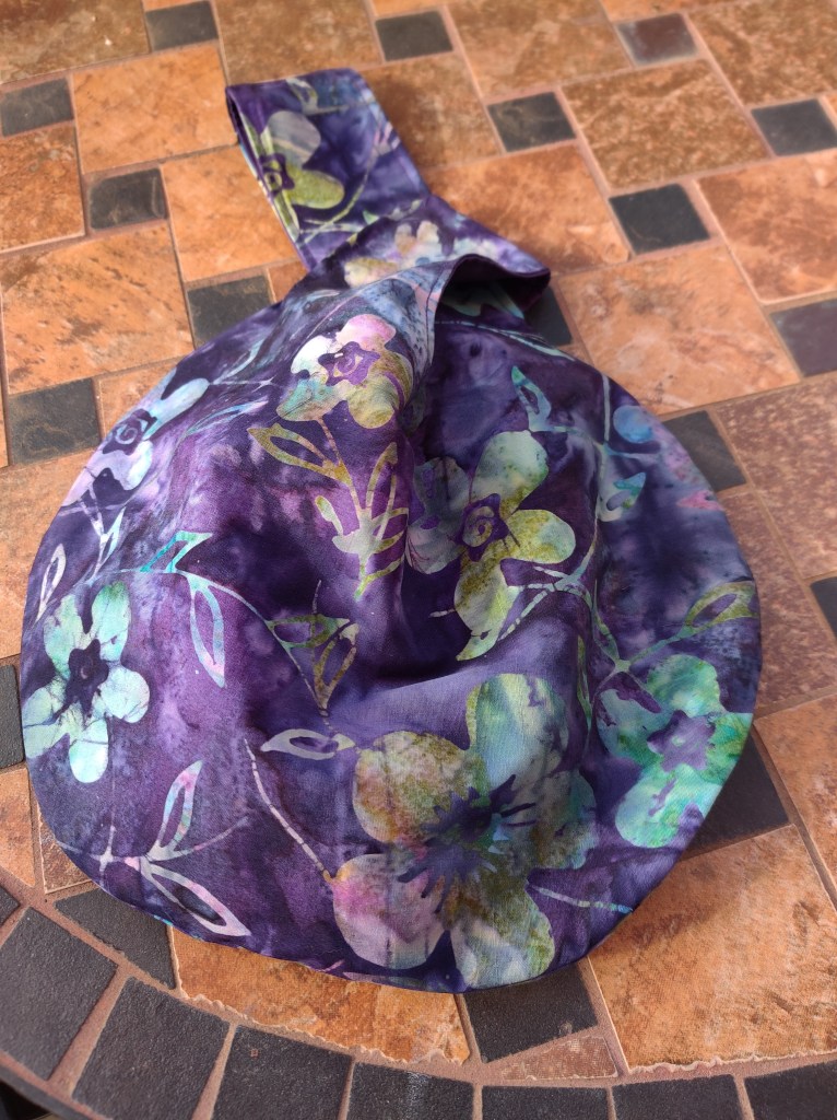
When I made the knot bag the other day, I had gone out to buy fabric. I bought enough material for two bags – one blue, one purple. The latter was chosen knowing full well someone I know named Judy might like one for her sock knitting. Well, Judy, here you are, as promised in my reply to your comment . . . see you soon!
I really enjoy sewing, but it has gone by the wayside as I have pursued painting and drawing. Determined to get other areas of interest back into my life, I have taken a few days off from the above, decided to limit it to a max of 2 hours / day, and then decided I needed a simple project to get my interest in sewing back.
It worked!
I looked up bags to sew – free patterns, too – and found a lot of them. The Japanese Knot Bag caught my eye, and this video from http://www.hellosewing.com got my immediate attention. First, the instructions for the bag are written here, and then there is a free pdf for the pattern, and finally there is this video! What a treasure trove of information.
My two cents is watch the video, slow it down a bit, and read the web page. I enjoyed the project enough to research more about the knot bag. On YouTube a lone you will find a variety of tutorials and bag styles. The one I made is from the pdf at hellosewing.com; it is small and will make a good bag for small knitting projects, such as socks.
I was too lazy to dig through my stash of fabrics; instead, I went to the local JoAnn and found sale material and bought enough for 2 purses. I made one yesterday, and total time was about 2 hours, beginning to end. I watched the video, slowed down by 50% to catch a few things, such as seam sewing early on and then how to turn the bag right side out. (Hint – through the opening of the longer strap!)
This is the bag, completed. This is a batik fabric and it is lined with a navy bluish solid color. The handles of the bag are really 2 different lengths. See below!
To close the bag, you pull the longer strap through the opening of the shorter strap. This closes up the bag, cinching it a bit, and the long strap then acts as a handle.
Then my machine presser foot handle decided to die – but it is, I think, a simple fix, and we should be back in business. I have another one to make!
I feel like a school kid – classes are taking up so much of my life! It is keeping me off the streets, so I am sure a few people are glad to know that! The classes are a series with Ian Roberts (online), Andy Evansen (online), handsewing 18th stays with Burnley & Trowbridge (far behind!), and a local class in oils / acrylics with a good teacher. Housework is falling by the wayside!
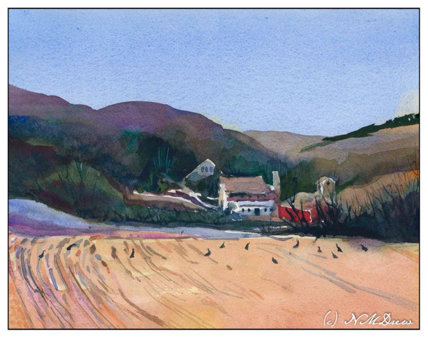
The above is a watercolor exercise from Evansen’s class. It’s a year-long course in watercolor, and the content needs me, the student, to work hard at the lessons. We began with skies – I am pretty comfortable with those. This module works with values, and I think I did a pretty good job with it.
What I found especially interesting was the beginning of the value study. Unlike Roberts who puts in all values in a pencil sketch, Evansen puts the middle value only as the first step. The white areas are bright spots and the sky, but the middle values are all created as one big shape. That was quite interesting, and not the usual route one takes with value studies.
Pencil drawing with middle value only added as a shape.
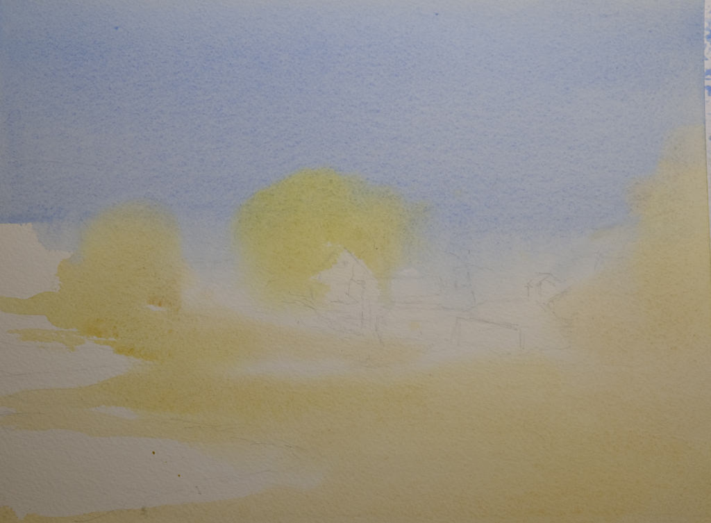
I messed up a bit, but it did lay out a map that was more clear to me than also including the darks. Once I got the idea in my head, the next step was to lay in soft colors on paper that was wetted on both front and back with a natural sponge. I used 9×12 140# CP Kilimanjaro paper here.
After doing the middle value shape, both as a prelim and then on the final painting, you are supposed to go back and add the dark areas to the prelim. I didn’t get there – I was too involved in the final product!
Light areas filled in on dampened paper. Includes the sky, white areas for buildings, and field and trees.
Doing the light areas on dampened paper allows the colors to bleed a bit, and create soft edges.
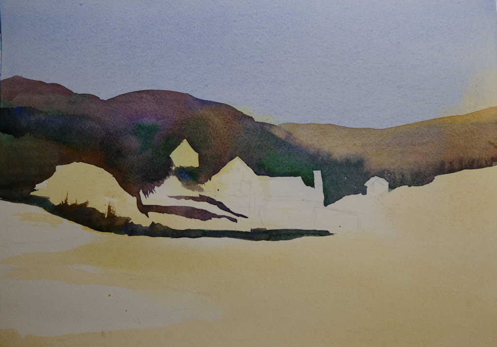
Thicker paint added once the light areas have been worked.
The next step was to work left to right so that the shape created for middle values in the preliminary study could be made on the painting. The idea is to work in one movement – left to right since I am right handed, but right to left if you are left handed. The idea is to create a bead of color that varies as you paint in a continuous design.
To me, this was really a dark based on the reference photo, but that is life! As I did this, I worked around the buildings and structures, as well as roads. The thicker paint and dryer paper allowed this to happen to create hard edges. I was happy with how easy it was to do!
Almost done!
This was perhaps the 3rd stage in my painting. I added furrows to the field and details to the structures. I scraped in tree branches and such with my finger nail only to realize I keep them trimmed too short to be of any use there!
After all the layers were dried, I did the heavier dry brush as well as glazes over the field and hills to create areas of warmth or coolness. I also did it on some of the structures to keep them from dominating .
Some thoughts . . .
It is really a lot of work to do these classes. My whole purpose is to stop my old ways of approaching painting and create some kind of shift so that I can become a better painter in my opinion. Also, I need to stay busy. I have felt like I have been floundering a bit, so an area of focus was important, especially in an arena I wanted to learn. I am still adjusting to all this, but in the big picture, I am happy I made the commitments.