Master Study of Voilier au Petit-Gennevilliers by Claude Monet

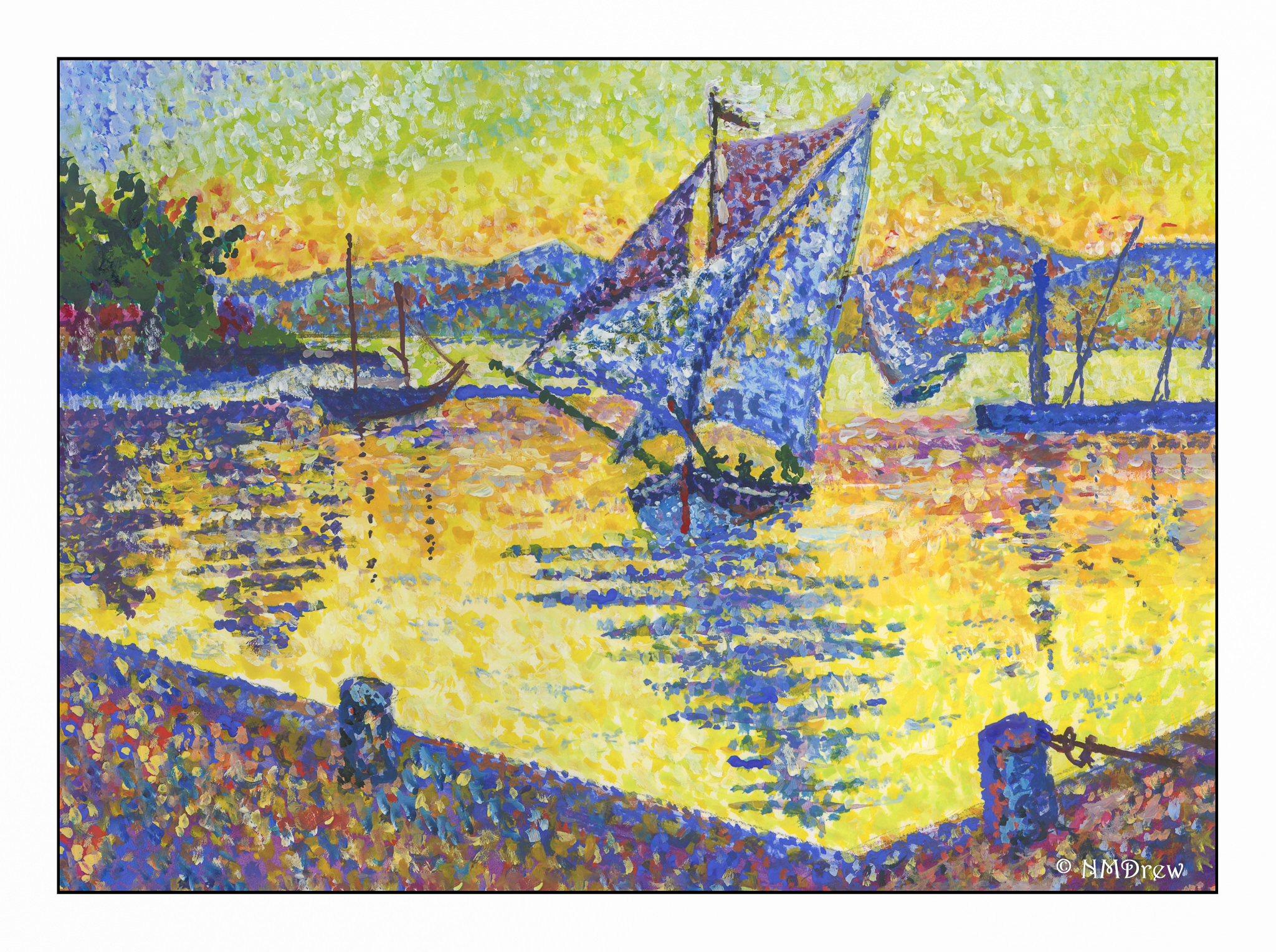
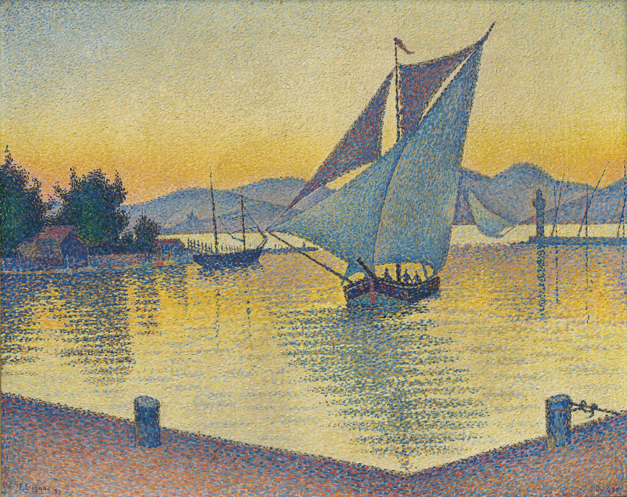
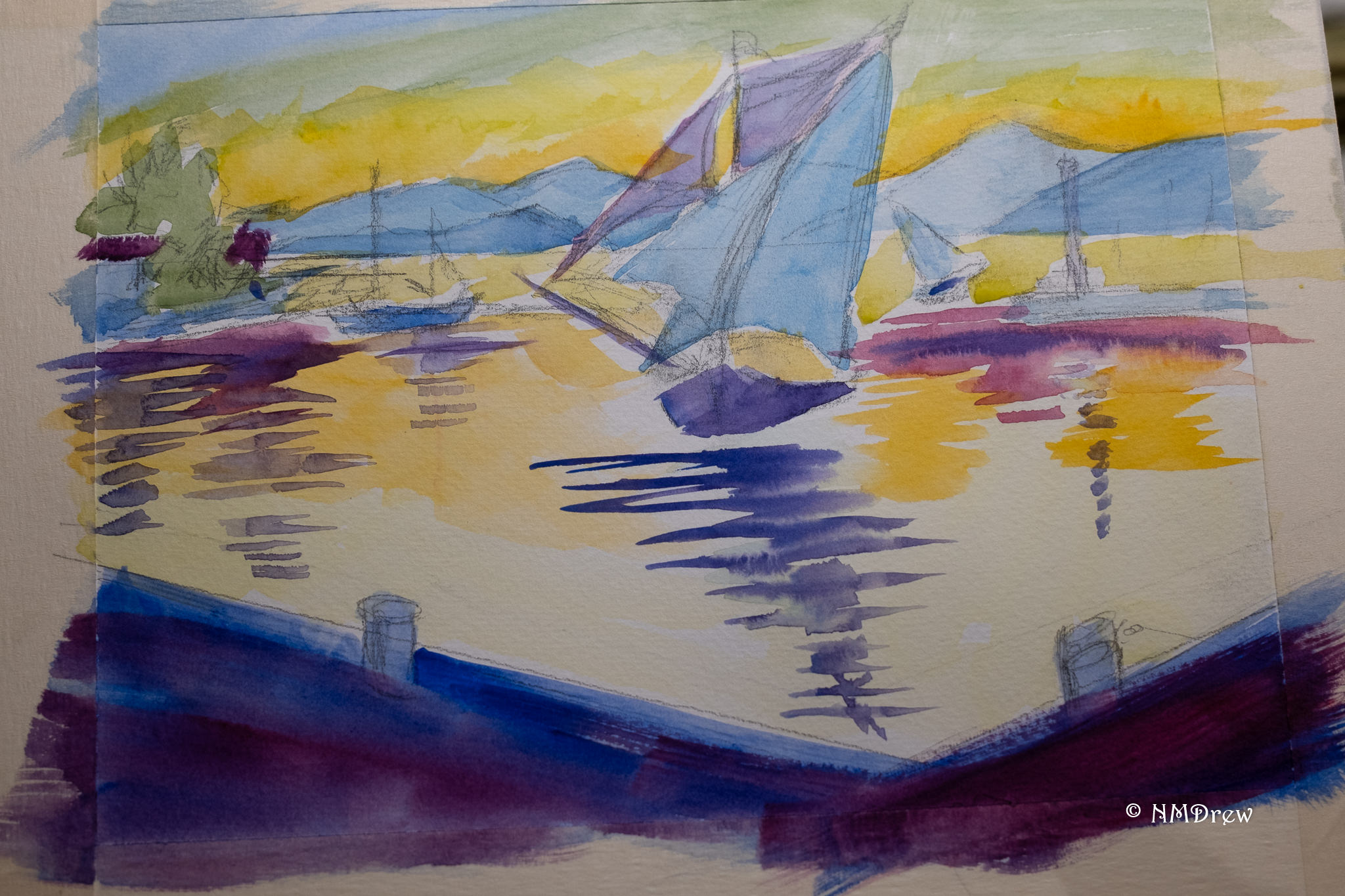
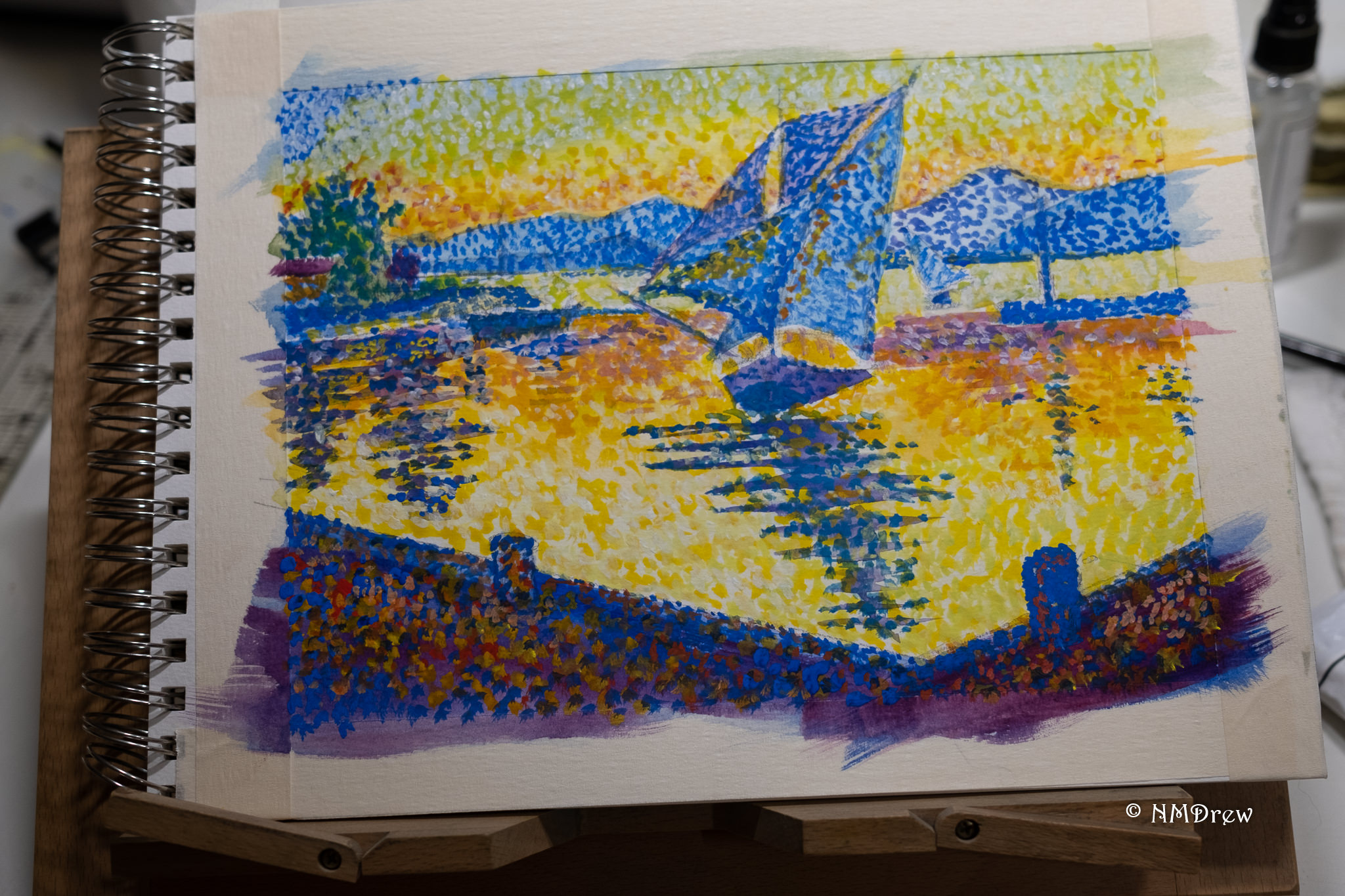
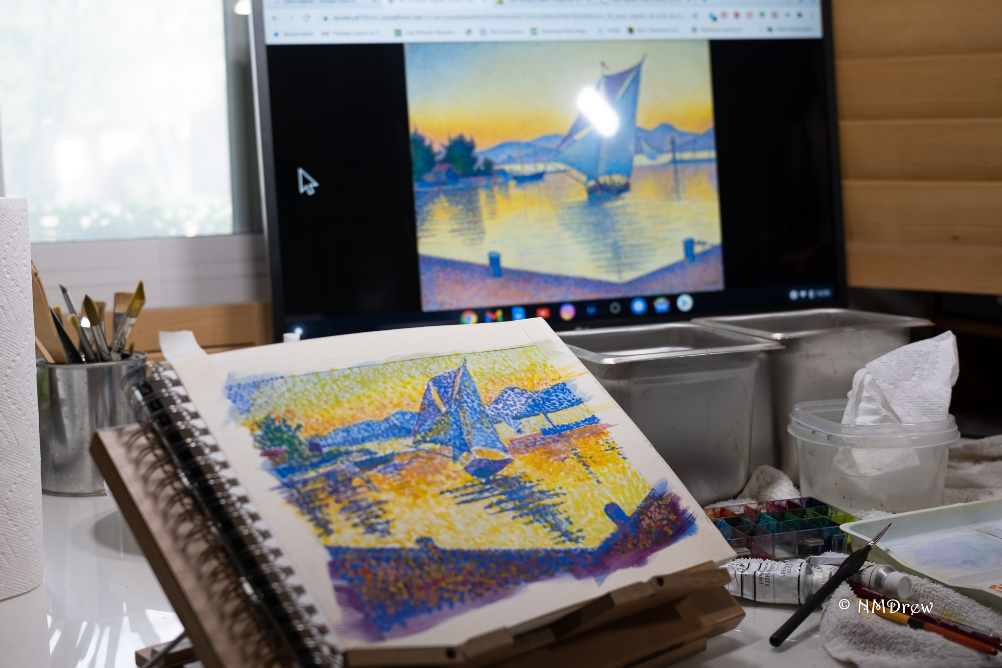
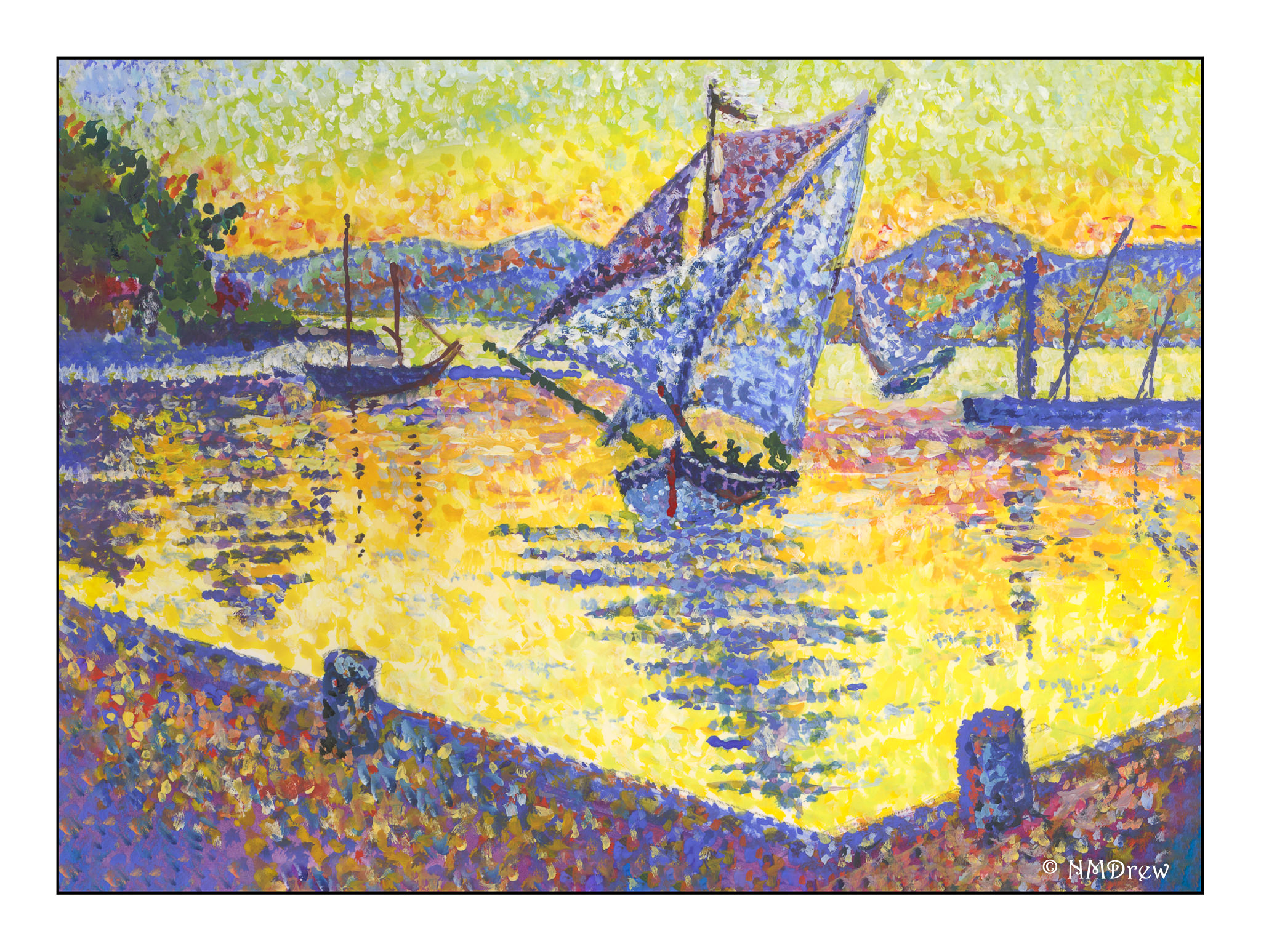
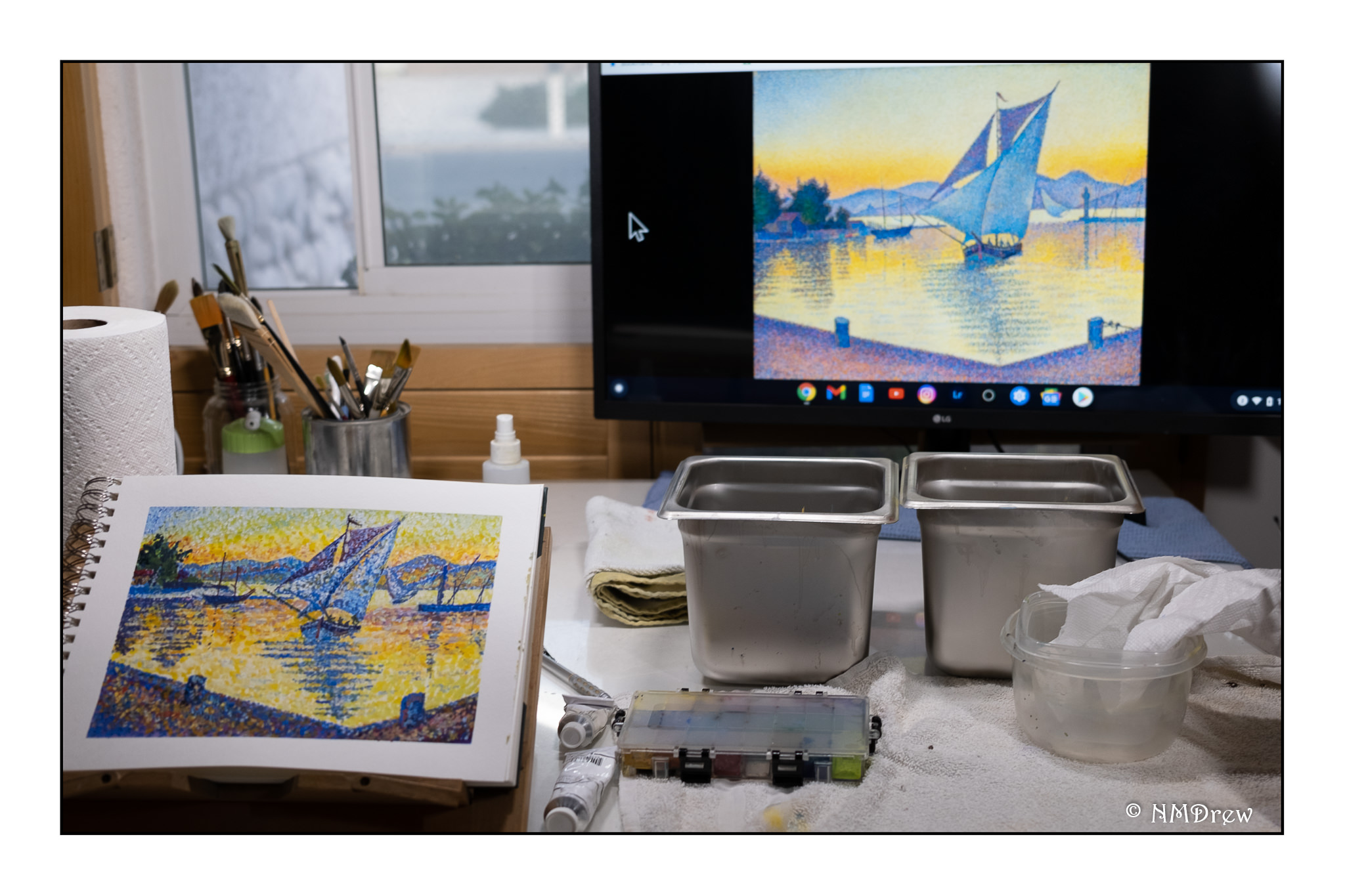
The original painting by Claude Monet was painted in 1874 and measures approximately 22 x 29 inches. My painting measures 11 x 14 inches, so it is close to the same proportions. I left out a few things simply because I was not trying to replicate Monet’s painting but catch its sense of spontaneity. This spirit is what I found refreshing, and while Monet probably finished this painting alla prima, I spent about 6 hours in the studio. He used oils. I used fluid acrylics.

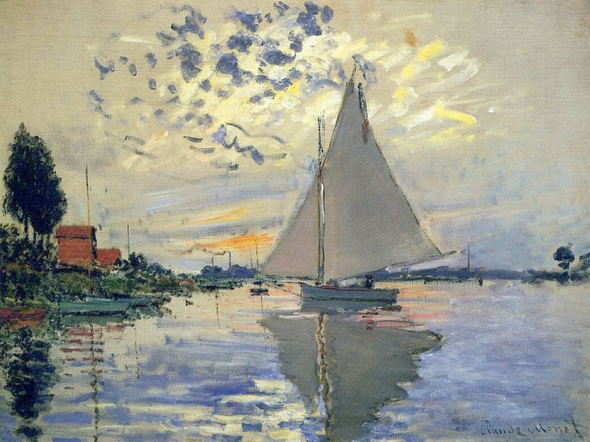
As I started to look more closely at Monet’s painting, I saw that his brushwork was very quick in many areas. The smudges of smoke in the left middle ground, the dark, wispy clouds used up a rather dry brush, one where paint was nearly gone. The white-blue swash across the sky seems like a quick thought. As well, it was interesting to see how the dark bits of clouds worked with the yellow and white areas to focus the viewer’s attention on the sailboat itself.

My own painting is more blue than Monet’s, but I saw a lot of blue in my reaction to his painting. Comparing the two is really interesting when I compare my scan to the Wikimedia online image presented here. It is hard work to get a good, warm grey and I did struggle with it. I also had to work on observing little things, such as the boats on the left middle edge – I couldn’t figure them out initially. The chimneys on the horizon also needed to be considered – what were they? The smoke on the left horizon gave it away. Once I had the boats on the left sorted, the vertical lines reflected in the water made a lot of sense.

What I really love about this painting is how it catches the light, which, of course, is the idea behind Impressionism. The moody sky with bits of cloud and fog and light as evening descends is what caught my attention. Even now, as I compare my master copy to Monet’s painting, I see even more subtleties which I could have caught. But, at some point, you just have to stop!

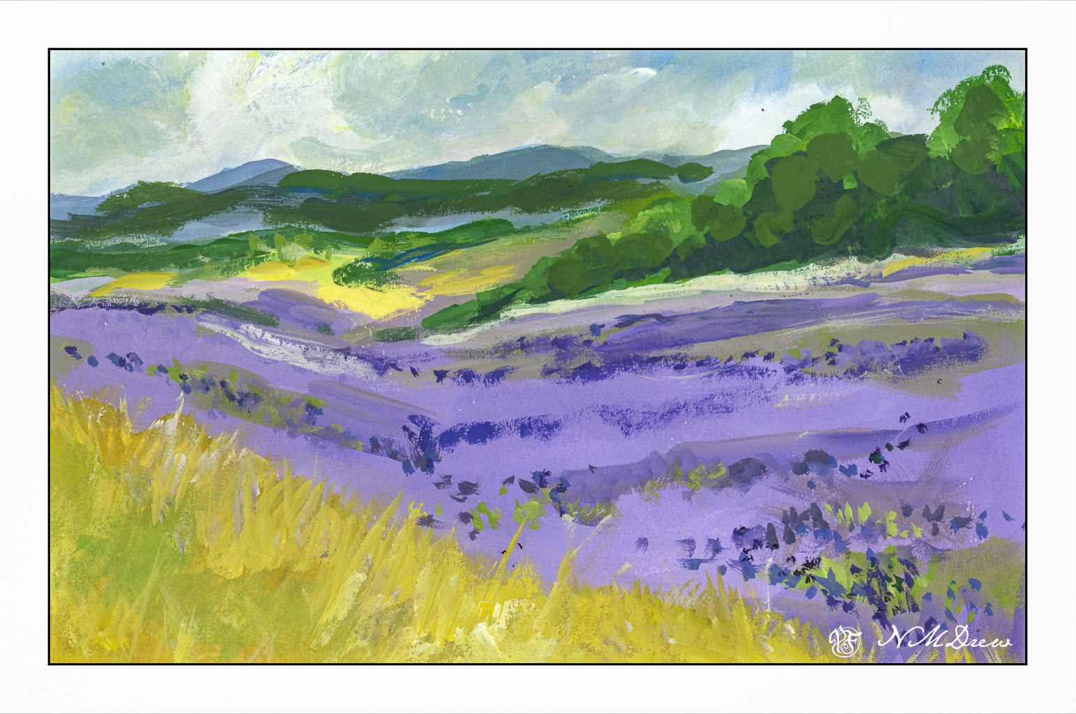
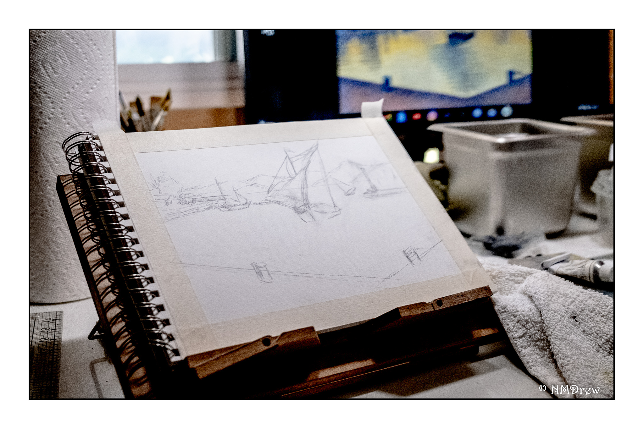
Fluid acrylics, Centurion OP DLX linen canvas pad, 11 x 14.

A Sunday Painter

These past two weeks have been rather a waste – bumps in the normal routines create havoc and everything just seems to fall apart. When that happens, it really does require a focused effort to get back up and into whatever interests me. I am just coming out of a cold – thankfully, not a sinus infection – that has made me not really tired, but just lethargic and lazy between bits of fever and congestion. Lounging around and doing very little and sleeping a lot has been my agenda, filled in with little fun things like dishes . . . .

Actually, yesterday was possibly the real turning point. I was feeling better, so I did some sewing in the morning. I am hand-sewing a top without a machine (including finishing the seams with a whip stitch), just to do it. Then blob time. Miss Marple entertained me for an hour or two between naps. And then it hit me – I was just unhappy because I wasn’t doing what I like to do best – paint or draw! I didn’t want challenges or messes (ie oils) to clean up, but …. what?

Gouache!

I haven’t used gouache for some time. I keep it in the fridge between uses. So, while it was coming to room temperature and soaking up the water I put on it, I taped up a piece of 9×12 CP 140# Arches into two somewhat equal sections. Hot press paper is my preferred paper for gouache as it is smoother and lets the paint move over the paper more easily than cold press.

If you have been following my blog, you know that of late I am rather focused on lavender fields. This first painting was no exception. I wanted to see what I could produce, sort of from a photo, sort of off the top of my head. I wanted a gloomy-looking sky to match the grey, rainy sky of my own world this Sunday, and so moved along. Landscapes are very forgiving (I think) and are a good way to warm up when re-acquainting myself with a medium. So, a lavender field, somewhere in the world.

Then, more of a challenge: Buildings, water, plants, and a boat on a river.

Somewhere in a mythical village along the Nile in Egypt. The traditional sailboats – the felucca – are just so beautiful to see because of their simplicity in shape and line. I sourced a number of photos to create this one. I drew in some basic lines, but that was it. I started with the buildings and then the sky, painting the palms and plants before beginning the river its banks. I left the entire area of the felucca as blank paper, waiting until the end to fill it in. The sail was fairly easy, but the shape of the boat and the suggestion of a person was the most challenging. In the end, I was really pleased with how I met this challenge I presented myself!

Paintings are about 4.5 x 10 each – maybe more or less, I am not going to measure! – using gouache on Arches CP 140# watercolor paper.

Beached and Not

I am trying to change my slap dash approach to watercolor that occurs when I don’t paint with them for awhile. Then I need to redevelop the discipline and forethought required for the medium. It’s aggravating, but necessary, and if I don’t make it a serious endeavour, it is very rewarding. I learn something each time.

I decided to begin with boats. The shape of boats is really not logical unless you break down the shape into squares or rectangles connected with curved lines. Then it can work. Here I focused on the shapes and shadows of two rusted old girls. Not a great study, but I really tried to see light and dark, searching for warm and cool as well.

Another beached wreck. This one is obviously of wooden construction – the slats along the sides. Building wooden boats is fascinating. I’ve watched some being built as well as seen videos about the process. Where I live, boats live in nice marinas, and sometimes in dry docks, but never are they left moored with an anchor or buoy to rest on the sand when the tide goes out. Of course, the California coast is not full of inlets and bays that are protected – there are a few, such as San Francisco Bay – but that is like a giant lake!

Here, I tried to catch the algae on the hull of the boat as well as the shadows. I didn’t do a very good job with the lines of the slats which make up the shape of the boat itself. I did try to catch her character and age as she lies abandoned on the shore.

After “Fishing Boats, Key West” by Winslow Homer

Finally, I decided to see what I could learn from Winslow Homer. He paints boats with abandon! New England boats, sail boats, row boats. Having lived during the 1800s, he saw sails to power boats more than steam or coal. His paintings are filled with detail and, to me, his watercolors are so alive I feel I am in the middle of them.

I don’t think a seaman would approve of my renderings – I am pretty much a landlubber, but I have sailed a bit in my younger days. There is something about the wind and the sea and the speed of it all – but it scares the hell out of me as much as it thrills!

Le Port au Soleil Couchant, St. Tropez – Paul Signac Study

I really love this particular painting by Paul Signac, Le Port au Soleil Couchant, St. Tropez.  The colors and composition draw my eye in so many ways.  My study is above, and the illustration I used is below.   Unfortunately, its color is rather flat and muted compared to other versions I saw.  This image was the best I could find to download and share here.

There are a number of things I like about this painting. The graduation of colors in the sky, from the blue in the upper left corner and its movement through the spectrum to green, yellow, and orange. The sailboats provide a visual dance, from the one in the center of the painting, and the especially delightful one further back on the right. That one, for some reason, just expresses joy to me. I used to sail a bit, and that one catches me in particular – the keeling over in a good wind is a grand experience! Finally, the reflections from the center sailboat along with the ones to either side, moving in to the dock. There is a sparkle and liveliness throughout the painting, and the usage of Pointillism really brings home that brilliance of the Mediterranean clime.

My own progress through this painting took a bit of time and tactical consideration. From earlier paintings I learned that an under painting of the primary colors for the section to be painted produced good results, as well as provided a structural basis for the painting. This requires a good drawing to get perspective correct.

Above, you can see the basic under painting, using colors close to the final one.

The first layer of dots goes down, and in many instances I simply used what I had on my palette, straight out of the tube. As this is gouache, even when the paints are dry, I can mush colors together on the paper if I want.

I work on my drafting table and use a large monitor to see what I am looking at. Out of range of this photo, to my right, is my Chrome Book set up.

My second layer of color was done by using a smaller brush than I used to lay in the first layer of dots. And what color did I use? White! Tap, tap, tap. I felt like a woodpecker.

Finally, the painting is close to finished. More layers of dots and various colors.  Little details were added at the end, such as the flag on the mast, the gaps in the top sail which show the sky beyond, the people in the boat, the rigging on the boat moored to the left, the upright lines on the dock in the right mid ground (more moored vessels?), and after the photo was taken, the lines on the right mooring bitt.

The takeaway here?  More understanding on using color, and the strength of a good composition.  Signac provided both, but copying brought home some lessons.  It is hard to say what I am learning here, but I do know that my hardest lesson continues to be not making mud.  Separating colors out from others – specifically, not blending them (too much) – is easily done in Pointillism.  I wonder how this will impact my future work and practice.

On to finding another Signac to study!

On the Bay

Way back when I was a young ‘un, I used to sail with friends out in the Santa Barbara Channel.  Wet Wednesdays were the thing!  Anyway, even though I get horribly seasick, and really am a landlubber, boats – sailboats in particular – always catch my eye.  There is nothing like keeling to one side, wind whipping through your hair, sails snapping, speeding along.  Sitting quietly on a boat, too, is wonderful – for me, it makes me really, really sick, but when that scopolamine patch kicks in and the seasickness goes away, it’s pure heaven!