The other day I was putzing around, looking at photography books, thinking about painting and drawing and photography, and something I read about Galen Rowell hit me. He was always looking at the light – how it worked, what it looked like, what it was doing to the scenery. Of course I have read about it – we all do – and thought about it a bit now and again. However, that moment seems to have one of those clarifying moments in my creative life.

Last week I went out with my newly CLA’d Yashica D TLR camera (beautifully done by Mark Hama) and took some pictures, just to use the camera and see how it was working. It was great – I had a serious issue with using it as the focusing screen was full of crud. Anyway, I used Fuji Pro 400H as it has wonderful colors, but I had never used the 120 film.
When I went out with the Yashica, I thought about contrast, the differences between light and dark, but not specifically light itself. I got some good images, just thinking about contrast, really obvious contrast, and more subtle contrast, perhaps in smaller areas. While the processing was done in a local lab, my own post-processing was done by scanning the negatives with VueScan, my V600 scanner, and a new-to-me software, Negative Lab Pro (more about that in a later post). I always increase contrast in post anyway – maybe it’s just my poor eyesight – because I like to have a clear picture. Here are some of the images from that roll.
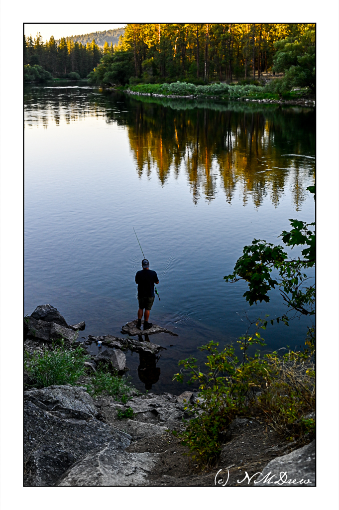
Because I was limited to 12 pictures at the most with the Yashica, I took my time. I thought about contrast. Plants against the sky, light coming up between the trees, backlit leaves – all of these are easily evident when contrast is considered. More subtle color contrast, such as leaves on the same plant, some in shadow, some in sun, required more analysis prior to making the shot. Other thoughts on contrast consdered were the contrast of light flowers against a darker background, or the light bark of the sycamore against the darker fence and foliage behind it. In general, things worked. DOF also adds to a sense of contrast when softly blurred items allow things more sharply in focus to come forward.
The same ideas of contrast came out when I decided to shoot a bunch of black and white images using my Canonet GIII QL17 and Kodak Tri-X 400. Here are some of my more successful photos from that roll, again with the idea of contrast (not light) as a foremost thought – light against dark, dark against light.
Contrast, for me anyway, is not a subtle thing. Short scale (less shades of grey) is really easy to visualize because the difference between light and dark is evident. The images above are strongly contrasty, and to increase the contrast, I asked the lab to push the film +2 (whether they did or not, who knows!). Long scale is more subtle, with variations between light and dark far more.
Yesterday, I went out with my Yashica D and a roll of Ultrafine Extreme 400 black and white film – only looking for light before taking a picture. The idea of light – not contrast – was in my mind when I went out last week. I looked for the play of light on the scene, not just contrast. This created a very different mindset. I saw contrast quite clearly, but in looking at the light itself, and its nuances, made me look much more carefully.
It may be a bit before the roll is processed, but hopefully not. We are planning a little road trip / photo shoot today up in the mountains north of us. I want to use up film in the Yashica, as well as the film in a few other cameras. Mountain road driving in a sports car with stops for a picture (or 2 or 3) is not a bad way to spend part of a day.


")
")
")
")
")
")
")
")


")
")


")
")
")

")
")
")
")
")
")
")
