Pencil, Ink, and Watercolor

Ahhh.  Frustration.  Nothing like it to make you feel like crap!  Or to push you past your comfort zone.

Comfort zone:  Ink, watercolor washes.

Sort of comfort zone:  pencil drawing.

Disaster!  Warning!  Alarm zone:  Watercolors!  We won’t even consider these at present.

Comfort Zone

There are times when a good book helps you out a lot.  These are studies copied from a book by Claudia Nice.  What is good about these kinds of studies is that there is detail, but not a desire to be so realistic you are going to scream, if super realism is not your thing.  (It’s not mine.)  Here, you will fine stippling and hatching, and cross-hatching.  Each of these brings dimension and texture.  Add some watercolor washes, and it can really make things pop out.

Sort of Comfort Zone

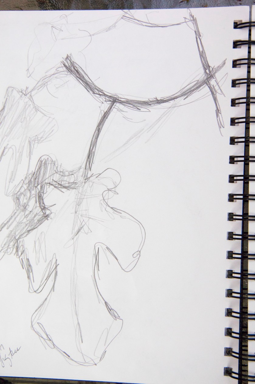
I think I mentioned in an earlier post that I have never really done any formal consideration of pencil drawing.  To me it seems counter-intuitive to think about pencil drawings beyond pencil drawings of a casual quality, like the scribbles and doodles students turn in with their work.  Rather, I looked at a drawing book from the library and had a deeper appreciation for the textures pencils can make.  As with pen and ink, stippling and hatching are at work – but so are circles and lines in varying directions, along with lines which depict texture, such as the little hook-shaped lines at the very bottom.

Alarm Zone!

Today, I filled up a palette with watercolor pigments.  Now, I am slowly studying washes and wet-into-wet.  I am also using a whole slough of pigments I have never used and dropping some of my old standbys.  I am feeling like crap.  But, perseverance.  Onward.

Whatever.


Sketches with Pencil, Ink, and Watercolor

Deciding to take the bull by the proverbial horns, I enrolled in a few of the online classes on Craftsy.  I have used them for a number of other courses, such as sewing or photography, and really enjoy their format.  Demonstrations which are practical, well presented, and make sense are worthwhile.  Online streaming format, without limitation (once bought), is another advantage – you can watch, play, replay, go away, and revisit.  I really like Craftsy for this one reason.  So, I enrolled in a drawing class called See Better, Draw Better: Exercises for Beginners by Kateri Ewing, and a couple by Shari Blaukopf on Sketching with Pen and Ink – one for landscapes, and one for cityscapes.

I am alternating between the drawing class and the sketching landscape classes.  I have my chrome book, pens, paper, ink, water, coffee, and watercolors, and who knows what else.  I am using one notebook – it’s a standard sketchbook, so the paper is thin – and taking notes and playing with the exercises as we move along.  I have also been doing some sketching while listening to an audiobook.  The watercolor studies are essentially play – not serious – because I do things as Blaukopf moves along in her class.  I want to see her class almost completely before I really do anything on watercolor paper, whereas the drawing class is easier to play and do some “serious” stuff as it moves along.

I’ve doodled with drawing throughout the years, but never really focused on drawing in the way Ewing presents it.  She uses 3 pencils – 6H, 4B, and HB.  She also explains the differences between willow and vine charcoal, which I never thought of.  As well, she discusses hatching, cross-hatching, broken lines, stippling, and other techniques for texture.  I never thought of drawing in the direction of the shape of an object.  She has you begin with gestural drawings and them move onto the shading techniques and so on.  I’m surprised at what I have been able to do – as you can see below!

From the gestural drawings, she moves into shape and shadow to give volume – light and dark.

And then, I’ve been sketching in between.

As I said, I am moving through the watercolor / pen / ink classes differently.  I want to focus more on listening, and observing, and hoping that the drawing class will help with my ongoing issue of contrast and value and tone.  The pencil pictures are helping a lot already, but the real key will be painting.  Below are some sketches made from the landscape class and done on non-watercolor paper, just to show some of the stuff I’ve been playing with.

My problem is a lack of time.  Work and life get in the way.  Still, it’s wonderful to feel the focus of drawing and painting and thinking I just might, just might, be able to do something worthwhile!

The Illusion of Spontaneity

Spontaneity in watercolor is and is not an illusion.  For the beginner, it looks spontaneous when you watch an adept painter at work.  For the beginner, you realize what is looking spontaneous is not because you cannot replicate what the adept creates.

Nearly everything requires practice – practice leads to skills that lead to mastery.  I should know this.  My problem is my impatience and my tendency to not focus.  In today’s world it is hard to find time to focus and means a deliberate choice to make time.  Rather than fritter away time putzing aimlessly on the internet, it is better to take that time to do something which will hone my skills a bit.

An Afternoon’s Painting Practice

I am an unabashed Charles Reid fan when it comes to instruction books and videos and style in watercolor.  I love his loose style and the way his colors flow in and out of each other without getting muddy.  Honestly, I am really a novice when it comes to watercolor painting – and mud is my usual result.  Somewhere in the past 6 months a part of me just quit worrying about what I produce, and this gave me the freedom from self-criticism (and condemnation) about what results I get.  I don’t care anymore, and this freedom is opening up doors which have been slammed shut by my unrealistic and unrelenting worrying.  It’s a great feeling!

Having a bunch of watercolors and supplies on hand, I dug out some water brushes and my traveling palette.  Out on the patio, with earphones on to listen to a spy novel, a bunch of paper towels and some water, I pulled out Reid’s book.  My watercolor pads came along with me, as did my coffee, water bottle, drawing pencils and who knows what else.  The verbal distractions of the audiobook keep me from getting too emotional about my practice pages.  I propped up Flower Painting in Watercolor and got to work, reading captions and color suggestions, drew some rough sketches from Reid’s exercises, and got to work.
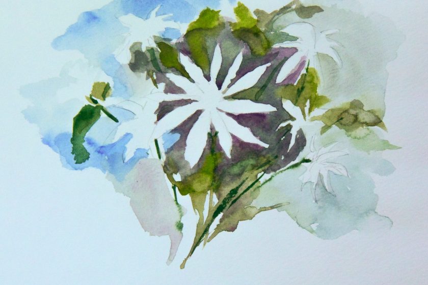
I think one of the hardest things to do is to leave white paper.  I just want to paint it all up.  And I also want to just keep going on – and this creates mud – without pause for paper to dry and paint to settle.  Rush, rush!

Well, I did succeed somewhat.  The crocuses above are one of Reid’s studies, and I was pretty pleased with it.  In reality, it doesn’t look half as good as the photo, but then it is on a piece of messy paper with scribbles on it and test swatches of color.
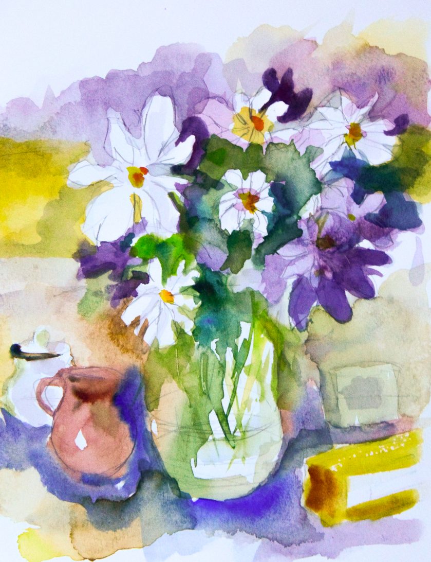
This was a quick study, more white space being left open.  I went back after I finished this study to use my pencil to add some shape to the white flowers.  I like lines – and it is a problem I find with my own sense of a “successful” painting – I need lines to define things.  Sometimes lines work – sometimes they don’t – but I do love the Renaissance ink studies I’ve seen, and lines have always held my eye.  Lines are expressive – but so are shapes of color.

Here, simply color shapes to imply a flower or a leaf.  My experience in sumi-e brush painting makes my understanding of controlling a brush – even an inexpensive water brush with nylon bristles – much easier.

One thing Reid pulls out is shapes without definition – just implication of form.  This is great practice for my line addiction!
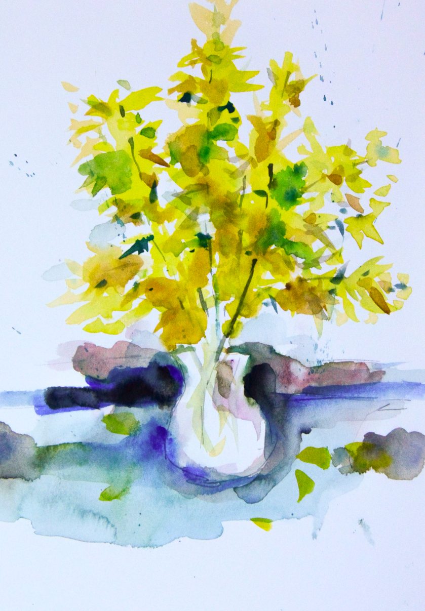
Another issue I find is contrast and value.  It’s hard for me to really get these right in a painting.  Reid mentions he makes his dark not super dark – not black – but installs a medium dark early on to establish value.  I struggle with this but with more practice I think I will get better at this.
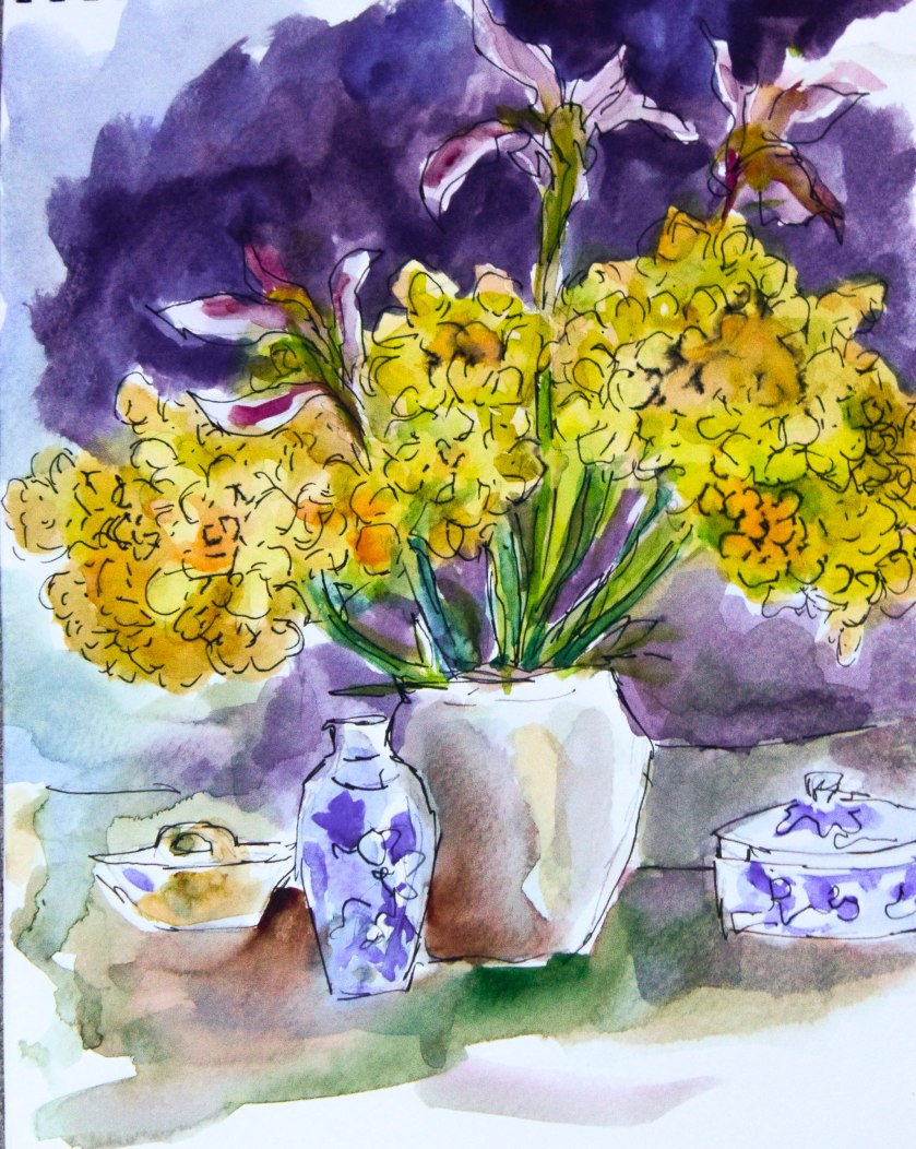
And here is the last one . . . not the best, but one which does have some good areas of contrast, and black lines from an India-ink pigmented pen.  Sketchy, painterly, and totally fun to do!

Quality paper is a must-have.  I have some tablets that I bought which I absolutely hate because of the texture and sizing in the paper.  However, I used them up and ordered more of the Canson’s Montval paper, in a spiral booklet form, 9×12 with 20 pages.  It’s a good working size – and it’s good paper, with a nice texture and sizing which doesn’t blotch up and look horrible.  It’s also very reasonably priced.  The Schmincke paint box may have Schmincke paints in them – or not.  My paint supplies include Schmincke, Winsor & Newton, Daniel Smith, Holbein, and M. Graham professional-grade watercolors.

I’m glad I sat down to paint – it’s such a wonderful feeling and one which gives me satisfaction.  Did I produce anything worthy of framing?  Not at all.  But working with my hands, seeing some success, is something which cannot be described – only experienced.  You know what I mean!  It’s like love!

Penstalgia

http://www.youtube.com/watch?v=1xUDehNvbrE

So many people these days cannot write cursive, much less read it, thanks to the insistence on “new technology” in classrooms.  Keyboarding takes place of learning how to write using a pencil or pen.  Printing seems to be the only thing taught, and mastering it is not even encouraged.  It’s funny to think that the hours I spent in the classroom learning to print, to write cursive, and to touch type are now returning to being recognized as skills more valuable than just being able to communicate.  Eye-hand coordination, fine motor control, neurological benefits.  I probably could do some research and list a thousand things.  All this automation and such makes life easier – no doubt!  I love my dishwasher! – but the satisfaction of working with your hands is completely lacking.

Cursive has become a foreign language to students born in the last 30 years.  They cannot read it.  It’s not just U.S. students who should learn cursive, but students coming in from other countries could also benefit from it.  Other languages have other alphabets, and their beauty is certainly something to be appreciated.  Good handwriting is really an unfancy form of calligraphy.  The practicality of good cursive is just as it was advertised years ago – it is clear and readable.

I’m revisiting what I learned ages ago, and it is a lot of fun.  I’m using a fountain pen, and I am using a dip pen.  A dip pen is not so hard to master, once you learn how to hold it and adapt to holding it at the right angle and tilt.  Once there, it is smooth sailing.  Repeating letters and practicing strokes, curves, and circles is very soothing.  Like coloring, there is something that simply refreshes, like a deep meditation.

Anyway, because I was blundering around on YouTube, I came upon the above video, which I totally enjoyed.  It’s informative, classic, and if you like fountain pens, wait until the end – you will learn a few things you may not have known!