Flat

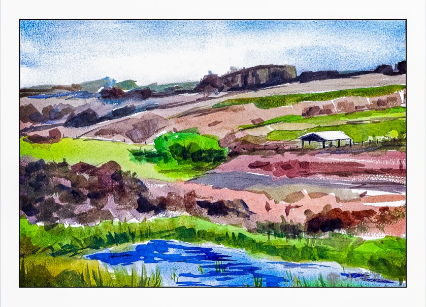
I normally tend to use pointed round brushes for watercolors, but every now and then I pick up a flat brush and use it throughout a painting. The other day I noticed some inexpensive flats on sale in a variety of sizes, so I picked up a couple to add to my collection. Now I have .25, .5, .75, and 1.0 inch flats, some firm, some soft. And tested them out.

Epson Scan used here – too lazy to putz around. The blue in the sky is granulated and light in color, but the blue in the water is too blue. The rest of the colors seem to be okay.

A flat brush is rather versatile. The longer edge makes for wider strokes, obviously. You can also load your brush with one color on one side and another color on the other side, and when you paint on wet paper, the results can be interesting. I didn’t do that here, but am writing this to remind myself I need to do it a bit more! The narrow side of the brush can give very nice straight lines, as you can see in the hay canopy in the mid-ground. Sharp edges, like in rocks can be easily expressed. Squiggly lines can also be achieved as seen in the too-blue-to-be-true water.

Watercolors, flat brushes, limited palette.

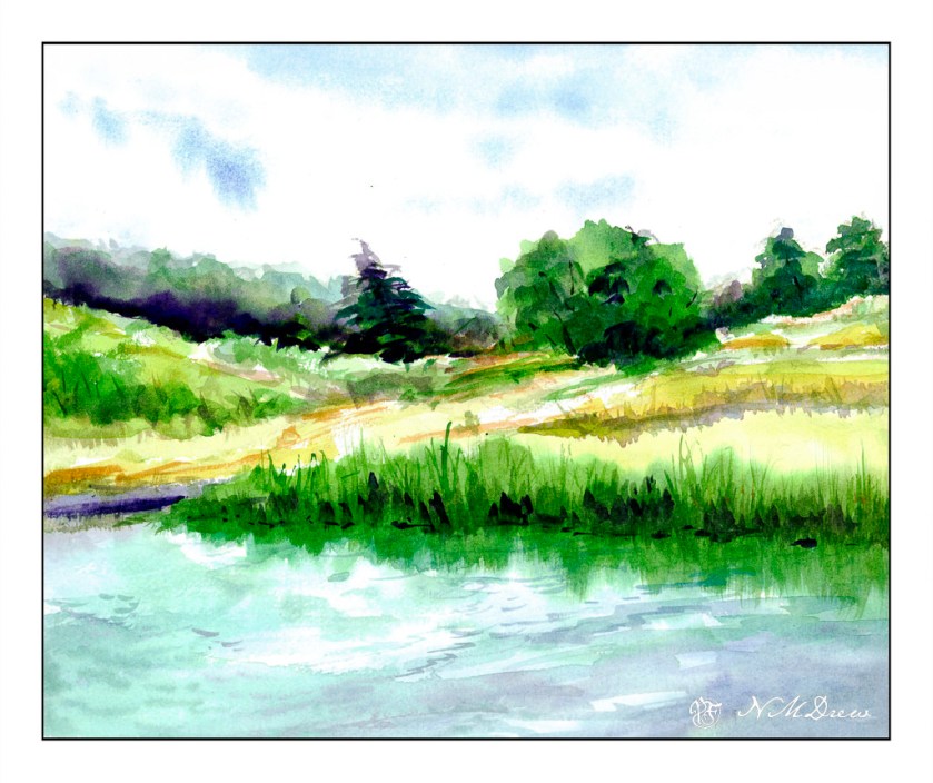
Across the Pond

This has been a terrible week out here. Where I grew up was burnt to the ground in a lot of areas with family and friends losing houses. Election week was a roller coaster. It is always surprising to me how such things can just cause my sense of world order and sanity to just blow away, as well as realizing the world is not as I see it – perceive it – want it to be. But connections with people and hobbies and doing things – normal, everyday things – does help settle the discomfort and chaos a bit. Not sure what the next several years will bring, so we will wait and see – what else can we do?

I guess we can paint!

Watercolors almost always soothe my troubled soul! Painting and drawing does in general. The act of doing is an act of being, an affirmation of life, and the validity of existence. Me, I am always searching for explanations, but there are times when the only explanation is to do something, like paint, watch a movie, read a book, go for a walk, watch the cloud pictures in the sky.

Nature. Water, trees, sky, grasses. Peace.

Watercolor, Kilimanjaro 300# CP paper, 11×14.

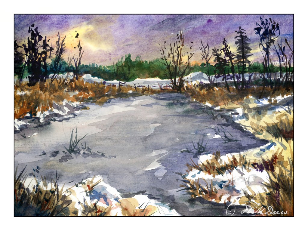
Skating Pond

I was never any good at skating, but I did try it out a lot when I was a kid. We moved from a really cold place in the midwest to a warmer climate on the east coast, leaving rural farmland with ponds and lakes for a bit of suburbia in New Jersey. Every year the neighbors would get together and scrape the snow off the nearby lake, test the ice, and create a skating pond. We were never allowed to go by ourselves because of the chance of falling through the ice, but it seems there was always a dad or mom to supervise a dozen kids in snow suits, wipe away our tears, keep us generally under control.

Watercolor, 9×12, 140# CP ArtBeek paper.

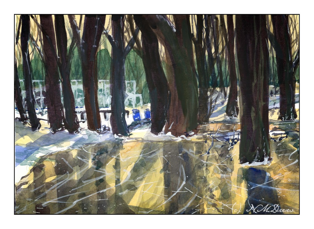
By the Water

I am taking an online watercolor class, and I am sort of this way, that way about it. There is feedback and some great videos, but I find that I like to have a more personal contact than such. Another online class I am taking has weekly Zoom meetings and even though we aren’t all yacking with the instructor, it is more personal.

Anyway, despite what I would like to see different, there is a lot of value in pursuing online learning. To a degree, you have to motivate yourself. You have to have the discipline to do it. One thing that I do find especially hard in all my classes is the making of value studies – oh, how I hate them! I don’t have them as part of my routine when it comes to painting, and the discipline of doing them is what I hate. I expect that doing them will pay off in the future – but it may be a bit down the road as I force myself to do them without appreciating what I know they are supposed to provide.

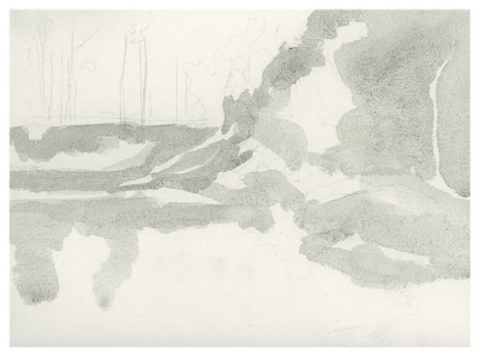
Above, a study from a photo in my watercolor class. Below is the first value study showing the midtones

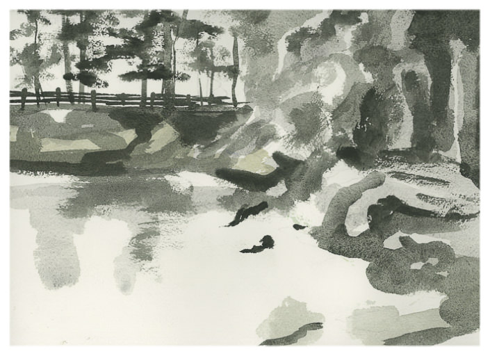
All the white area is supposed to be sky and the lightest areas of the picture. The grey is the middle value. These are used to help shape the painting before refinement with darks and details. Below is my dark-added value study.

I actually really think this idea of doing middle values for the first step of a value study is a good idea. Do these values first, paint your lights and mid values in color, and then move on to the darker ones in the value study and the final painting. Doing this is very nice, really, because the dark values and details get distracting.

Like I said, this is a thing I am not enjoying doing but know it is probably going to reap bigger rewards than I can imagine at present. Values and edges are what I am trying to see in anything I do.