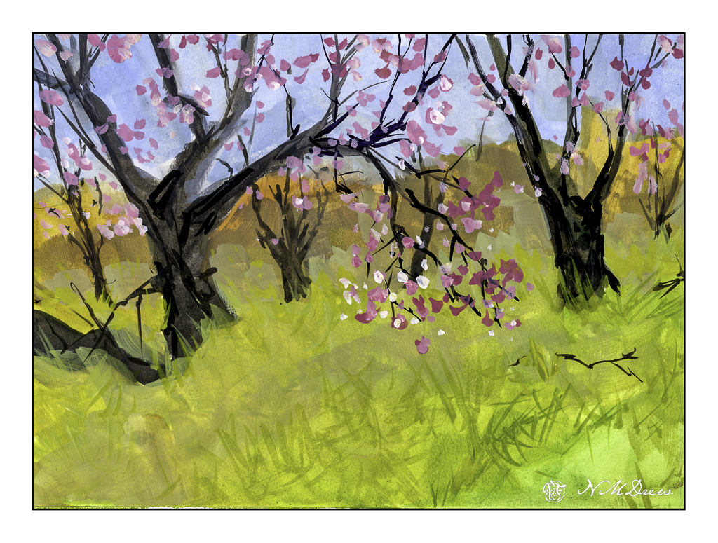
I had to miss my oil painting class yesterday as I had some things to do and some workmen to work. I had planned to use gouache while I waited. The workmen came, but I didn’t get around to painting at all. This afternoon I made up for my missed paint time. Spring is nearly here, so Spring it is!
As with any medium, if I have not used it for awhile, I need to get used to it again. As I was playing and it was lying around, I picked up my pad of Strathmore Vision watercolor paper. This is not a great paper for watercolor, but I love it for pen and ink. Why not gouache?
What I like about gouache is that it is opaque, yet diluted it becomes transparent – or certainly thin enough to show the colors beneath it. I painted with an angle brush and thin paint, laying in colors. Details were done with a small, pointed round. Additionally, as this is artists’ gouache and non-acrylic, the colors can be re-wet, and thus some fun blending can happen. I used all my little tricks to refresh my gouache memory, and here we are.
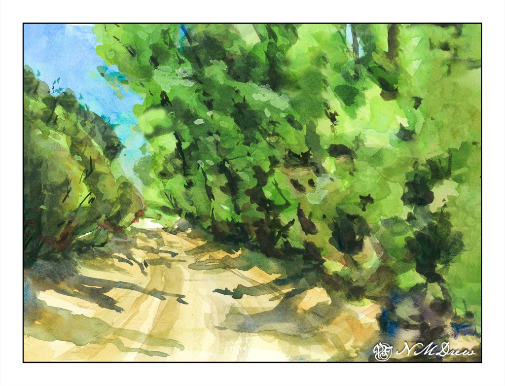
Yesterday I posted a hill that was a color study. Today I am posting trees and a road as large planes of colors. Green is green, but there are variations. The trees on the left are different greens than on the right, and so is the brushwork. The center is a rather yellowish grey road. The shadows, too, are a bit different, with the ones on the left are more blue than on the right, which have more green.
The painting started out with my using my the Schmincke half-pans on a large painting for the pans. I struggled to get enough color to begin a wash and resulted in blooms and cauliflowers everywhere. The whole beginning was a major disaster and I was not happy. Then I pulled out my usual large palette with tube paints. Start the painting over on a new sheet, or try to rescue it? I decided to apply some life saving . . . .
The sky was a big cauliflower. The trees on both sides of the road were big cauliflowers. I began with using clear water to wash away as much of the cauliflower lines, blending the paint into the surrounding color. This ended up with some lifting of color and some stripey areas, but that was not a bad start.
The next step was repainting the sky. It started out a nice light color but with another layer of color it got darker. Then the trees. Each layer became darker although I did manage to save some lighter areas. This was annoying, but then I decided to re-watch Shari Blaukopf’s “Trees Across the Seasons” to see her tree painting technique. It really helped.
My crime in watercolor is a lack of patience. That is what happened with this painting – my frustration using the pan paints made me impatient. I just want to get in and paint – I don’t want to pre-plan, do value studies, etc. There is a place for spontaneity and a place for patience. Outdoors is for spontaneous painting with drawing and thought; in the studio I want to be more deliberate. I made the choice to use tube paints, and be more patient.
The end result is not too bad. The original is darker than this one, but that is the beauty of digitalization – I can fix things. I use it in my photos, and I use it when I post my paintings online. Is this wrong? I don’t really know, but as far as I am concerned there is nothing unethical about such manipulation. If I were selling prints, I would be working to make sure the prints were good – just as in a photo – removing spots, augmenting colors, etc. Having worked awhile in the printing industry, this is the norm to produce modified images. Digitalizing a painting lets me crop and frame and sign it, too.
Besides helping me make a painting look better, it also allows me to see it differently. A monitor makes everything more clear, and that includes mistakes like weird shapes and splatters that I don’t notice in the original. Seeing such things is a learning experience in and of itself.
So, color planes and shapes, getting rid of cauliflowers, learning that half-pans are not best for my way of painting large, and fixing a painting that could have just gone into the scrap paper pile. Altogether, a good experience.
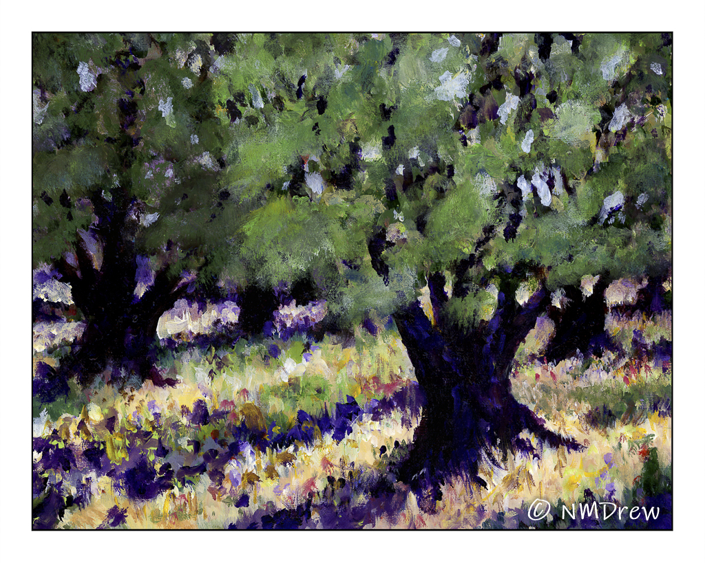
I started this painting a couple of months ago at least, but because of life and cataract surgery, I didn’t finish it until today. There have been several iterations of it. The subject itself was inspired by van Gogh, and I had thought to try to copy his style of painting, but found that it was far more difficult than I anticipated.
The painting itself is done on an 11×14 canvas panel by Arteza I gessoed over its primed surface, in part because I like the process of preparing a surface for a painting, in part because I never like something already prepared by someone else. From there, the surface was neutralized with a pale underpainting of yellow ochre and burnt sienna, very thinly applied.
One of my primary issues in painting of ay type is depth of field. Easy to do in photography, but not in painting! Thus, this was a goal in this painting. In general, I think I made it, but had to work and re-work the surface of the painting. This is the pleasure of acrylic – once dried, I can paint over what I don’t like.
I used a variety of techniques, one being glazing to dull own areas by using a cool glaze, and to bring others forward using a warm glaze. It worked, but I realized I needed to go further by using a dullish grey-green for the tree on the left, and a brighter, warmer green for the olive tree in the foreground.
This is the first painting – artwork of any kind – I have done since I had my cataract surgeries in July and August. With new lenses, in my eyes and in my glasses, my sight is much better. However, I may still need a newer prescription in a month or so as it was hard to see what I was painting with my new glasses. Time will tell with this.
Altogether, I am pleased with this attempt. First, I like the painting. I am going to let it stew a bit before I apply any varnishes. So, letting it sit is “second” – already I can see areas which are a bit illogical. Finally, the entire process was fun to do. Acrylic, as with all media, has its good and bad qualities or frustrations, or whatever, but the simple doing it is delight. Painting just removes the outside world and transports me into another dimension which is pure bliss.
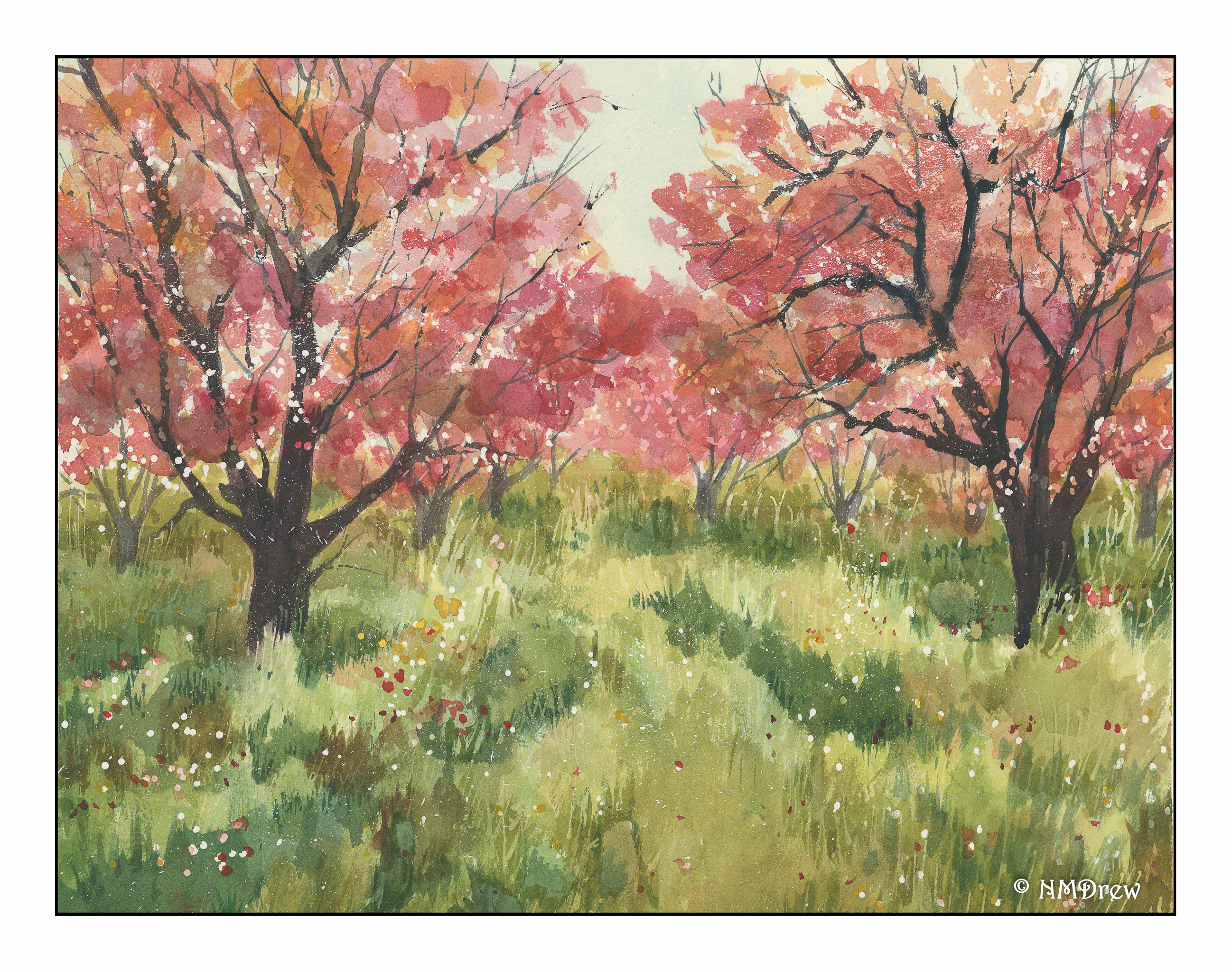
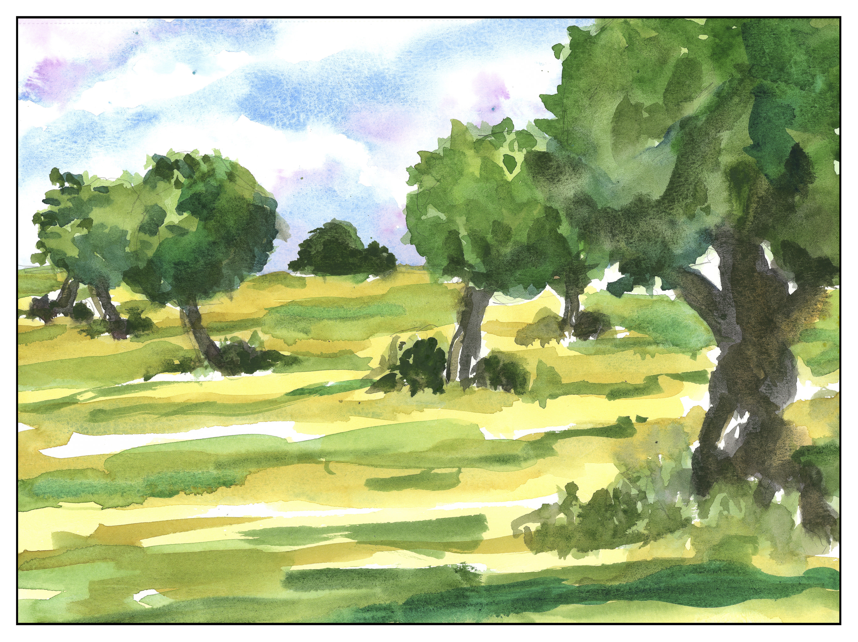
This is by far the painting which took the most time to produce. There was – gasp! – actual forethought and planning done. Can you believe it? Does that mean I’m progressing or something?!?
Anyway, what I did was consider what I wanted to see. I also thought about some things I have observed other watercolorists do, namely underpainting. I also have been reading and seeing many painters lay out light colors, in a general way, move into medium washes with perhaps more detail, darker areas, and finally the details. This is what I did, but, before painting, I put down a lot of frisket in the shape of dots. Then, the first pale layer of wash. Between the third and fourth photos, I did more frisket. Dots again, but I also used a toothbrush for splatter, and drew lines over the green washes, to retain colors. Then the fourth layer. At that point I stopped for the night.
This morning, I rather knew what I wanted to do. I laid down a pale wash over the grassy areas of quinacridone gold and sap green. It was necessary to pull the grasses together. Finally, I removed the frisket and did a bunch of details complete the painting. Total time – about 5 hours! All of it was fun, and not a lot of frustration. I think because I took time, and because I am less “serious” about my stuff (knowing it won’t be what I envision) really helps.
Below, a gallery of the steps I took in the painting, if you are interested in the process.
Living in a “Mediterranean” climate means living in a dry, temperate climate. Locally, we have a number of olive orchards which produce local oils that are tasty and delicious. Here is a tribute to them.
Besides commercial uses, olive trees are often used as decorative trees in one’s yard as they do require a lot of upkeep in terms of water – but the downside is a messy yard as the olives drop. Most people never consider using the olive fruit for anything at all.
I tried to simplify everything in this painting – trunks, field, crown of trees. At the same time, I tried to work on contrast and failed overall. It’s really a talent to get something dark enough on the first take! The trees on the left look like one in the foreground in overlapped by the leaves of the one further distant. And so on. However, getting out the paints every day is the goal, and practice, not making a “completed” painting is the whole point.