Crocus – A Flower I Have Never Seen

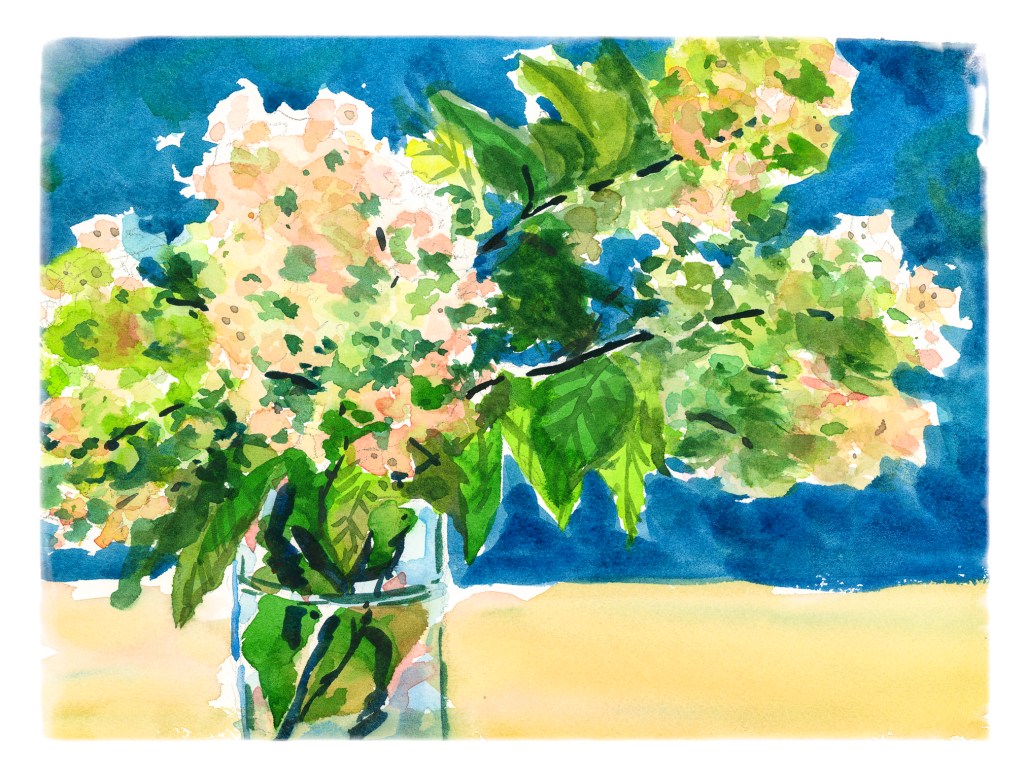
I am not inclined to enjoy painting classes online unless they are done in chunks of short amounts of time. Shari Blaukopf’s most recent class, Sketching Spring Flowers, is one such class. In fact, all her classes are very much like this. Her style of teaching and painting are very fresh and direct, and up front, I think she is one of the most talented and unique watercolorists of our time.

So, taking the first section of the class, we are doing a small batch of purple crocuses blooming in her garden, bright colors after a long, cold Montreal winter. Well, I have lived in cold places, have seen tulips and hyacinths emerge from the snow, but never have I seen a crocus. One day! Anyway, this is the first of her flower studies. I can only hope someone else can tell what it is supposed to be.

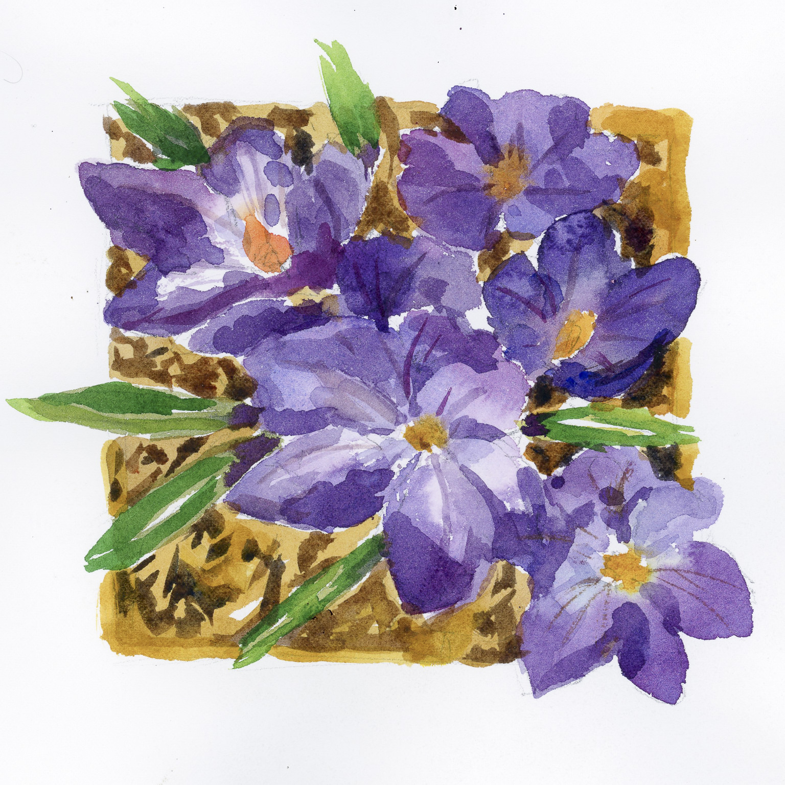
My own painting is a bit muddy-looking as far as I am concerned. My paints were not as fresh as hers, but that is not the point. It is more about learning technique. It is hard to paint something from a photograph, and hard, too, to paint something completely alien. However, technique and color mixing are the point. For instance, thick wet paint. Let water do the work in the lighter areas. The experience is the point – but my problem is I am hasty. This painting took me about an hour, watching the videos and thinking about things. I wonder if ever anything sinks in! Despite that, exercises like this are always valuable …

Shari Blaukopf class; crocus; watercolor on Arches CP 140#. About 8×8.

Art with a Broken Arm

I signed up for two art classes at the local adult school, one in acrylic painting and one in Chinese calligraphy. The acrylic painting class I have to drop simply because I cannot carry an easel, paints, paper, and all the other supplies with me, but I can do the Chinese calligraphy class because the teacher supplies all the stuff and there’s very little that I need to bring to class! That’s great.

Consequently I thought, well, what can I do? I decided to try an online course in drawing buildings and learning from an architect of many years experience. I think this is going to be a really good lesson or group of lessons as I have never been good at drawing buildings and only through a lot of effort and learning about proportions and relationships have I been able to draw this one which is the preliminary drawing prior to any classes at all.

If I say so myself, I did a pretty good job on it and I am looking forward to seeing my progress in the future. There are a lot of tricks that I’m going to learn in this and I will be posting them perhaps as I go along.

And the class begins in 20 minutes!

Class: Sketching Winter – Capturing the Colours of Snow

There are a lot of watercolor instructors out there. Many are good, some mediocre, and others not worth the time. Among my favorites are Rick Surowicz, Oliver Pyle, and Shari Blaukopf. Most important is if I like their paintings or not! Next is their teaching style. In person classes are hard to find, get to, and can be expensive, but online courses are often repeatable. I am beginning to find this to be the best venue for my own learrning. Blaukopf has a number of short courses, very reasonably priced, which fous on this or that. Shari Blaukopf fits both criteria – great painter, great teacher.

I have purchased a number of her courses. Over time, her classes, already good, have gotten even better with more details and focused studies. You can learn a lot from copying a painting – a long, traditional history for the art student – but when you watch a painter achieve a painting, how they apply paint, when they explain their approach, learning is an even better experience.

I can paint snow and have done it fairly well, I think. What I enjoyed about this class was to see her sequence of painting, understand the logic behind her approach, as well as the fact that her painting is pretty direct. Shari applies her colors directly to the paper, sometimes mixing on the palette and other times on the paper while adding other colors. The key factor in her success is she does not overwork her painting!! She also explains why and where she is using hard and soft edges, as well as warm and cool colors. Not everyone is this clear.

In the end, her painting always have a lively freshness to them, with plenty of detail mixed with a painterly quality. Perhaps a lack of fussiness? Whatever it is, her painting seems very spontaneous to me. Seeing / learning how she achieves this has been the highlight of her classes. She is thoughtful, plans ahead, and yet achieves a looseness that is hard to match. As watercolor – or “watercolour” – is such a challenging medium, good techniques are like gold to me.

A Few Flower Studies

When you find an artist whose work you like, and who is also a good teacher, an online class can teach you a lot! The nice thing with videos is that you can watch them over and over, catching little things with each viewing.

Shari Blaukopf is a painter that I admire. Her watercolors are clean and fresh. She also has a really nice online personality, whether it is on her blog or in her recorded classes. I’ve made comments on her blog and she replies; I have uploaded a painting or two, and she is always gracious. One day it would be nice to take a class with her in person.

Anyway, I have / am taking two of her courses on flowers. One is painting wet-in-wet flowers, and the other is painting fresh cut flowers.

The above one is from the wet-in-wet flowers class. The paper is wet on both sides after the initial pencil sketch is done. The paper is then blotted. And from there, you go to town! It was really fun to see how the paper and paints all worked together. Not a great rendition, but the experience is the most important part as that is how you learn. My contrast issues are not too bad.

The hydrangeas are from Blaukopf’s course on fresh flowers. She does three different flowers – a blue salvia, then echinacea and black-eyed Susans, and finally the hydrangeas. I’ve done the salvia, but have yet to do the second one. I wanted to do the hydrangeas especially because of the delicacy of colors involved, as well as work on the contrast and negative painting, the latter which is just as much as a challenge for me as good contrast! Having been very frustrated with my colors always being too intense, this was also a good challenge for me with pigment and water control.

The past few days have been spent practicing free-motion quilting for a class this morning, so it was really a treat to wade back into painting. I love flowers, so painting them is the challenge, especially as I prefer a looser rather than more precise rendering of them. I think precision can be a lot easier than abstraction.

By the Water

I am taking an online watercolor class, and I am sort of this way, that way about it. There is feedback and some great videos, but I find that I like to have a more personal contact than such. Another online class I am taking has weekly Zoom meetings and even though we aren’t all yacking with the instructor, it is more personal.

Anyway, despite what I would like to see different, there is a lot of value in pursuing online learning. To a degree, you have to motivate yourself. You have to have the discipline to do it. One thing that I do find especially hard in all my classes is the making of value studies – oh, how I hate them! I don’t have them as part of my routine when it comes to painting, and the discipline of doing them is what I hate. I expect that doing them will pay off in the future – but it may be a bit down the road as I force myself to do them without appreciating what I know they are supposed to provide.

Above, a study from a photo in my watercolor class. Below is the first value study showing the midtones

All the white area is supposed to be sky and the lightest areas of the picture. The grey is the middle value. These are used to help shape the painting before refinement with darks and details. Below is my dark-added value study.

I actually really think this idea of doing middle values for the first step of a value study is a good idea. Do these values first, paint your lights and mid values in color, and then move on to the darker ones in the value study and the final painting. Doing this is very nice, really, because the dark values and details get distracting.

Like I said, this is a thing I am not enjoying doing but know it is probably going to reap bigger rewards than I can imagine at present. Values and edges are what I am trying to see in anything I do.