Negative Painting: Pink Daisies Gone Mad

Today has been a day of frustrations.  Nothing seems to be going right.  Everyone has those days, yeah, I know, but I rather other people have them, not me!  But, they do serve a purpose in that they do make you realize … something.

That said, let’s get on to the negative painting scene.  It is not easy.  I think to create a painting like this, practice and experience play an important part.  Practice is what I keep doing.  And then I reach a point where I am just irritated beyond measure, and need to break loose.  I’ll come back to practice, but by nature, I am a gaudy color lover, and having a monochrome study makes me feel trapped.  I wonder if others feel the same way.  So, pink daisies, a la the hydrangea, and I am ready to go nuts.  Here they are  – the first round.

And then the second one from this morning . . .

Some success.  And then I did the third layer . . . and had to just mess with it as I was ready to scream.  Part of it was just frustration in that I didn’t really like this process at all.  Maybe it’s not for me.  In the end, just playing with some colors on my palette, some which I just recently got.  It was a total color mess – so lines were added.  It’s sort of cheery, but it also reminds me of what I cannot do.

The good news, no mud.  It’s kind of fun.  But I also know what I want to accomplish, and doing this stuff is not going to get me there.  The colors are fun, and good practice, but I also know that my impatience and scatterbrained-ness don’t help me, either.  Ongoing practice will improve my skills, I hope.  So, I keep playing.

A part of me wonders if / when I reach my desired “look” if I will become extremely boring to myself.

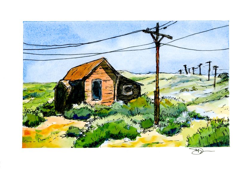
Lines of Bodie

Today I ventured out on my own, influenced by practice sketches by Peter Sheeler and his videos.  This is from a photo I took in 2016 up at Bodie, California, when it was moving toward noon on a hot, hot day in August.

I rather like the composition, particularly the lines of poles marching over the hill in the distance.  If you ever have been to Bodie, you know it’s a long drive down a long and bumpy washboard road.  The telephone poles and lines emphasize the town’s isolation.  As far as painting the subject matter, I started out with a line drawing, painted, and then came in again with the ink pen.  It was so, so, so hard to not try to draw and paint every line and rock.  Simplification was a big challenge for me.

As I painted, I worked hard to recall what I have learned doing the practice studies.  Keeping things simple also meant keeping the palette simple, and the brush choice as well.  I started out with sky in Cobalt Blue after wetting it down with a big round brush.  Then I kept myself isolated to a dagger brush – first time to use one, too.  The remainder of the palette included Quin Gold, Burnt Sienna, Ultramarine Blue, Sap and Hooker’s Green, and by accident, a tad of Indrathene Blue.  The paper is 5×7 Arches Hot Press and taped down with a 3M painter’s tape with specialized edge-sealing qualities, which really worked to keep the tape from pulling up as it got wet.

Overall, I like the lack of mud and the contrasts I developed between light and dark.  Pen and ink come to save the day again!

Moonlight

Night is always mysterious and exciting.  The moon overhead – clouds – wind- the creaking of branches – the rustles in the undergrowth.  This is what I decided to try, using an old sycamore tree as the subject, and a bit of my imagination.

First step was to decide on colors, and approach.  I decided warm undertones for the tree and the sky.  I used a bit of Quinacridone gold and Yellow Ochre for a thin wash.  From there, successive glazes in Ultramarine Blue, Indrathene Blue, and Carbazole Violet.  As things progressed, some Burnt Sienna.  You can see the different layers below.

At times I used a hair dryer to dry the layers . . . other times I painted as I held the hair dryer.  I used rounds, flats, and finally a rigger brush (for the very first time!)  It was okay to use the rigger in the background, but crossing it along the bottom of the tree – I don’t know – I think it detracts from the rest of the tree – hard to say at the moment.


Negative Painting & Glazing

This morning I decided to do a few things I haven’t been too fond of in the past.  One is negative painting.  The other is using glazes.  That’s what I did here.  The first layer was a warm yellowish wash, very thin.  From there, about 3 or 4 consecutive layers of blues and violets around the main trunks, and then over the ones to the sides, making them bluish.  I then used a rigger brush (for the first time) to create branches.

Overall, the picture works, but the areas I can say shouldn’t have happened are the branches in front of the central trunk.  The other thing I need to do is to create better contrast on the branches, in particular it seems on the right.  I would like to see more blue in there, in narrow strips using a flat brush.  I may do that later.

The idea behind this painting a sycamore tree in moonlight, with the above exercises to accomplish it.  I thought ahead more than I usually do, considering colors and such, as well as the approach to creating what I desired as an end product.

Sky, Interrupted

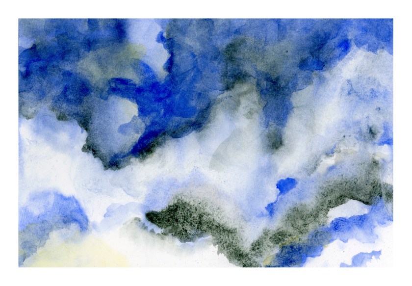
This morning I sat down to practice skies.  If I were to do the ones in my neighborhood, they would be blue.  That’s all.  Just blue.  Clouds are not a common sight where I live!

Anyway, so I scooted around YouTube and found some videos that had some good ideas.  One showed how to do lifting with tissue, advising not to scrub too hard on lightweight paper.  Important to know – I scrubbed a bit of the paper off.  Others used some rather wild color combinations, or certainly ones I haven’t thought about using.  Add to that, I wasn’t trying to accomplish anything more than playing, so it was altogether a fun way to start the morning.

This first one is a combination of Sodalite Genuine, by Daniel Smith, Ultramarine Blue, and Quinacridone Gold.  The Sodalite is a color I picked up on a whim, put in my palette, but had never used until this morning.  It granulates wonderfully, and is a good charcoal grey.  I think I will be using it again.

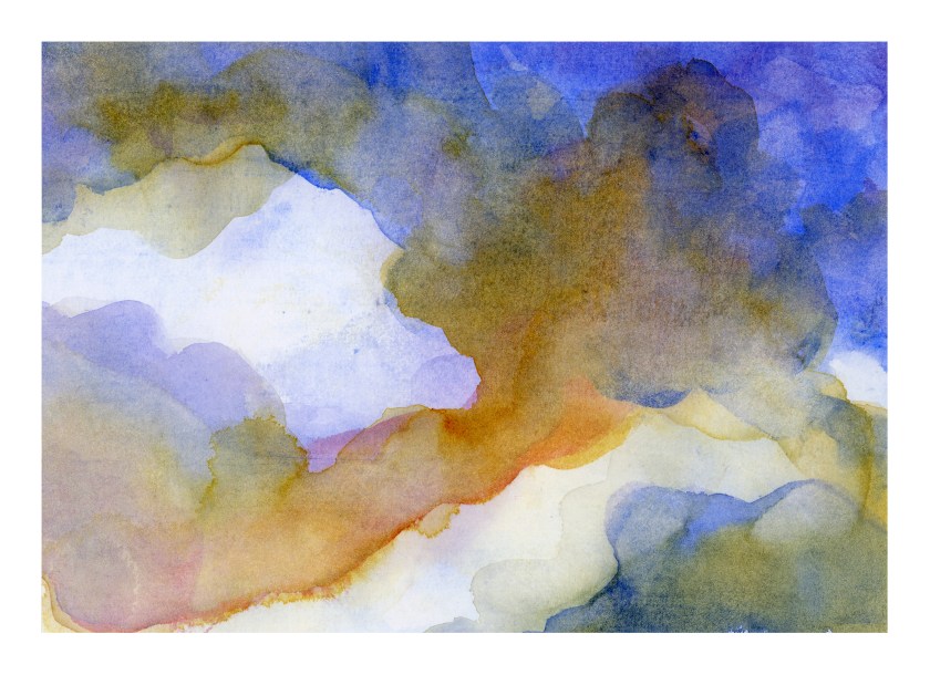
Then I started another one, wetting the paper once, letting it soak in a second time, and then wetting it again.  I am using Canson XL watercolor paper, which has a nice texture, is about 90#, and is a student grade paper.  I like it because it is working out really well for my needs.

After wetting the paper, I decided to start with a gradated wash, using the reverse side of another painting (to save paper, eh?).  The brush I used was a flat with rather stiff bristles, and the result was lines throughout the wash.  Oh, well.  Then I simply lifted the color off.  Then I began adding Carbazole Violet and Quinacridone Gold.

And then the phone rang!  My brother and his wife in Wisconsin calling, to wish us well for the holidays . . . . the painting was forgotten for the next several minutes, and this is the result.

Regardless as to whether or not this last looks like clouds, the colors have a lot of potential for a dramatic sky some day.  I really like the colors!  I like both, actually.

White space.  No mud.  I must be doing something right!