Morning Sketch 4 – Negative Painting & Flowers

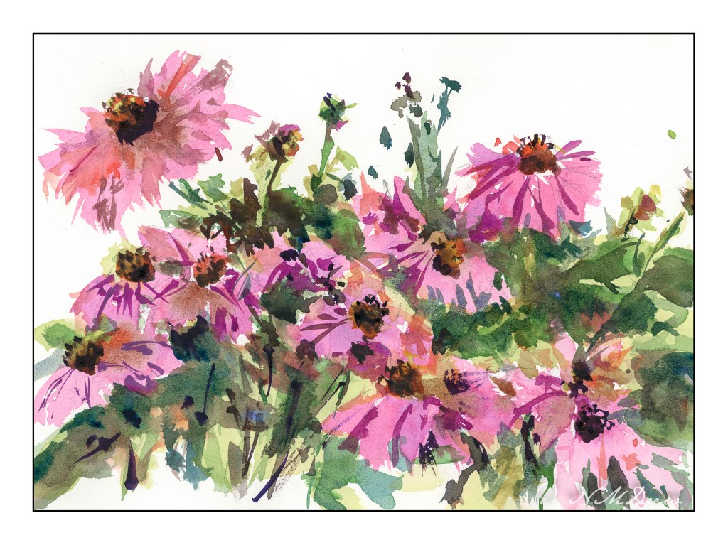
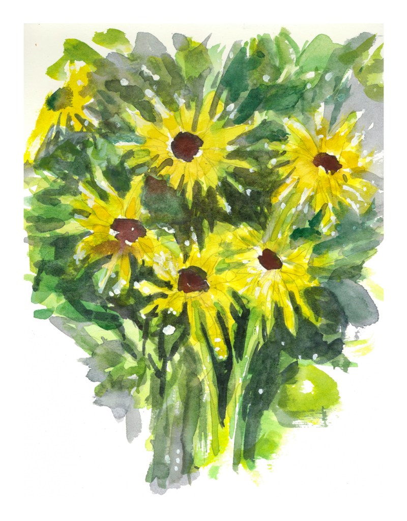
Negative painting is painting around an object, usually using darker paint around a more lightly painted object. Anyone who paints finds this quite often to be a bit of a mind tweak, so it is always worthwhile practicing. For me, negative painting is best done with the subject matter, if a photograph, done upside down. Then it – and everything else – just becomes a shape. Shapes are easy to relate to, more so than a flower or a whatever.

I really cannot paint flowers easily. I don’t want to create realistic paintings of flowers, but impressions of flowers. Being able to express a flower and to know what it is appeals to me far more to me than a scientific flower illustration. Don’t get me wrong – botanical illustration is stunning and something I love to see and admire them – but I want a looser style.

One way to express a flower is to create it in its environment. A field of flowers can dance in the wind. A bouquet of either one type of flower or many has its own beauty – the shape of petals and leaves and stems creating their own designs. Stems and leaves seen through clear glass are distorted fascinating to see.

For now, though, I just wanted to practice negative painting. I drew my flowers, and went to work, laying down basic colors and then coming in with darker colors to create shapes, such as leaves and stems. I did the daisies first, and they are rather crude. The poppies were next, and while the colors are muddy in places, it was more successful as far as what I was trying to accomplish.

Echinacea

I think this is the first original flower study I am happy with. The reason is that it has the looseness of style I have been trying to get, a brightness of color, and decent contrast.

I began by wetting my paper on both sides after drawing in the basic flower shapes, some stems, and leaves. All of the pencil lines are simply guides, but it did help. From there, I did the flowers with a wet wash, more water than pigment, to suggest the basic flower petals. From there, leaves in a light yellow green with the plan to paint darker colors over petals and leaves. Once I had those general shapes in, I placed the flower center in, allowing it to bleed into the leaves and petals as it would. Then I dried it with the hair dryer.

More washes came along using more pigment and less water, but still wet. I tried to suggest leaves and shapes, painting around the flower to create indents where the petals fell over the leaves in an attempt to create some depth. Again the hair dryer, probably multiple times. Finally details with a fairly dry brush, thicker pigment slightly dampened with water. This was done for some of the stems, the flower centers, and a bit here and there.

I am using my new palette, but I don’t think I really like the alizarin crimson that much. It is the “permanent” variety and seems rather dull to my eye. I tried to liven it up with other colors, like some blue and red and orange in different areas, but it is not as vibrant a red violet I would like. I will need to do a bit of research here.

So, at last, a sense of being able to paint flowers in a manner pleasing to my sense of what a floral watercolor should look like.

9×12 CP Arches, 140 lb.

In the Canyon

Another rendering of another artist’s work! This is from a (what else?) YouTube video by Roland Lee, an American watercolorist who paints the national parks of Bryce and Zion with a beautiful and delicate touch.

The subject here, of course, is landscape, but here are more subtle renderings of nature – here, more trees – using negative painting. I added a few of my own touches, of course, but the point of the lesson was observed and learned to a degree. Not easy to do, not easy to follow, but I rather like the results. More practice to come, too.

Learning from a paint-along is rather fun, at times daunting. I used to think of my paintings all as “failures” because I never replicated the teacher’s work. Of course, that is silly, but until I could let it go, as well as become more adept at watercolors and skilled in their handling, my own paintings would be disappointments. Now I am getting comfortable with my own style, if there is one, as well as how I handle everything. Skills are building.

Done on Arches CP 140#, 9×12.

And here is the video to enjoy – Roland Lee is a good presenter – clear instructions and a deft hand. I know I will be looking at more of his over time.

The Forest for the Trees

Another adventure in negative painting. As I have mentioned earlier, trees are a very good way to practice negative painting.

Here, I painted around the white trunks, and then more tinted trunks. I couldn’t find myself getting rigidly graphic with this, and just did a splish-splash approach. I also think I did a fairly decent job of moving from a dark, shady forest floor to a more sunlit canopy.

In the end, I used some white gouache, too, and rather like the vibrational energy of it all.

Negative Painting

Negative painting is painting around a shape. Positive painting is painting an actual shape. The first is hard to do. The second less so, but the skill of negative painting is necessary and can produce some pretty dramatic results. It is also a skill if you don’t want to use liquid frisket to block off areas to keep white. Positive painting sounds easy, but it ain’t. (My flower paintings are evidence of this!)

A common exercise to show the learner how to do negative space is to paint a tree, paint around it in a light wash, draw another tree on the colored wash, and then paint around this, until you have a lot of trees ranging from white to the varying values of the wash. Sterling Edwards has a lengthy but very good video about this method:

While I know about negative painting, and have stated it as one of my goals, along with flowers (which benefit from the skill of negative painting), I thought this was a good one of the many I watched. What I liked was how he blends his paint inward.

Anyway, I did trees. Rick Surowicz is also a master at negative painting, and if you look at Edwards’ paintings, and those of Surowwicz, you will see both apply the same techniques. In my painting, I used Arches 140# CP, 9×12. I outlined the tree, and then painted around it. At some point I was frustrated and decided to do some painting with white gouache, on both the primary tree and then adding others.

Overall, I rather like the effect, particularly after adding the gouache. I think it enhanced the painting rather than making it just another annoying experience! I used to be quite rigid about not using gouache, much less gel pens or diluted acrylics in my watercolors, but rules exist to be broken, and I expect purists would call this “mixed media” – but that no longer bothers me as much as it used to. Watercolors they are (water soluble), so watercolors these remain.