Another window, this time set into a log building. The logs were fun to paint – just broad swooshes with a brush, and then some detail. (I think I could use a few more wider dark swooshes in the upper 1/2 of the windows for the logs.) Here, as in yesterday’s painting, detail is important, but still needs simplification to express the window and the logs. Overall, I am rather pleased with this picture. My palette was very limited – burnt umber, burnt sienna, and ultramarine blue. Oh, I threw in some zoisite (DS) because I love its granualtion!
Tag: limited palette
Studies in Two Colors
Over the weekend, I worked on numerous simple watercolors, inspired by the 2-color studies found in Ted Kautzky’s classic book Ways With Watercolor. He suggests beginning with just two colors, Burnt Umber and Ultramarine Blue. From his book, I did the exercise below.
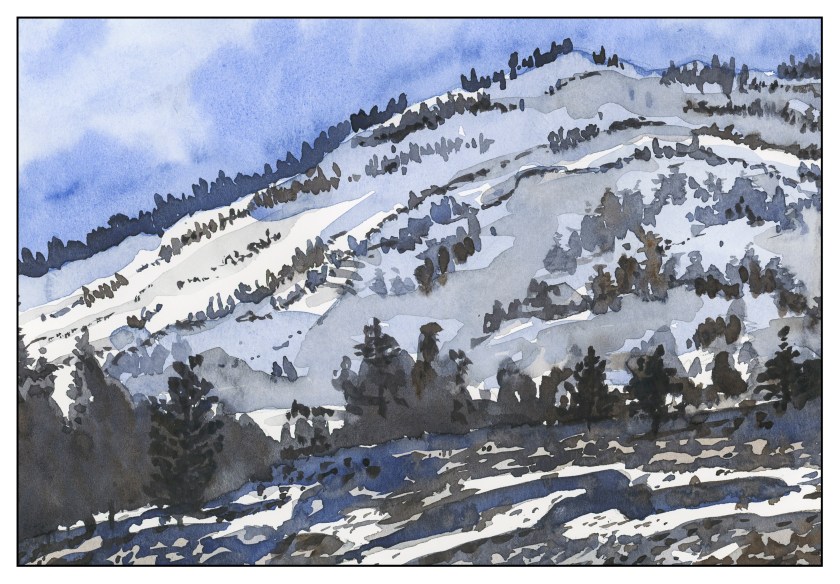
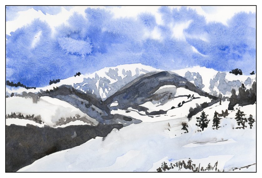
The umber and ultramarine are considered to be “warm” colors from what I have read, but they work to make wonderfully cold winter scenes! Here are some I did after the one above, to continue the study.
The beauty of using only two colors is there is little likelihood of making mud. That’s a good thing! Instead, I got to focus on value, which is not an easy thing for me.
Values are not just light and dark, but everything in between. For instance, above, there is bright white, a light grey, a darker grey, and so on, moving into essentially black.
Besides working on value / contrast, the above painting was a work done with a lot of wet-in-wet, particularly at the horizon line, to blur the plant growth into a hazy atmosphere.
From there, another wet-in-wet, accompanied by a gradated wash, in the above painting. I started with pure Ultramarine Blue, and then worked it lighter and lighter until I reached the bottom of the sheet. Then, with a dry brush, I worked upward to remove the blues. You can see some blue streaks left behind. After the picture was finished, I used white gouache and a toothbrush to spatter snow onto the painting.
After all these umber-and-ultramarine paintings, I have moved onto ultramarine and Burnt Sienna. The sienna is much warmer, to my mind, as long as it is not mixed with the ultramarine. With ultramarine, the color can be as deep as you want – nearly black – as you can see in the trees.
The shadows across the snow, and the ruts, were painted with plain ultramarine, as was the sky. It’s a great color for shadows, on snow or otherwise. You will see that the dark colors, such as on the trees to either side in the foreground, are blackish, but of a very different hue than the darks in the paintings above.
This study has been worthwhile. I may do more in just two colors, or add a green. Varying just one color produces considerably different results. I also did the same pictures over again, in different browns or blues, or both; this is also a good way to become familiar with colors and how they interact.
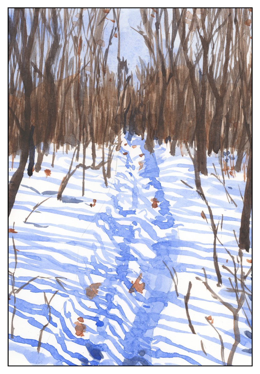
Two Color Studies: Trail in the Snow
Another two-color study, this time using Burnt Sienna instead of Burnt Umber, along with the Ultramarine Blue. As an aside, looking up lists of “warm” and “cool” colors, the umber and ultramarine are considered “warm” by some. Beats me, as they sure look icy together. Here, the Burnt Sienna alone or diluted is warm in cast, but moves to dark and cold (in my eye) when combined with the Ultramarine Blue.
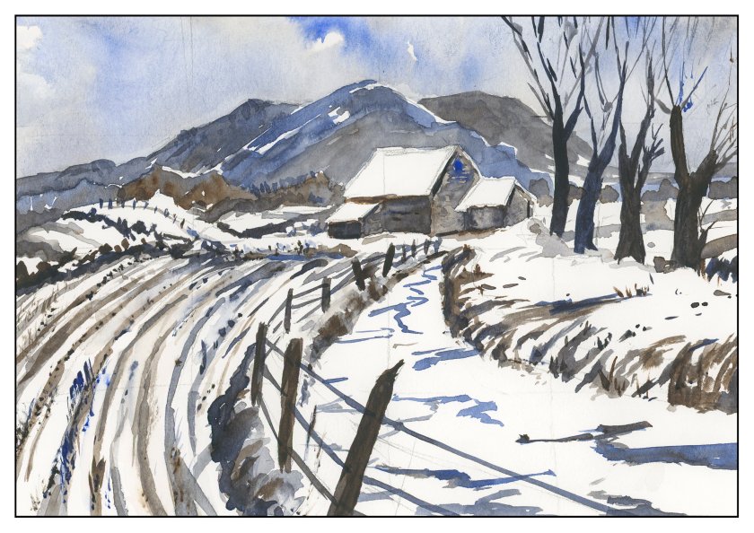
Studies: Roadside
Last summer we drove through a lot of the wild west. The loneliness of Wyoming always gets me – vistas of open space, few cars, fewer people. Taking a picture during the summer is much different than what you see in winter, so I looked at some of the photos I took out of the window as we drove from Laramie to the Tetons. I tried to imagine how barren and cold it could be. Always the sky, always the distance, always the barbed wire fences. Again, in Ultramarine Blue and Burnt Sienna.
Besides trying to imagine a scene, I also tried out a new brush. It is a Cosmotop flat, by DaVinci brushes of Germany; it’s about 3/4″ wide. I wanted to see how it would do on the Canson XL paper I use for practice, in particular to see if I could get a “sparkly” effect with a dry brush. The paper is too smooth for that to work successfully, which is why there are fine lines in the foreground. (Sigh.) It did a pretty good job for wet-in-wet sky, and along the horizon line.


