Windbreak

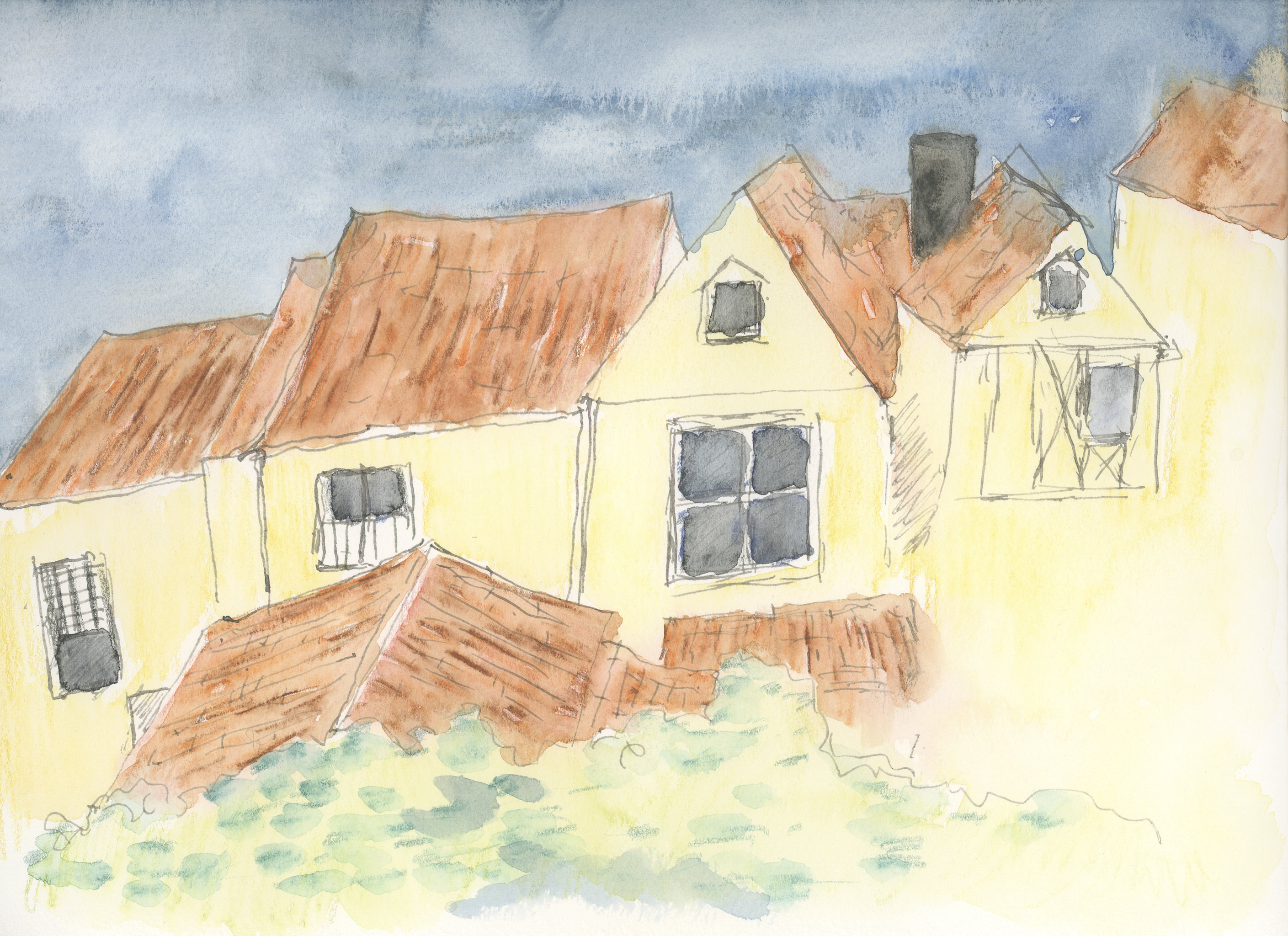
California is losing its farmland – development of tract homes played a big part in the loss of arable land. Now it’s floods and drought. But in a more perfect world, eucalyptus trees were planted between fields to keep the damage from wind – erosion – down, especially when the east winds blew.

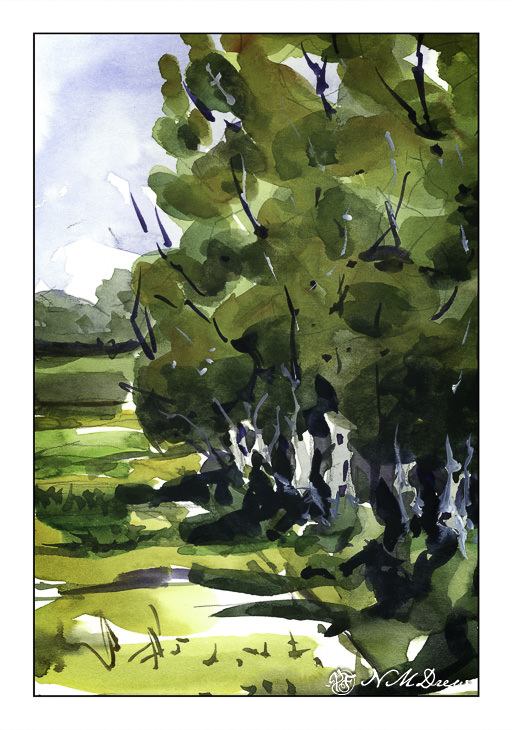
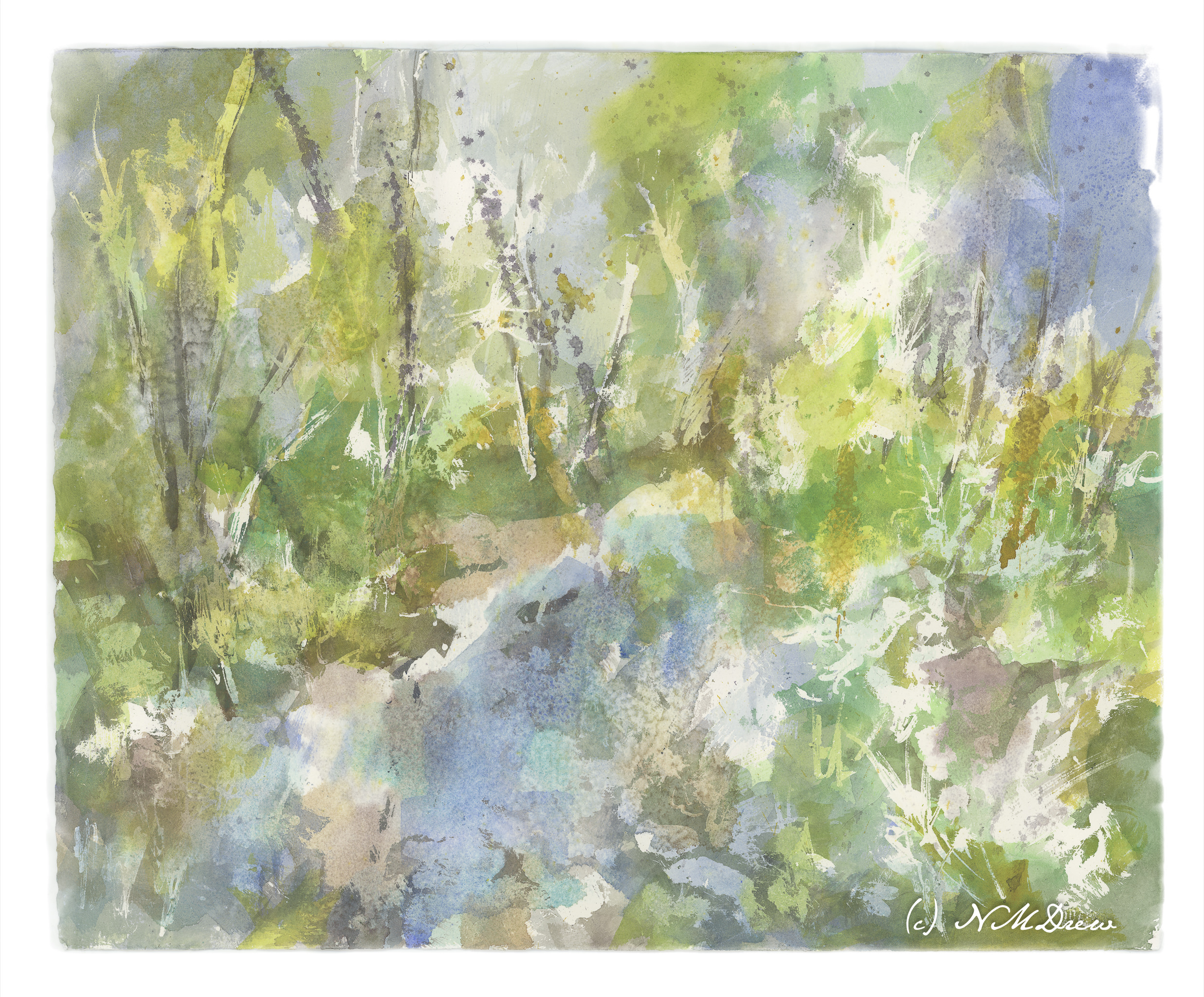
Here, more working with broad swaths of similar colors laid out in a wash. I did this one in a few layers. The first thing I did was the sky and the tree trunks. From there, a pale layer of varying color for the tree foliage, and second and third layers of the same, increasing in darkness. At the end, the field and track and a bit of stuff in the distance. Branches in both dark paint and in gouache.

I have been using Strathmore “Vision” 140# paper for this and other studies, and it is not too bad! Reasonably priced, and it seems to be holding up quite well to wetness and working. I haven’t tried larger sheets, but this may make me interested for practice.

Water Thaw – 2

Round 2!

First, I removed the liquid frisket. From there I added more color to increase contrast, again using the wide 1.5 inch flat brush. While the paint was still wet, I sprinkled on some kosher salt. After letting it dry, I again added more color, salt, and then spritzed it with rubbing alcohol. This morning I shook off the salt and now am contemplating what to do next. The first step, though, will be to add more frisket to help preserve the existing whites as well as some of the areas of color.

Such a crap shoot at times!!

Below you can compare the first image to the next.

Aspen Grove

I painted this using multiple layers of frisket on the paper.  On the first round, I blocked off the right side of the aspens.  Once I was fairly content with the overall image, I added frisket over various areas, such as the greens and browns of the foliage.  I made lines to represent trees, and dots to suggest a glint of sunshine on a leaf.  I did this three or four times on dried paint.  In the end, I removed the frisket, left some areas white, and painted over other white areas with transparent glazes, hoping to pull together different areas of the painting.  Finally, I made small dots of colored paint in the foliage, to suggest leaves.

This study was to utilize what I have been learning from the experience of following Rick Surowicz’s YouTube videos, as well as what I learned just painting.  This is the first time I conscientiously laid out a plan or method on how to approach the painting.  First, drawing.  Then frisket.  Next, washes of green, gold, brown, and oranges broad across the paper and blurred using a spray bottle and blotting.  From there, details, contrast, and so on.  Overall, I think my painting has taken a turn for the better.

Red Poppies

I always have loved vistas of wildflowers, and the red poppies seen in so many French paintings always seem wonderful to me.  Red like that is hard to find (I think) in the natural world.  Painting it is even harder.  I ended up using mostly Cadmium Red Orange.

This is another direct watercolor from this morning, but because of the multiple layers of washes, I had to let it dry in between.  I went about getting ready for work between layers.  At first, I just did a sky and put in colors of grasses and poppies – but they all bled together, so the second attempt – the one above – is the final version.  If you look at the pictures below – click on them to see them in sequence – you can see what I did.  I scanned each wash layer before doing the next.

Village Windows

Here is yesterday’s first layer of watercolor pencil, now “watercolored”.  I tried to follow the lines of the pencil.

Here is the second layer of watercolor pencil, with a little bit more detail.  The sky was done with about 4 or 5 colors, layered down with a blue, some white, some grey.  The roofs are an orange and a brown and a black.

As you can see, I also colored in the windows and am trying to add texture to the tiled roofs.  Some green, too, for the foliage in front.  After this, I then added water.  Once more, I followed the lines, such in the roofs.  The space on the lower right is a bit of a problem.  I think it needs something, but have no idea at this point.  Maybe a cafe awning so we can a shot of espresso?

As I have never used watercolor pencils for any complete picture, my cunningly brilliant plan is to simply layer color, then use water.  As you can see, there is some bleeding.  Most interesting to me is the sky – in the center the little bleeds are rather interesting.  In the windows, I also did some lifting of color with a dry brush to lighten the glass, as a reflection or to enhance a shadow.  The iron gall ink is beginning to blur into the colors.

I have no idea how many layers I will end up with, but I am going to try to do glazes / layers to represent shadow and form.  No idea how successful this will be!