Lavender #2 – Stage 1

Hurricane Hilary is supposedly barreling toward SoCal, so after battening down the hatches and getting a virus and sleeping for more hours during the day and night than normal, running a fever, I finally emerged with some sense of clarity today and accomplishment insofar and I am awake-ish and my mind may be capable of functioning. And, I am bored with being so uncreative and dedicated to duty and chores that need to be done despite the desire to crawl back into bed.

So, more lavender. Let’s just call it Lavender #2 for now, as I am sure there will be other versions sometime in the future. Stage One is below.

I am using the Golden Fluid Acrylics again, and really do like them the more I use them. The paper is some badly sized watercolor paper which is fine for acrylics and dreadful for watercolors. It is 15×20. I mounted it on a piece of coroplast with some tape and went to work. Because of its size I put it on my easel.
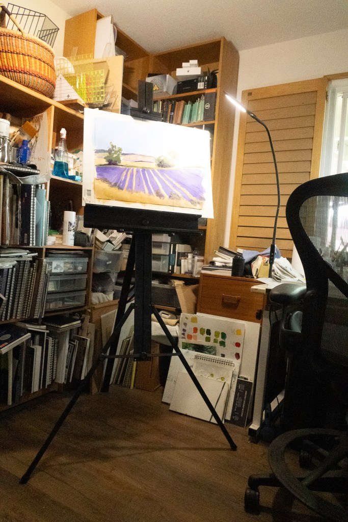
I have my paints to the right, with the window facing east. Lots of LEDs with variable lighting – I hate overheads! Anyway, I adjusted the easel to my height and find I rather like this set up. The easel is lightweight aluminum and folds flat. The esposo is kind enough to fetch it when asked as it resides on a shelf in the garage, up high and out of the way.

Colors, at this point, are limited. So far I have used yellow ochre, chrome green, carbazole violet, titanium white, cobalt blue, ultramarine blue, and a drop or two of cadmium yellow medium. My palette is a mess. I just cannot create a tidy one like other artists . . .

For today, I am done. I am getting tired, but painting is refreshing! That is definitely good for the soul.

Under a Summer Sky

More Pointillism!

This painting was done on a larger sheet of paper than my earlier ones as my sketch book was filled and finished with the painting of the other day. I began with a thin wash of gouache, putting in the basic colors of the sky, fields, house and trees. From there, I began the dots. And more dots. And even more dots. Paint went from thin to thick, and thin again. Dots were bigger and smaller. The closer I came to the completion of the painting, the more I began to use the paint to shape the different areas of the subject. I tried to use some complementary colors in shadows, such as red in the shadows of the trees, and bright yellow to enliven the lavender. Altogether, this painting took about 3-4 hours to complete (I lost track of time), but in the end, the dots were worth the effort.

I think I could live here.

Icky and Not Too Icky

Let’s start with the flowers I did that I like.  Spontaneous background, flat brush, working on edge of brush for dots and lines of stems and flowers.  No pencil drawing.  I liked painting this one a lot.  Not so icky.

This one absolutely sucks.  Pencil drawing.  Overworked.  I was ready to snap the brushes and burn down the house.  I really hated doing this painting as it so uptight.  Icky.  Icky.  Icky.

Lavender Field

Pastels are getting to be addictive.  Unfortunately, this scan for some reason came out a bit too yellow-green, but I wasn’t interesting in putzing with it!

I tried a few different things here – in particular how I made marks.  Vertical and horizontal to contrast.  Obviously the lavender is vertical and tilty, but in between, horizontal helps create some interest.  The trees I used a torchon to scumble and blend the colors, as well as push shapes into the sky.

I know I am getting addicted to this – I just ordered a roll of Uart 600 grit sanded paper – 56 x 10 yards.  That should last awhile!  This was done on a 9 x 12 inch bit of Canson Mi Teintes, which is a very nice paper, but unsanded.  I like them both.