Snowfall

Christmas Day! Nothing like a snowfall and the cold and the quiet of the woods for remembering the magic of the season. New and old traditions overlap, memories and hopes for the future all seem to be rolled into the end of the year and depth of winter. The stillness of the winter woods gives pause to our crazy lives. Holidays of any sort at this time of the year make us look backward as well as forward.

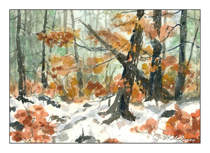
Here I worked from very light to dark. The colors I used for the greenish-blue sky were cobalt teal, a bit of ultramarine, and a touch of Hooker’s green, neutralized by a bit of alizarin. The leaves and autumnal foliage were various siennas and orange with a touch of Indian yellow. Trunks, from light to dark, were essentially ultramarine with burnt sienna and raw umber with a bit of Payne’s grey. Snow shadows were ultramarine and Payne’s grey. Finally, I watered down some titanium white gouache and tapped my brush across my forefinger to look like falling snow after applying a few lines and dots in white here and there.

This is another watercolor which pleases me. Perhaps I should stick to Arches Rough paper instead of my usual cold press . . . ?

Have a wonderful Christmas Day – or whatever it is you celebrate!

Watercolor, Arches Rough 140# paper, 10×14.

Later in the Day

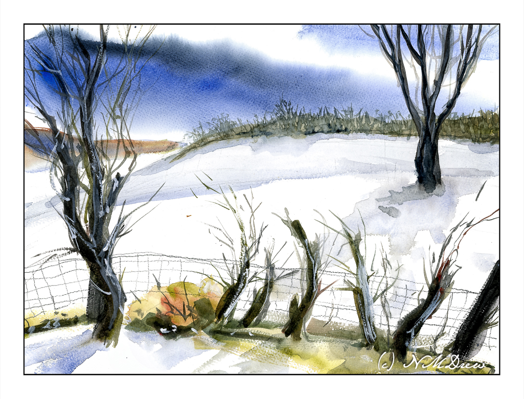
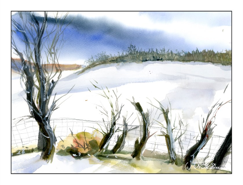
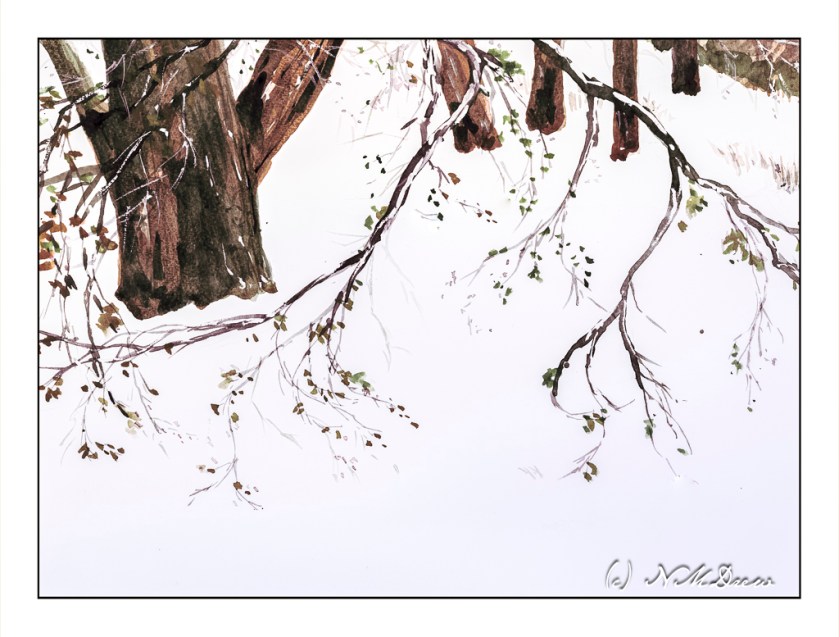
A few days before Christmas and, while I don’t live in it, I do enjoy a snowy holiday! I’ve always thought that a walk in the woods, in the snow, on a misty but sunny day is the best way to enjoy the cold. Colors are soft in the distance. The contrast of bright white against dark branches and trunks is fascinating, creating twisty patterns on the intertwined branches of bushes and young trees devoid of leaves. There are lines and blobs, shades of blue and grey snow, bright white and deep shadow.

I used a limited palette here – mostly umbers, sienna, some yellow, blues. A touch of alizarin, too, to make some warmth. One of the goals of this painting was to create a soft view of buildings in the distance, suggestive of a misty sunniness. The pale blue of the sky is barely there. I used a lot of water for this effect! Coming closer to the viewer, colors are a bit brighter and shapes more evident. In the woods, sharp trees, shadows, snow, plants.

To date, I think this is one of my better watercolors.

Watercolor, Arches rough 140# paper, 10×14.

Shades of Grey?

Recently it has brought to my attention that my watercolors have very intense colors with strong contrast – too strong colors and clashing contrast. It is an interesting thought. Often I feel my colors are a bit over the top, but after working hard to get rid of mud and blandness, I worked to have more pure colors. Now that I can do this, perhaps it is time to scale back a bit. This means, the way I see it, is to create more middle tone values in general throughout a painting, and then have areas of light and dark.

So, let’s begin. On Pixabay I downloaded an image which was not too complicated but, in color, provided a pleasant array of colors and a few areas of bright and dark while the overall tone was middle values

As you can see, the shadow in the left middle ground is strong, as is the tree on the right, as well as bits of the buildings and trees. I converted this to grey scale to see how well it held up to my perceptions in color to actual black and white.

My suspicions were confirmed! My eyes did not deceive me! And, if you are interested, I simply desaturated the photograph by reducing the vibrancy and saturation in Lightroom Classic.

From here, on to my watercolor. I chose a limited but coherent palette of about 6-7 colors – yellow, green, red, blue, browns. Which ones I chose, I don’t recall, but I worked to create secondary and tertiary colors while I painted. My painting is meant to replicate values in the painting as well as make it recognizable without painstaking details. Below is my color rendition.

My painting looks a bit more dynamic than the photograph, I think, but it is interesting to see how it looks in black and white – again done in LR by reducing vibrancy and saturation.

Overall, most of this painting is in middle values of grey with some areas of bright and dark. So, I did achieve what I set out to do. I plan to work on this a bit to see if I like my paintings better – and, I expect I probably will. Working with color is challenging as colors distract so easily from value!!

Thoughts?

Watercolors, Hahnemuhle CP paper, 9×12.

Transition

Even though seasonal changes in SoCal are subtle, elsewhere in the state, further north or at higher elevations, shifts in color and temperature are more apparent. The tilt of the earth changes the light, winter pushes trees to change colors and lose their leaves. Temperatures drop. While today is about 73F, two weeks ago it was in the 50s (no snow, yay!) and nights are chilly. So, let’s celebrate the shift of summer to fall, and now fall to winter.

For me, this is a rather complex painting. Rocks and sandy shore, trees and brush, water, sky and reflections in the creek. Remembering the “rule” – simple big shapes, moderate shapes, details last, I worked by creating the most noticeable areas – or certainly the ones I felt could be the most challenging. This meant the creek in particular – keeping the water marked out. As well as that, the shoreline in the foreground coupled with bits of sandy shore on the right. After that, the rocks on the left and foliage of trees. I was all over the place working larger to smaller, light or dark, and then on to light or dark details.

Overall, I think this painting worked out. Analyzing its complexity and then breaking it into its larger components and areas of color helped. It is still not quite what I would have liked to produce, but much of it did succeed.

Watercolor, Hahnemuhle paper, about 10×12.

Above the Treeline – Mountain Peak & Snow

As always, I can never fail to but enthusiastically recommend the short watercolor courses by Shari Blaukopf! Her most recent one is called “Peaks and Valleys.” It is inspired by her trip into the Alps while teaching a class. Having lived near the Rocky Mountains in Colorado and driven through them many times, I found this course especially fun to do. Shari’s instruction is clear and to the point, but her lovely personality shows through to make the lessons personable and friendly.

I am not going to show you the subject matter I have done so far in the course. Instead, I am going to show you what I learned to put into my own painting. My reference for this watercolor was a mountain peak photo found on Pixabay – the best resource for public domain, royalty free photos (and other things, too!).

Mont Blanc was the first mountain top study in this course. At 14,000 feet, it is way above the timberline, covered in snow, and nothing else than barren rock and clouds. At this elevation, the view across the Alps must have been amazing with ridges of more and more mountains before and beyond Mont Blanc itself. To paint it, essentially blues and browns were used in the class – cobalt, ultramarine, burnt sienna – with the addition of Payne’s grey, some organic viridian, and yellow ochre to neutralize of brighten the colors. Myself, for this painting, I stayed pretty much with these colors, but threw in some dioxazine purple as well.

It seems that the one most important lesson I fail to really retain when I watercolor is to be patient and think ahead on what I want to do. Taking a class such as this make me remember to plan ahead.

On the other hand much of my color mixing is automatic because I am familiar with how my colors look and blend, but my natural impatience is sorely tested. This is where 99% of my mishaps occur – rushing. With this painting, not so much because I started playing a game with myself – how will I plot my next step? I didn’t do a value study, but I want to try to do that more often. Here, the strong contrasts of light and dark, warm and cold, made the values and contrast easy to perceive.

I am rather pleased with this painting. It is cold and starkly beautiful, and that was the whole point of this painting.

Watercolor, Arches 140# CP, 9 x 12.