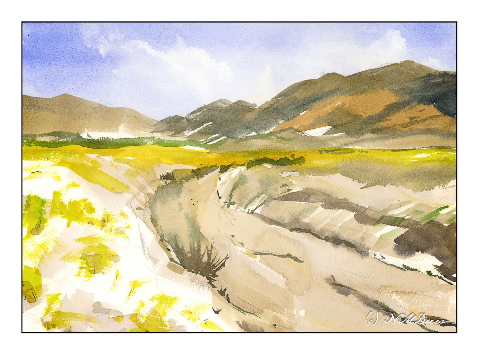
Another view of the desert in bloom. Rains bring out all sorts of wonderful things to see in Death Valley, from vanished lakes to tiny, colorful flowers which cover the sandy soil, before vanishing as the season changes and the heat returns.
I have been painting too much in oils – slow process, very satisfying, but it doesn’t come close to watercolors. I needed to take a break from it and return to my first love . . .
We have had a few good rains this year, and that can mean the desert blooms! The plain beige becomes green and flowers blossom. Sparse, harsh landscapes become far more gentle and welcoming. Death Valley was filled with life this year.
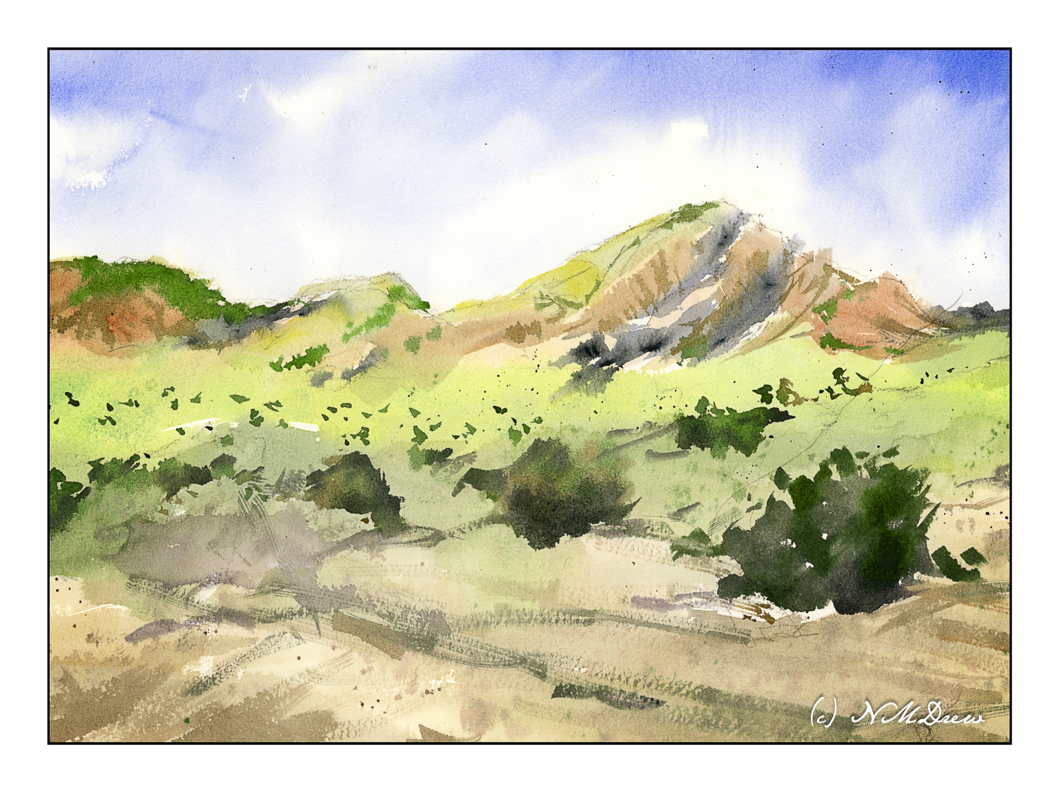
The southeastern corner of California is primarily desert. The land varies. There are hot springs, mountains, little rainfall, sparse vegetation. Days can be hot, nights can be cold. Within it are contained major parks and areas, which include Mojave National Preserve, Joshua Tree National Park, Death Valley and the Anza Borrego Desert State Park. Farming here is supported by irrigation from the Colorado River, but as times go by, the Colorado is not able to support farming as it once did. Despite its rather hostile environment – at least to people in some ways – this part of California is stunning. Its austere beauty is something perhaps not appreciated initially, but with time and observation, it becomes a magical landscape. There are towns, too, where you can stay to visit and learn a bit about the desert and its land and people.
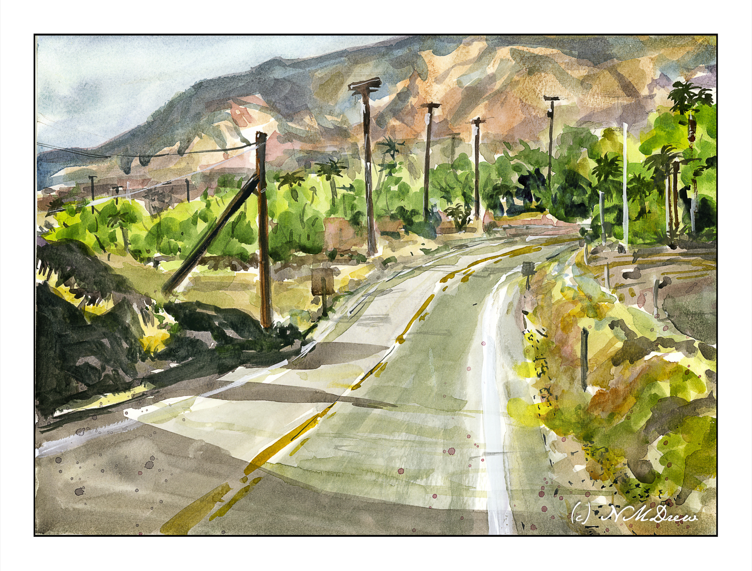
This afternoon was a sort of what-do-I-want-to-do day. I really didn’t know. The winds are up right now, and anything done outdoors would require hanging onto everything. So, an indoor watercolor rather than an outdoor oil painting was my choice. And as far as any planning – well, let’s just say I did this on the proverbial wing and a prayer.
Overall, I blocked in the major color areas, using lighter colors. First came the sky, then the mountains of blue and orange brown. The road was limned in, along with the greens of the vegetation. Once dried, details were added. I used the hair dryer a lot! Finally, white gouache here and there, splatters of reddish and bluish paint, and here we are.
I am quite surprised that it turned out as well as it did – at least in my opinion!
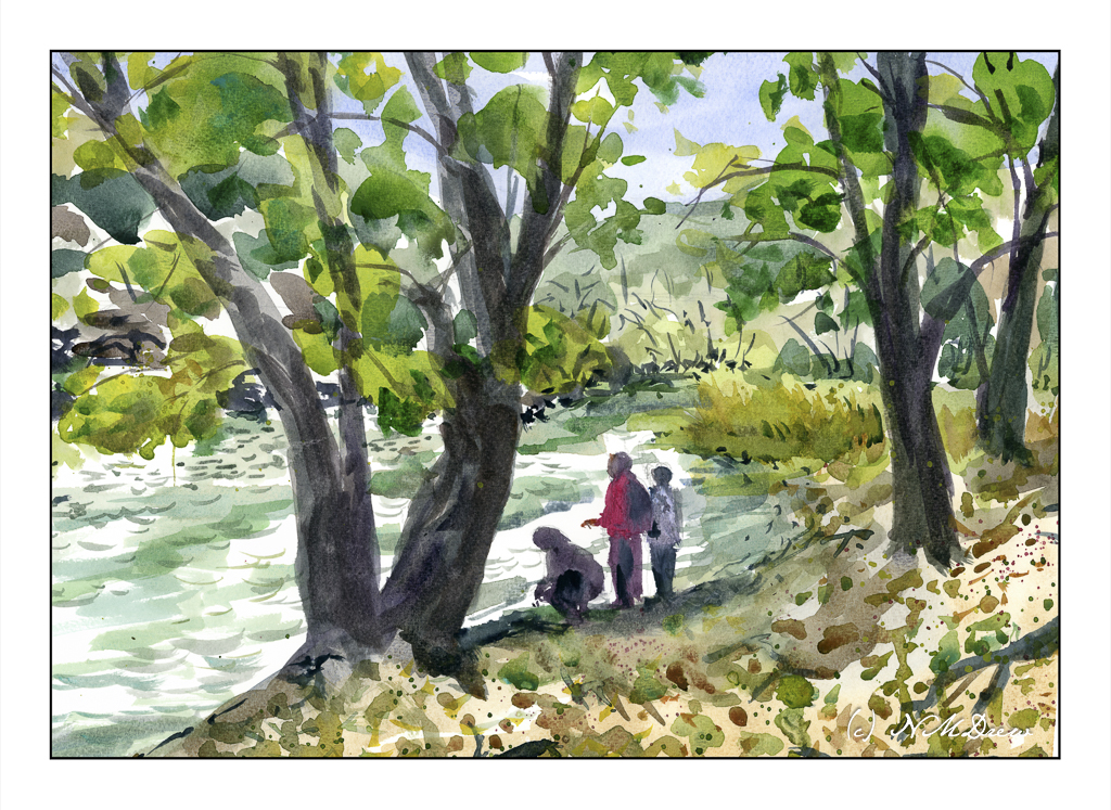
This painting is based upon a pubic domain photo by Natividad Chavez of the BLM (Bureau of Land Management) taken at the Cronan Ranch Regional Trails Park in Pilot Hill, CA. Northern California has some absolutely beautiful landscapes. As well, the BLM showcases some truly magical parts of the country, areas both easy to get to and others quite remote, requiring hours to reach.
What I liked about the scene was the curve of the water and the people standing on the river’s shore beneath the trees. While my execution of the light was not what I wanted, I am rather pleased with other parts of it. And, it has people in it!
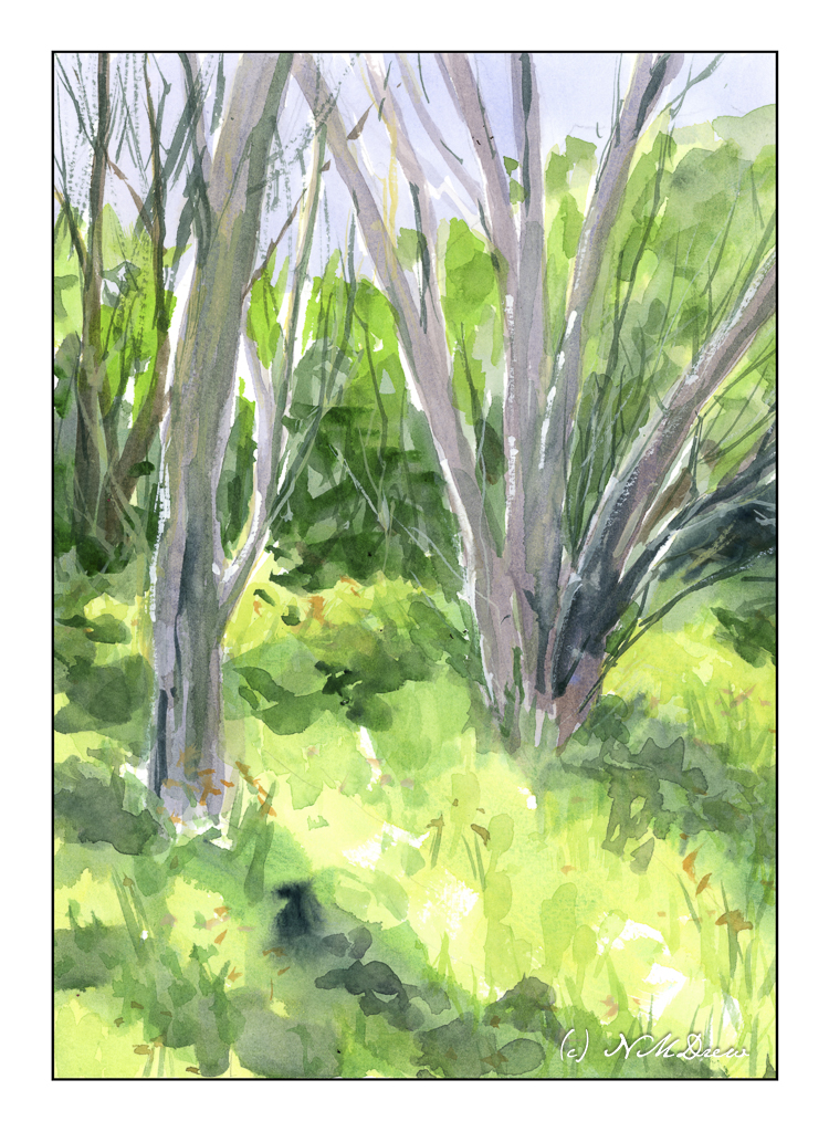
There are some days where chaos is the daily menu and you just have to flow with it. I had an appointment in the morning so I could go to my painting class in the afternoon. Well, that appointment turned into a hurry-up-and-wait-for-a-phone-call situation. Solution? Watercolor!
This painting is loosely based on a photograph I took while out at the settling ponds in Ventura. In California, “Spring” happens after any rainstorm. The brown grasses green, trees bud, flowers bloom. It’s the nature of the beast. We had rain yesterday and have another big storm coming in next week. In the days before my visit to the settling ponds, we had a lot of rain, and the result is this lovely little bit of trees and grass. Hard to believe this is within walking distance to the beach!
I did a bit of post in LR on the photo, but it does catch the sense of Spring, I think.