Another practice study from Peter Sheeler. Here he uses masking tape – painters tape – to create a frisket. He tore pieces of tape and pressed them into the paper, as a resist to the dry brush technique he used to create the sense of a very windy laundry day. As a kid, I remember those days, pegging the clothes and sheets. It was a lot of fun, a lot of work, but always worth the smell of fresh air on your sheets when you went to bed.
First, here is the picture with the “laundry” masked with randomly torn bits of painter’s tape.
And here is the final picture. To frame the picture, I used more tape around the edges of the picture. If you watch the video, you’ll see why!
Once again, a demonstration from Peter Sheeler which I used for a card for my sister-in-law.
Peter’s is far more masterful than mine! Who’d have thought a simple leaf could be so difficult? I went in afterwards and inked in some extra lines and put a frame around the picture – the leaf looks like it is floating in space.
As a present, my sister-in-law asked for some hand-painted cards. Given I have enjoyed Peter Sheeler’s videos, I thought I would use his exercises as a way to practice painting, and fulfill a family member’s request for a Christmas present! Here is Mr. Sheeler’s video:
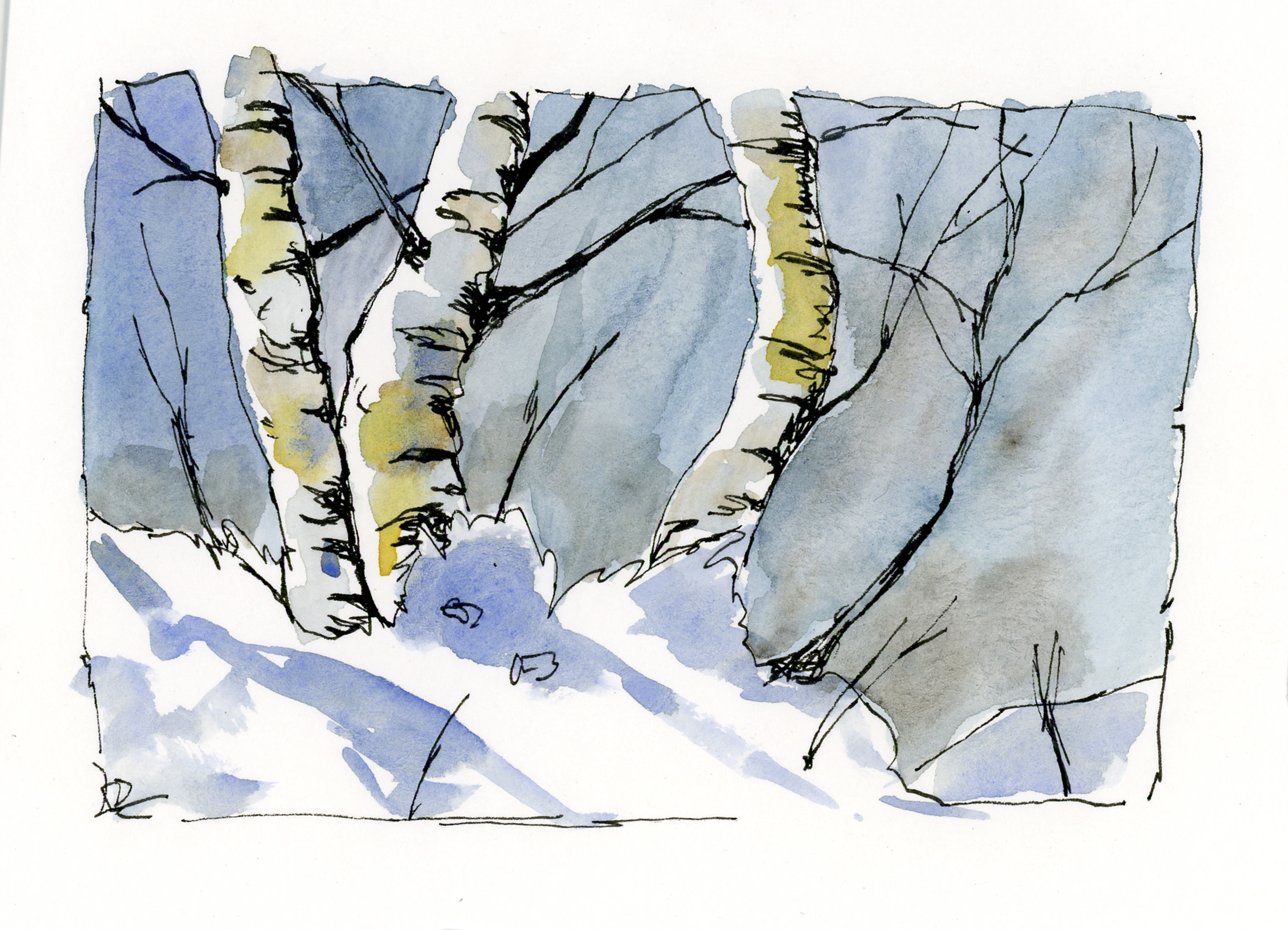
Birch trees are some of the easiest and most lovely trees to draw or paint. The white trunks and white snow made for a good chance to work at keeping white space. The other thing is that the palette was limited, which I am beginning to find refreshing – a lot of colors can be made from two or three.
My sister-in-law requested hand-painted cards for a Christmas present. She’s getting them! Out of all of these, 6 were from exercises I did following Peter Sheeler’s YouTube painting tutorials. What made them particularly useful, to me, was that many of them had a lot of white space in them, such as white snow or flowers. The other thing was the simplicity of composition – a few trees, a stream, some flowers. While they look easy, I did need to focus on the videos to follow the sequence of painting, as well as to focus on what I was seeing. Of all of them, I think the stream was the most challenging.
From using Peter’s videos to practice with, and to create cards, I went on to do two based upon photos I have taken. One is a prickly pear which really does sit on a heart-shaped paddle, and the California poppy fields at the State Preserve. The latter made me think of Monet’s painting of a woman in a poppy field – the brilliant colors against a sea of green. Our poppies in California are orange and yellow, so no reds, but mixed in with these colors are blues and whites and so many other colors it is hard to imagine that much of California once looked like that in the springtime!
Below are the different cards I did. Click on one of them to start the slide show.
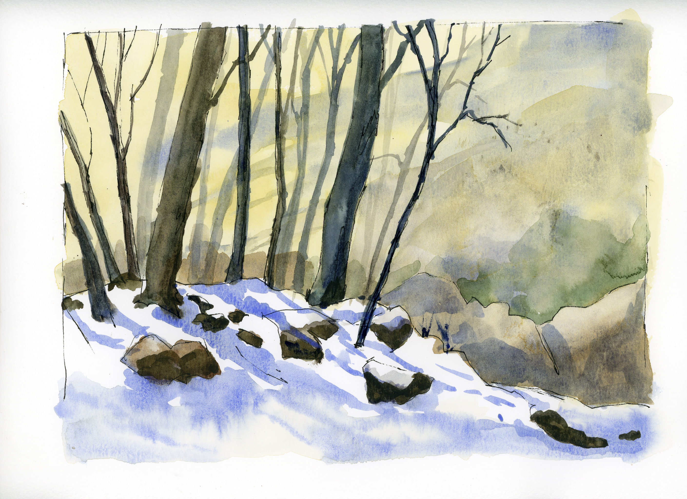
This morning, in a room only lit by the light of my monitors, and a half-drunk cup of coffee at hand, I decided to go ahead and watch Peter Sheeler’s video above, and try to do a painting. I dragged out a bowl for water, a few brushes, and my travel palette. I sort of know where my colors are, so what the heck – paint and draw away.
I pretty much followed what Peter did, but obviously his work is better than mine. Despite that, I did learn a few more things. One thing I have always liked – and will continue to like – is ink with color. Using a limited palette is also fun as it really helps you keep yourself under control. I think – remember, it was dark, and I was only half of cup of coffee into my morning! – I used yellow ochre, quin gold, a bit of viridian, a bit of alizarin, indathrene and ultramarine blues, and burnt sienna. Some of these were just little dabs because I couldn’t see very well, but the main colors were the sienna and blues.
That said, below is a scan of my painting before putting in the final lines.
Objectively, it’s okay. There are some nice areas, and there certainly is some white space (yay! white space!), which is why I am focusing on snow painting practices. Some good light – dark areas. A nice bleed or two. Other areas are dreadful, such as that greenish area on the mid-right side.
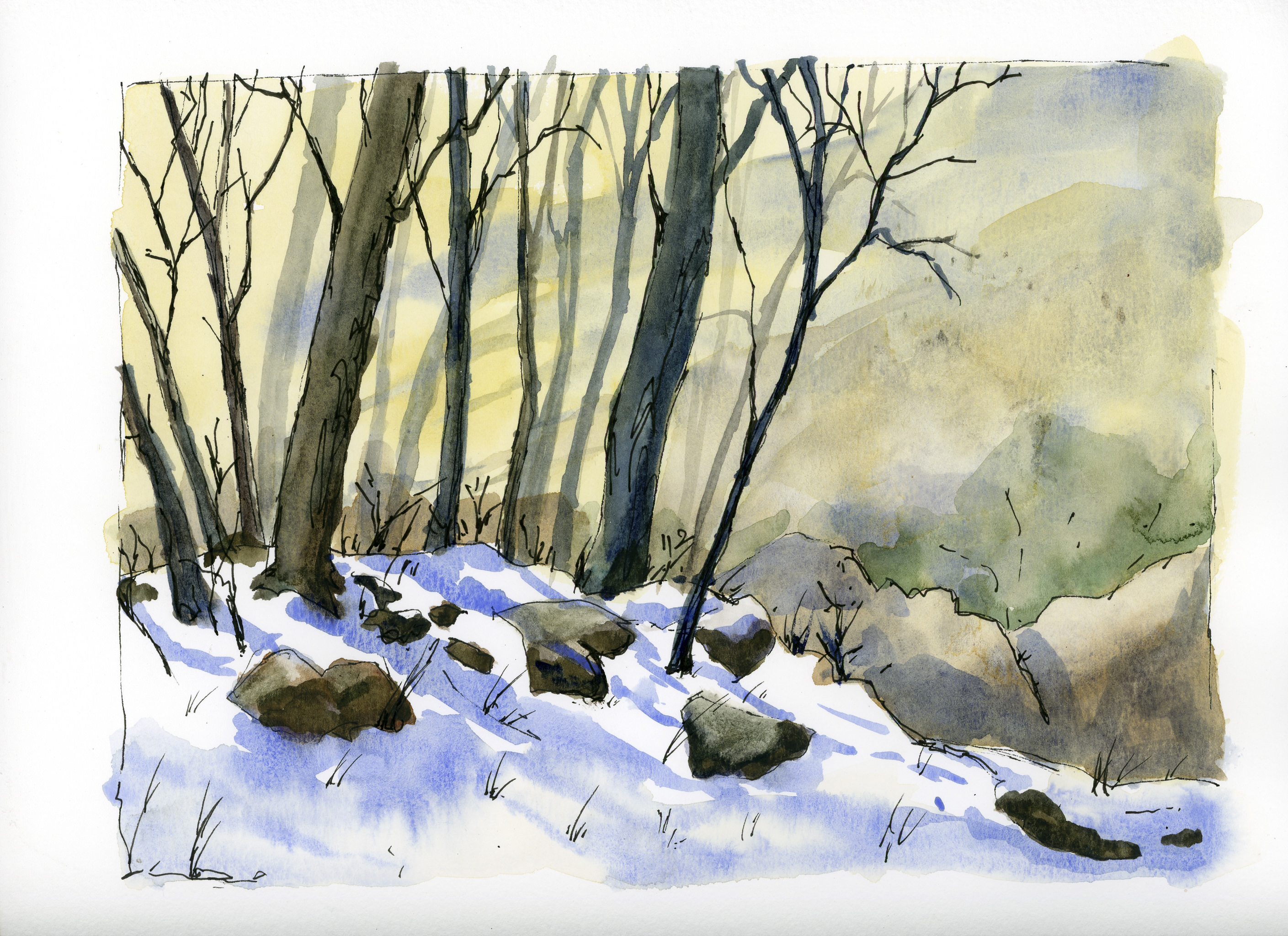
Below, the inked in version.
Frankly, I like the final one better as there is more definition. Now – finish that coffee and jet off to work.


")

")