Sketching with Shari, ii

It seems as if my life has been in a frenzy with multiple little tasks to be done before the day’s fun can begin! Today is no exception – banking, bills, dishes, housework – and then little petty things that pop up, like buying a bit of something for dinner as we have no leftovers today. Yes, we have no leftovers! And no bananas.

Nonetheless . . . I did complete the second exercise series in Shari Blaukopf’s most recent online class of pen and ink. This time we have a square somewhere in France. I know because she said so! This time it was to be done with a water soluble ink, of which I have none, so I again played with diluted permanent ink. In a few areas I wet the paper and then drew with a permanent pen, but I don’t like that as it seems to mess up a pen’s nib.

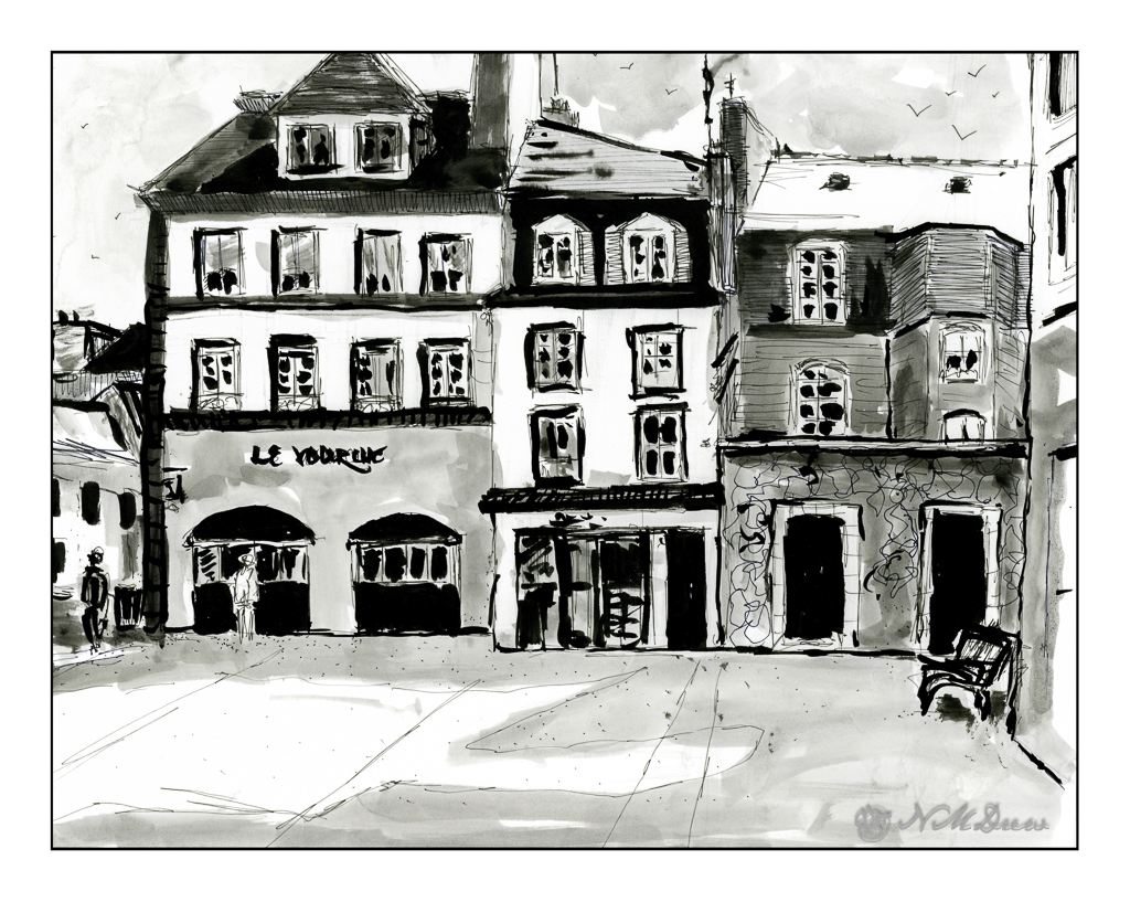
This is done on Bristol paper, very smooth but fairly heavy. The lack of tooth can be very nice when drawing with pen and ink as well as washes. My lines are a bit wonky here and there – earthquake? – and people are not well done, but I struggled most with the park bench on the right!! I will say I don’t like my results as much as I did the first exercise, but this is also a far larger drawing, taking up the entire sheet of 11×14 paper. Still, it was fun and satisfying to do.

Bristol paper, 11×14, ink, pen, ink washes.

Sketching with Shari, i

I think I have purchased every single course that Shari Blaukopf has online! She is such a good teacher, puts together short and affordable courses, and I always learn a few things – or oodles of things – from her! Her latest one is “Sketching Techniques with Pens and Inks” which you can check out here. I do a lot of pen and ink, but figured I would dip into this one just to see what I could learn. And, I did – such as a more clear way to view things from eye level. Ellipses become more round below and above eye level (duh!), and she explained it in a way that made me review my own way of drawing a bit, and perhaps will help me solve some perspective problems.

So, this first one is a potted plant in a planter somewhere in France. It’s a cool planter, too. Shari pointed out that it is good to begin with the big shapes and determine ratios. Top is a circle for the pruned tree or bush. Make a square, insert your circle. Below is the trunk, and beneath that is a large rectangular shape which you can divide into upper pot and lower pot, as well as the stand. Texture a bit for the gravel and stones upon which this planter stands. Shari put in light pencil lines, which she later erased in her video, but I left these in. You can see them very lightly in the painting. Contrast and shape coupled with expressive lines and here we are.

The Victorian door is considerably more complex than the planter, but once more Shari’s clear instructions helped me set up the proportions to make things work. Both the planter and this door came with reference photos, which is very helpful because things can become a bit confusing. This subject was definitely a challenge.

The detail in this subject matter makes for a desire to put it in – one of the good things about pen and ink – but I also needed to make sure I did not lose a sense of light and dark. I used waterproof ink, but to get the greys I put a bit on a plate and used it straight or diluted it as needed. I check the values to the side of the drawing before inking. Lines and dots also add to the texture and contrast of the drawing.

I like my potted plant as it works well with contrast, value, and textures. The Victorian door is more complex. Under the stairs is a second door, and I may go back in and fictionalize it a bit or darken it a bit to the right of the stairs. Something to look at and rethink.

Sailor black ink; fountain pen with Sailor ink; water and brush. Strathmore Bristol paper.

Along the Colorado

Two different scans, and neither is truly exact. That was planned. I decided to change the mood of the scans – one in Epson Scan and the other in VueScan. Don’t remember which is which. The moods were to be bright and sunny, breaking through rain clouds perhaps, and the other just rather cold and gloomy when the sun has vanished behind heavy clouds.

Above, the warm colors are being pushed – yellow, orange. A bit of glow to try to express that sudden brightness you see when the light changes rapidly because of the weather.

And now the light has changed – potential rain and bad weather. I expect there is a bit of wind, too!

Technically, I drew in the landscape with a waterproof pen, painted, and then drew some more. The mesas’ slopes are a bit steeper than reality as these are about 45 degrees, and in real life, I think they are more shallow, about 30 degrees. Artistic license?

Watercolors, ink, Hahnemuhle 300gsm CP paper, about 9×12.

Afternoon Sketches

It’s a nice semi-sunny day this afternoon, and the wind is soft, the temp is about 70F. It’s perfect for spending a bit of time sketching in ink and color some of the remaining plants after the winter clean-out.

These hot peppers are from last year – and it appears they are getting some new ones! The little tiny blobs of orange are this year’s crop – I guess it is time to harvest some of last year’s fruit. We don’t know how hot these peppers are, but we should give them a shot.

I have three different lavender plants. I am not sure which one this is – I have a tag, but am feeling too lazy to investigate. What appeals to me is the bright purple flowers above the soft grey-green foliage. They look like tiny purple butterflies to me.

This is the tulip tree which graces my front yard. It’s a strange tree – not really a good one for a neighborhood. It tends to be brittle and branches can break and fall. We have had some 6 footers and then some fall onto the sidewalk below. And then it oozes sap all over the sidewalk. Birds love it – sparrows, crows, doves, and owls have been known to visit. The leaves are an interesting shape, and while it flowers, they are not showy. However, come autumn, the leaves turn an amazing yellow-gold and drop onto the lawn – and this is what makes it so beautiful to me. Add to that, right now the bare branches and twigs are just lovely against the sky.

Colors here are very limited. For the peppers I used organic vermilion, cad and lemon yellow, a bit of Hooker’s green and cobalt teal. The lavender was carbozole violet, and the foliage was a mix of lavender, Hooker’s, and yellows. The tulip tree is primarily the leftovers on the palette, so who know what the colors could be!

And now, time to head out for some fine Thai food provided by Auntie Am and Uncle Ed!

Foxglove & Milkweed

After all the stress of fire and fears of fire, no electricity, setting up a generator, yesterday was just a nice, normal, and pleasantly dull day. The usual daily chores got done, things were cleaned and straightened, the yard cleared of debris. My fig tree is also pruned and ready for its next crop – the first new tips are already pushing their way into the world and bulbs are sending up new growth. Little things like this make for a much better day.

I got to see all this, and then settle onto a patio chair just to look around. With wind and cold, being outside was not much fun, and certainly not a place to sit with pen and ink. With it gone, I could settle and sit, enjoying the warmth of the day. And draw . . . above is a sketch of my dead foxgloves – the leaves are dried and flopping over the edge of the pot, under and over each other, and into the milkweed plants.

A friend gave me a wonderful pen, a cheapie from Amazon. The ink is waterproof, and the tip is fine. The paper I am drawing upon has a bit of tooth, and the result, for me, is wonderful. When lines are drawn more quickly, the ink breaks up and gives texture. The pen point is sharp enough to deliver beautiful dots. In between, the lines are steady and solid. All together, a great drawing experience.

A few years ago, Josh and I spent a number of days in Decorah, Iowa, and there I found a lovely little stationary – art supply store. An inexpensive set of pan paints was available, and I have found it to be perfect for adding color to an ink drawing. The colors are intense but not overly so, and seem to be of a transparency many fine watercolors possess. I have been using it a lot for such pictures. The colors mix together well, and with a light touch with water and brush, these paints (with a bit of help from yours truly) work very well with delicate drawings.

Ink, pen, watercolor on multimedia paper. About 5 x 10 inches.