Adobe

Yesterday was Easter, a quiet time for us. The day was gorgeous and the weather so pleasant – perfect Spring. I love the way the light catches as the seasons turn, and the clear, dry air of the southwest pushes colors to a harshness which at high noon can be glaring, but early or late in the day, when the shadows are long, the light is clear and bright but doesn’t hurt your eyes.

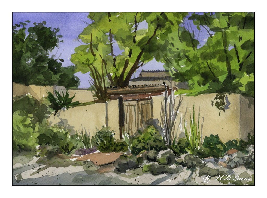
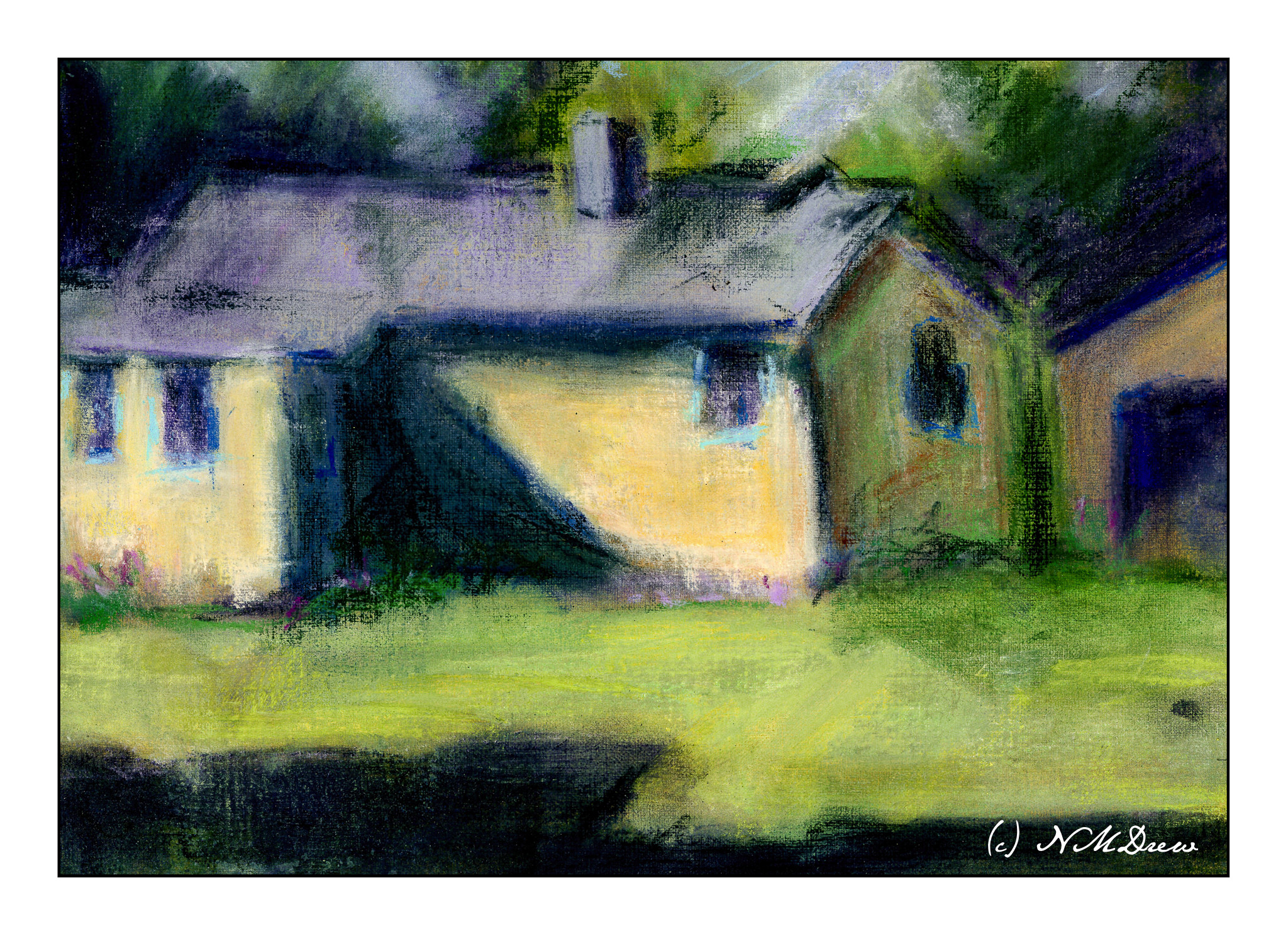
For the past several days I have been working in watercolors on smooth paper to practice pale colors which would work well with ink. I think I am getting it. Easter Sunday, though, I was getting a bit bored with the colors I was using as well as the lack of papery tooth to hold colors. As a challenge, I decided to paint a building. I realized why I am intimidated by buildings – they have straight lines and a jerk of the brush can ruin a good, hard edge.

A few straight line glitches, but I will say I am pleased with what I did here. I took my time and tried to create a simplification of a complex structure that works well with shape, shadow, contrast. I know where I messed up my straight lines, but you can find them and tell me if you like!

Watercolor, Arches CP 140# paper, 9×12.

The House in Back, Albuquerque

Double lots are interesting as often you find an old, beat up house behind one that looks great from the street. Such is this – an old stucco house with turquoise trim on a back lot in Albuquerque. Not a fancy house, but one which makes for a great study.

This is another pastel done on the paper I created using yellow ochre and Golden pastel medium. It works pretty good so far! I laid in values, working from large to small, adding details at the end. As with oils, the work was done dark to light. In between each layer, after knocking off the pastel dust, I sprayed it with rubbing alcohol, and used alcohol as the final sealant. As with any sealant on pastel, the colors end up becoming darker, so I worked to make this a bit lighter than I thought it should be. Some post-scan twiddling in LR, too.

As an aside, my air purifier arrived, so I have it turned on and used it during the painting process as well as wore a protective mask. I damp wiped all my surfaces the best I could as well.

Nupastels, soft pastels, Rembrandt pastels, Terry Ludwig pastels, Jack Richeson pastels on Canson XL oil / acrylic paper primed with Golden pastel ground and yellow ochre paint. 9×12.

Tomorrow I think I will prime some watercolor paper to see how it does as a painting surface.

Evolution

Several weeks ago I started an acrylic painting of a building at the end of a road. It was sort of painted in a traditional manner, meaning I was trying to represent reality. Truthfully, it bored the hell out of me, but I kept it as it was fairly decent in my opinion, but it did put me to sleep. 

Working with brighter colors of late has really been exciting for me as I feel much more of a connection to the colors I use than I do to subject matter. Subject matter can be anything – but colors express more to me and are more true to who I am (a magpie reincarnated as an old bat) than subject matter in general. So, I took the painting and painted over it. Below is the original.

This is a photograph I took and it is pretty crap (above) as there is a lot of weird stuff going on. I didn’t think it scanning it because of its size. This morning I scanned my current iteration of this painting.

I like this much better, but it is not quite done. I need to work on the road in the foreground as well as details of the building. More windows, fix windows, fewer windows? Create some focus at the end of the road? Fix the road? Cast some shadows – creating light and dark – across the road?

Many things to consider here. I am going to let it sit and ignore it awhile. If you have any ideas, let me know!

Acrylic, canvas, 18×24, scanned on an Epson V600.

Lost

Coming from a family where family history is lost or suppressed or deliberately forgotten, I always have a bit of nostalgia for old things and memories and stories. Life in the future seems forbidding and apocalyptic, especially these days, so looking backward to areas of familiarity feels good and safe. Good because there are good memories, and safe because I know what was what (as best one ever can), and even though there were areas of ambiguity or fear or confusion, familiarity can help. Getting older has the same effect – familiarity. Falling in love as a teen is not the same as falling in love at 40!

Anyway, I put the black and white capabilities of a digital camera to work. The original photo was quite gritty and really not interesting as far as I was concerned, but then I putzed a bit and thought that a sepia print – faded black and white – and a deckled border could do the trick.

Artistic impulse satisfied!

Nostalgia satisfied!

Good memories of esposo and pooches add to the mix, and here you are.