I asked for some criticism on this painting I did a few weeks ago. Below is the original scan.
Posted April 2022
Some opinions were that it was lacking in depth, and that the right and left sides needed to match better. So, today, finally got around to doing some modifications. Here is the new painting.
Round 2 – 5/2022
Let me know what you think. The newest scan is a bit more vibrant than the other, so keep that in mind. My class is tomorrow afternoon, so I will talk to my teacher, too.
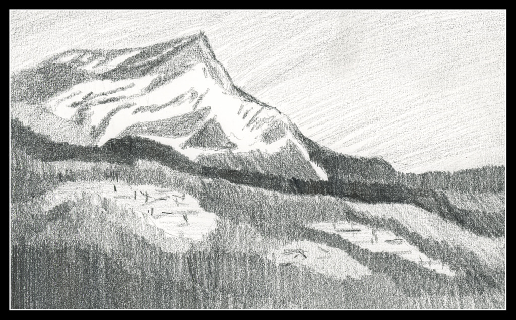
I started this painting a few weeks ago, at the first class at the local adult school with a new teacher. This is from a photo I took some time ago. I was at the bottom of a hill, looking up.
This painting has taken a lot of time – several hours – but the work has been worthwhile. I have been applying the various principles I am slowly garnering from hours at the proverbial grindstone, memorizing techniques, concepts, whatever. For instance, I think this painting actually has a nice sense of depth and perspective – something I have struggled with for a long time. The light on the trees also pleases me, as do other bits and pieces of it.
I have also learned just through doing how to get the heavy body acrylic paint into a more viscous and enjoyable mess to paint with, and that is a big help! It’s a combination of matte medium, water, and the paint itself. I dislike the plasticky quality so often that accompanies acrylic paints, so even thought my colors are bright, I think they moosh together fairly well.
I’ll ask my teacher’s opinion when I see her next week. Meanwhile, here is (to my eye at present) finished work. Below is the photo which is the basis for this painting.
I am beginning to lose track of the days since I began this project since some days I do nothing, and other days I do a few.
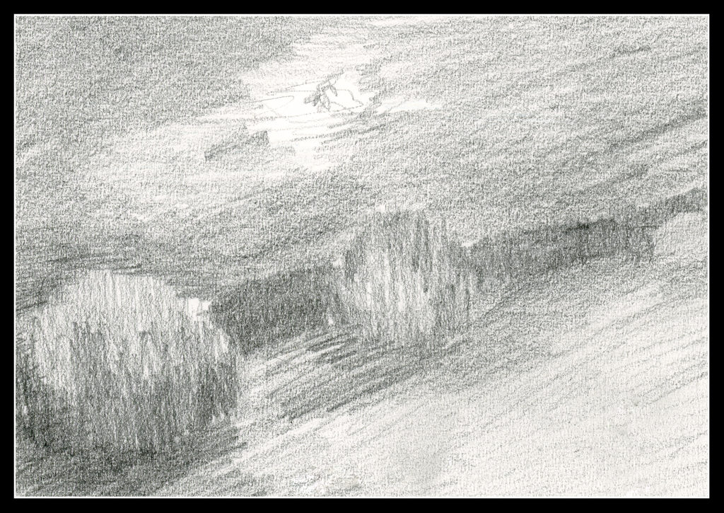
Above is Day 14. Continuing to simplify shapes and masses into values, the above should represent a mountain in the distance. From there, mid-ground is a dark ridge before the mountain, and another to the right of the mountain, behind the mountain itself. The white blobs in the foreground area with sticks is supposed to represent structures. To me, they look like felled timber. Ideally, I think the mountain itself should be lighter to represent atmospheric perspective.
Day 15
This is an attempt at a nocturne – a night time value study to see if I could catch the light of the full moon. The bush-like thing in the middle needs some lightening at the top. Overall, I like this as a start to something even though it is so vague – but that is how night is!
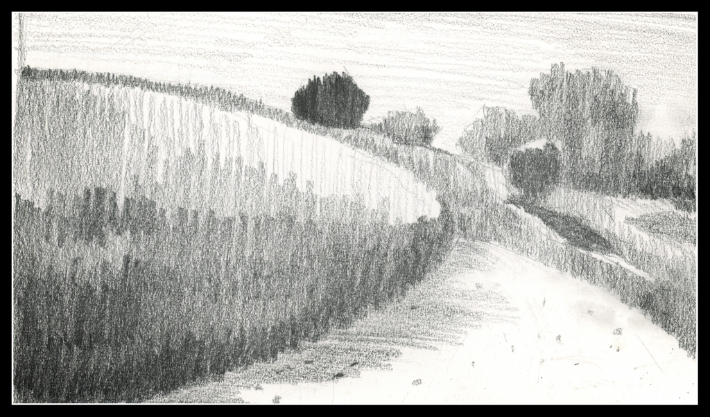
Day 16
This is a view upward to the hill at the center of the local botanical garden. The white swath in the right foreground is the sand trail which winds around downward (behind the viewer) into the riparian woodland below.
I am not quite sure if I like the values as I have them set up here – nor am I really sure about the focal point of the drawing. It seems the dark tree at the top is too dark, but it could be a leading line down the hill to the tree with the cast shadow. The trail leads the eye. In a painting, this could work out with warm and cool tones in addition to values. Maybe I’ll give it a shot!
Commentary
With Day 13 I tried to make my masses more simple and graphic. I am continuing this, and will for the rest of the 30 day challenge.
Some studies lend themselves to it more readily than others. Despite that, I tried to simplify in all three. Doing this makes Roberts’ admonition to “draw shapes, not things” easier to do. Distilling the more important – most important – into value masses seems to be happening (at long last!).
Again, it will be interesting to see where it works with painting.
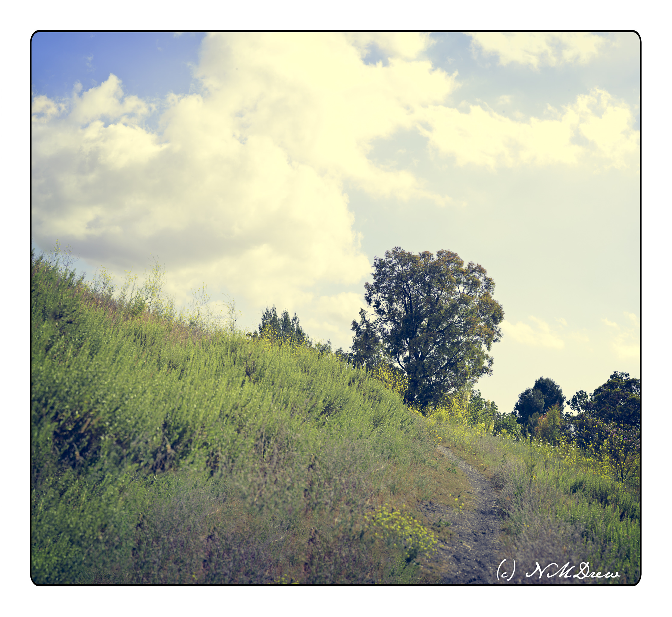
More browsing through history! Today, a trip back to the spring of 2017, a hike on a pathway behind the local botanical garden. Obviously there was some rain that year as there are green plants!
One thing I really enjoy doing is making panoramas out of a whole series of images. Sometimes I fail to get enough to create a good study, and that is where Photoshop comes in. I did a lot of filling in of empty spaces, and if you look closely you will see repetition of the cloud in the upper right corner, and plants in the lower left corner. That is what happens when I hand hold my Nikon Df camera and a long lens – this was the Tokina 100 macro lens. I think I took about 50+ photos here. I like to use a macro lens for panos because of the sharpness that is inherent in such lenses.
Altogether, I like what I did in post here. The coloration and composition are pleasant and summery. I also think it is a photo worth using as the basis for a landscape.
The end of summer and the brilliant greens of summer fade to brown and beige . . .
Here, I just wanted to make a light painting with simple washes. Usually I go for really intense colors, and it took a bit of work to get the sky light, as well as keep the colors of the distant mountains and grasses paler than my normal approach. The sky was easiest as I just blotted up my colors with tissue and used a lightly damp brush.