Values

I just recently realized that I can use Photoshop to help me create shades of grey in a photograph. This is particularly useful when trying to render a portrait into a painting. Portraits are very difficult to produce with any reliability as a painting because the face is subtle in construction, and thence, subtle in gradation. My skills are lacking in this arena.

To begin, I found a portrait on Pixabay. From there, I imported it in PS and applied an “artistic” filter, using the “cutout”, keeping defaults. I then printed out the photo, sized to 5×7, and gridded it out to a correspondingly sized piece of paper.

Once done, I chose gouache as the medium to use – already out on the desk, and easy enough to use without making myself crazy. First done was all the darkest values on my drawing.

I just lay down the black in most of the areas that looked darkest to me. I missed a few areas, but since gouache is able to be applied over previous layers, I was not too worried. Also, as this is the first time I have ever done this, I was not too concerned about perfection – the experience was more important.

From there, some white was mixed in with the black to produce the second darkest shade. Truthfully, I did not mix in enough white as it was nearly the same shade as the black when it dried. That is the nature of gouache – it dries darker than it goes on. I had to lay on a second and third layer.

Next, the third shade of grey. This I tried to push into being lighter than I thought I needed. From there, the highlights as light as I thought I needed. Again. the white was really a light grey that dried rather darker than expected.

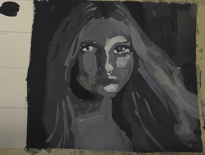
Finally, I increased the white, using titanium white instead of zinc white (the former being more opaque than the latter) and did some touching up and adding of detail.

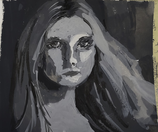
This is the final image. The paint is cracking a bit as it is really thick in some areas. Given this is 5×7 or less, the detail is not too bad, but I wouldn’t like to have this a portrait of myself! The goal of doing values is what is key here – light to dark, catching the face. Much room for improvement, but what I set out to do – a value study – worked out.

I plan to use this method with PS to do more portrait studies. Tools like this aren’t cheating – they help you see what is in front of you more clearly. Gridding the photo onto paper helps keep proportions relatively correct. I would like to do this on a bigger surface with acrylic, perhaps limning in only the white and black values, and from there adding the different shades of grey before moving into a final white.

Birch Trees

Birch Trees – from a photo in Module 2 of Andy Evansen’s Class

If you have been following me for a bit, you know that I have enrolled in a lot of painting classes. This is a study from my watercolor class, online with Andy Evansen. His work covers a lot of subjects, but I like his ones of the natural world the best. So, lazy me, I stick with his photos of the wilds, but will, at some point, take the dive and do something with buildings and people, and maybe even cars.

I used frisket to create the hard edges of the birch trees and the snowy areas of the logs in the foreground. The other white areas, the snow, is plain paper, no frisket. After the frisket dried, I did the sky, sunlit mountain, and dark background. Then, a bit of the foreground. Finally, the frisket was removed.

When the frisket was gone, I worked left to right, creating the shadows of the birch trees. Upon those shapes I added heavier paint to create the blacks characteristic of birch trunks. Various other details got worked in. White gouache came in handy to clean up some of the birch tree trunks as well as to create the fine branches of the trees toward the top of the painting.

The only thing I have some issues with is the very large birch tree on the right, the one which stretches top to bottom. It is not quite right, but that is something for correcting later on. Despite that, I am pleased with what I am learning, and creating, with all these classes. Painting and drawing and artwork is in the forefront of my mind these days, and it is beginning to show in more “successful” paintings from my viewpoint.

9×12 CP 140# Arches paper; primarily watercolor with a touch or two of gouache. (Maybe 3 or 4 or more….)

Winter at Jalama Beach

Where have I been these last several weeks? Busy with online classes in drawing as a prelim to painting and hand sewing 18th century stays. So, I have been doing things, but have had so many other distractions that I have not been too active online here. So, today, a gouache, just because paint needs to be used to feel like a normal person.

Jalama Beach is in San Luis Obispo County along the central coast of California. It is a strange, remote beach. Winds blow the sea foam onto the sand, and it can look like very dirty snow. The first time I came here was in my teens – a long, long time ago. Then you could get abalones just by picking them up, and the beach was littered with their shells, big ones easily 8-10 inches in diameter. (Tasty critters, I will say.)

Winter time brings erratic tides, scudding clouds, and wind that can blow fierce and cold. Sandpipers and gulls wheel overhead as the wind beats you back. The wildness of the place is something that anyone who has been to a lonely beach can understand. I think I caught it (for myself at least) here.