Up a Cobbled Lane

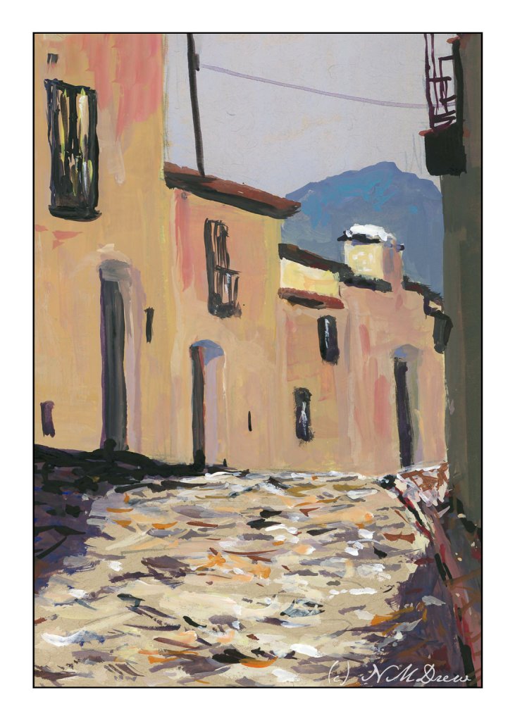
More gouache, this time on toned paper – tan specifically. The tan paper seems to give an extra warmth to the colors applied over it. Besides using toned paper, I am trying to venture into different areas – here I am doing a totally urban scene. One thing nice about painting old buildings is that standardization wasn’t quite like it is now, so my door don’t all have to be the same size, nor my windows! Heck, even the cobbles are rather rough.

I like painting in gouache, but there are times when it gets to be a bit tricky as it re-wets and it is easy to pull up lower layers of color. To help prevent this, you need to start with thinner paint and add the heavier colors later. If a drop of water falls off our brush, you can make a bit of a mess in the area it lands. Most people when they use thicker gouache paint smaller paintings – it is not a paint that spreads out generously and stays opaque. The charm and challenge!

Gouache, Strathmore tan toned paper, 5×7.

The Hill

I’ve spent the last two afternoons following along with an online class in gouache. It’s been fun. The main focus has been skies and their moods as shown by clouds and color and time of day and weather. For some reason the dark and stormy sky stayed in my mind’s eye, and visual memories of days of yore came back.

I don’t know about where you live, but here in California where I am, the clouds are seldom domineering and frightening like they can be in the tropics or midwest. I remember one day when I was about 9 coming home from school and the sky was nearly black with clouds. It was still daylight, but it was in the fall of the year and cold. It was eerie and scary and beautiful. All the colors in the surrounding fields and meadows and trees were brighter than usual, almost to the point of being unreal.

That is what I have tried to catch here – intense light, strange light and colors, a wildness waiting to happen.

Gouache, 9×12, CP cotton 140# paper.

A Bit of Colorado

Great Sand Dunes National Park and Preserve is located in south central Colorado. It is, as the park site states:

The tallest dunes in North America are the centerpiece in a diverse landscape of grasslands, wetlands, forests, alpine lakes, and tundra. Stay on a moonless night to experience this International Dark Sky Park’s starry skies.

I never ceased to be amazed by the beauty of the natural world.

9×12 hot press Arches, 140#, gouache.

Abandoned in Winter

Well, this one sure had me going for a while! The idea was to avoid angles, and look squarely into the building, and so I did . . . and then came along the Esposo who said, “Nay! This does not work!” And, damn, if he wasn’t right! So, I had to pull out some gouache to overlay a roof on the tree in the background, and make the roof look rather beat up and weathered, with beams and such visible. Sort of a success.

And, I wanted to paint falling snow. Falling snow in a photograph varies from white, sharp dots to elongated shapes. Time to experiment. I used some gouache, diluted, and applied some streaks – I wanted a sense of wind blowing from upper left to lower right, with snow pushed by the wind. It was okay. So, I got a fan brush and made a wet mess of the white paint and splattered and splattered and splattered. I even got it my coffee. Luckily the paint isn’t poisonous, so I shall return.

Overall, this is not a great success as a painting, but it was fun. I rather like the composition with the tree in the very front of the painting. The barn is w-a-a-y off as far as believable perspective, but such is life. But, I have been sticking to my snow themes, and perhaps it is time to do one more and then move to a different season different subject, or put it away for a few days and get back to sewing or doing photography. I can now hobble forth on my partly healed broken toe.

Arches rough, 140#, 10×14. Watercolor with a splash (well, several splashes) of gouache.

Negative Painting

Negative painting is painting around a shape. Positive painting is painting an actual shape. The first is hard to do. The second less so, but the skill of negative painting is necessary and can produce some pretty dramatic results. It is also a skill if you don’t want to use liquid frisket to block off areas to keep white. Positive painting sounds easy, but it ain’t. (My flower paintings are evidence of this!)

A common exercise to show the learner how to do negative space is to paint a tree, paint around it in a light wash, draw another tree on the colored wash, and then paint around this, until you have a lot of trees ranging from white to the varying values of the wash. Sterling Edwards has a lengthy but very good video about this method:

While I know about negative painting, and have stated it as one of my goals, along with flowers (which benefit from the skill of negative painting), I thought this was a good one of the many I watched. What I liked was how he blends his paint inward.

Anyway, I did trees. Rick Surowicz is also a master at negative painting, and if you look at Edwards’ paintings, and those of Surowwicz, you will see both apply the same techniques. In my painting, I used Arches 140# CP, 9×12. I outlined the tree, and then painted around it. At some point I was frustrated and decided to do some painting with white gouache, on both the primary tree and then adding others.

Overall, I rather like the effect, particularly after adding the gouache. I think it enhanced the painting rather than making it just another annoying experience! I used to be quite rigid about not using gouache, much less gel pens or diluted acrylics in my watercolors, but rules exist to be broken, and I expect purists would call this “mixed media” – but that no longer bothers me as much as it used to. Watercolors they are (water soluble), so watercolors these remain.