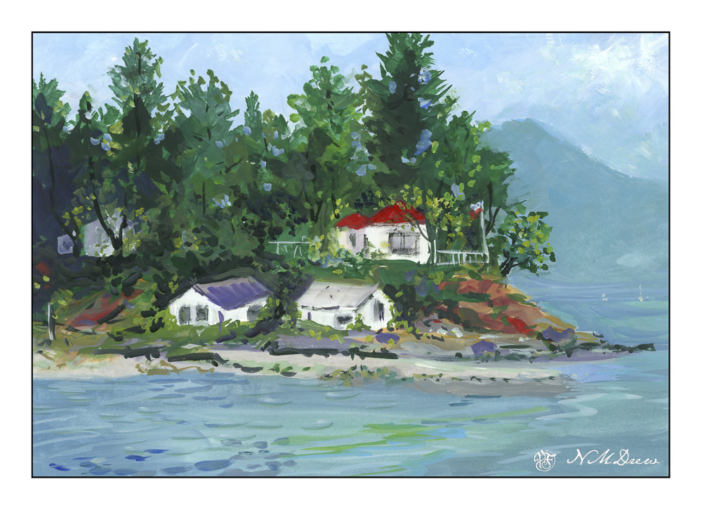
Years ago we spent several weeks in Canada, and by far a favorite place was British Columbia. Protection Island is off Nanaimo, and on it is a lighthouse and residence. The lighthouse is called Gallows Point, and as you can imagine, the site of an execution. The history is interesting, and you can read more about it here.
I really did not have much of an idea what to do today – it is cold and foggy and so chilly that the house was 66F. The damp makes it worse. So, bundled up, I went looking for things to do. Some ukulele practice, chores, dog petting, and finally the decision to pull the gouache out of the refrigerator (keeps down the mold) and off I went. I spent a few hours painting and while not an especially beautiful painting, or accurate, it was fun to do a bit of color frenzy with gouache – which I have not done for awhile.
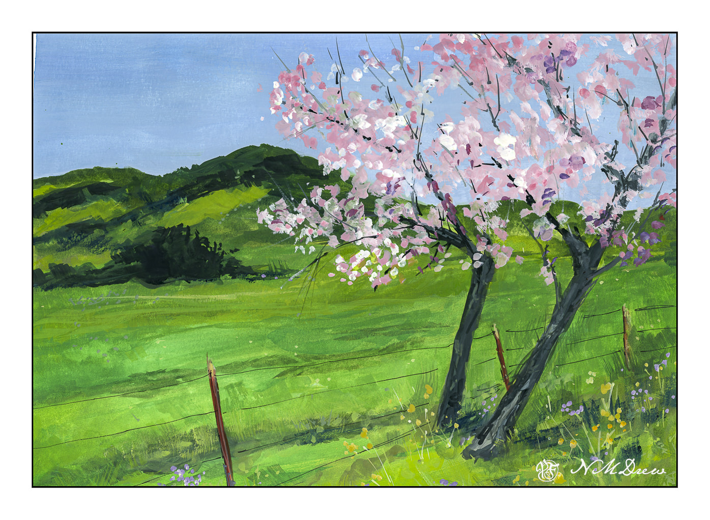
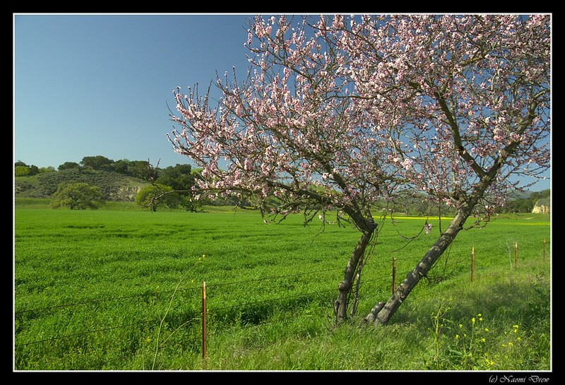
These two trees have long since vanished. I photographed them in 2012 in Santa Barbara County along Figueroa Mountain Road in the early spring. I thought they were a beautiful spot of color against the greens of the California hills, which in themselves, during a superbloom, can be covered in shades of lavender, orange, and gold.
I mixed together gouache paints – whites (zinc and titanium) and some ivory black with my watercolors. This allows for layers to be built and bits painted over, as in gouache, but allows for a bit of transparent and opaque. I’ve done this before and always find it is a lot of fun. Gouache, when thickish, is best with small paintings, but mixing whites with watercolor gets an effect like gouache but at a much lower price point.
The photo – linked from Flickr – is not an especially good photo, but I do feel it catches the beauty of these two trees. When I went back looking for them a few years ago I could not find them, so I am glad I have captured them!
Watercolor paint mixed with white and / or black artist’s gouache. 11×14 on Canson watercolor paper.
These past two weeks have been rather a waste – bumps in the normal routines create havoc and everything just seems to fall apart. When that happens, it really does require a focused effort to get back up and into whatever interests me. I am just coming out of a cold – thankfully, not a sinus infection – that has made me not really tired, but just lethargic and lazy between bits of fever and congestion. Lounging around and doing very little and sleeping a lot has been my agenda, filled in with little fun things like dishes . . . .
Actually, yesterday was possibly the real turning point. I was feeling better, so I did some sewing in the morning. I am hand-sewing a top without a machine (including finishing the seams with a whip stitch), just to do it. Then blob time. Miss Marple entertained me for an hour or two between naps. And then it hit me – I was just unhappy because I wasn’t doing what I like to do best – paint or draw! I didn’t want challenges or messes (ie oils) to clean up, but …. what?
Gouache!
I haven’t used gouache for some time. I keep it in the fridge between uses. So, while it was coming to room temperature and soaking up the water I put on it, I taped up a piece of 9×12 CP 140# Arches into two somewhat equal sections. Hot press paper is my preferred paper for gouache as it is smoother and lets the paint move over the paper more easily than cold press.
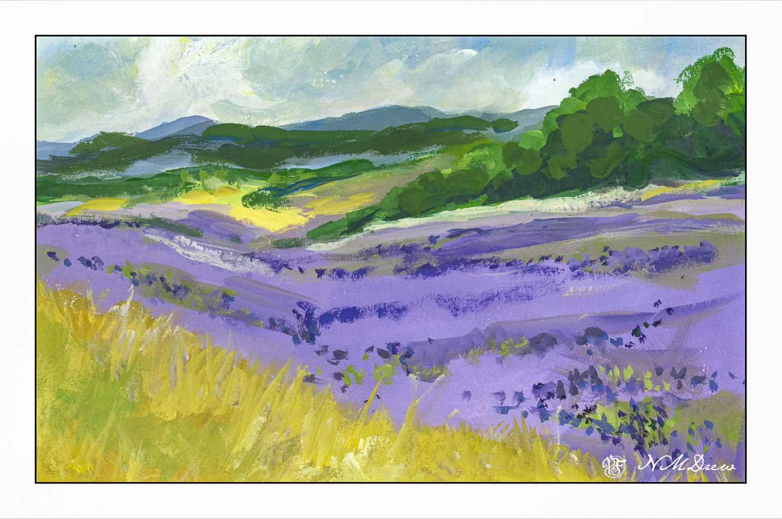
If you have been following my blog, you know that of late I am rather focused on lavender fields. This first painting was no exception. I wanted to see what I could produce, sort of from a photo, sort of off the top of my head. I wanted a gloomy-looking sky to match the grey, rainy sky of my own world this Sunday, and so moved along. Landscapes are very forgiving (I think) and are a good way to warm up when re-acquainting myself with a medium. So, a lavender field, somewhere in the world.
Then, more of a challenge: Buildings, water, plants, and a boat on a river.
Somewhere in a mythical village along the Nile in Egypt. The traditional sailboats – the felucca – are just so beautiful to see because of their simplicity in shape and line. I sourced a number of photos to create this one. I drew in some basic lines, but that was it. I started with the buildings and then the sky, painting the palms and plants before beginning the river its banks. I left the entire area of the felucca as blank paper, waiting until the end to fill it in. The sail was fairly easy, but the shape of the boat and the suggestion of a person was the most challenging. In the end, I was really pleased with how I met this challenge I presented myself!
Paintings are about 4.5 x 10 each – maybe more or less, I am not going to measure! – using gouache on Arches CP 140# watercolor paper.
As someone who has used water-based media for years – watercolor, acrylic, gouache – I am used to using just one brush for the most part, or two if I need a different quality. A round, a flat. That’s about it for watercolor or acrylic or gouache. Of course, different sizes matter as far as what I am painting, but with a couple of good brushes, much can be accomplished. I just take my brush, swish it around in water, and then on to the next color.
Oil painting does not allow this. To clean a brush means to work at getting it clean, and that work is best done at the end of a session when all is ready to be set aside. This means cleaning the brushes in mineral spirits to get rid of the oil. This is done after wiping excess paint off and discarding the rags or towels. After the mineral spirits comes a bar of soap and hot water. Squish and swish the brush in the soap, rinse. Repeat if necessary. Set aside to dry after reshaping the brush, and you are ready for the next session.
I have done a bit of observation and a bit of reading about brushes. Some oil painters say you never need to wash your brushes, just clean them off by wiping and using some mineral spirits. For me, this is a disaster in the making. My habits are to use the same brush with rinses in between, and oil painting does not allow for this – at least, not the way I paint.
The classic picture of an artist is with his handheld palette, beret on head, easel in front of him / her, and multiple brushes being held in the hand holding the palette. It makes sense! Brushes with different colors, different values, different shapes to create different strokes. I watched a lot of oil painters, and some do hold multiple brushes. Some even go so far as to have the same brush in 3 editions – one for light, one for medium, and one for dark values, with other brushes exclusively used for blending. Recommendations for brushes are also as varied as how and what to do with brushes – what shape, what size, what material, how much to spend.
Well, for now, I need to focus on clean brushes. Mud was a very common byproduct of my earlier days in watercolor, and now I have to fight the same problem with oil painting. I need to retrain how I use brushes altogether. I have also found I need to determine what kind of brush I like. Watercolor works with both soft and stiff brushes, depending on desired effect. Soft brushes are the best, IMHO, for gouache. Acrylic, like watercolor, can vary with the need of the painter – hard, soft, round, flat, filbert, fan. Right now, I prefer softer brushes for oils, but I know that this will change as I become more comfortable with the medium.
Meanwhile, I think cheap brushes for 3 values will be my default for now – and it won’t be easy!
Pretty fancy title for an attempt to 1) take a color photo of pears, 2) reduce the colors in the photo to 16 so that fields of color appear, thus allowing an easier visualization of values, and 3) painting observed fields.
First, let’s put this out there: I really do not like painting outside at this point. I used my gouache paints for this study and had to take the following out to the table on the patio in multiple trips – paints, brushes, water, paper towels, image on a tablet, palette. Of course I forgot this and then forgot that, and it really just riles me up! If I ever want to have a plein air experience, everything needs to be consolidated in one thing to take all the little things out at the same time. Inefficient usage of my art supplies really makes me crazy. It is soooooo much easier to have everything in one place on a shelf rather than having to traipse hither, thither, and yon.
Okay, gripe session over. Using gouache on hot press paper, I used green in different values to depict light and shadow, somewhat successfully. I referred to my simplified image (which kept turning itself off on the tablet – another reason why painting from a reference photo indoors is so much nicer), and worked from there. Some areas of the pears were more yellow, as pears can be, and other areas were a colder green. This did end up showing in the simplified photo, and you can see it in the above painting.
I like to desaturate color photos or paintings to see how they read in black and white. This way I can get a sense of values in the colors I used. In the above painting, you can see that, overall, it worked in the pears. The shadows beneath the pears were nothing special and honestly not something I paid much attention to. Using desaturation, I see faults and areas for improvement. For example, the neck of the middle pear would benefit from more dark shades – middle values – to create a sense of the cylindrical nature of that part of the pear.
This was actually fun once I got into it, despite my frustrations with the outdoor set up. I have to think more about how I go about painting outdoors. The fact is the day was beautiful and nearly 70F for a bit of the afternoon. No wind to fight with. Later this week the rains will return (hooray!), so getting outside was probably the main point! Painting was just something to do . . .