Under the Cottonwoods

Cottonwood trees make bright yellow splashes of color in autumn. The dark trunks and limbs curve in between and the drama of these trees cannot be underestimated in the muted colors of the desert. For me, they epitomize the southwest in fall, and to see them in full color is really wonderful.

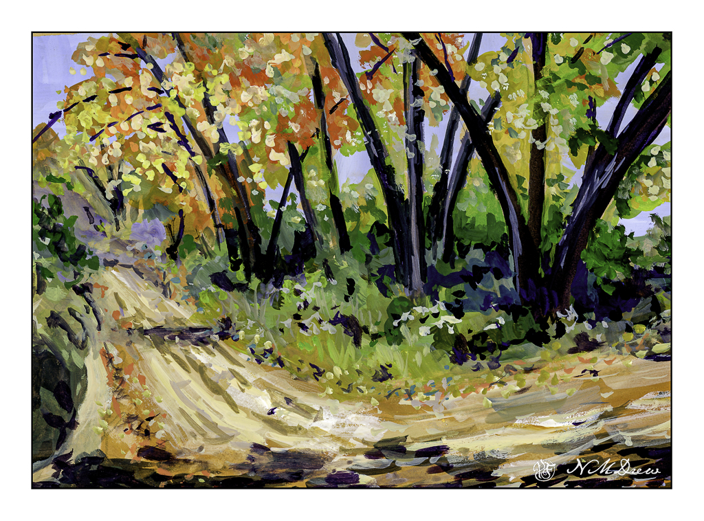
Here, another painting in gouache, and this time one that was difficult to do. Somehow I don’t think it has the crispness of the day I was trying to express. The drama of the light – dark contrast is there, but perhaps because the leaves of the cottonwoods are always more detailed in my eye than is shown here. At first I thought my scanner was a bit soft, but I really don’t know. Oh, well!

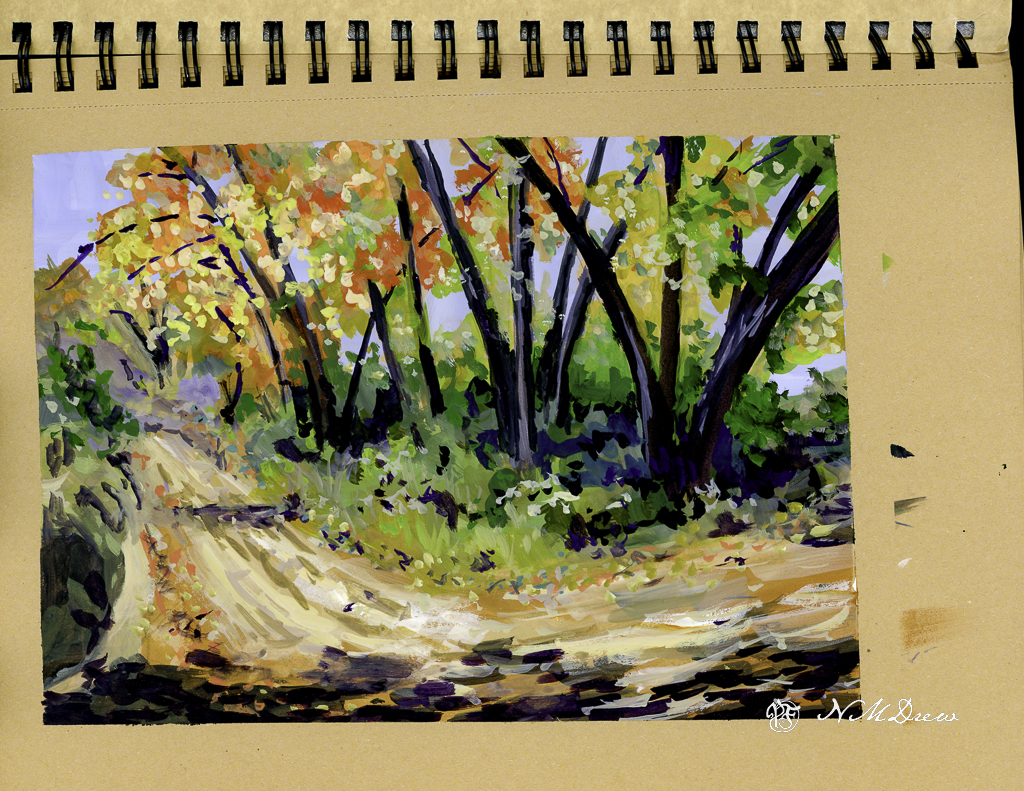
I did this painting on tan toned paper. Perhaps that adds to my sense of it not being quite what I wanted. Below is the original painting in my sketchbook.

Whatever – it is certainly something for me to think about. Gouache is opaque unless really diluted, so I am not too sure how much the toned paper is affecting my color perception.

Gouache, 9×12 toned paper, painting about 7×10.

Coastal Beach

Where I live there are so many wonderful beaches in our county, to the south, and to the north. Just pop onto Hwy 1 / 101 and off you go! Some are wide and flat, such as in Carlsbad, others are easy to get to even if they have cliffs, and others are quite rugged.

Santa Barbara County has a lot of really great beaches. When I lived there, I had a lot of favorites – Butterfly, Hendry’s, and Goleta Beach. This is a view of Goleta Beach facing north. It is very typical of this section of California – sandy beaches, friable cliffs, Mediterranean vegetation. The coastal range is often right at the ocean’s edge and can create some dramatic views from the shoreline. I really like our beaches!

The biggest challenge here was the water, both waves and the damp water on the sandy shore. Putting people in was not too hard – just a few blobs to make the blobs people shaped. The foreground rocks were a bit of a challenge – I wanted enough detail to make them believable but not too detailed. I am pretty pleased with the cliffs, distant mountains, and sky. Overall, I think this painting turned out pretty good.

Gouache, Strathmore Vision 140# CP paper, 9×12.

Super Bloom

The vernal equinox is upon us, Spring is springing, and a few rains brings greens and oranges and yellows and lavenders to the hills of California. Poppies, more poppies, mustard, lupine. The hills are filled with them – of course, depending on where you are – but when we have really wet winters the hills are alive with color.

Years ago, and other years of yore, we would drive to the back country or the poppy reserve to just look. Lake Elsinore is well-known for its super blooms (what these massive flowerings are called) to the point where they shut off roads and keep people out. Like parts of the world, over crowding and over-touristed. I’ve taken a lot of photos of this bloom-a-thon, and it is always worth it. And, it is a challenge to paint in a ways as the colors are vivid and almost unreal when you live in a water-starved place and it is beige and brown.

The colors here had to be almost pure pigments with little dilution with zinc white. Gouache, of course. Colors include cadmium red, yellow, and orange along with ultramarine blue, zinc white, yellow ochre, and some umbers. Greens include every single one on my palette!! Once I settled the sky I brought out the titanium white for a bit of emphasis.

I spent a couple of days on this one just because it was really hard to paint. I tend to be a dabber, and that is how I began. Later in the process I just mushed all the colors together, and the next day dabbed in the poppies in the foreground.

Gouache, Strathmore Vision 140# CP paper, 9×12.

Winter Water

Having used a lot of gouache colors in my palette, this is a deliberate effort to see how I can make a primarily white painting. Snow, of course, is the best subject.

The two whites available for gouache are zinc white and titanium white. Zinc white is more transparent and works very well with colors to lighten them. It is not as bright as titanium white. Titanium white is more dense and opaque, and works very well for areas you want to be very white – such as white caps on waves and here very bright areas of snow.

Besides the two whites, I kept my palette limited to most ultramarine blue, burnt sienna, yellow ochre. A touch here and there included some orange, yellow, and umber to mix colors I needed.

Strathmore Vision CP 140# watercolor paper; gouache; 9×12.

Back Country, Amargosa River

The Amargosa River is located in Nevada and California, moving into Death Valley National Park of the Mojave Desert. As a river, it flows freely both above and below ground, providing much needed water in an otherwise dry climate. Because of it, there are many rare and unusual plants and animals, some found nowhere else in the world. It is managed by the Bureau of Land Management (BLM) to conserve it . . .

This is another gouache painting. I wanted to capture the contrast of the river basin to the mountains it runs through, as well as illustrate the wonderful colors you can see in a desert or riparian area. Dry, rocky mountains, flat areas from flash floods and trails, the occasional tree, low-growing plants adapted to a dry environment. Plant colors are generally pale – sage green being a dominant one as well as bright yellow flowers. Dry air lets you see for miles into the distance and at times you wonder if you will ever see a cloud in the endless blue sky.

Gouache, Strathmore Vision 9×10 140# CP paper.