To the Lighthouse

A bad reference to Virginia Woolf’s novel, which is an interesting read.

This painting is a dedication to lighthouses worldwide. They have saved so many lives by letting sailors know of treacherous waters. Add to that, lighthouses are often found in spare and rugged places, all of which make for dramatic and wonderful photos and paintings.

I have often thought I would like to live in such a place, hearing the waves crash, watching the light circling through the night, and, of course, the sound of fog horns. Throw in some seal barks and sea gulls, and I would be pretty happy. Sleep could be a challenge though.

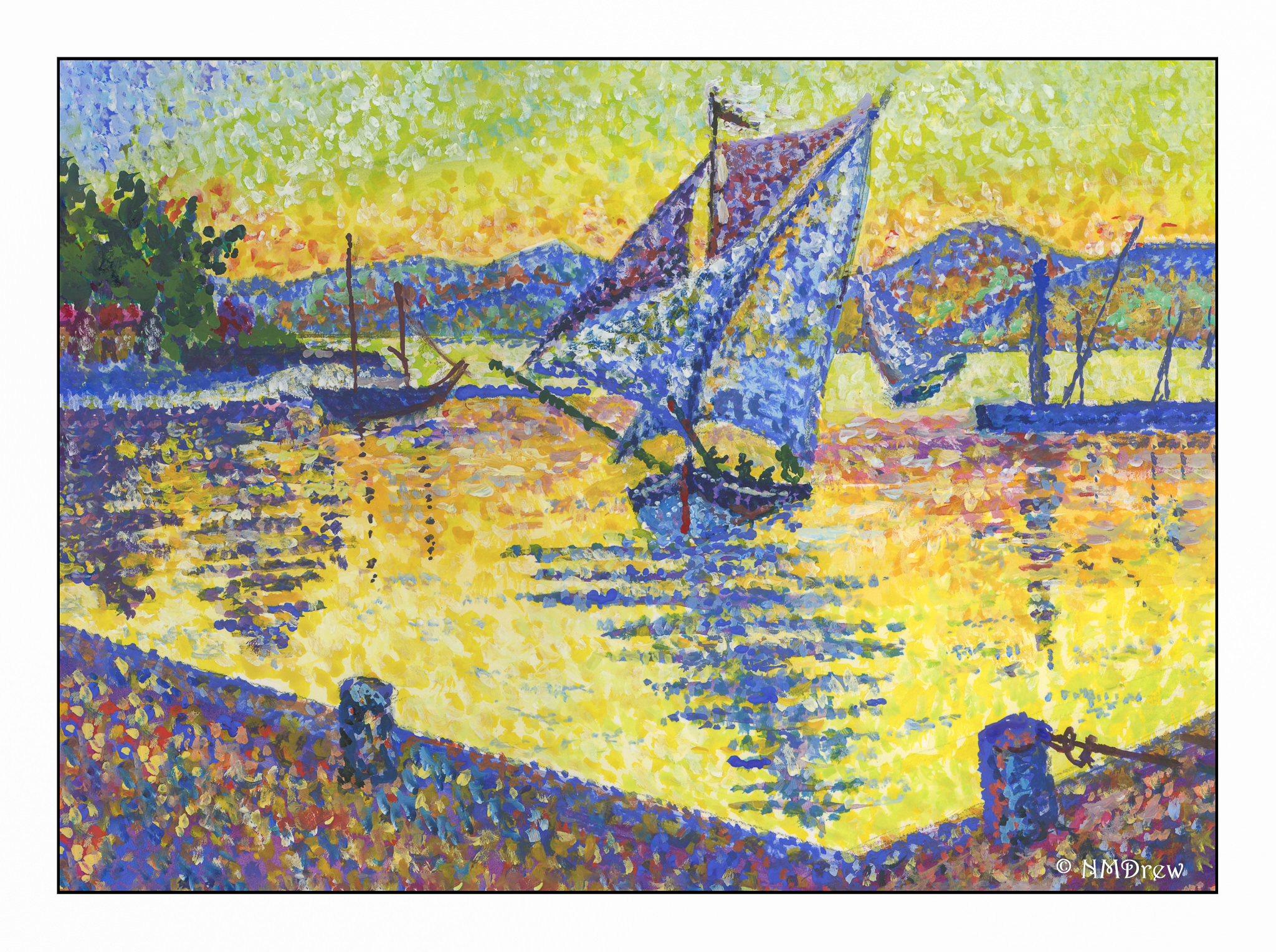
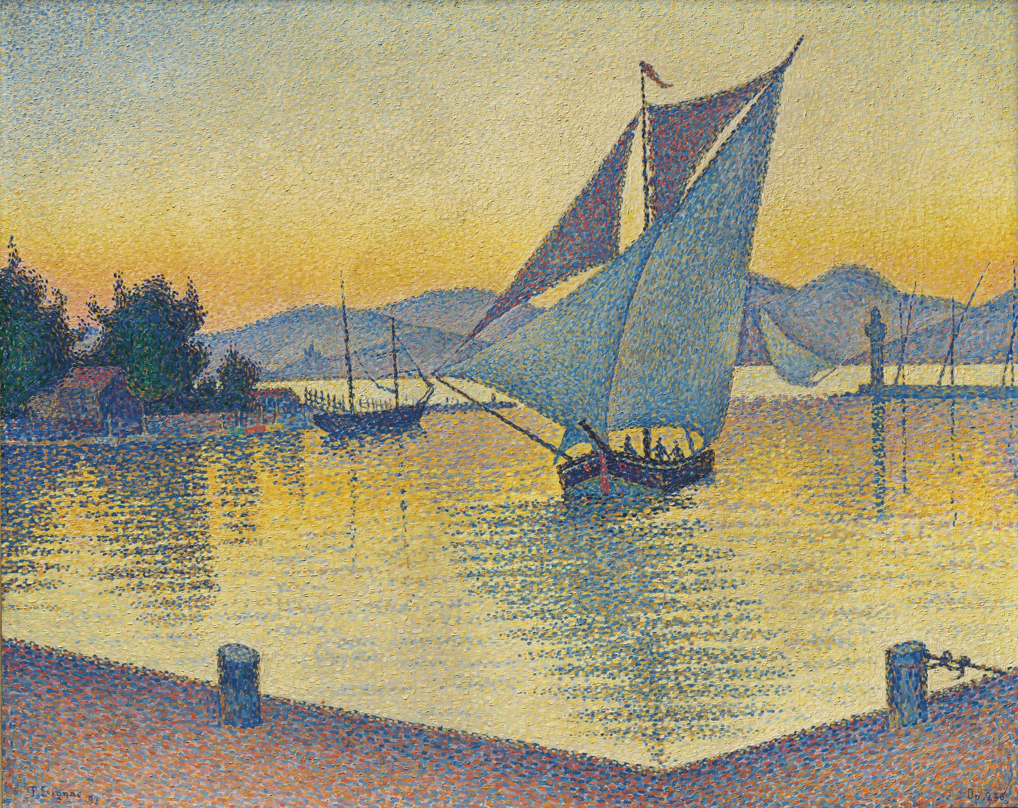
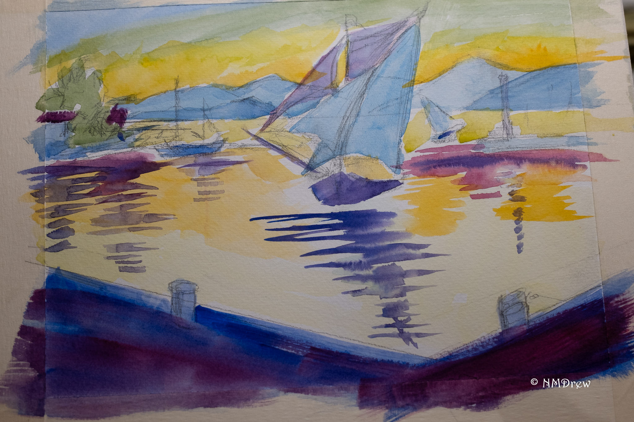
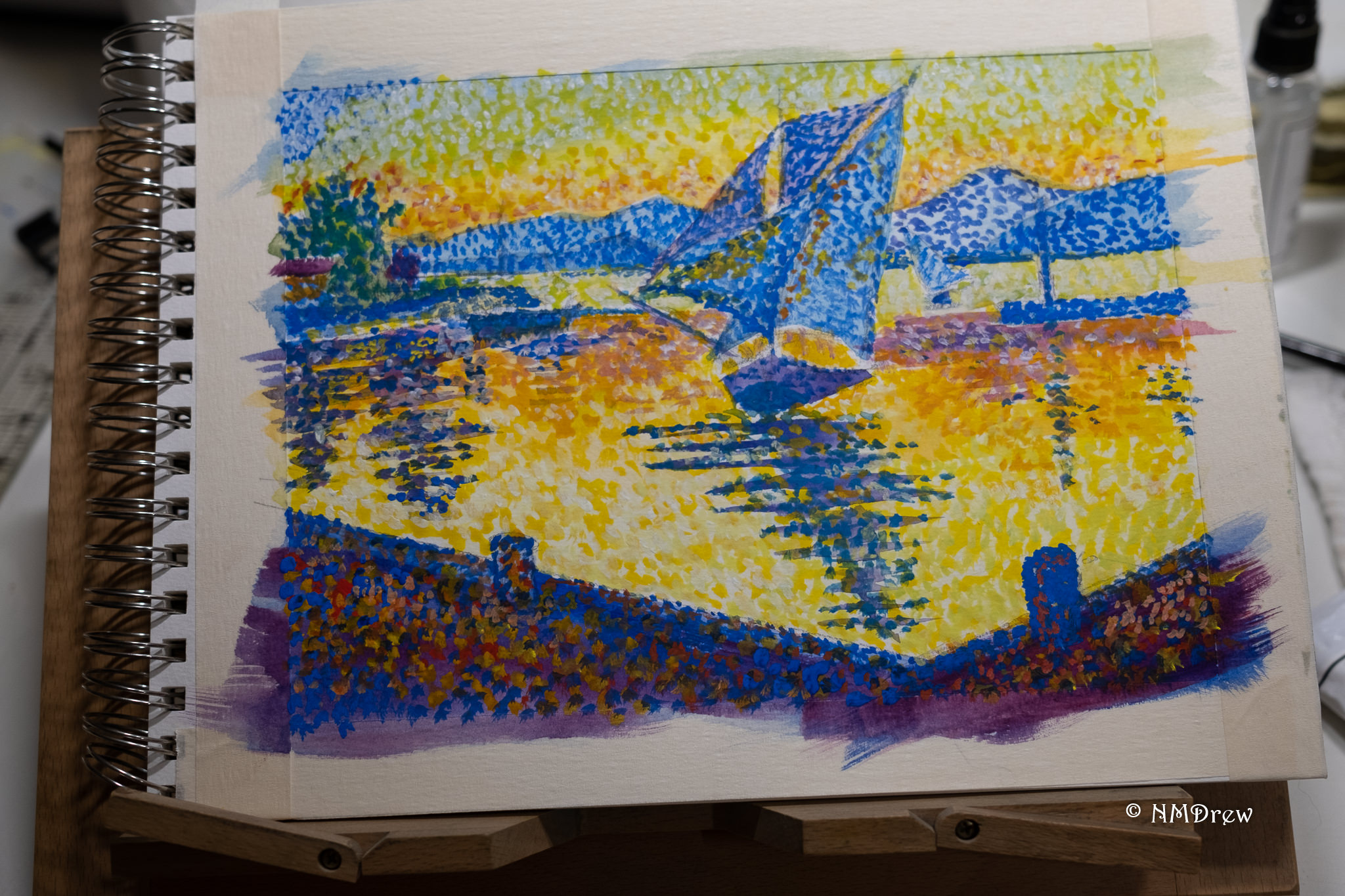
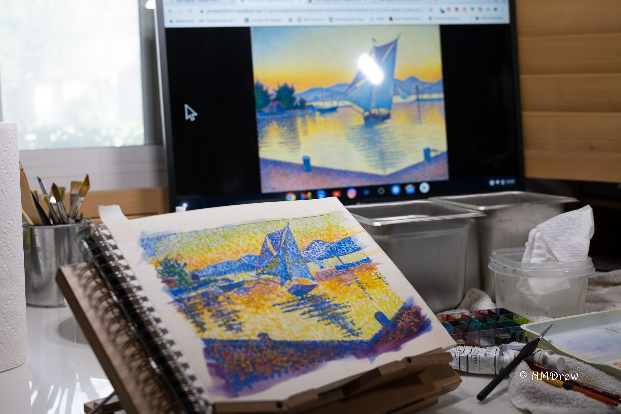
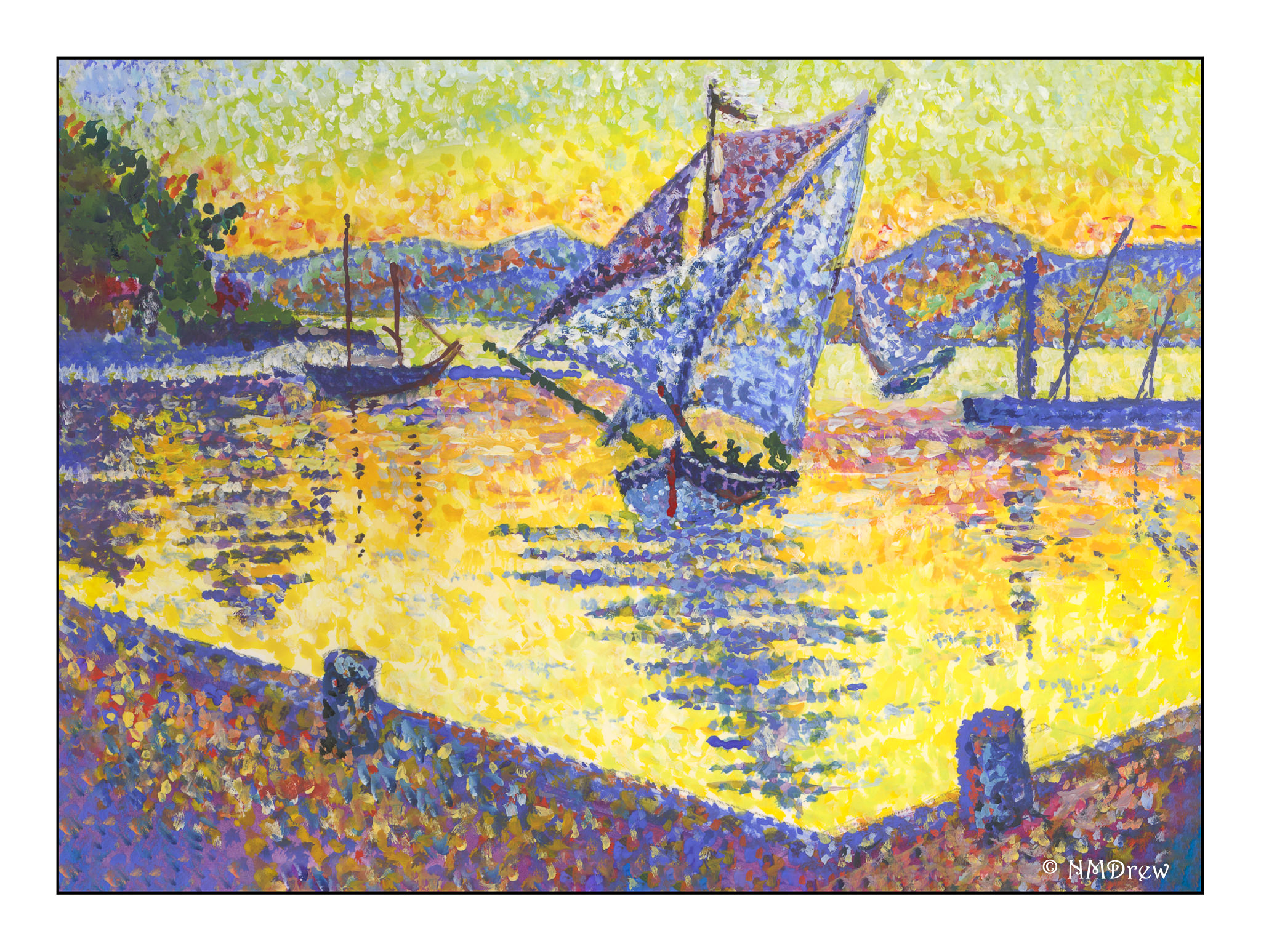
I made up this painting, amalgamating lighthouses and buildings from various images. My goal was to practice shading, such as moving from a sunlit side to the shadow side, using pointillism techniques. You can see this on the conical shape of the lighthouse as well as on the buildings. I have tried to give a sense of cliffs and housing sunk down a bit behind the green of the grass. Morning or evening light for the sky, or an intimation of fog and filtered sunshine is also attempted.

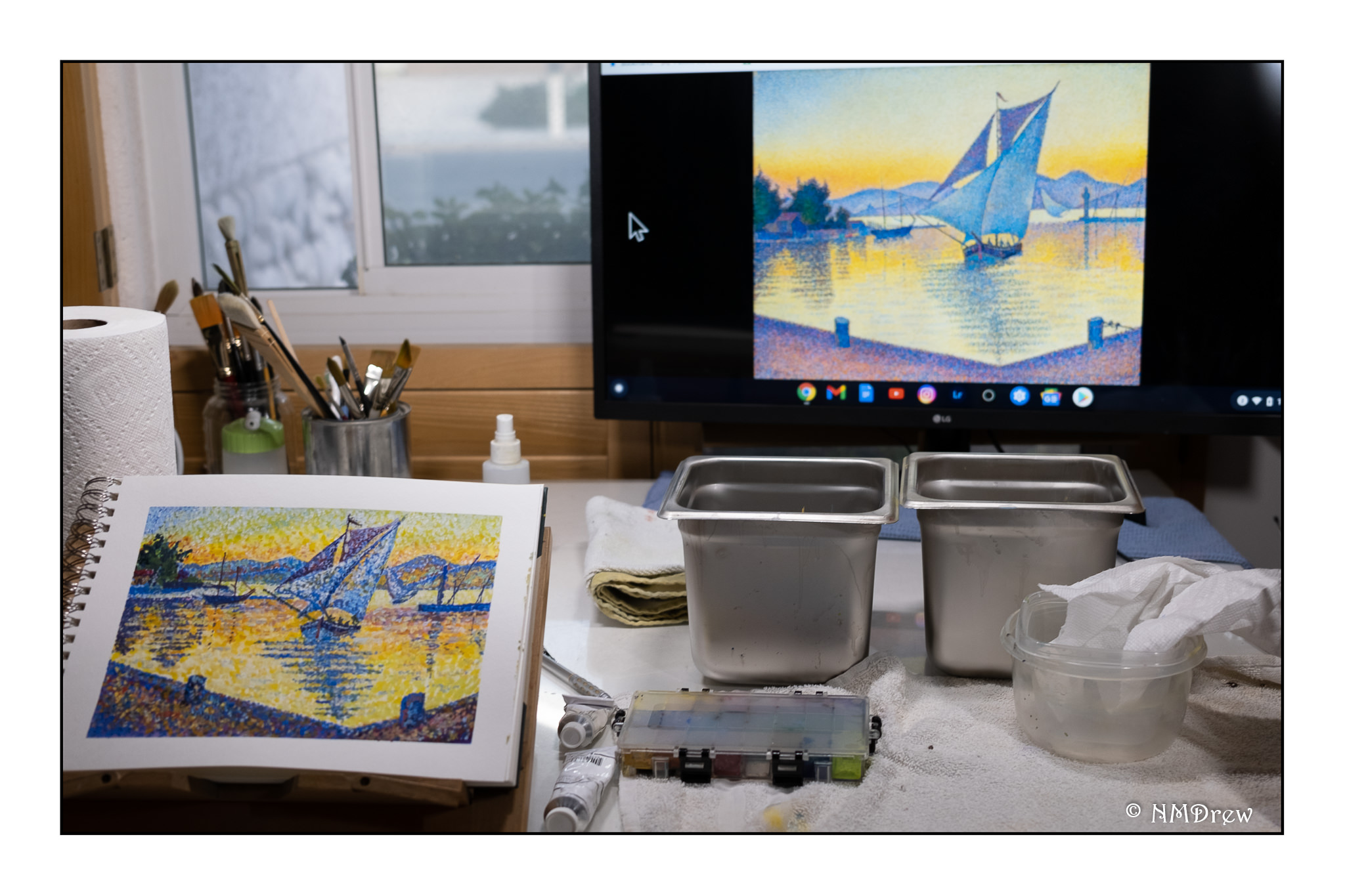
As I work more in pointillism, I realize that this helps me tremendously in sorting out colors. As far back as I can remember, mud has been my most famous by-product in painting. It could be that this is something I really need to use as a primary technique, though I am thinking of doing a pointillistic painting in gouache, and then re-wetting it to blend the colors applied in dots.

Now, on to other adventures!

A Winter Morning

Still dreaming of snow and winter, but honestly glad not to be in the northeast! More snow dumped in 24 hours than was dumped all of last year. That is a lot of snow! Nothing like snow up to the roof, no electricity, and wondering how you are going to stay warm. When I was a kid, we burned oil for fuel, so heating the house wasn’t an issue as far as I can remember, but I do remember a few times when my youngest brother was in diapers, and there was no electricity to heat water. Frozen pipes, too, but that is usually easily solved by letting the water run gently through open taps.

I am continuing using gouache and Pointillism. Something in me just loves this, and I have started looking beyond Paul Signac and into contemporary artists. The graphic quality of Pointillism and the colors keep drawing my eye. Also, I am getting more “aware” (for want of a better word) of color interplay by using dots and mushing colors together.

Meanwhile, today in California it was a chilly 68F and I had to wear socks in the house.

Santa Paula Ranch in Winter

California is filled with open space and ranchlands; in fact, according to the US Department of Agriculture:

Over a third of the country’s vegetables and two-thirds of the country’s fruits and nuts are grown in California. California is the leading US state for cash farm receipts, accounting for over 13 percent of the nation’s total agricultural value.

So, California is far more than rich people, Los Angeles, and movie stars. Where I live, agriculture is a major industry. It is around little towns and large suburban areas that you find ranches, for flowers, avocados, citrus, strawberries, and vegetables. Here, a view of a ranch in Santa Paula, taken from a train ride several years ago. The original photo is below.


Le Port au Soleil Couchant, St. Tropez – Paul Signac Study

I really love this particular painting by Paul Signac, Le Port au Soleil Couchant, St. Tropez.  The colors and composition draw my eye in so many ways.  My study is above, and the illustration I used is below.   Unfortunately, its color is rather flat and muted compared to other versions I saw.  This image was the best I could find to download and share here.

There are a number of things I like about this painting. The graduation of colors in the sky, from the blue in the upper left corner and its movement through the spectrum to green, yellow, and orange. The sailboats provide a visual dance, from the one in the center of the painting, and the especially delightful one further back on the right. That one, for some reason, just expresses joy to me. I used to sail a bit, and that one catches me in particular – the keeling over in a good wind is a grand experience! Finally, the reflections from the center sailboat along with the ones to either side, moving in to the dock. There is a sparkle and liveliness throughout the painting, and the usage of Pointillism really brings home that brilliance of the Mediterranean clime.

My own progress through this painting took a bit of time and tactical consideration. From earlier paintings I learned that an under painting of the primary colors for the section to be painted produced good results, as well as provided a structural basis for the painting. This requires a good drawing to get perspective correct.

Above, you can see the basic under painting, using colors close to the final one.

The first layer of dots goes down, and in many instances I simply used what I had on my palette, straight out of the tube. As this is gouache, even when the paints are dry, I can mush colors together on the paper if I want.

I work on my drafting table and use a large monitor to see what I am looking at. Out of range of this photo, to my right, is my Chrome Book set up.

My second layer of color was done by using a smaller brush than I used to lay in the first layer of dots. And what color did I use? White! Tap, tap, tap. I felt like a woodpecker.

Finally, the painting is close to finished. More layers of dots and various colors.  Little details were added at the end, such as the flag on the mast, the gaps in the top sail which show the sky beyond, the people in the boat, the rigging on the boat moored to the left, the upright lines on the dock in the right mid ground (more moored vessels?), and after the photo was taken, the lines on the right mooring bitt.

The takeaway here?  More understanding on using color, and the strength of a good composition.  Signac provided both, but copying brought home some lessons.  It is hard to say what I am learning here, but I do know that my hardest lesson continues to be not making mud.  Separating colors out from others – specifically, not blending them (too much) – is easily done in Pointillism.  I wonder how this will impact my future work and practice.

On to finding another Signac to study!

Under a Summer Sky

More Pointillism!

This painting was done on a larger sheet of paper than my earlier ones as my sketch book was filled and finished with the painting of the other day. I began with a thin wash of gouache, putting in the basic colors of the sky, fields, house and trees. From there, I began the dots. And more dots. And even more dots. Paint went from thin to thick, and thin again. Dots were bigger and smaller. The closer I came to the completion of the painting, the more I began to use the paint to shape the different areas of the subject. I tried to use some complementary colors in shadows, such as red in the shadows of the trees, and bright yellow to enliven the lavender. Altogether, this painting took about 3-4 hours to complete (I lost track of time), but in the end, the dots were worth the effort.

I think I could live here.