Most of my watercolors tend to have intense colors that are rather bright. With the underwater rocks and floating leaves of the other day, to get the effects I did, I used a lot of thin layers of colors – glazes – to create the desired effects. I was pretty happy with the results, so today I decided to work at creating a painting with good contrast but with many delicate ares of color.
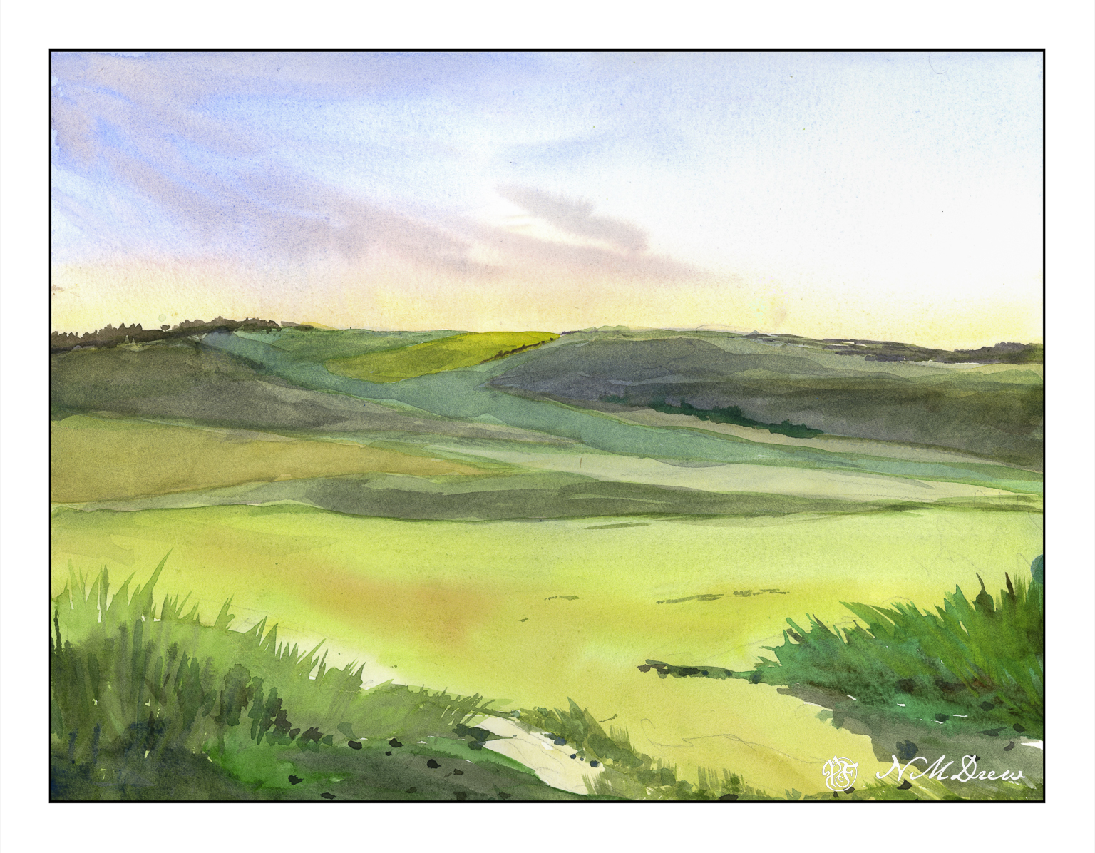
My intention here is to create the effects of early morning with sun just beginning to brighten the landscape. This needs a delicate sky. I had drawn in my sketch first and from there began with thin washes of cobalt, quin rose, and Naples yellow. The wispy clouds were painted wet-in-wet using cobalt and umber. Pleased, I again used pale washes to create the fields in mid and foreground.
Looking at the picture, I realized that the lower 2/3 of the painting were essentially all the same value even though different in color. A scan of the painting and a desaturation of color showed my assumptions were correct.
Sooooo??
A bit of thought. In the end I applied thin glazes of quin gold along the hilltop horizon and a number of layered glazes on thew lower hills in cobalt and umber. This gave depth and distance.
Another painting done slowly and with more deliberation. And I am pleased with the results as well as even learned a few things!
Watercolor, 9×12, Fluid 100% cotton CP paper.


")