We are still moving things around since my brother moved out last year. Needless to say, we are slow! In that process of making room for him, a lot of stuff was shifted, stored, and forgotten. Now that the studio is being revamped, I am refinding things, namely, two ink stones, one Chinese, one Japanese. Today I will write a bit about the dragon stone. Clicking on the image below will take you to a larger image which will allow you to see the in greater detail.
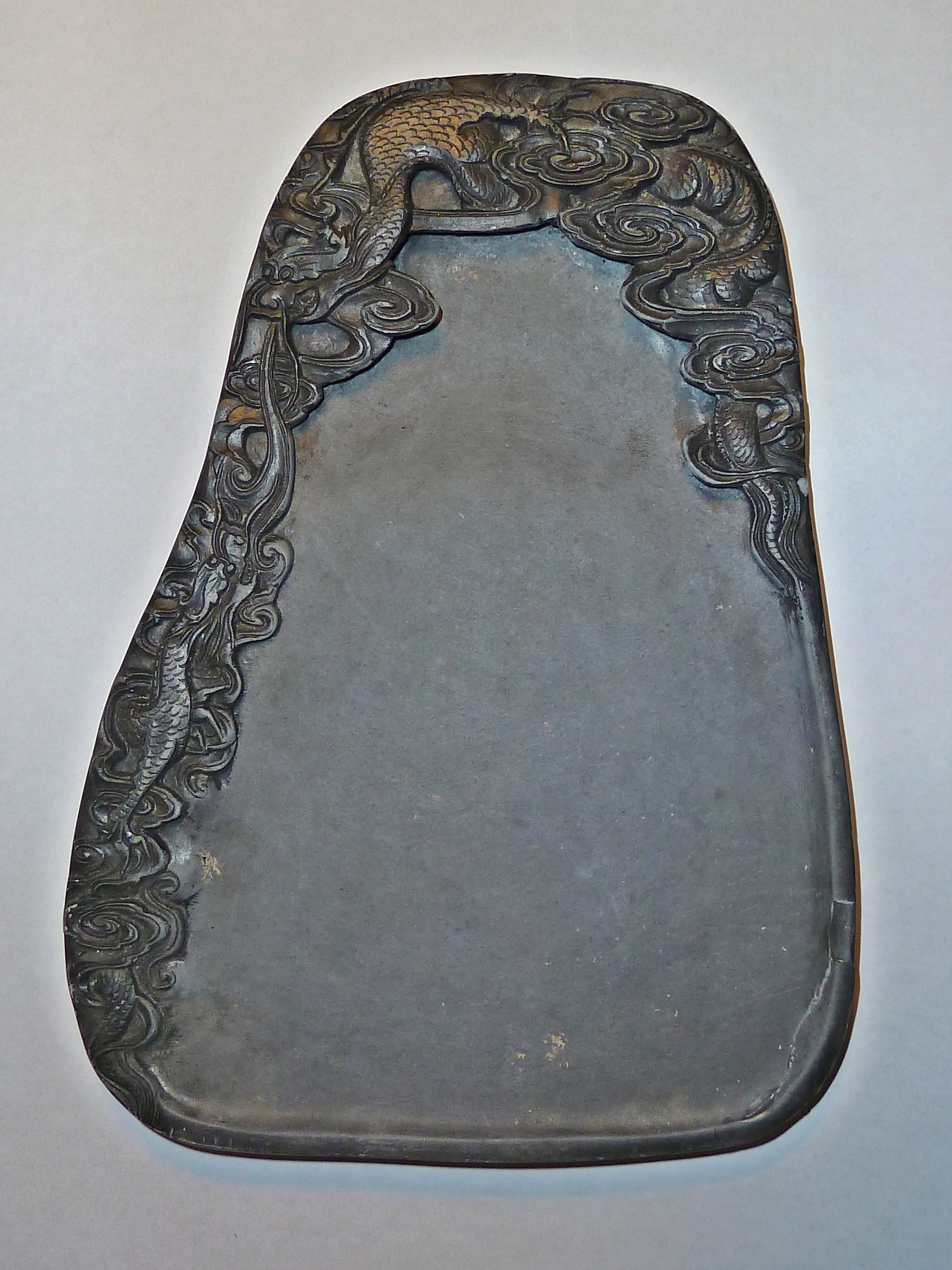
Dragon Stone - Dragon on Upper Left, Clouds and Tail on Upper Right - Smaller Dragon Along Left Edge
The above stone is Chinese and measures about 8.5 x 6 inches (22 x 15 cm). What kind of stone it is – most likely a slate – I cannot tell you for sure, but I will say the design is more Chinese, from what I know, than Japanese. The stone has a rather bell-like sound to it when tapped. Breathing on the stone shows little retention of surface moisture, as do some other stones, but a thin layer of water holds to the surface, then vanishes. I have not ground any ink on the stone as of this writing. Also, I have no idea where or when I purchased this stone! I expect I bought the stone because I like the carvings of the dragon in the clouds more than anything else – I’m a water dragon myself.
Repairing Chips on Lower Right Side of Dragon Stone
Unfortunately, when I unpacked the stone, a number of chips were in the box. I managed to salvage a few, and, not knowing what type of glue to use, decided to just try white glue. As the stone is porous, and white glue works well on porcelain, I decided to give it a shot. Admittedly, it doesn’t look great, especially in large pictures, but the mending is not too noticeable in the large picture of the stone itself. The stone seems rather soft, which may account for the issue of low moisture retention on its surface, so it may be rather porous as well. However, until I use it to make ink, I really cannot assess its grinding qualities.
Top of Stone - Dragon
I love the energy of the carving! You can just imagine wild, stormy weather, and a fearsome dragon flying through the clouds.
Dragon Tail - Upper Right
The carving on this stone is quite fine, with thin lines being well expressed in the undulating lines of the dragon’s body as he flies through the clouds. Scales are small and subtle; the whorling clouds undulate gracefully over the carved surfaces.
Left Side Carving - Smaller Dragon and Clouds
There are also small, light inclusions in the stone, which probably to the knowledgeable will give a lot more information about the type of stone this is, and its origins.
This stone is enjoyable for its carving and size. I’ll ink it up in the next few days and tell you what I think. And, hey, maybe I’ll even do some painting (at last!).
Every region has its artistic styles, as well as every time period. The same may be said for production of the suzuri, with a classical shape and style modified according to era and taste. The most common suzuri is a rectangular stone with a deep well on one end, and a flat surface sloping into it This makes sense, as it is practical and probably fairly easy to accomplish. Decorative elements and embellishments in the non-working areas are certainly possible, and I would be inclined to say almost inevitable for the expression of the carver’s creative force.
Besides the impact of regional and time preferences, the economics behind the stone’s production itself may be seen. Stones for the masses – the daily stone – are probably more plain than those for the aficionado, simply because of their utilitarian role. These can be made quickly, with or without attention to quality or aesthetics. Today, stones for tourists may be pretty but worthless as far as usability; other stones may be far better in quality and less ornate. A good stone is absolutely necessary, whether for calligraphy or painting, if you are using an ink stick.
Kiri Wood Box
Today’s stone is from Japan. It does not have a rosewood box, but it is very nicely encased in a kiri wood box. Unfortunately, I cannot read the label! (If anyone can translate for me, please let me know.) This is the only stone in my collection I have not yet used, and I am still deciding on whether or not I should – it is so beautiful as it is! Knowing me, though, I will at some point when I am not rushing around – I want to take the time to enjoy it.
I am under the impression this stone is carved from nachiguro, a lustrous black slate or river shale unique to Japan, and has been used since the Nara period (710 – 794 CE) for carving practical and ornamental items, such as suzuri, go stones, and suiseki, This stone is a sedimentary shale which originates in the upper side of the Kumano river in Japan’s Mie prefecture, and is characteristically very dark and shiny.
Suzuri Lid with Carving
Many traditional Japanese themes and symbols may be considered by a master craftsman in creating a high-end suzuri, but this artist has taken a considerably more modern approach. The abstract elements of the lid are suggestive of many things, and certainly some traditional themes as well. Just in a glance, I can envision falling leaves or swimming koi. The carving is very subtle and pleasing, working very well within the smooth borders of the circle. To the touch, the different textures are smooth and rough at the same time, without any sharp edges.
Inside Well of Suzuri
The smooth elegance of the polished stone is a bit more rough on the grinding surface and the well, having the necessary tooth to create sumi ink. The borders of the well are polished and shiny, in keeping with the rest of the stone. The contrast of these two areas repeats the circular motif of the suzuri’s shape, as well as the framing of the lid’s pattern. The underside of the lid is as smooth and reflective as the underside of the lower portion of the stone. Even the underside of the suzuri well is smoothly finished, and follows the circular motifs of lid surface and underside, and the well. This stone is not especially old, probably produced in last quarter of the twentieth century. It is a large, heavy stone, measuring more than 8 inches (20 cm) in diameter.
Suzuri Well on Left; Underside of Suzuri Lid on RightUnderside of Suzuri Well
I expect this stone could be considered something of a luxury item, for oneself or as a special gift. Given this, I cannot help but wonder if the beauty of the stone is all it has – can it be used to produce good ink? Even if it does not, there is something to be said for simply beautiful objects. The suzuri’s circular shape is pleasing, the lid’s carved surface intriguing, and the soft, candescent glow of the stone subtly elegant. Aesthetically, this suzuri is a sculpture to be appreciated in its own right.
According to Wikipedia, and other internet sources, there are four main ink stones historically prized throughout China:
For serious calligraphers and painters, a good inkstone is as important as the quality of the ink. An inkstone will affect the quality and texture of the ink that is ground upon it. Four kinds of inkstones are especially noted in inkstone art history and are popularly known as the “Four Famous Inkstones.”
The first is Duanshi stone (Japanese: Tankei) (端石砚) from Duanxi, Guangdong. Duan stone is a volcanic tuff, commonly of a purple to a purple-red color. There are various distinctive markings such as eyes that were traditionally valued in the stone. A green variety of the stone was mined in the Song period. Duan inkstones are carefully categorized by the mines (k’eng) from which the raw stone was excavated. Particular mines were open only for discrete periods in history. For example, the Mazukeng mine was originally opened in the Qianlong period (1736-1795), although reopened in modern times.
She stone (Japanese: Kyū) (歙砚) from She County, Anhui. This stone is a variety of slate and like Duan stone is categorized by the various mines from which the stone was obtained historically. It is a black color and displays a variety of celebrated gold-like markings. These inkstones likewise date from the late Tang period.
Of great rarity is Tao River stone (洮河砚) from South Gansu. This stone is no longer found today and was gathered from a river bottom in the Song period. The stone is crystalline and like jade. The stone bears distinct markings such as bands of varying shades. This stone can be easily confused with Duan stone of the green variety, but can be distinguished by a careful observation of its crystalline nature.
Chengni ceramic stone (澄泥砚) is a ceramic-manufactured inkstone. This process was begun in the Tang period and is said to have originated in Luoyang, Henan.
She Ink Stones
In particular, the She ink stone has long been prized for its quality.
The history of inkstone goes back to over 5,000 years ago. There is a lot of archeological evidence that Chinese used inkstone for grinding ink. There was a stone inkstone found in a 5,000-year-old archeological site in Jiazhai of Shanxi Province.
As one of the essential tool of ink brush painting, She inkstone, produced in Anhui Province in East China, is one of the most sought collector’s item among the literati and elite for thousands of years. It is one of the Four Great Inkstones in Chinese history.It is named after Shezhou Prefecture, Anhui Province, where it was first produced in the Tang Dynasty (618-907). Many counties under the jurisdiction of this prefecture produce She ink slabs, but the best come from Longwei Mountain in Wuyuan County. Sometimes She ink slabs are referred to as Longwei inkstones.
She inkstone is made of gray, light green, or black rare slate with markings, and the stone appears in layers and is hard. She inkstone has three features: quick forming of ink, no harm done to the brush, and preserving wetness of ink.
She inkstone has a special artistic style with different markings resulting from geological changes with passage of time. Typical markings are Gold Star, Gold Star Patch, Gold Line, Silver Star, Silver Line, Cherry Blossom Gold Star, and Small Water Wave. More rare ones are Eyebrows, Jade Belt, Jade Belt with Gold Star, Big Water Wave, Fish Egg, Dates Kernel Eyebrows, Jade Patch, and so on.
My Suzuri
The inkstone I am writing about today is my favorite. I purchased it a number of years ago from Japan, but it is Chinese in origin. It is a very large, very heavy stone, encased in a custom rosewood box. The box measures 6 3/4 x 9 7/8 inches (17 x 25 cm) and weighs 1 lb 10.2 oz (745 g), while the stone measures 5 3/8 x 9 inches (13.65 x 22.86 cm) and weighs 4 lbs. 10.4 oz (2.1 kg). It is my understanding that this is a She inkstone, and over 70 years old. Acorn Planet has a lot of information about Chinese ink stones – unfortunately, they no longer sell them.
Custom Box for Suzuri
Custom Made Suzuri Box
Boxes are custom made for each high quality suzuri, to ensure protection as well as a fit unique to the shape of each stone. Above, you can see the box for this stone. It is solid and heavy, made of rosewood. The wood is smoothly polished. The bottom half of the box holds the suzuri securely. Underneath, small feet provide support. Altogether, the box is a work of art in itself.
Inside Bottom of the BoxUnderside of Box Bottom - Notice the Feet in Each Corner
My stone itself is a beautiful dark grey color, with a single inclusion or marking, which is skillfully centered in the middle of the carvings, like the moon amongst tree branches on a foggy night. The well is deep, and the slope onto the flat surface is evenly carved. There are no rough spots on this stone. Touching the stone, it is cool. The sound of the stone, when tapped, is clear and crisp. Breathing onto the stone, the moisture from one’s breath sits on the surface, and slowly – very slowly – evaporates or is absorbed by the stone, which shows the correct porosity for hand-ground ink. Tilting the stone in sunlight shows fine sparkles, indicating the presence of pyrites.
My Best Suzuri
Ink ground on this stone is very fine, and quickly ground, and rests easily on the surface with little need to replenish the water. I use my finest Japanese ink sticks on this stone – to use ones of dubious quality would possibly ruin its smooth surface if there were coarse grains within the ink stick. To pour liquid ink onto it would be sacrilege!
Suzuri with LidSuzuri with Lid
High quality stones, according to some web sources, are well-carved, but without excessive design. Lesser quality stones may be more elaborately carved to increase their value. Various inclusions, such as color streaks or the dots, as seen on this stone, are rare and add to the value of the stone. This stone has a narrow band of elaborate carving at the top, of cherry blossoms, bamboo, and birds. Its style is very Chinese, from what I can tell; Japanese stones have different carving characteristics.
Carving DetailCarving Detail, Close UpCarving DetailInclusion or Marking
There is no way to describe the intense pleasure which comes from using a fine inkstone – it is an experience unique to itself. Any sumi artist or calligrapher will know what I mean. I am very fortunate to be able to enjoy such a wonderful stone.
Quite some time ago, I wrote about brushes used in Asia. As I am beginning Saturday morning Japanese language classes, I am in conflict with time and distance in being able to attend my Chinese painting class. I’ll just have to figure that out later. However, the fact that I am learning hiragana, my preferred practice method is the traditional brush since I enjoy it so much. It is also said that the strokes used in Asian calligraphy are those used in Asian painting. Given that, I thought it would be worthwhile to review elements of holding the brush.
Holding the Brush Is Not the Same as Holding a Pen
When I was in school, penmanship was an important part of the daily curriculum. I practiced my penmanship from first grade through the eighth. My third grade teacher shamed me by saying “Any one who draws as well as you do should have good penmanship.” Ooops! In eighth grade I won a penmanship award. Over the years, I’ve collected a few manuals on the Palmer Method of penmanship, which is the basis of much of what I was taught in school. Today, penmanship has been replaced by other methods of handwriting – you might find this article amusing if you remember your penmanship classes.
Enough digressions. The fact is that Western culture teaches the student to hold the pen at a slant. These scans from an old Palmer Method manual show what I mean. Additionally, the writing surface is also at a slight angle, tilting gently toward the writer’s lap. Paper is also angled, so that an uphill slope is created for writing left to right.
Illustrations from various books, published in the US, Japan, China and elsewhere demonstrate how to hold the brush. Rather than the slanted wrist resting on the table, the brush is held perpendicular to the writing surface, which is not at all slanted. The forearm is held rather straight, yet relaxed. The brush may be held close to the bristles, or anywhere along the handle, all the way to the top. The paper is also straight, with the idea being writing is vertical, and there is no need for the paper to be slanted.
Ms. Kuroda Holding a Brush
Holding the Brush
Hand Position
To the right, you can see how to hold the brush. This illustration is from a Japanese book on sumi-e painting, and unfortunately the only thing I know about the author is that her name is Kuroda san.
Grip the Brush Gently and Focus Your Ki through the Brush Tip
Physically speaking, shodo [Japanese calligraphy] begins with the student’s grip on the brush. Unless a suitable technique of gripping is mastered, no advancement is possible . . . First, your elbow should not stick up or out to an excessive degree. This would only create an unsettling of the arm’s weight a s well as produce tension in the muscle of the arm and shoulder. This tension can cause your flow of ki to clog in the shoulders and not be effectively transmitted through the brush into the painting. This point is important, and various Japanese calligraphy authorities have made note of its significance.
At the same time, do not let your elbow sag or droop . . . when your elbow sags heavily toward the ground, it also tends to rub against the body and produces a cramped feeling that is expressed in your in your artwork. You should feel that your elbow is floating in a settled position a few inches from your body. (pgs. 76-77)
Sitting with the Brush
In my opinion, one of the very best books on sumi-e is Sumi-e Self Taught, by Kohei Aida. No longer in print, you might be able to find it through an online used book service; if you are interested, it was published in 1968, by Japan Publications, Inc., of Tokyo, Japan. The text is in English, which is very helpful. The best part of the book is that he shows the artist how to load the brush, how angle and roll it on the ink-water dish’s edge, and many subtleties not illustrated in most English-language sumi books.
Aida san shows how to sit in a western manner (upright at a table) while holding the brush. H.E. Davey’s book, Brush Meditation, also has several photos on posture and sitting.
Going back to my blurb on knitting, posture, and pain, I suggest that you concentrate on sitting upright and focus on bringing your shoulder blades back toward the spine. Don’t arch your back, but focus on a gentle backward movement of the shoulder blades, and a focus on a plumb-line approach to your spine. If you are sloppy like me, this will be unfamiliar, and uncomfortable because you may not do this naturally, and your muscles will not be happy. However, with time, it gets easier – I’m actually remembering to do it, and occasionally find I’m still upright later on . . .
In this position, you can move your arm as well as your wrist. Tighter movements will be done with the hand closer to the bristles, while holding the hand at the top of the brush gives a wonderful looseness in the stroke. In calligraphy, I expect these same results will apply. If you look at my post about painting the dragon you will also see that the brush can be held at different angles – sideways, for example. Aida san’s book demonstrates the same.
Aida san Demonstrates Brush Movement
Movement of the Brush
This illustration to the left, from Aida san’s book, shows how the brush may be tilted to achieve a brush stroke while painting. The hand and wrist may also be tilted to create curves, pressure may be applied at the end of the stroke, and gliding motions similar to an airplane landing and taking off can make thin-to-thick line, and vice versa. Ending a stroke with increasing pressure will also create a certain effect.
The Charles E. Tuttle Company has published wonderful art books about Japan. One book which has been in print since 1960 is Japanese Painting as Taught by Ukai Uchiyama, Kay Morrissey Thompson. The reason I mention this is because the next picture is for the artist sitting on the floor, in the traditional manner, to paint. At the same time you can see that the brush is being held very near the top of the handle. Looking at Uchiyama san’s work, you will notice a very loose, wild style which is, nonetheless, very controlled and lively. Mastery of the brush allows for this, and perhaps sitting on the floor adds to the process.
Ukai Uchiyama PaintingUchiyama Holding Brush
This detail of the photograph shows you how Uchiyama san holds his brush – just the same as Aida san, simply closer to the top of the handle. Practicing this yourself will help you understand the quality of stroke and control obtained by holding the brush at different levels along the handle. Certainly the closer your hand is to the bristles, the more minute control you have. Shoulder and arm movement are more restricted when in this position. Freedom and spontanenaeity increase with distance. However, without a knowledge of how to use the brush, this can be a study in frustration! So, focus yourself, breathe slowly and deeply. Imagine your energy flowing out of the brush tip – your ki – and with practice, your brush may dance with your soul.
Artist in Action
Once more, I believe videos can clearly demonstrate something which is difficult to explain with words. This video will show you how to hold a Chinese (or Japanese, or Korean, or whatever!) brush for calligraphy.
The following video is of the young Japanese artist / calligrapher, Koji Kakinuma. In particular, watch how he changes from thin to thick lines, as well as how he tilts the brush at different angles; you will observe this by observing the brush tip. When the brush is perpendicular to the paper, the tip must be considered to be the center of the line. Tilting the brush, increasing and decreasing pressure – sometimes all combined – vary the appearance of the stroke. Notice, too, that the bristles in the brush are longer in length than a painting brush. Soft, hard, and mixed-hair brushes may be used, each having its own qualities.
Finally, here is a video about the difference between calligraphy brushes and painting brushes.
Ink sticks – sumi sticks – are made in China and Japan, and most likely in Korea as well. Bottled ink is also available, but lacks many of the qualities preferred by traditional painters and calligraphers. Pouring ink from a bottle is not the same as being able to take the time grind a fine stick on a lovely stone, to enjoy the task, and focus one’s energy. Most ink is also poorly made, and contains chemicals which can damage a fine brush or stone. It is very important that if you do use bottled ink that you wash your brush thoroughly afterward, blot it, and reshape the point prior to hanging it to dry.
In this video, the artist Hirokazu Kosaka discusses ink sticks. While he does not go into great detail about their production, he does show some interesting elements of their construction and packaging. Opening a pawlonia wood box, he shows a “color” chart for the sumi stick. The light and dark capabilities of the ink are demonstrated on a piece of paper inside the box lid. He also shows the mold used to create the ink stick. Many ink sticks are embossed with symbols or pictures, which are later colored with gold or silver or colored paint.
The quality of a sumi stick varies, from very poor (as is most sold in the U.S.) to student grade, to professional. They also vary in size and shape, from very small to very large and colored. There is some argument as to which is better, the Japanese or Chinese; I have both and will say that the professional quality Japanese sumi is one I prefer. I also have some Chinese ink sticks, and their quality tends to fluctuate. Also, the Japanese ink tends to be a bluer-black color, while the Chinese ink is more brown-black. Both have their beauty.
According to Wikipedia:
Inksticks (Chinese: 墨 pinyin: mò; Japanese: 墨 sumi), sometimes known as sumi (Japanese transliteration), are a type of solid ink used traditionally in several East Asian cultures for calligraphy and brush painting. Inksticks are made mainly of soot and animal glue, sometimes with incense or medicinal scents added. To make ink from the inkstick, it has to be continuouly ground against an inkstone with a small quantity of water to produce a dark liquid which is then applied with an ink brush. Artists and calligraphists may vary the thickness of the resulting ink according to their preferences by reducing or increasing the intensity and time of ink grinding.m Sumi sticks after it has been used), and delivered.
Ink sticks need to age, just as wine. A well-made sumi stick may be very old and very valuable. Commercially, such ink sticks are available, but not readily in the U.S. or Europe. There are various importers, but as the market is limited, they are unlikely to carry the variety available in China or Japan.
Most ink sticks sold in the U.S. are inexpensive ones, whether originating from Japan or China. If you cannot grind a dark ink in a moderate amount of time, if there are grainy particles which scratch your stone, you do not have an ink stick worth using as far as I am concerned.
This video from Yang Hai Ying (“yanghaiying” on YouTube) gives a few more details about the manufacture of ink sticks:
And finally, another one by Yang Hai Ying showing both bottled and stick ink:
For us ink stick lovers, it would be sheer heaven to walk into a shop filled with ones to choose!