Tag: flower
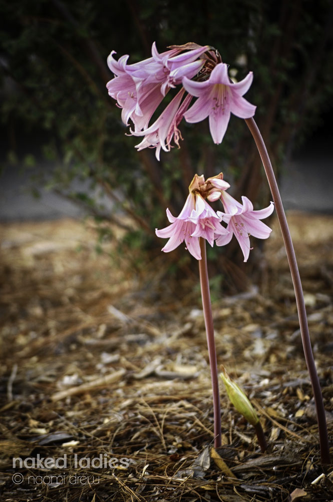
Naked Ladies

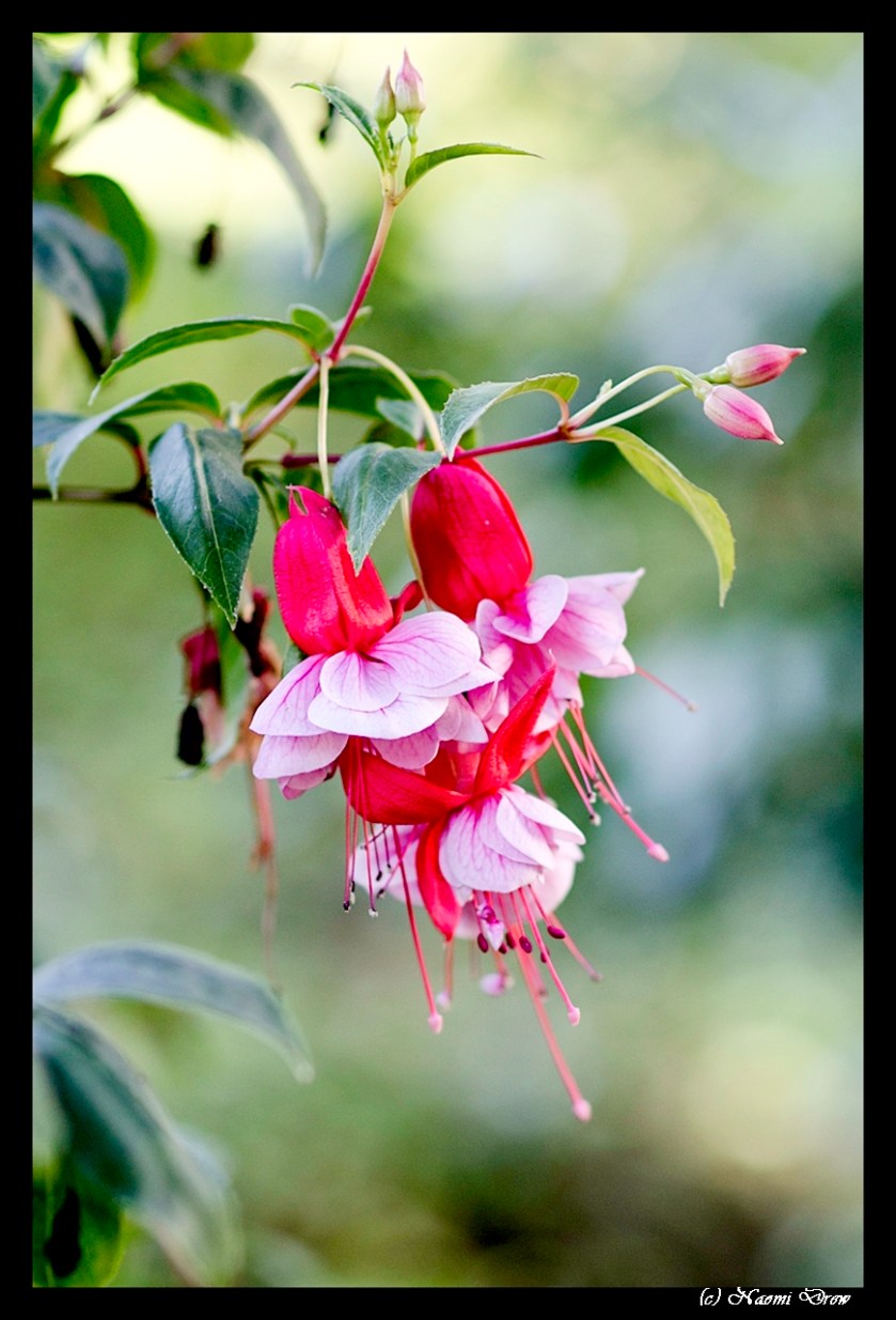
Fuschia

Pushing Up Daisies
Below is an image of a daisy taken awhile ago alongside our house. It’s rather bland. Below is the same image, with post-processing done in Photoscape. You can see that under the top daisy, the flower’s receptacle has become nearly pure black, like a puzzle piece. Even in the original picture, it is a bit dark, and consequently distracting to the eye.


Neither picture above is especially spectacular, but the post-processing certainly messed up the final image. Below are two more results, the first which is sharpened only from the original. The receptacle is a bit more defined, with its ridges a bit more clear, but not darker. The second one uses the “bloom” feature (which I don’t understand – I’m a novice in post-production photography software) in combination with the sharpening. I think the result is a little better. The whiteness of the petals is more apparent. I also used the mole removal feature to get rid of the black spot on the foreground daisy.


One thing I have a very hard time with visually is contrast – adjacent areas and their shades of grey – when I work in color. Whenever possible, I try to take photos of any artwork I am doing to check out the contrast. High contrast has few shades of grey; low contrast has several. The degree of density in each, how dark or light, can determine the “pop” in a picture. In painting, this can cause items to retreat to the background, or move forward. This is what our mind uses to create depth and dimension in a photograph or a painting.
This next photo is the last one above, converted to greyscale. It is a soft photo, not especially dramatic. There are good areas of contrast, but the petals are lost.

This next photo is the greyscale photo further sharpened, and the contrast increased. The petals are more apparent.

Finally, here are chorus lines of the photos in a row. It may be worthwhile to look at it, and thus decide which photo is ultimately the best. I set the lines up so they would span the same space, but in doing so, some of the image quality is degraded. What I am looking for is the contrast and clarity in the final image of the petals, the inside yellow part (stamens and pistils? I forget my flower sex!).


Ultimately, I am not sure about any of these photos. I think the viewer needs to determine it. Liking or disliking a photo is a personal thing. I do think, in general, the composition is rather nice, but in retrospect, I should have taken the photo from a more superior perspective, looking into the foremost daisy a bit more, but not by much. Also, to cut down on “busyness,” it would have been a good idea to remove the dropped petal on the most distant daisy, the one up against the wall. If I knew how to remove it with software, I would try it. There is some movement in the photo. The center of the daisy on the left may be a distraction, just as the receptacle on the upper daisy may be too dark.
Good, bad? I need to step back to reconsider! Too close, too much, a bit overwhelming. Later I can make a decision.

One thing which does help is turning one’s work upside down.The same can apply to a photo. Maybe I am more successful than I think, as I really like the movement in this upside down image. And, in reconsidering, I like the one of the colored daisies only sharpened a bit, with the black spot removed, the best.
Iris, i
I tend to be somewhat encyclopedic when it comes to learning about something. The result is a collection of stuff, and the clutter in my life is evidence. Given that, here is some info I’ve collected about irises. For our Chinese painting class exhibit, this will be one of my subjects.
These complex flowers, if well done, may be accomplished with a few brush strokes.
 Anatomy of the Iris
Photos, diagrams, drawings. All these can familiarize the painter with the parts of the iris plant. Knowing what is what, and where, make the difference in successful rendering. This does not mean a scientific illustration is what must be done for an artistic or spiritual representation of the iris, but knowing how it is structured helps (me, at least) figure out what an artist is attempting to do – and what I might want to do.
This schematic illustration may be found at the Historic Iris Preservation Site, along with many colored illustrations and information about irises. Other illustrations may be found by doing a websearch for parts of the iris flower.
Painting the Iris – Videos!
Watching various artists and their approaches to painting is always educational. And what is caught on video can be watched over and over. How a brush is loaded, with ink or with color, is as important as how the brush is utilized on the paper. For this, I am talking about the free-style painting of the iris, not the fine line tradition in Chinese art. One brush may express a shape with a thin line, a smushing line, and rolling. Below, you will find a number of artists and their interpretations, as well as a very structured example, with the brush strokes done step-by-step.
This first video is by Danny Chen; you may find his work at Chen’s Gallery. His mastery of color mixing is astonishing.
Virginia Lloyd-Davies of Joyful Brush is very talented; her website will show you her mastery of Chinese painting.
Next is Henry Li of Blue Heron Arts. His small business on eBay has blossomed (if you will excuse the pun) into a one from which you might buy a variety of supplies. Here he demonstrates the iris using a hake brush.
Nan Rae is a California artist who has produces lovely paintings in the Chinese style; she has authored and illustrated a number of books as well.
Next is Kazu Shimura, who I absolutely adore. You can find his videos on You Tube as well as here.
Rebecca Lynn Cragg on You Tube shows you numerous sumi-e techniques, as well as how to wear a kimono! Ms. Cragg runs a tea house, Camellia Teas in Ottawa, which I would love to visit.
Finally, Yang Haiying (I hope I spelled her name correctly), has videos on Chinese painting, and many other things. Her videos are brief, but if you watch her brushwork carefully, you will learn a lot.
