Paper & Hyacinths (or Gladioli?!)

These paintings serve two purposes. First is to check out two different 100% cotton papers and decide which has a better feel to it when it comes to handling copious amounts of water. Second is to take a color on a long journey down a sheet of paper, adding similar colors for variety as I go along. I did it in both.
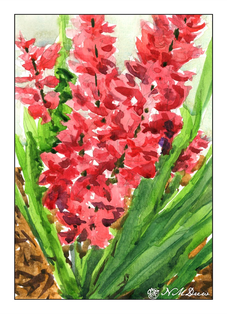
This is done on ArtBeek paper. I consider it to be a student grade paper even though it is 100% cotton. I like it as it has a nice absorbency but it is not up to snuff to my preferences. It is good for studies, though, and a very affordable and nice paper. I prefer it to Strathmore or Canson watercolor papers – they don’t come close as far as I am concerned. This paper has a texture imprinted on the front, but the reverse side is smooth. This actually makes it a good paper for gouache as well as value studies with pencil. No complaints in general.

I mixed together alizarin crimson and some other red to try to get a pink – big failure there, so I ordered some Opera, which is a rose pink of a definitely pink leaning. I worked a bead of color down for leaves and flowers, adding different colors to vary the major color. From there, once the flowers were dry, I added darker values with thicker paint.
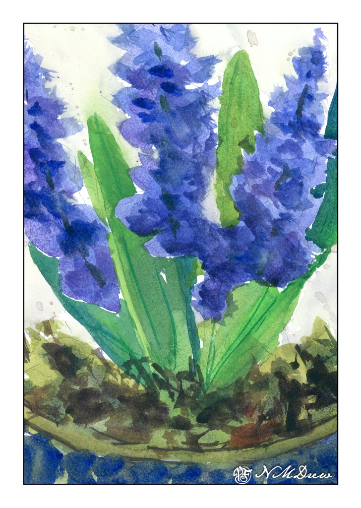
These hyacinths are not as appealing to me as the pink-red ones (which could be gladioli, too!), but the paper is. The paper is extra white Fabriano 100% cotton 140# CP paper. It connects with the paint more readily and there is a sense of contact and control that I don’t feel with the ArtBeek. This same feeling comes with Arches and Kilimanjaro (from Cheap Joe) watercolor papers.

As with the pink flowers and leaves, I worked beads of color down and added various colors as I moved. I started out with a blue that I think is too dark now, but that is part of experience. The same techniques as the pink also applied – dry the painting, add darker colors, creating some sense of depth and detail.

I tried to keep each painting pretty direct as far as colors, not adding too much in the way of glazes. I also worked on negative painting, painting the background around the flowers and leaves.

The past two days’ studies of flowers in sketchbooks were rather precious. Fussy, annoying. That, though, is the purpose of sketchbooks in many ways, as well as memories of places visited or developments of ideas.

Both paintings are 9×12.

Along Mystic Creek

I cannot believe it has been over 3 weeks since I last posted here! Suffice it to say I have been busy with learning how to handle oil paints and some drawing, and really not in the mood to look at the computer much.

That said, today a trip down to Pasadena’s Blick store was a fun morning’s journey and got my mojo going again. I didn’t spend too much, but did pick up some colors in oil and watercolor from brands not available locally (and that is not to say we don’t have a fantastic store nearby), and just had fun wandering around a well-stocked art store. The esposo did the driving as I am not a big fan of driving in L.A., even on a Sunday morning.

Anyhoo! I am trying a more subtle approach to my watercolors – perhaps less bright, more delicate? As well, trying to convey depth better along with leading the eye of the viewer where I want to go. Not too sure if it is working, but the process is fun.

9×12, Fabriano 140# CP.

A Few Paintings

No joking when I said my “new job” was watercolor painting and drawing!  I’ve been getting daily life stuff done, but somewhen in between, I manage an hour or two a day with paper, pen, and paint.  It’s paying off (that’s what jobs are supposed to do, right?) I think.  Still a lot of goofs, but some progress, too.  Mud is now something I decide to paint more often than not.  Below is a gallery of the work I’ve done in the past few weeks – not all of it, just some of it.  Click on one picture to begin scrolling through them.

I have been using two different types of paper for the watercolors. One that is inexpensive, 100% cotton is Bee Paper, in 6×9 inch format. The other is Fabriano, in block format. 11×15 inch Artistico; this is a higher quality 100% cotton that is still affordable. Both papers are really good for heavier washes. The Artistico has more tooth than the Bee paper, but the smoother surface of the Bee really lends itself well to ink-and-watercolor drawings.

So many plans with impending retirement, and I am finding I certainly will not be able to do everything I want to do – just not enough time! I used to give myself 30 minutes to paint – now I can give myself whatever time I want. Thus, first loves take over other loves, but the sewing and the photography and knitting and, and, and will get in there. Time will be dedicated!

So, on this rainy Saturday morning, the studio will get cleaned up again, and the fun continue.