Contrast Studies in Gouache

Today I set another painting goal: contrast. This means working toward bright whites and dark darks. Catching light is what art is all about, at least in photography and more realistic painting. I tend to struggle with contrast, more so when the colors are very similar. Today I decided to work on the light-dark contrast, but in the near future, monchromatic studies in black-grey-white and in variants of tone will be done.
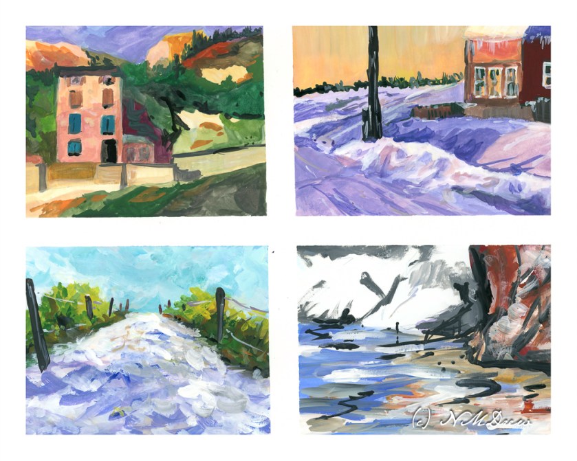
Today I chose a white, multi-media paper with a very smooth surface. I blocked off 4 rectangles on a 10×14 sheet of paper, so each rectangle is about 4×6. This is the single sheet I used.

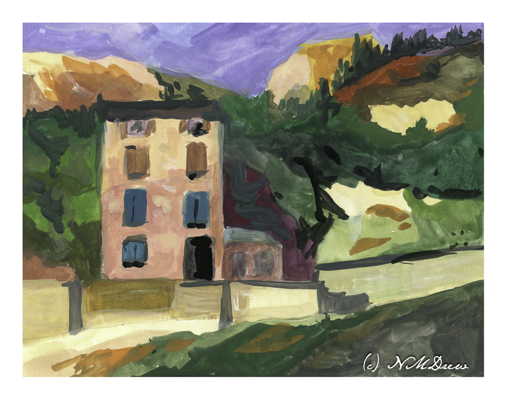
This is the first painting I did. I looked to have a shadow on the lower part of the building and the upper part in sunlight. The same for the various bits of light and dark rock and walls, or whatever they are, to give a sense of a strong light, perhaps from a late afternoon.

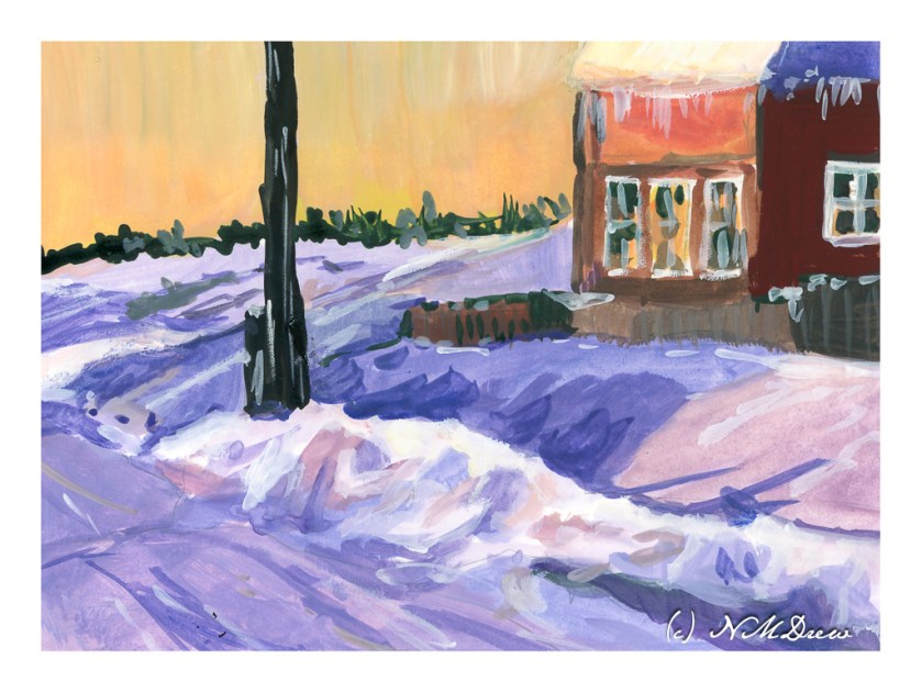
This painting was a bit easier to do than the first – I was warmed up. Here, I wanted to catch bright snow and shadows on snow and buildings. I used titanium white for the really bright bits of snow alongside the road. The contrast is much stronger than in the first painting, but the real challenge lay in capturing the snow – which is white – in shadows. I also put in some icicles on the building, which was rather fun!

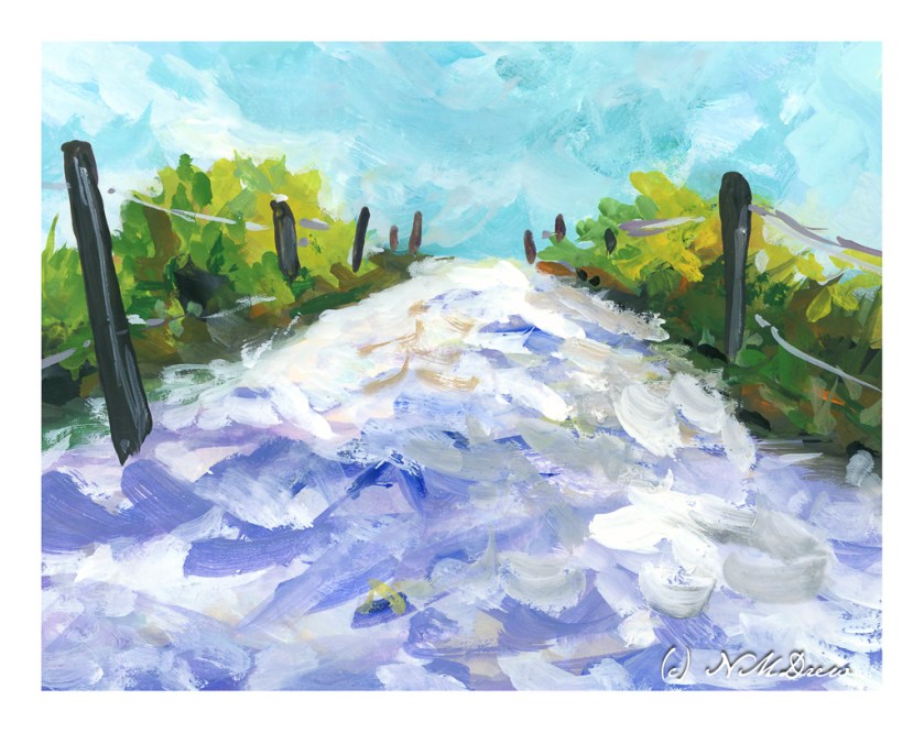
Moving from the dead of winter in the middle of nowhere, I now went for a bright day in the Caribbean. White sand, bright sky, brilliant light, strong shadows. I think this worked out fairly well and am rather pleased with my contrast.

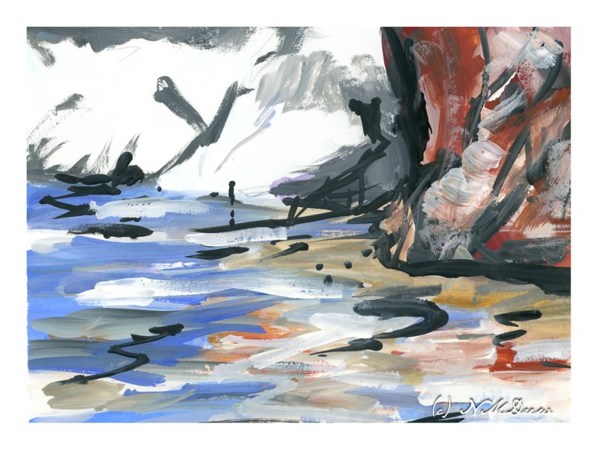
And this one? A crazy bit of abstraction of a beach, reflections in shallow water, and bright white cliffs in the background. I did this just to be “painterly” and use up the paints left over on my tray. Playtime with a bit of success.

Today’s activity accomplished what I wanted to do – strong contrast in different settings. There is a challenge in gouache insofar that colors are a bit odd in some ways. I played with colors as I mixed them trying to get a color you might call a “rosy glow” that could portray the golden light of a late afternoon or early evening. A strong white, too, with very little if any color added, was used for the cliffs and sand. More than anything, the experience of working on a lot of little paintings turned out to be a bit of fun because each painting had a slightly different area, or areas, of brightness and darkness.

Gouache, 10 x 14 paper divided to about 4 x 6.

Nocturne Studies in Gouache

For some reason, gouache seems to be especially good for depicting strong colors and contrasts. In part I think it is simply because the colors can be so very saturated compared to watercolor. Their opacity also lends to this. Artist gouache is also water soluble, and you can re-wet what you have painted to modify it. You can hide mistakes, but you can also scumble and scratch and get some rather nice effects.

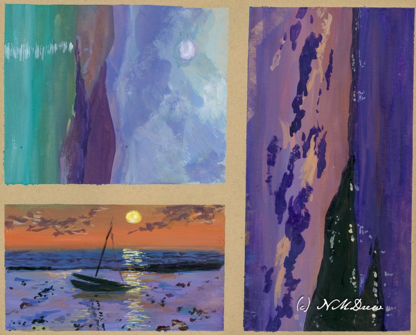
I divided up a sheet of tan paper which measures 11×14 inches. I used a lightly sticky artist’s tape to make up the different areas to paint. The first I painted is the large rectangular area on the right, and then on the left I did the next largest rectangle, and finally the one in the lower left corner. This image is directly from the scanner, so if you look carefully, you can see my mistakes which I corrected using Photoshop. The one in the lower left has 2 masts in the reflections – that is because I misplaced my mast and had to fix it for the final image.

Cheating? Well, if I were printing these critters, I would fix them, so for purposes here, I don’t think so. Also, these are all studies and the point is not accuracy so much as atmosphere – night, whether after sunset, before sunset, and on a full moon night.

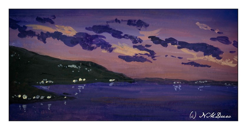
In the above painting I wanted here was a sense of dusk, when the sun is down and darkness is coming on. I worked with the sky, making it brighter than the water because with the earth’s curvature, the sky will still be bright. Lights coming on, too, add to the atmosphere, some warmer than others. And reflections, too, on the rather calm water.

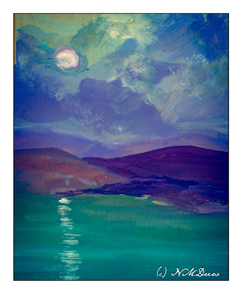
This one I played with in post because all of a sudden, in one foray of this or that setting, the light of the moon suddenly seemed to light up the surrounding clouds! I really liked it. Now, as far as the moon’s reflection on the sea – should it be more narrow closer to shore, and wider toward the bottom of the page, suggesting that is where the viewer is? The same applies to the painting below.

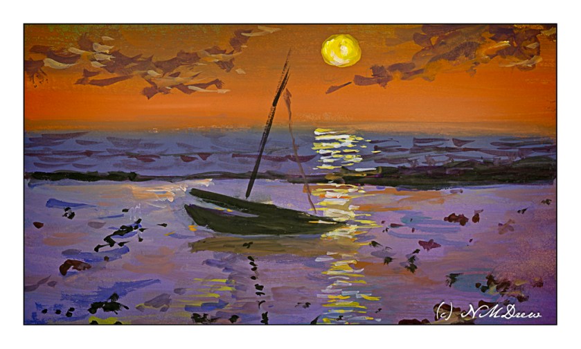
Once more, dusk. The sun is still out, but it is becoming increasingly dark. The sun’s reflection on the sea may need to be more narrow toward the horizon – again, something I need to check. What I wanted to do here was to get a sense of a boat resting on shallow water because the tide has gone out. The water is acting as a mirror and a bit of glass for the light above and the sand below.

Altogether, I had so much fun doing these studies! I want to carry them into watercolor, which I think could be extremely challenging, as well as into acrylic and oils. I also think that, much as I like the tan paper, it is very absorbent and perhaps I need to use a layer of acrylic paint or casein as a bottom layer for the paints. That is something to try later on.

As I post this, I have been awake about an hour. Rather funny to post a bunch of nocturnes as I watch the sunrise.

Now, back to my coffee!

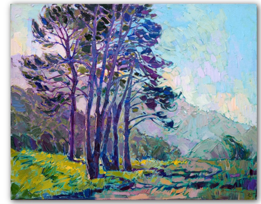
Master Copy: Erin Hanson’s “Coastal Light”

Erin Hanson painted this painting in 2017 and it measures 24×30 inches. You can find it here on her website. It is called “Coastal Light” and it shows an evening (my opinion) in Southern California sometime in the spring when the rains have come and the hills are green.

I chose this to use as a master copy because the composition is simple, and I felt I could relate to it emotionally. For me, connecting with a painting or subject matter is very subjective – if I don’t like something I am not interested. I also felt I could handle the colors comfortably.

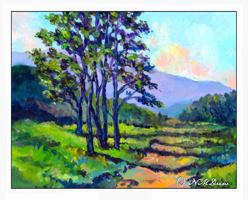
My own painting is in oils and as I worked on my copy, obviously things shifted. This master copy measures 16×20 inches, so of course my proportions are a bit different.

A number of things drew me to this painting. First, as I stated above, was the relative simplicity of the composition. The colors Hanson uses are vibrant and the air shimmers a bit. The leaves seem to flutter in a light breeze. I like the quiet energy of “Coastal Light”. The spring evening is very gentle. Additionally, what also attracted me was the way Hanson subtly outlines the shapes of the tree trunks, vegetation, clouds and terrain. Brush strokes give a sense of direction, especially in the foreground.

Initially, I tried to paint this using acrylic paint. I laid down the initial painting about 6 months ago, and really did not like it. Acrylic paints are not easy to use as they dry so quickly. I found the painting rather harsh and was thinking of painting over it with something else. Instead, it sat in the garage, ignored. And, I think, that was not a bad thing.

When my current painting class began again, I decide to pull the painting out and re-do it using oils. I didn’t have Hanson’s painting to refer to as I had forgotten where I had found the image. So, I just painted over the acrylic paint with oils, using the acrylic painting to guide me into finishing it. This took me about a month of classes once a week, and only last Tuesday did I finally consider it finished and not needing anything else.

I finally found the image of “Coastal Light.” Comparing my version to hers, I found that what I really like with both are the way the tree trunks are delineated using light colors to show light without overdoing details. Foliage, too, was something which pleased me in both paintings, with Hanson’s being a bit more expressive than mine – I am a dabber, and my foliage is definitely dabbed! When it came to bigger areas of color, such as the distant mountain, foliage, and foreground, my dabs got all mushed together to create better color masses and shapes.

For me, a master copy is to learn whatever I learn. I have no goals specifically in mind. What I came away with was an awareness of my need to stop dabbing and become a bit more bold in applying areas of paint. My dabs work well when I mush them together as subtle color variations can show up. I really liked doing the tree trunks and the foliage, working to get a sense of the direction of light on the trunk and the movement of the fluttering leaves. Achieving a sense of depth using the contrast of shadows falling across the path – lighter in the distance – was a bit of a challenge but my lovely instructor, Barbara, really helped me see what I was not seeing.

An oil painting master copy is sort of a luxurious event because time is on my side. Watercolor master copies, such as with Seago, are very immediate as watercolor is simply watercolor! Doing this, my first master copy in oils, I have come away with a better sense of how to paint a mood and light. Even better, my level of frustration was very low once I began working in oils – acrylics really cause me to get agitated because I feel like I have to work so fast to do this or that before they dry. Altogether, I enjoyed this and learned more about how to use my paints. For me, the trees were the best part of this adventure.

Erin Hanson’s colors always appeal to me, and, of course, color is subjective. Her sense of composition is one of her strong points, and her brushwork is enjoyable because it creates an energy that works well with much of her subject matter. I may try another one, working a bit differently than I did here, because the entire process was both challenging and satisfying. On top of that, she loves landscapes and the great outdoors – much preferable to portraits I think!

Winter Farm on Christmas Eve

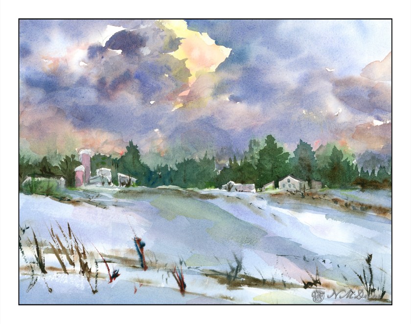
Now to the northern part of the continent . . . somewhere in North America for winter on the a prairie farm, snow covering field stubble, early evening or morning. Cold, desolate, and heartbreakingly beautiful.

I spent the morning painting this on rough 300# natural white Kilimanjaro. I did it in stages. The sketch was light, with suggestions of shapes. Then the sky was wet and yellow, quin gold, and permanent alizarin crimson used to create the rosy golds. Once down, cobalt blue and ultramarine were placed to simulate sky being careful not to merge into the rose gold of the central cloud. As the sky dried, purple and alizarin were mixed with ultramarine to create the darker clouds. 

After the clouds were laid in, I did the dark trees, blurring some green into the still damp sky, as well as waiting for the sky and soft trees to dry. This was done to create the hard edges needed for the buildings against the tree line. The buildings themselves were left white as the trees dried.

From there, the snowy field was laid in with cobalt and ultramarine in a very light wash and using a 2″ soft brush. Again, drying. At one point, the 2″ brush was dried and dipped into lightly damp burnt umber and applied to make the streaks of brown for field stubble near and far. Then the buildings were done, and once the snow dried, more thin washes as glazes applied to the foreground snow, culminating in a streak of quin gold and then permanent alizarin to the middle of the painting, hoping to show a sense of light reflected in the still dark snow from the breaking clouds above.

After that, details such as dried grasses, windows, tree trunks and whatever were added as deemed necessary.

I am pleased with this painting quite a bit! It achieves what I set out to do – a winter scene, snow, clouds, and patience to wait and think about a painting before just diving in with brush and color. The 300# rough Kilimanjaro is 11×14 and a wonderful paper to paint on. More is needed in the future for sure.

The Room

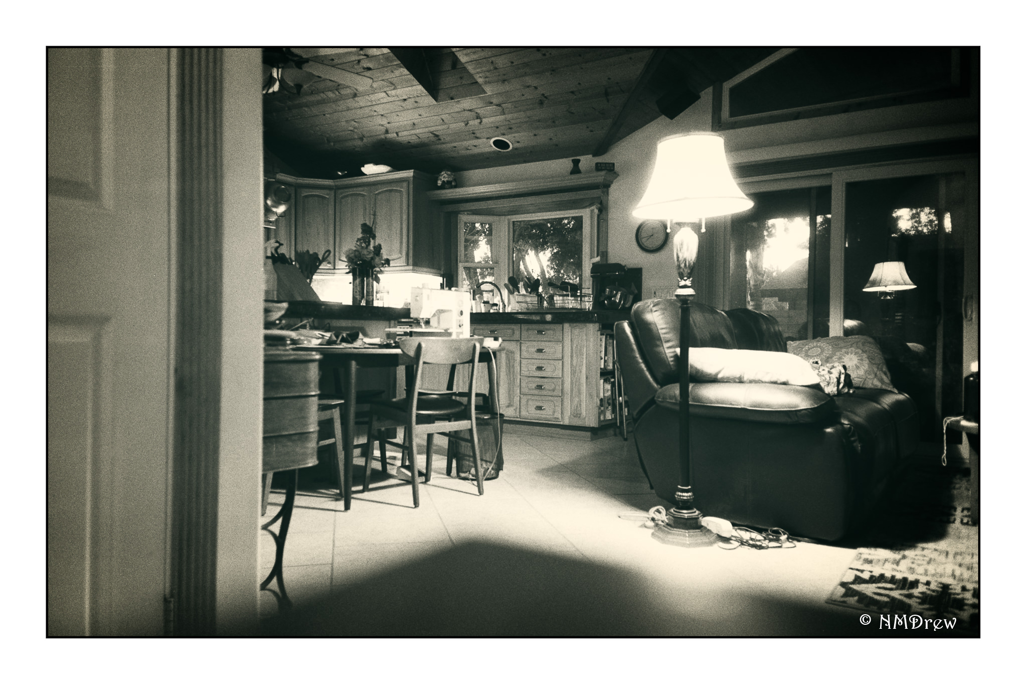
Just a random shot out of the side of the house which faces west. Early evening, so the lights were on and the last of the sunset can be seen through the trees and windows. Not sure which camera I used for this – Trip 35 or Oly XA4. I don’t even remember taking it – but do know I rather like it.