I was feeling rather depressed by my rather poor watercolors of the other day – so, time for a break. What to do? Well, how about a bit of serious cleaning up of stuff that this gal has accumulated? What I am talking about is my bill and finance drawer. Need I tell you what was in it – nay! But let us say I shredded up about 4-5 fifteen gallon trash bags worth. Now there is a lot of room in the drawer, it is organized, and I have made the resolution to shred unnecessary items about every other month.
Okay, stop laughing. There is a definite pack-rat gene in the family, specifically on the paternal side (sorry, Dad!). De-pack-ratting requires a break, and a break from watercolors means using something else. Enter revisiting pastels. I did an apple.
I was doing pastels a few years ago and really enjoyed the medium. It is a combination of painting and drawing, both of which I like. Apples are rather generic and very recognizable, and cheerful, too, if you like bright red. I do like bright red, and so here we are.
I think I am going to be doing pastels for awhile. I need a bit of a break and a change from watercolor, even though I am really trying to work hard at it. The only drawback to pastels is the dust, but I wear an N95 mask and clean up the dust with a damp cloth afterwards. Here, Nupastels and Rembrandt soft pastels, and a touch here or there with a pastel pencil. I have some fixative arriving tomorrow which supposedly will not darken the pastel painting much. The paper is Mi-Teintes, reverse surface, painted upright.
Since February or March of this year I have been taking a series of online classes, complete with live Zoom meetings, with Ian Roberts. He has been the best online teacher because he is so diverse in his interests and he brings them into the world of creativity. I admire his artwork, too, and think his book on composition is an excellent resource. For me, art is more than a pretty picture – it is an expression of a person, a skill, a view point. All of this, in a painting, is more akin to me than any other form of art, such as photography or music. While I enjoy them, I just am not as I entranced by them as I am by color, paint, and the process of painting.
That said, the first of the three courses was about drawing and values, not as an art in and of itself, but as a means to move forward into preparing for a painting. Next came brushwork, using black and white to render shades of grey and to learn about value. By adding yellow ochre, the next step was discerning warm and cool variants of color – or monochrome. Finally, we have come to the third and final class in this series – colorwork.
What is color? As the title says, color varies with hue, value and intensity. This week our job is to mix greys from complementary colors. Easy enough – or is it? Part of it will depend on medium used, and then, it also depends on warmth and coolness of colors. Our preliminary palette begins with a warm and cool color of each of the primaries, along with white if necessary. Cool colors are Cerulean Blue, Alizarin Crimson, and Cadmium Yellow Lemon. Warm colors are Ultramarine Blue, Cadmium Red Light, and Cadmium Yellow Deep. I have stuck with these three colors and a bit of titanium white gouache where I couldn’t keep the highlights, or lost them in my painting, or forgot about them altogether!
Pretty dull painting! It makes me think of the Upside Down. The point of this study was to take the clashing and garish still life Ian Roberts provided and tone it down – dull down the colors. I am using watercolors here, and I used complementary colors to tone things down but still leave the original color recognizable. The foreground cloth was bright lavender-violet; back behind squash a dark blue, wall on the left a sea green. Bowl is pinkish rose, apples green, and squash an orange with ridges casting shadows. Some shadows were hard edges, others blurred together. It was a hard exercise because I had to test my colors over and over again on a piece of scrap watercolor. This was on Arches 140# CP.
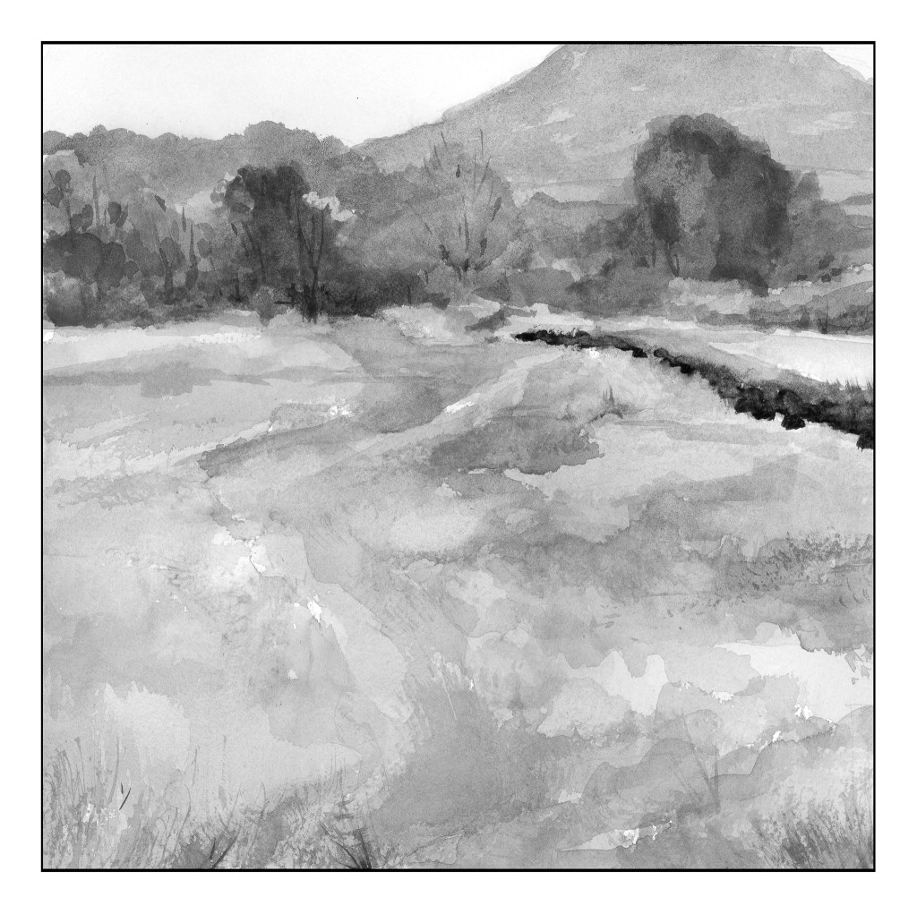
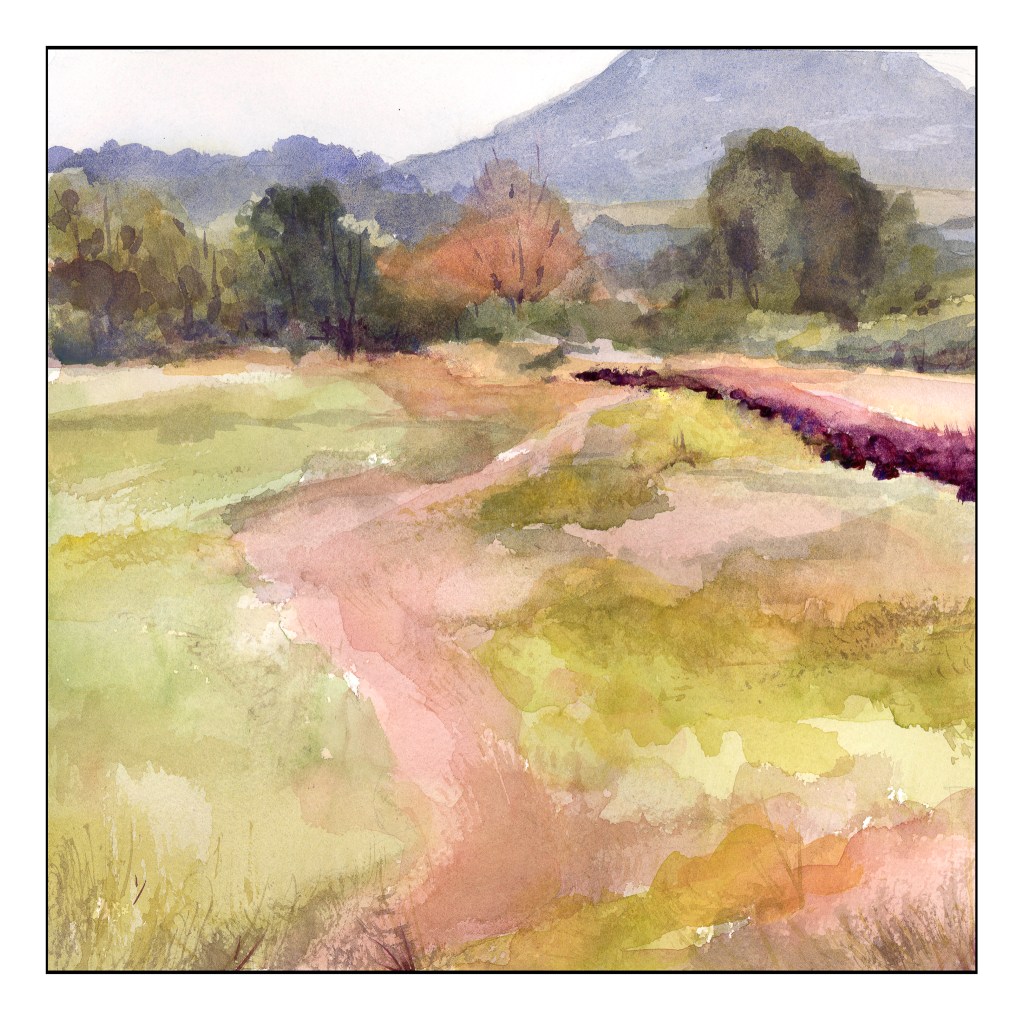
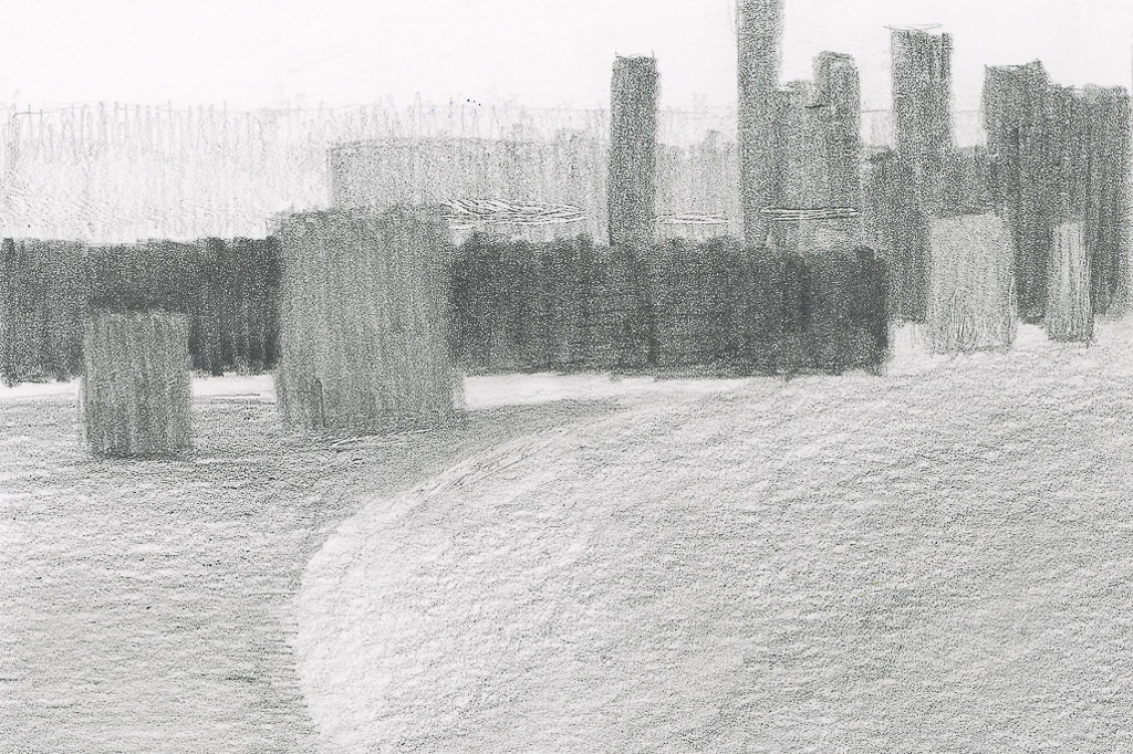
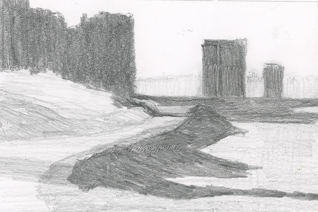
Our next study was a very low key (low key in color intensity) landscape. Evidence of a hazy day dulled all the colors so that while they were warm and cool, they all were similar in tonality. The above scan of my painting in black and white showed me I did accomplish by and large, especially in the field that makes up the lower 2/3 of the painting. The colors were very soft without a lot of bright or intense colors; rather, they all sort of blended into each other when I squinted my eyes. Only a few areas of dark contrast stood out – on the right of the field in the curve, and the bottoms of the trees at the edge of the field.
As you can see, there are no colors of high intensity. They are soft and subtle, even when dark. Hue means variations of color – and there are several, and as this is watercolor the colors are transparent and can be laid over one another or blended, depending on the wetness of the paper. The values are all in the middle of the spectrum. I used Kilimanjaro 300# Bright White paper, and this is a 10×10 inch square. My palette here are only the 6 colors I mentioned above, without any white at all.
In many ways, the still life is more “my style” insofar as the colors are laid in rather heavily. The landscape involves a more delicate and patient approach to the colors. Both were very challenging in their own way, but each taught me a lot. I liked the limited palette as I was forced to stay within its parameters, but could still achieve a lot of lovely colors, as well as darks and lights.
These past 8 weeks or so have been very, very busy. I have been taking an art class online which is very demanding and equally fulfilling. A sewing class, too, which is also demanding and fulfilling. At times I have had to make choices between the two, and the art class won out, as it always does.
I don’t know about you, but for me focusing on one thing for a long period of time becomes overwhelming and I feel trapped. It’s not like I spend an hour or two doing something, but sometimes a whole day just doing one thing. When this happens, it is really hard to get back to a normal perspective of life. That is when everything has to simply stop and a determined moving toward other activities has to be done.
One way I do this is to get out and move. Going for a walk, watching a movie, gardening, cooking, socializing. Getting out of the house, away from the studio or fabric, pulls me out of the singular focus of the moment. Being singularly focused gets a lot done, but the feeling of being trapped is not a good feeling. It is suffocating and in many ways crippling. Anything beyond the focal point becomes unimportant.
Obviously, that doesn’t work too well!
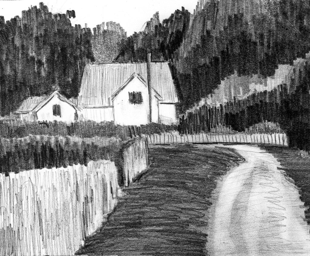
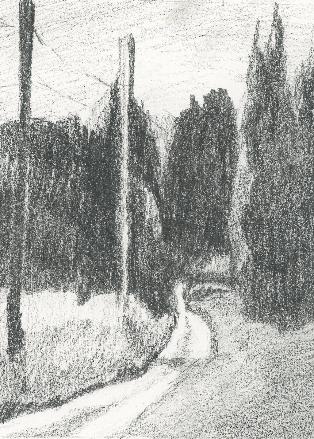
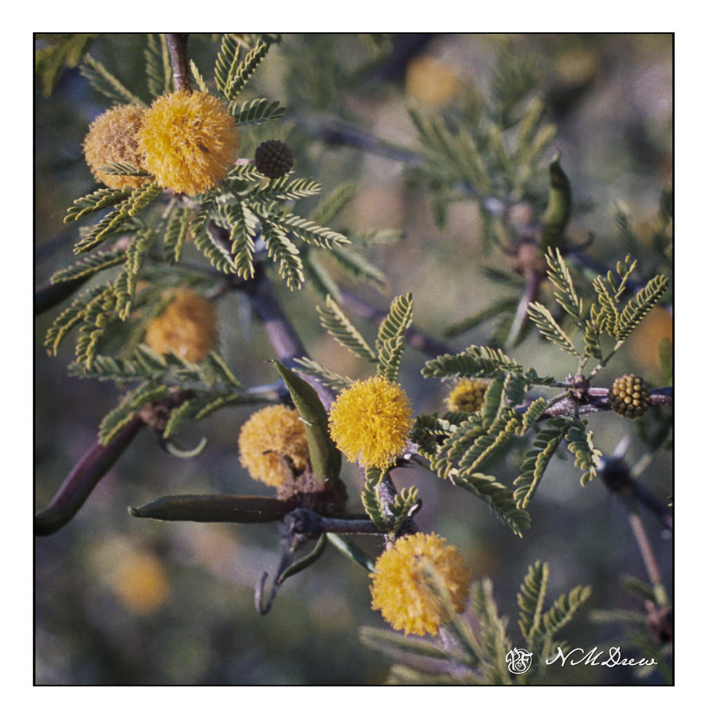
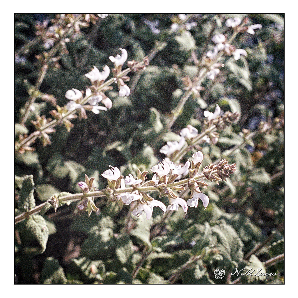
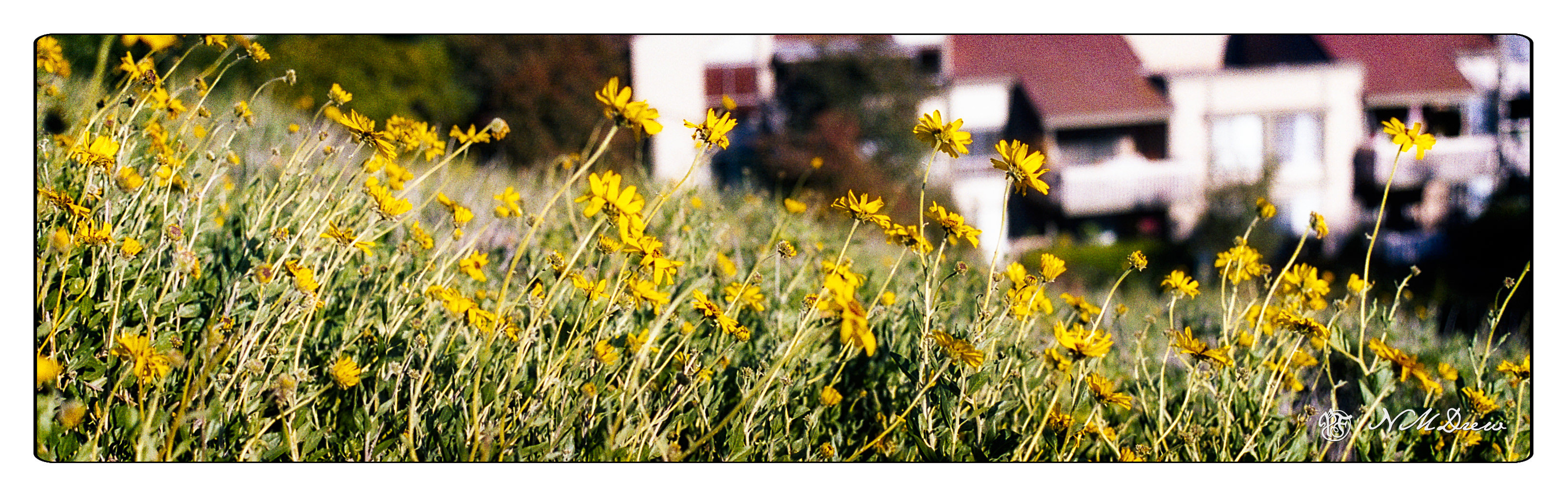
The other day, I decided to take a camera I had loaded up with film out and take a long, long walk. Up hills and down, near creeks and on rather scary heights. I went alone. I took my phone for safety, and I let my husband know where I was. I just needed solitude and movement and being out in a world welcoming spring. And then I played with the post processing, sometimes with color, sometimes with silly extremes, and sometimes just to enhance a pretty place.
The world feels a bit more normal now! And given the current craziness, it is something to be cherished and appreciated. Nature gives us something far beyond our comprehension.
Inktober comes but once a year, and it is a lot of fun, too. Ink is the focal point – drawing with it, shading with it. Not only is black ink used, but so is colored. It’s a great time to sit down and just draw with ink, or, what I always do, is to draw from a given prompt.
If you go to Instagram and type in #inktober2021, you can find all sorts of responses to the prompts. People are amazingly creative! Sometimes I feel a bit prosaic and dull, but that varies from drawing to drawing, of course.
1: Crystal
2. Suit – as in Law Suit
3. Vessel
4. Knot
5. Raven
6. Spirit
7. Fan
8. Watch
9. Pressure
If you want to see what I added below the images on my painting-drawing blog, head over to Journey By Paper to see more, or my Instagram account. At Journey By Paper you can enjoy boring commentary or doggerel by yours truly, others, as well as good poetry and song.