These past two weeks have been rather a waste – bumps in the normal routines create havoc and everything just seems to fall apart. When that happens, it really does require a focused effort to get back up and into whatever interests me. I am just coming out of a cold – thankfully, not a sinus infection – that has made me not really tired, but just lethargic and lazy between bits of fever and congestion. Lounging around and doing very little and sleeping a lot has been my agenda, filled in with little fun things like dishes . . . .
Actually, yesterday was possibly the real turning point. I was feeling better, so I did some sewing in the morning. I am hand-sewing a top without a machine (including finishing the seams with a whip stitch), just to do it. Then blob time. Miss Marple entertained me for an hour or two between naps. And then it hit me – I was just unhappy because I wasn’t doing what I like to do best – paint or draw! I didn’t want challenges or messes (ie oils) to clean up, but …. what?
Gouache!
I haven’t used gouache for some time. I keep it in the fridge between uses. So, while it was coming to room temperature and soaking up the water I put on it, I taped up a piece of 9×12 CP 140# Arches into two somewhat equal sections. Hot press paper is my preferred paper for gouache as it is smoother and lets the paint move over the paper more easily than cold press.
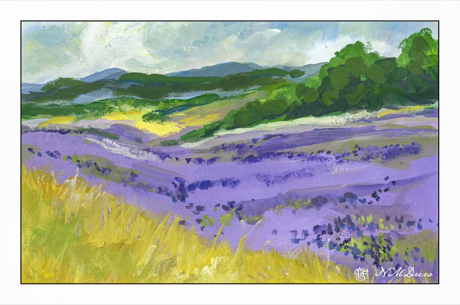
If you have been following my blog, you know that of late I am rather focused on lavender fields. This first painting was no exception. I wanted to see what I could produce, sort of from a photo, sort of off the top of my head. I wanted a gloomy-looking sky to match the grey, rainy sky of my own world this Sunday, and so moved along. Landscapes are very forgiving (I think) and are a good way to warm up when re-acquainting myself with a medium. So, a lavender field, somewhere in the world.
Then, more of a challenge: Buildings, water, plants, and a boat on a river.
Somewhere in a mythical village along the Nile in Egypt. The traditional sailboats – the felucca – are just so beautiful to see because of their simplicity in shape and line. I sourced a number of photos to create this one. I drew in some basic lines, but that was it. I started with the buildings and then the sky, painting the palms and plants before beginning the river its banks. I left the entire area of the felucca as blank paper, waiting until the end to fill it in. The sail was fairly easy, but the shape of the boat and the suggestion of a person was the most challenging. In the end, I was really pleased with how I met this challenge I presented myself!
Paintings are about 4.5 x 10 each – maybe more or less, I am not going to measure! – using gouache on Arches CP 140# watercolor paper.