Tanglewood (Pastels)

Another series of three to emerge from this Land of Pandemica, where house arrest prevails and imagination runs wild!

I took this picture about a month ago, just as the shelter-in-mandate order came down from on high.  I really like this picture because of its moodiness and the brightness of the leaves.  It looks pretty mysterious, but in reality that is an effect of the editing.  Still, I like it enough to give it an attempt for a number of reasons!  There is a rhythm in the trees and their curves.  The leaves on the ground lie fairly horizontally, while the green leaves are vertical.  All these conspire to challenge me . . . So, without further ado, below is the first attempt, in pastels as today is dedicated to pastels!

As you can see, I moved the leaves from vertical to a bit more diagonal.  I also added some “stuff” to the lower left corner as the original photo was pretty dark and lacking in detail.  The floor of last year’s leaves are more orange than beige.  I tried to pay attention to my marks – the stroke of the pastel stick – as well as to doing some negative painting to help the lighter areas stand out.

I am a fairly pleased with this painting.  Pastels are more forgiving than either gouache or watercolor – especially watercolor! – and because of this, I can think about contrast and structure a bit as I go along.  It may make the final one (watercolor) easier to do after the next one, which will be in gouache.


Color Anon

If you follow my photography blog, The Glass Aerie, you will know that I have spent the last year posting black and white photos I have made.  Some were edited from color images, both digital and film, and changed to black and white, and others were from black and white film.  It’s been quite a journey!

There is a lot to learn from doing black and white.  For one thing, it has changed my perspective – or viewpoint? – concepts – preconceived ideas – about what to look for in a black and white picture.  The simple takeaway is contrast, meaning light against dark.  By asking myself how the light is working I begin to see differently.  This simple question really helps as I see colors far more readily than I see contrast.  I tend to prefer strongly contrasty and graphic expressions of black and white photography, too, and that has been a hindrance in the past.

Let’s take a look at the image below.  Other than adding my name and a frame, this is SOOC.  I made it last night when I was out toward sunset, enjoying the world after the week’s rain, and just for the pure pleasure of taking a camera out on my walk.

As you can see, the above picture is really low key. If you like subtle black and white images, it could work. The thing I like about the picture is the line of the trail – straight, and then curving around the bush into the hills and canyon beyond. Other than that, it holds little interest for my eyes. To me, the only thing to make this a worthwhile black and white picture is to really create a mood in it of some kind. Playing will help. However, before moving into black and white, I also like to see what I can do with color and contrast in LR or other editing software.

Using Lightroom, color in the image below was enhanced, as was contrast by moving the highlight slider down, increasing blacks and whites, and opening up the shadows. Vibrance, clarity, and saturation were also changed. I did not think my first image (above) caught the light at all, nor the rich tints of green that come out after a few days of rain. As it was also sunset, there was a glow to the environment, too, but the sun was blocked by vegetation. To catch this glow, I warmed the image up a bit. The result is still subtle, but more expressive of what I saw and felt when I was out.  Now, on to the black and white conversion.  The image below is the SOOC with vibrance and saturation set to zero.Next is the second color image with saturation and vibrance also set to zero.Of the above, the second one is far more interesting to me than the first.  This is why I find increasing and decreasing varying elements in a color image so important prior to converting an image to black and white.  And, at last, my final image of the trail in black and white.  This is the one I prefer to the other B&Ws, and to the original color one as well.  More punch, more contrast, a bit of blue.

Mood is enhanced or created by using contrast to define shapes, and texture.  The play of light is easily lost for me when what I see first is color.  Playing with color in post helps me begin to see the contrast of light play itself.  It is then that I consider the subtlety of long-scale contrast (lots of greys between the black and the white) or strength of short-scale contrast (fewer shades of grey).  The result is by studying black and white and forcing myself to edit in black and white, my ability to see light and its workings has been strengthened.  It is still a weak area for me nonetheless.

Perhaps next year’s project will be to post color pictures, and then a conversion to B&W.


Light

The other day I was putzing around, looking at photography books, thinking about painting and drawing and photography, and something I read about Galen Rowell hit me.  He was always looking at the light – how it worked, what it looked like, what it was doing to the scenery.  Of course I have read about it – we all do – and thought about it a bit now and again.  However, that moment seems to have one of those clarifying moments in my creative life.

Last week I went out with my newly CLA’d Yashica D TLR camera (beautifully done by Mark Hama) and took some pictures, just to use the camera and see how it was working.  It was great – I had a serious issue with using it as the focusing screen was full of crud.  Anyway, I used Fuji Pro 400H as it has wonderful colors, but I had never used the 120 film.

When I went out with the Yashica, I thought about contrast, the differences between light and dark, but not specifically light itself.  I got some good images, just thinking about contrast, really obvious contrast, and more subtle contrast, perhaps in smaller areas.  While the processing was done in a local lab, my own post-processing was done by scanning the negatives with VueScan, my V600 scanner, and a new-to-me software, Negative Lab Pro (more about that in a later post).  I always increase contrast in post anyway – maybe it’s just my poor eyesight – because I like to have a clear picture.  Here are some of the images from that roll.

Because I was limited to 12 pictures at the most with the Yashica, I took my time.  I thought about contrast.  Plants against the sky, light coming up between the trees, backlit leaves – all of these are easily evident when contrast is considered.  More subtle color contrast, such as leaves on the same plant, some in shadow, some in sun, required more analysis prior to making the shot.  Other thoughts on contrast consdered were the contrast of light flowers against a darker background, or the light bark of the sycamore against the darker fence and foliage behind it.  In general, things worked.  DOF also adds to a sense of contrast when softly blurred items allow things more sharply in focus to come forward.

The same ideas of contrast came out when I decided to shoot a bunch of black and white images using my Canonet GIII QL17 and Kodak Tri-X 400.  Here are some of my more successful photos from that roll, again with the idea of contrast (not light) as a foremost thought – light against dark, dark against light.

Contrast, for me anyway, is not a subtle thing.  Short scale (less shades of grey) is really easy to visualize because the difference between light and dark is evident.  The images above are strongly contrasty, and to increase the contrast, I asked the lab to push the film +2 (whether they did or not, who knows!).  Long scale is more subtle, with variations between light and dark far more.

Yesterday, I went out with my Yashica D and a roll of Ultrafine Extreme 400 black and white film – only looking for light before taking a picture.  The idea of light – not contrast – was in my mind when I went out last week.  I looked for the play of light on the scene, not just contrast. This created a very different mindset.  I saw contrast quite clearly, but in looking at the light itself, and its nuances, made me look much more carefully.

It may be a bit before the roll is processed, but hopefully not.  We are planning a little road trip / photo shoot today up in the mountains north of us.  I want to use up film in the Yashica, as well as the film in a few other cameras.  Mountain road driving in a sports car with stops for a picture (or 2 or 3) is not a bad way to spend part of a day.

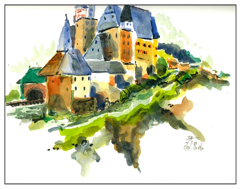
Castle, No Lines

Besides doing the orchid yesterday, I sat down and did what is being called”direct watercolor.”  As in sumi-e, the artist thinks about things before committing brush to paper.  No lines.  No value studies.  Look, see, think, paint.  It is a bit of a challenge and rather daunting, but I think this is such an enlightening way to learn the art of brushwork, value, contrast, and so on.  I did some glazes here and there, to create contrast as well as to carry various colors throughout the painting.  I also worked with vignetting, considering the shapes of the four corners of the vignette as well.