Shades of Grey?

Recently it has brought to my attention that my watercolors have very intense colors with strong contrast – too strong colors and clashing contrast. It is an interesting thought. Often I feel my colors are a bit over the top, but after working hard to get rid of mud and blandness, I worked to have more pure colors. Now that I can do this, perhaps it is time to scale back a bit. This means, the way I see it, is to create more middle tone values in general throughout a painting, and then have areas of light and dark.

So, let’s begin. On Pixabay I downloaded an image which was not too complicated but, in color, provided a pleasant array of colors and a few areas of bright and dark while the overall tone was middle values
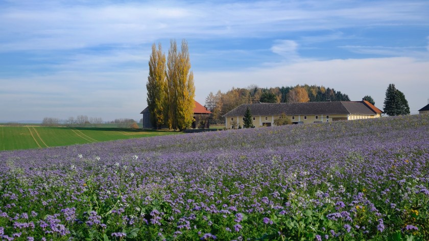
As you can see, the shadow in the left middle ground is strong, as is the tree on the right, as well as bits of the buildings and trees. I converted this to grey scale to see how well it held up to my perceptions in color to actual black and white.
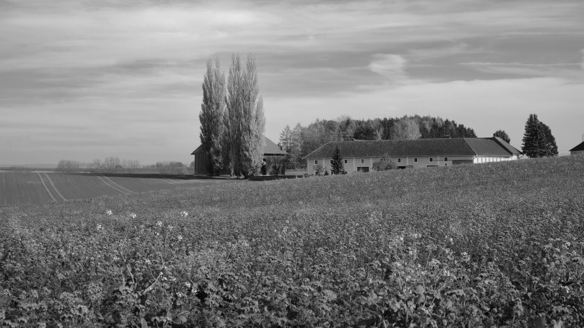
My suspicions were confirmed! My eyes did not deceive me! And, if you are interested, I simply desaturated the photograph by reducing the vibrancy and saturation in Lightroom Classic.

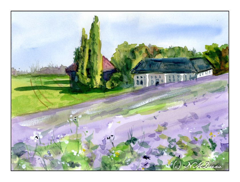
From here, on to my watercolor. I chose a limited but coherent palette of about 6-7 colors – yellow, green, red, blue, browns. Which ones I chose, I don’t recall, but I worked to create secondary and tertiary colors while I painted. My painting is meant to replicate values in the painting as well as make it recognizable without painstaking details. Below is my color rendition.

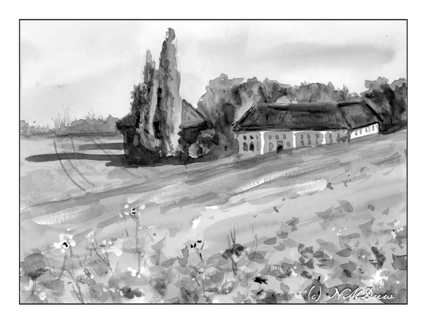
My painting looks a bit more dynamic than the photograph, I think, but it is interesting to see how it looks in black and white – again done in LR by reducing vibrancy and saturation.

Overall, most of this painting is in middle values of grey with some areas of bright and dark. So, I did achieve what I set out to do. I plan to work on this a bit to see if I like my paintings better – and, I expect I probably will. Working with color is challenging as colors distract so easily from value!!

Thoughts?

Watercolors, Hahnemuhle CP paper, 9×12.

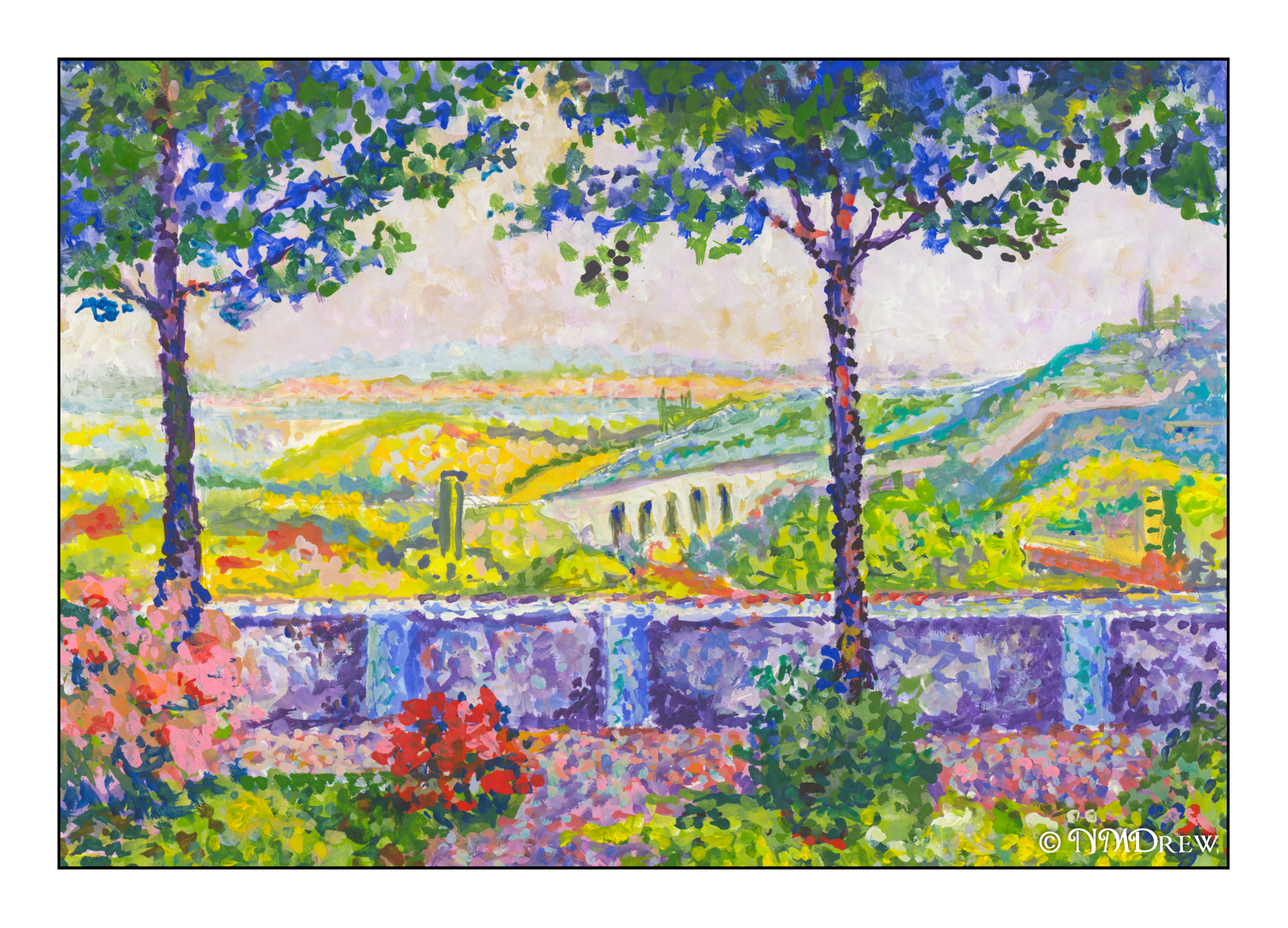
Terrasse de Meudon – Gouache Study After Paul Signac

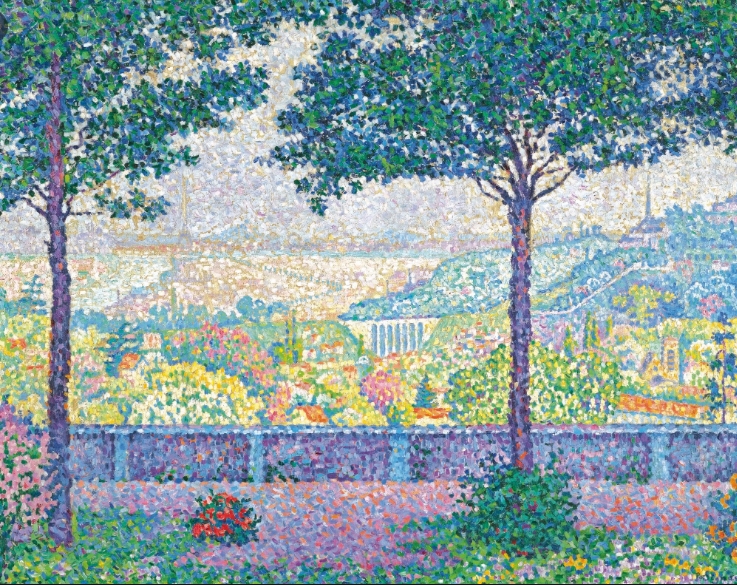
I must say, Signac does make a lot of cheery, colorful paintings! Not only are his colors great, but his compositions are often so interesting. Here, another study, mine perhaps more colorful than the original.  It is always hard to tell when you look at something on a monitor.  Even my scans are often off, needing some color adjustments before a final jpg is created.  Age can often cause colors to deteriorate in oils, too, as the varnish yellows and dims the original.

What really attracted me in Signac’s work below were the lavenders, greens, and blues.  So many shades!  Additionally, I really tried to look into how he juxtaposed colors, such as the oranges mixed in the blues and lavenders of the paved surfaces of the foreground.  The warmth of the scene in the middle ground plays a pleasant contrast to the cool, shady canopy of the trees at the top of the painting.

I am learning a bit each time I copy a painting in the Pointillistic school.  Colors are distinct from one another.  Even when a work is not a “dot” painting, I am beginning to get a better sense of color and shapes, contrast, and so on.  Much of this is just sitting around in my subconcious, and sometimes, with an original painting, it manages to escape.

Gouache Sample Cards with Zinc White

I am not the kind of person who likes to swatch things, colors, paints, knitting, and so on.  I just like to dive in and do things.  To a degree, this is good as it allows me to spend time learning about something before working on the theories, if that makes sense.  With painting, experiencing it first is for me a better way to understand something.  Afterward I can get analytical.

Since I feel comfortable now with gouache, I made up a series of swatch cards.  I took each color I have (which is far too many most likely!), painted a pure out-of-the-tube bit of color, and then, from right to left, added more white to see how the color changed.  It took a bit to figure out the best way to swatch, but that is how I like to do things – just do!

Each swatch card below can be enlarged so you can see the name of the paint color and see how it responds to the addition of white.

I found this to be a really helpful exercise. Some colors are so different when white is added, some for the better, some for the worse, and some are just plain surprising. For instance, I love Hooker’s Green in watercolor, but am not at all enamored with it in gouache. It could be the brand, too, but it came as a surprise.

My next exercise is likely to be adding black to the colors, or choosing a complementary color. I like the idea of working with complements for greys, and while blacks will dull a color, it is not the same as making a grey. I can also try my Holbein Grey #2 as well. Today, though, enough with analysis, and on to painting!

Creating My Own Watercolor Palette

Books abound about colors to use and to choose and why and wherefore.  The fact is that to understand them you have to use them.  Years ago, my palette was filled with the traditional cadmiums and earth tones and blues and such, and I am very comfortable with them.  I still love those colors as they are old friends with history and familiarity.

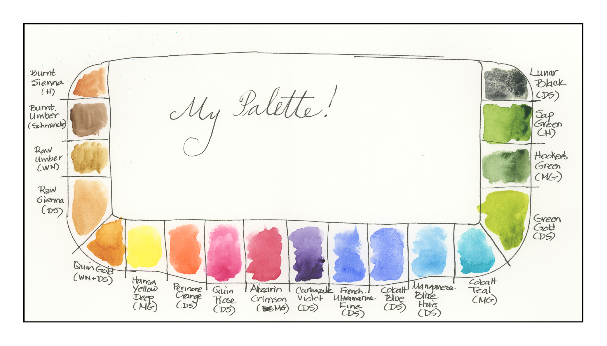
Today I decided to choose 18 colors.  Some are new-to-me (like quinacridones) in the past year, and some are old buddies, like the earth tones.  Here they are, as arranged on the palette:

  1. Burnt Sienna (Holbein)
  2. Burnt Umber (Schmincke)
  3. Raw Umber (Winsor & Newton)
  4. Raw Sienna (Daniel Smith)
  5. Quinacridone Gold (Winsor & Newton – last bit, along with Daniel Smith)
  6. Hansa Yellow Deep (M. Graham)
  7. Perinone Orange (Daniel Smith)
  8. Quinacridone Rose (Daniel Smith)
  9. Alizarin Crimson (M. Graham)
  10. Carbazole Violet (Daniel Smith)
  11. French Ultramarine Blue Fine (Daniel Smith)
  12. Cobalt Blue (Daniel Smith)
  13. Manganese Blue Hue (Daniel Smith)
  14. Colbalt Teal (M. Graham)
  15. Green Gold (Daniel Smith)
  16. Hooker’s Green (M. Graham)
  17. Sap Green (Holbein)
  18. Lunar Black (Daniel Smith)

Some of these paints are old and little is left in the tubes.  I took a chance and mixed two different brands of Quin Gold together – it might be interesting to see their differences when I use them on paper.

All of these colors sit really nicely in the wells except the Cobalt Teal, which is very runny and puddles.  I want to use it up and try a different brand – I have a tube of DS sitting in the wings – but it produces an extraordinarily beautiful green when mixed with Quin Gold.  Having used neither color in the past, that was a fun surprise.

Other new colors include Green Gold, Perinone Orange, and Carbazole Violet.  I’ve never had a violet on my palette until this past year!

When you think about it, modern chemistry and color chemistry affect us everywhere we are, from the colors of our clothes, to neon signs (replaced now with LEDs), to food, to who knows what!  Thus, it makes sense to use modern colors in a more modern watercolor palette.  Additionally, many of the colors made today are much more lightfast, which means less if any fading, compared to the more traditional colors.  A watercolor of 100 years ago was probably far more vibrant then than it is today.

Old friends include Burnt Sienna, Burnt Umber, Raw Umber, Raw Sienna, Alizarin Crimson, French Ultramarine Blue, Cobalt Blue, Manganese Blue (now a hue)), Hooker’s Green, Sap Green, and Lunar Black.

It was really difficult to choose these colors – like a lot of painters, I read about or see a color and go off to buy a tube.  There are some that are incredibly beautiful – but for a travel palette, even 18 colors may be a bit much.  For myself, I prefer to have a stable of greens rather than mixing them a lot.  I haven’t really taken the time to do it as the Sap and Hooker’s have been in the color stable for a long time.  Green Gold is totally new to me this year, so I thought I would include it.  This forced me to narrow down my blues and reds to a degree, as well as the addition of the Perinone Orange and Carbazole Violet.

Over the next several days I plan to use these colors, perhaps make some swatches and grids to see how they react to each other.  A “good” artist is inclined to do that . . . me, I get antsy unless I make it a goal!

Tree Ferns

When I first posted the outline of these ferns, a reader, Sharon, suggested in her comment to fill in just the background.  I was going to fill in the stems and leaves, but her idea was intriguing.  I had thought of using watercolor with a brush, or watercolor pencils, or even just colored pencils.  Instead, I thought brush pens (like Tombow, but not Tombow) might work.  So, I ordered them from Amazon.  Fun to use, and a lot of colors!  And a great excuse to buy some art supplies, don’t you think?  I rather like the results.  Thanks, Sharon!