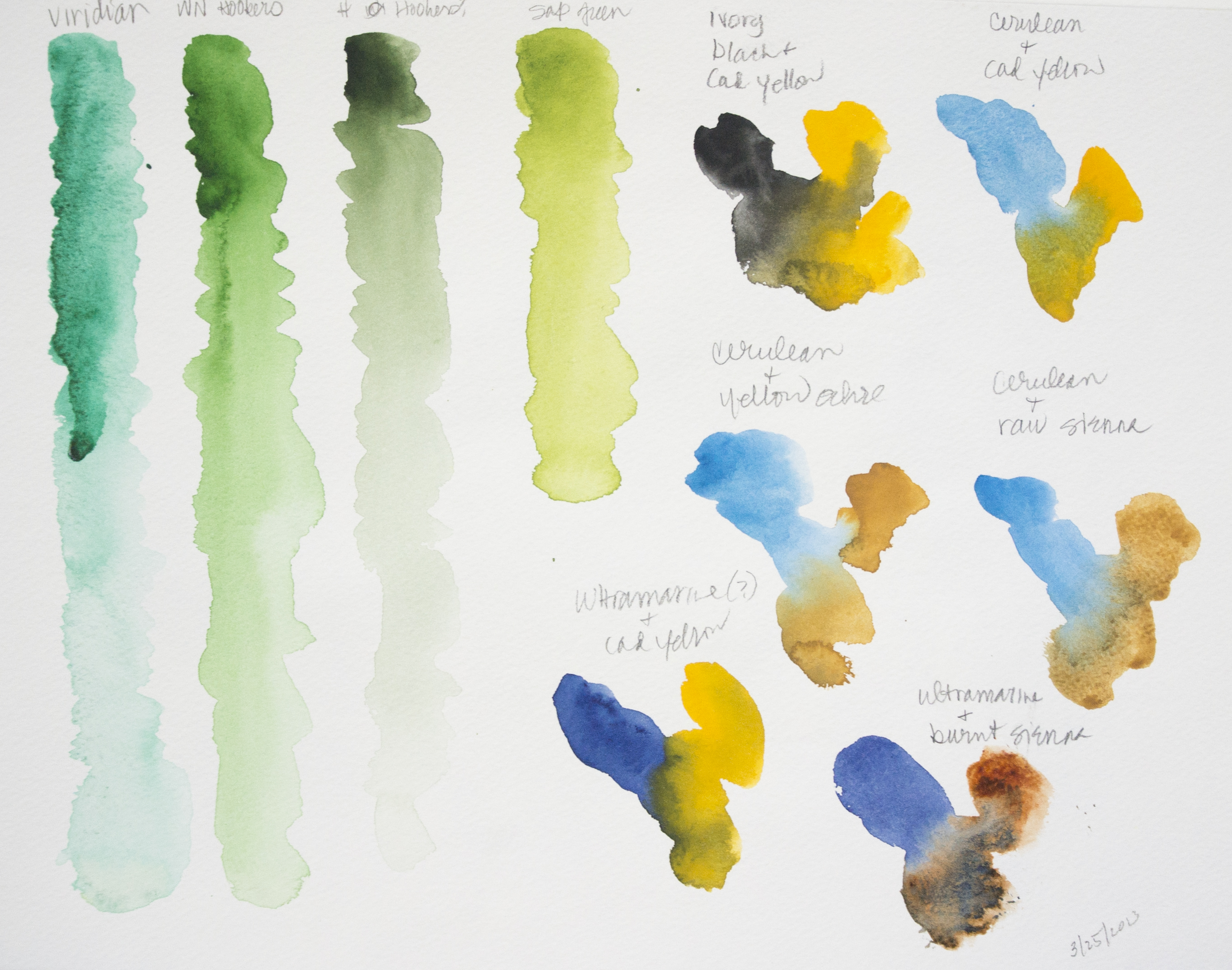
After playing with yellows yesterday, I decided to try to mix greens. A very green landscape seemed appropriate. Most of the greens were mixed using hansa yellow, quin gold, and cadmium yellow along with cerulean blue, ultramarine, and cobalt. At times, I pulled in Hooker’s green, which I really like, along with some sap green. Others at times, too, mixed with yellow or blue, or even orange!
Looking at the painting, the sky seems to not really match much of the linear quality of the rest of the picture – technique, I expect. I had wanted the trees, foliage, and foreground to be softer, more blurred perhaps, but still full of greens. One thing I should have done is to have not painted the sky across the entire upper portion of the picture – this kept the green foliage from being more discernible or distinct.
Overall, I am rather pleased with the final result. The goal was green, which I certainly got, but the composition and style, while not what I envisioned, are not too bad.