Halibut Point

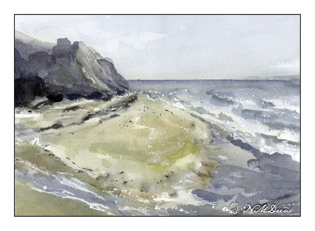
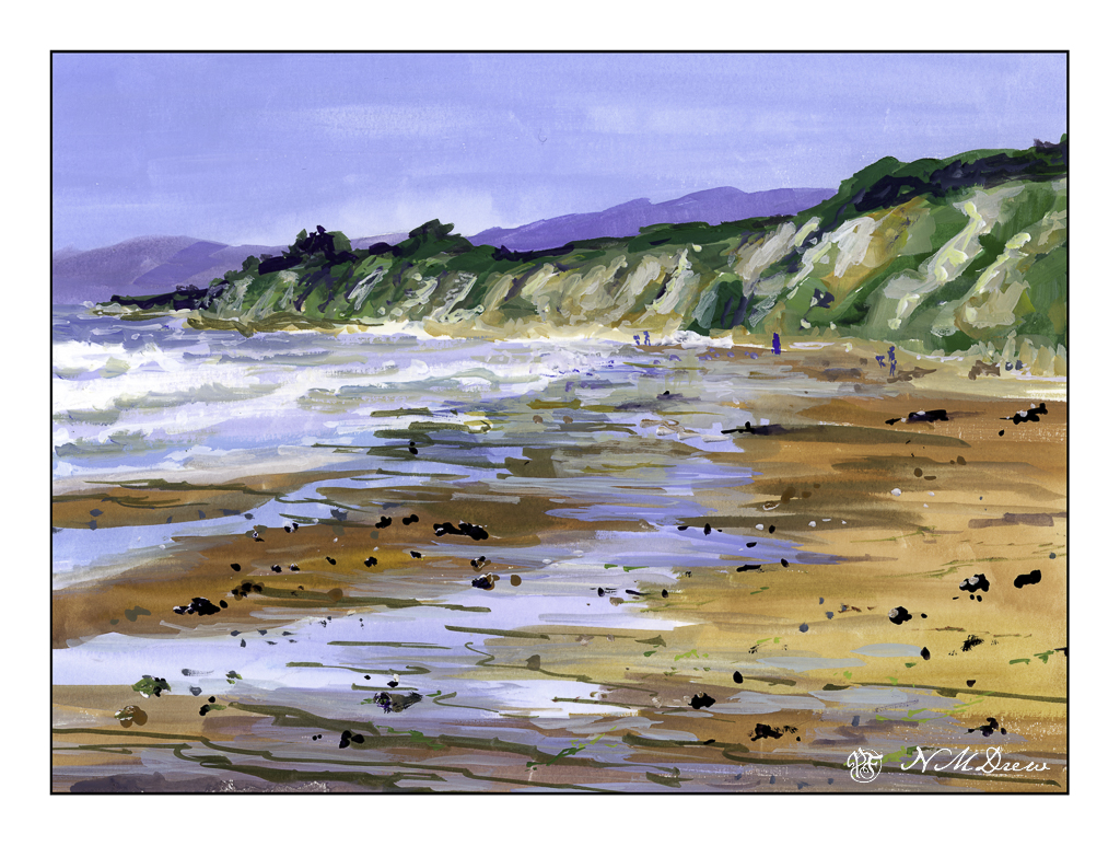
Halibut Point State Park is along the coast of Massachusetts. According to the park’s website:

Halibut Point is a granite edge between the Atlantic Ocean and the mainland. On this rocky coast, people have quarried the robust stone, built military structures to defend the nation, and today the park supports a wide variety of wildlife.


On a clear day, visitors to Halibut Point State Park will be able to see Mount Agamenticus, located 40 miles away in Maine, and the Isles of Shoals off the coast of New Hampshire. You can explore the park’s trails and tide pools, picnic on the rocky ledges, and learn about the park’s World-War II history and the Cape Ann granite industry history.

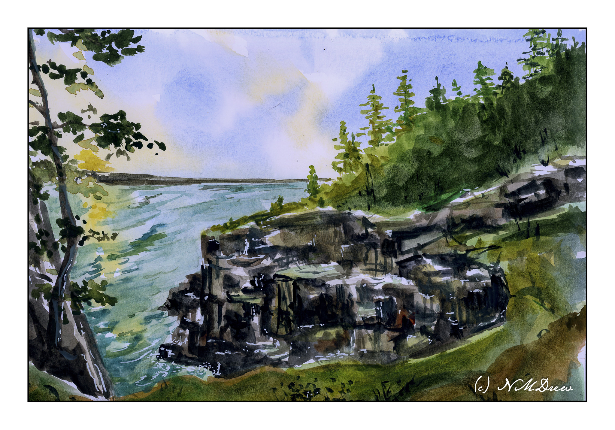
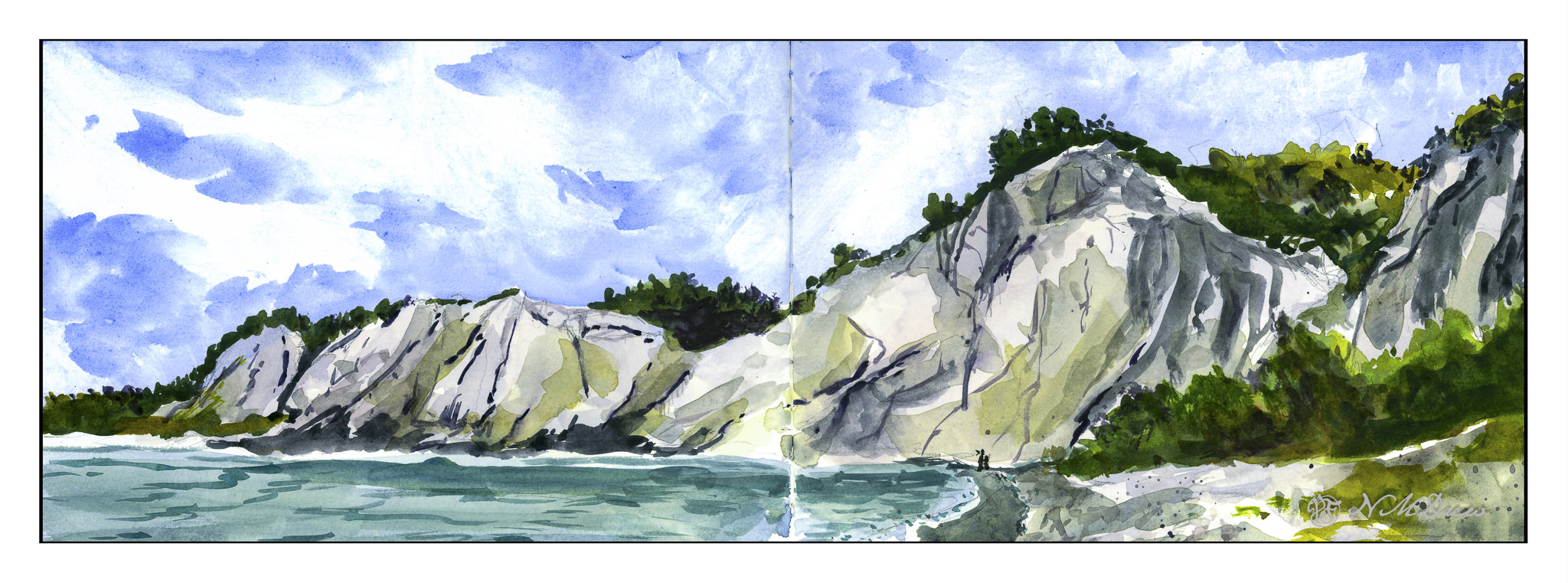
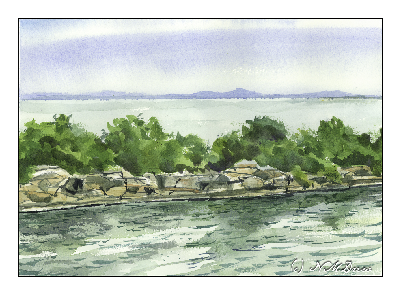
What draws me to Halibut Point is the quarry, its cliffs, and the geometric properties of the stones themselves. Water is everywhere. All these present challenges as the weather changes or the view changes. The East Coast is definitely different than the West Coast!

My focus here is the graphic quality of sky, land, sea, trees, stone, more water. The scene is quite simple but the detail can be a bit overwhelming – I want to be specific and show every leaf and grain of stone and wave in the water. I needed to make it very simple for it to work, keeping the sky and distant land and sea simple before moving to the middle ground trees.

And, I think it does. I like the way my trees tuned out – masses of greens in different value to add depth and suggest the denseness of its growth. The rocks of the quarry walls are filled with straight lines which can be vertical, horizontal, or diagonal. The color of the stone is a rather warm white to ochre, but light, too, renders it warmer or cooler. Finally, the water itself in the foreground. A calm water, but a bit of wind. Reflections in the water and ripples on the surface. More detail, but hopefully not too much.

Watercolor, Arches rough 140#, 10×14.

Outgoing Tide

After considering the intensity of colors of my last posted painting, I thought about trying something a bit more subtle. In landscapes that usually means fog and damp – and that can be a challenge in itself. Muted colors, subtle gradations, diffused light, soft edges – with watercolor, a lot is chance and a lot is forethought, and a lot is knowledge acquired by experience. I see each watercolor painting as an experiment and adventure and while sometimes things “just happen” or I am too impatient, a bit of thinking ahead doesn’t hurt.

Here, a pretty limited palette of indanthrene blue,ultramarine blue, yellow ochre, burnt umber, and perhaps a dab of this or that. I use carbazole violet often when I make deep darks, sometimes a bit of ivory black to neutralize a color a bit. Here, I also used a bit of liquid frisket to keep some areas of paper white, such as in the water and along the shore. Titanium white gouache also was applied intermittently for a bit of bright white.

Watercolor, 10×14, Arches Rough 140#.

Coastal Beach

Where I live there are so many wonderful beaches in our county, to the south, and to the north. Just pop onto Hwy 1 / 101 and off you go! Some are wide and flat, such as in Carlsbad, others are easy to get to even if they have cliffs, and others are quite rugged.

Santa Barbara County has a lot of really great beaches. When I lived there, I had a lot of favorites – Butterfly, Hendry’s, and Goleta Beach. This is a view of Goleta Beach facing north. It is very typical of this section of California – sandy beaches, friable cliffs, Mediterranean vegetation. The coastal range is often right at the ocean’s edge and can create some dramatic views from the shoreline. I really like our beaches!

The biggest challenge here was the water, both waves and the damp water on the sandy shore. Putting people in was not too hard – just a few blobs to make the blobs people shaped. The foreground rocks were a bit of a challenge – I wanted enough detail to make them believable but not too detailed. I am pretty pleased with the cliffs, distant mountains, and sky. Overall, I think this painting turned out pretty good.

Gouache, Strathmore Vision 140# CP paper, 9×12.

In Acadia

Acadia National Park is one of the most incredible parks – wild, rugged, beautiful.

Another painting with watercolor on Vision paper; again more direct approach. Not sure how good this looks online as the scan was not especially good.

This was a challenge altogether. Goal was simply to simplify. The rocks were not so easy to do as they are complicated in a lot of ways, at least here. They are very rectangular and sharp. I used broad strokes – and then some more – and then some more, each getting smaller. The trees, foreground, lighting were difficult as it was sunset or sunrise and catching the colors felt elusive. It feels overworked to me, but this is practice with both the paper and subject.

Vision watercolor paper, 140# CP, watercolor, 9 x 12.

Scarborough Bluffs

More work on painting more directly in watercolor. It is becoming easier but it still presents a mental challenge. By nature – though experience shows otherwise – I think of watercolor as splashy and fast. Well, it is not! Patience is paying off as I am rather enjoying my latest forays into watercolors.

To enlarge, click on the image.

Once more, a panorama in my current sketchbook. This one is simpler, I think, than my previous one, so it did not take as long – about 90 minutes, including using the hair dryer to dry things off.

First, sketch in with pencil the entire drawing. From there, wet the sky, leaving edges for the cliffs and trees, though I really didn’t worry about the trees too much. I knew the trees would be using dark, thick paint. The bluffs, though, needed to be fairly free of color and water, though if you look at the far left, you can see a bit of sky color ended up in the bluffs.

Colors for the sky were essentially ultramarine and cobalt mixed together. I mixed a large area of wash and applied the color after wetting the paper. To create the clouds I blotted out a lot of color. This is always a fun and scary part of any painting!!

While waiting for the sky to dry a bit, I worked on the water, the shore, and the land mass on the right. The lowest tree mass, too, was done with a mixture of colors. I am not really satisfied with it, but it is okay and not too messy or overdone. Once these areas – sea and shore and shrubbery – dried I moved onto the bluffs themselves.

The bluffs will vary in color, depending on sky and time of day. I decided these should be bright as is the sky. Mixing up a light grey is a challenge, so I did a bit of cobalt, yellow ochre, and bit of what I think may be quinacridone rose. (Alizarin crimson would work, too.). I mixed together very small amounts of each and diluted it heavily. I used this to lay int he lighter areas of the bluffs, leaving some areas plain white paper. From there, darker shades, yellower shades, lines and fissures.

The final stages were details. Trees on the bluffs, some green along the right side shore, varying color in the water, shadowed areas in the bluffs, and splattered color on the lower right. Finally, a couple of figures to give scale – these bluffs are really tall!

Watercolor in sketchbook on 140# CP paper, about 8 x 18 inches.