Sketches on a Hot, Lazy Afternoon

It’s over 90 F / 32 C today, muggy, and to do more than move around, even with air conditioning (which is not on at present), requires more energy than I want to spend. So, sitting at my computer, I decided to find pictures of things to draw.

My choice was carbon ink in a fine nib pen with a flexible point and the tan, toned paper I have been using for gouache. I get to sit still, cruise for a subject, and then scribble on smooth paper with a responsive pen. If you use pen and ink, you will know the pleasure it provides!

Above are my sketches. One piece of paper, both sides. Tan toned paper by Strathmore. I really like this paper.

I don’t think there is more to say other than it has been a very pleasant afternoon scribbling away. Each sketch is done freehand, no pencil prelims under the ink. Shapes and shadows and direction were all attempted to be expressed simply through the ink, hatching, dots, lines, etc.

Strathmore multi-media tan paper, 11 x 14, Platinum Carbon Ink.

A Painted Cat

A couple of months ago I took an oil painting class with a very good teacher at the local adult school. He won’t be back until fall, sadly, but I do have another class I am attending and which is also taught by another good teacher.

This cat is one of the assignments we had in the class, a photo provided by him to copy. For me, it was a challenge, but more than anything I wanted to use colors to provide contrast in color and value. This is not something I do easily, but I did accomplish it! Part of it was I just was not going to let the subject matter trap me into copying the photo completely.

I finished this cat up last week – it’s in oil and has been drying – and could get the shape of the cat’s nose when the new teacher reminded me that using a negative shape to create a positive one helps a lot!

And so it does – my chin and nose area were more along the lines of the proportions seen in Egyptian statues of Anubis and Bastet – a narrow mandibular area, and one a bit elongated.

I will say that I am really pleased with this painting. There are a few tweaks I need to do to clean up a couple of areas, but that is something done in a couple of minutes. Painting an animal is something I have never done, and it really was intimidating. Doing it helped me appreciate just the different brushes I could use, such as a rather beat up bristle to create a sense of fur, and a soft, pointed one to create the whiskers. Patience is also becoming more comfortable than not, and this lets me take time to work on this painting at the right time. I also work on other paintings, too, while this one or that one awaits my talents.

16 x 20 (or 11 x 14?) cotton canvas on board, oil paints.

Play with Oil Pastels

Ages ago when people thought the world was flat, I tried out oil pastels. I hated them. Messy, unresponsive, and just unpleasant to work with. I threw them away. 

Ignorance, though, and a lack of the internet, can make art materials mysterious and frustrating. Today, now that the world is round, YouTube and other media outlets show me what can potentially be done with oil pastels. Choices of paper, solvents, blending methods, brands and qualities of the oil pastels themselves has changed considerably. I bought some – Caran D’Ache, Sennelier, and Mungyo. I also bought some PastelMat paper and board, and I also have different papers here at home to try. And YouTube and oil pastel artists on Instagram.

‘Tis tangerine and mandarin season, so here we go with some locally grown. I used the Caran d’Ache as underpainting after outlining with a graphite pencil. The pencil blurred and created a bit of a fuss. To get the colors blended, I used tortillons and mineral oil, gentle touches and pressure. All play. I was rather pleased with them.

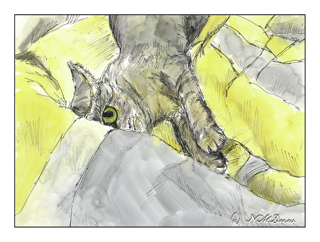
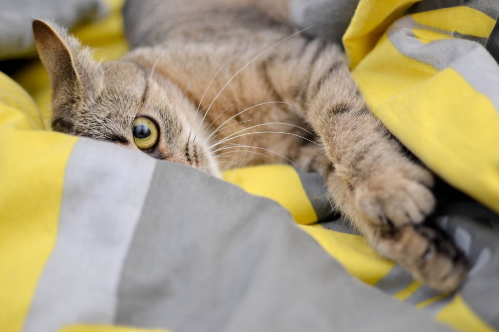
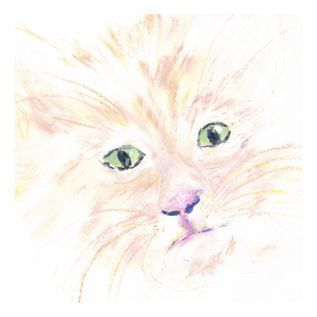
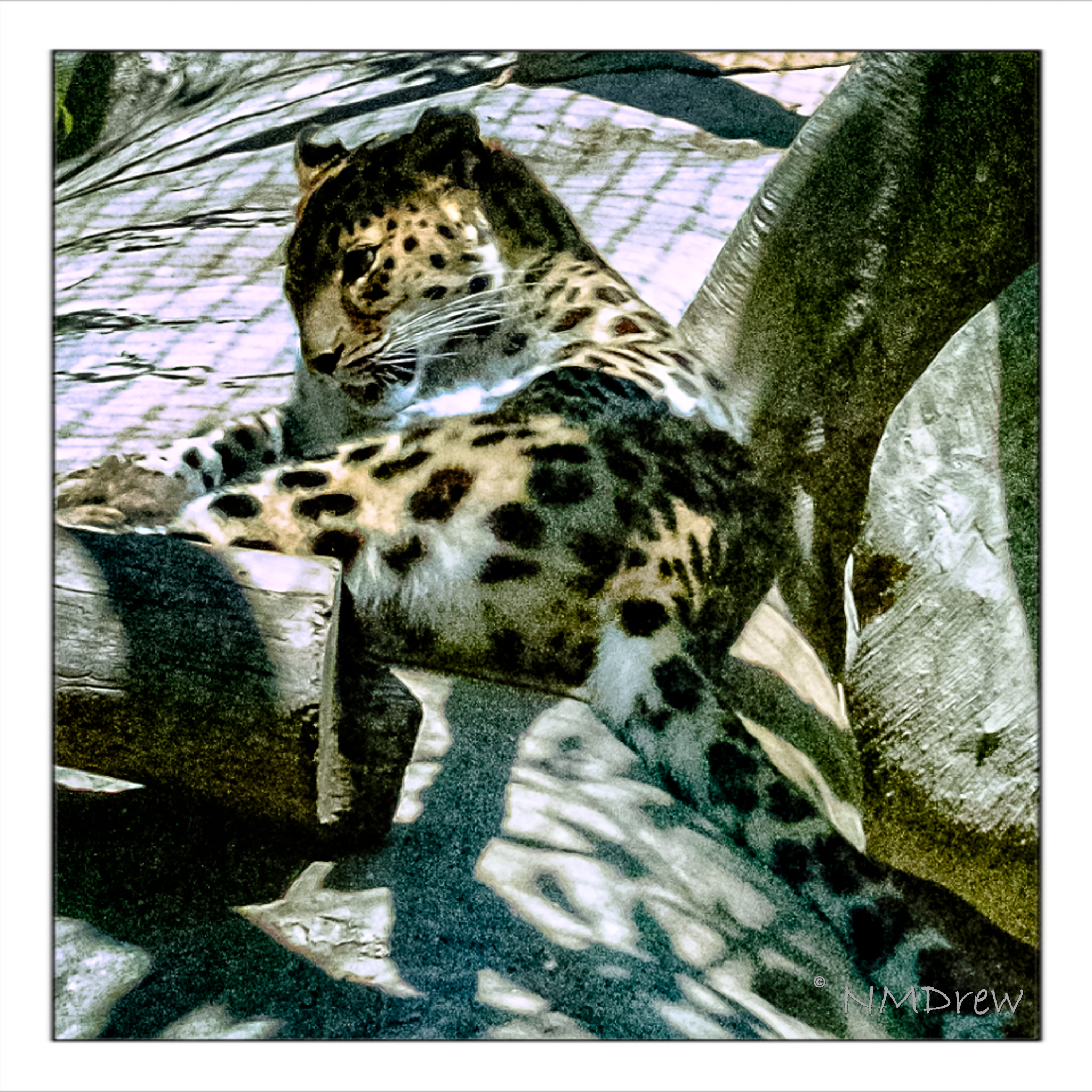
Then I decided to see how it would be to work with a very pale subject, namely a pale white and beige tiger cat. The green eyes are a combination of white, green, and blue, blurred together with a tortillon. The sharp edge of a black pastel crayon made the dark eye and nose lines, and even some colored pencil at the end to provide further sharpness in detail. Eye highlights were sort of a gamble with the white pastel – which one to use, softer, harder? And placement, too. The cat’s white whiskers wouldn’t show up no matter what I did, so I opted for a beige-y color and then some white over the lines.

Neither of these is spectacular – the poor cat is suffering a lopsided face – but the point was to play with the colors and work with blending. I did use some mineral oil on the tangerines, but everything dissolved into a gooey mess, so after the first scan, I scanned no more.

Now, on to my knitting! The acrylic painting is still vegging and that is fine for now.