Winter Valley

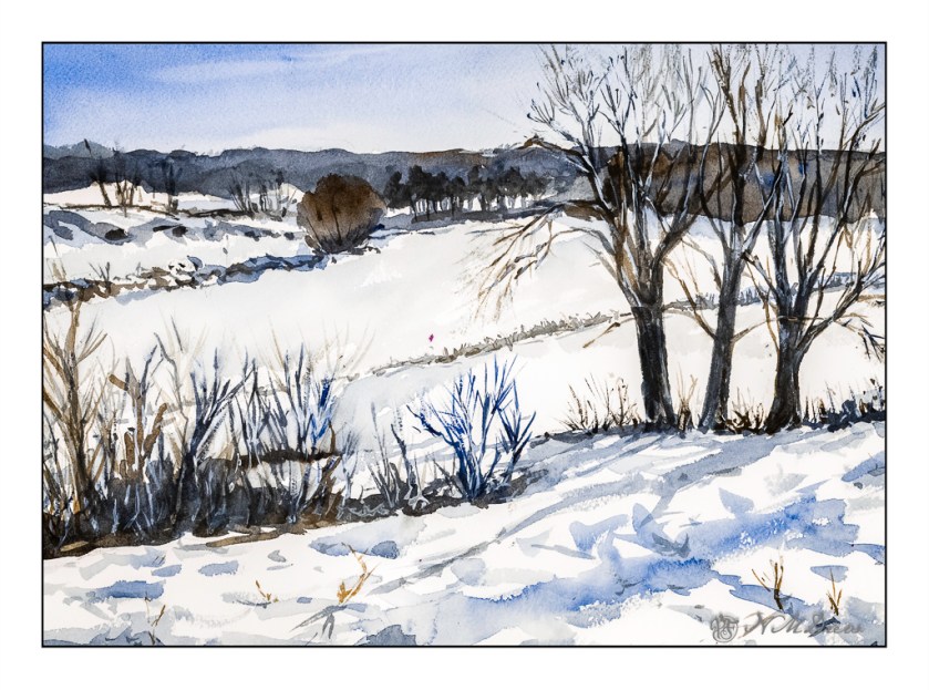
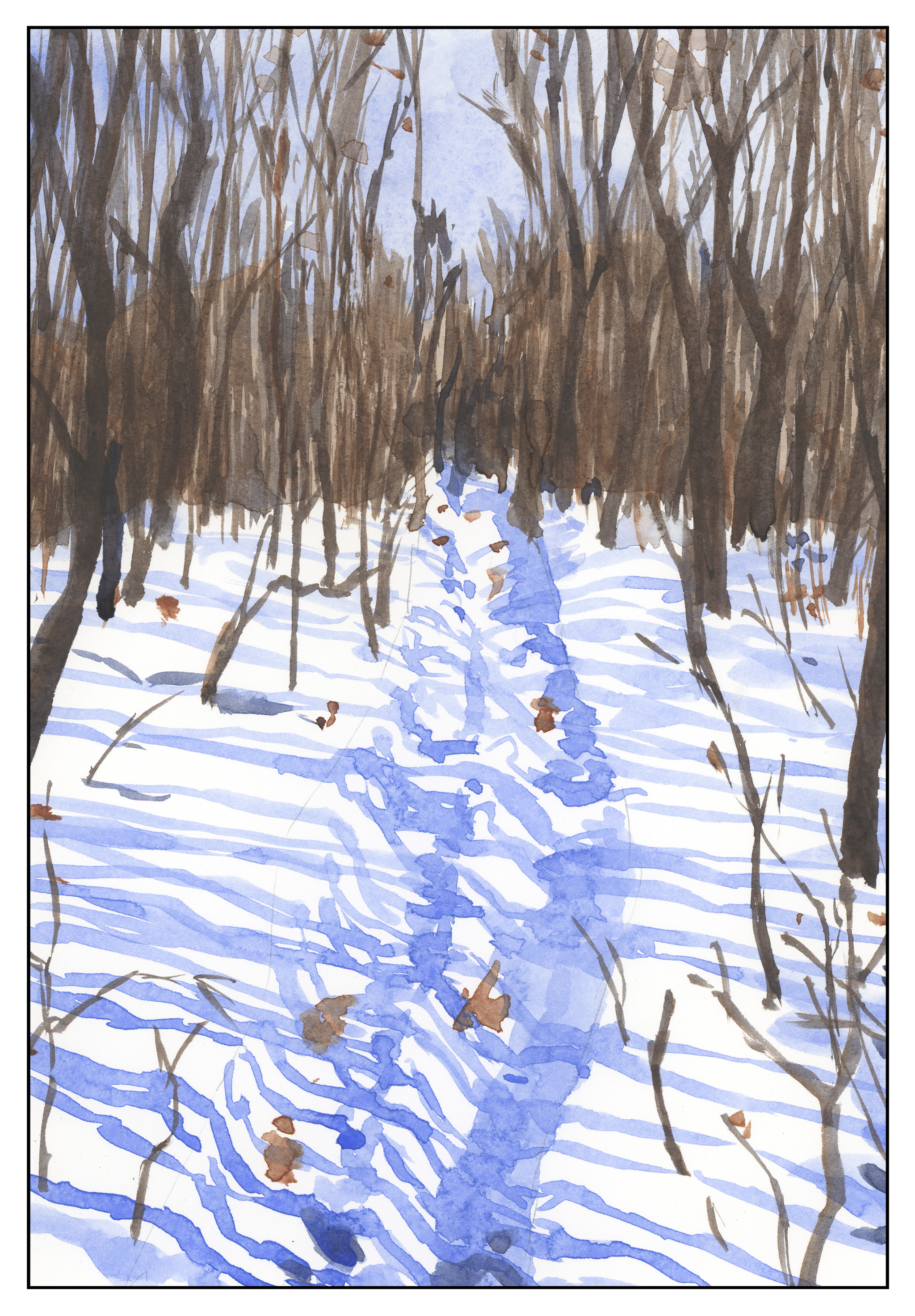
Today I thought I would be a bit self-disciplined and work with only two colors to create a winter landscape. I used MaimeriBlu’s “Faience Blue” and somebody’s artist quality Burnt Umber. Add to that, as needed, some white gouache.

I have never used MaimeriBlu paints, much less Faience Blue. This blue seems a bit of a cold one, which is perfect for a winter day. The Burnt Umber, mixed with the blue, produces a nice dark as well as plays into the coldness I am trying to express.

The first part of the painting was done with the sky – start at the top and work down. This is pure color, diluted, to create a sky. First the paper in the area of the sky was wet, and then the blue brushed in. Before the paper dried I lifted out the color.

Next I painted the distant hills and background area, solid in color, but varying the intensity of the colors and mixes of brown and blue. I painted through where the trees in the mid-ground would be as I knew the tree branches would be a bit darker once painted. Next came the trees in the foreground right and shrubs and grasses on the left as well as under the trees. All dried with the hair dryer. The middles areas were done after these dried.

Finally, the snow was tinted with blue in varying strength, bits of grasses, and final details. The snow on the trees was done with white gouache, as in the front left shrubs. Once the gouache dried, a mix of blue and brown was glazed over it to tone it down. Finally, a light wash was put into give a sense of dimension to the snow.

In the end, I am rather pleased with this painting. Using triads made me recall some other watercolor exercises I have done with limited palettes of color. The cold is much to my liking as is the complexity of the foreground giving way to simpler forms in the distance.

Arches 140# CP paper, MaimeriBlu “Faience Blue” and Burnt Umber. 10×14 inches.

Studies in Two Colors

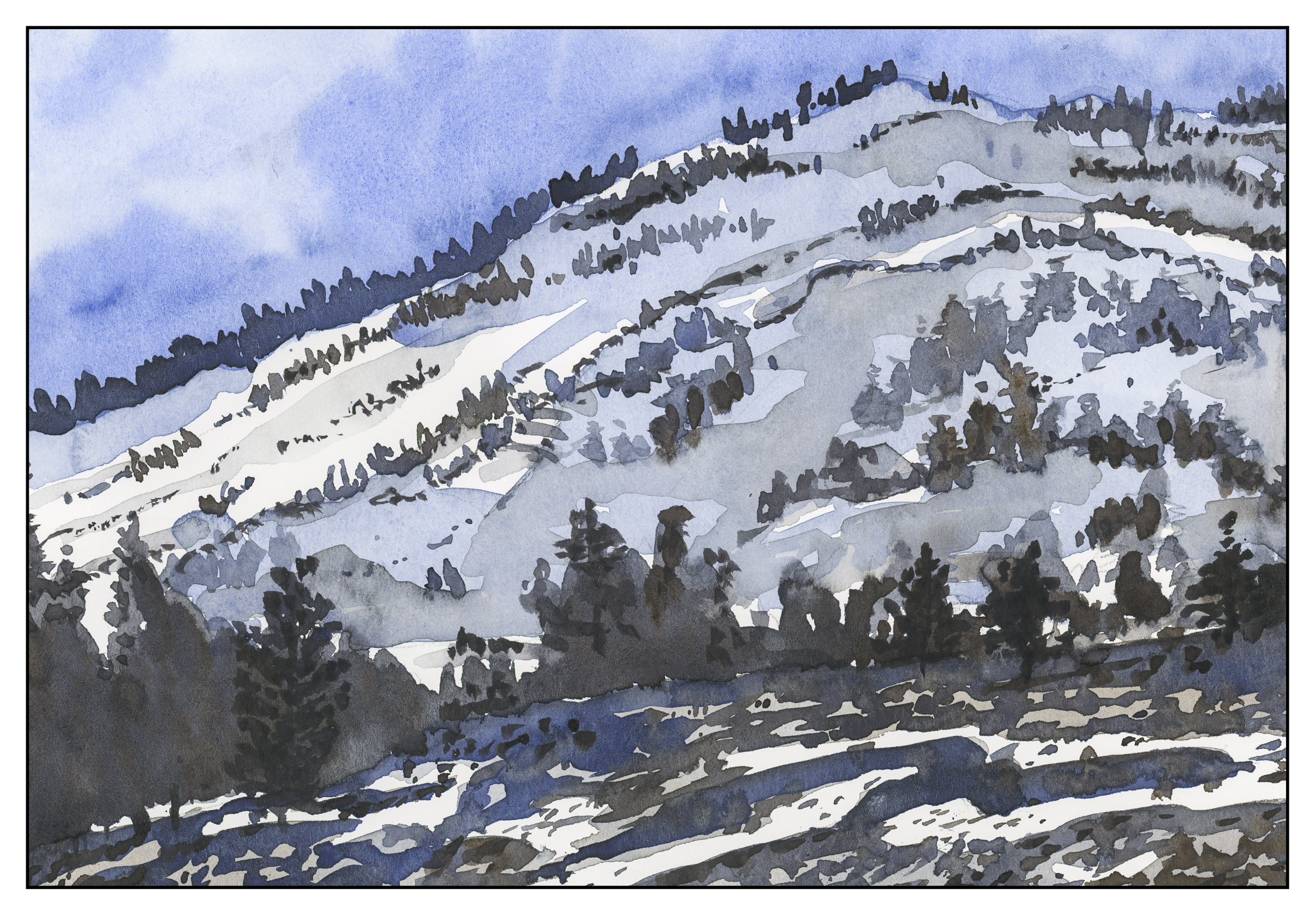
Over the weekend, I worked on numerous simple watercolors, inspired by the 2-color studies found in Ted Kautzky’s classic book Ways With Watercolor.  He suggests beginning with just two colors, Burnt Umber and Ultramarine Blue.  From his book, I did the exercise below.

The umber and ultramarine are considered to be “warm” colors from what I have read, but they work to make wonderfully cold winter scenes!  Here are some I did after the one above, to continue the study.

The beauty of using only two colors is there is little likelihood of making mud.  That’s a good thing!  Instead, I got to focus on value, which is not an easy thing for me.

Values are not just light and dark, but everything in between.  For instance, above, there is bright white, a light grey, a darker grey, and so on, moving into essentially black.

Besides working on value / contrast, the above painting was a work done with a lot of wet-in-wet, particularly at the horizon line, to blur the plant growth into a hazy atmosphere.

From there, another wet-in-wet, accompanied by a gradated wash, in the above painting.  I started with pure Ultramarine Blue, and then worked it lighter and lighter until I reached the bottom of the sheet.  Then, with a dry brush, I worked upward to remove the blues.  You can see some blue streaks left behind.  After the picture was finished, I used white gouache and a toothbrush to spatter snow onto the painting.

After all these umber-and-ultramarine paintings, I have moved onto ultramarine and Burnt Sienna.  The sienna is much warmer, to my mind, as long as it is not mixed with the ultramarine.  With ultramarine, the color can be as deep as you want – nearly black – as you can see in the trees.

The shadows across the snow, and the ruts, were painted with plain ultramarine, as was the sky.  It’s a great color for shadows, on snow or otherwise.  You will see that the dark colors, such as on the trees to either side in the foreground, are blackish, but of a very different hue than the darks in the paintings above.

This study has been worthwhile.  I may do more in just two colors, or add a green.  Varying just one color produces considerably different results.  I also did the same pictures over again, in different browns or blues, or both; this is also a good way to become familiar with colors and how they interact.

Two Color Studies: Snowfall

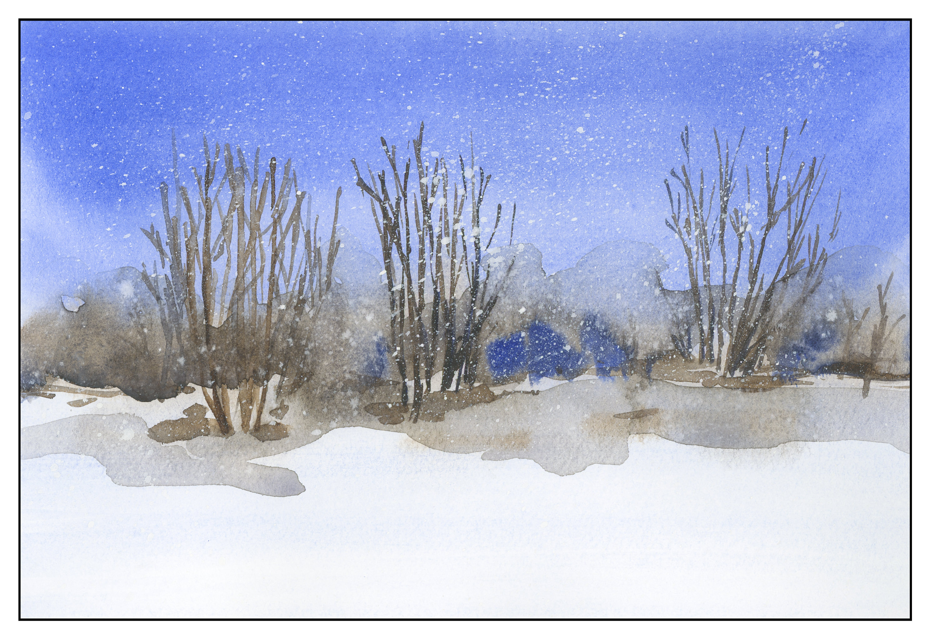
Another study in Burnt Umber and Ultramarine Blue.  Cold, wintry colors.  Here is a study done to practice laying down a gradated wash.  Using a strong blue wash, I started at the top, then went all the way to the bottom, lighter by adding more water.  Then, starting at the bottom, I used a dry brush to begin removing the wash, bottom up, until I reached the horizon.  From there, a mixture of blue and brown to create the blurred trees in the distance.  Then trees, shadows, and the shading under the trees.  The paper is not the best for heavy washes – there is a bit of puddling – but the exercise of wash and 2 colors worked.  Finally, I took some white gouache on a toothbrush and splattered it to create the effect of snow.  Maybe this is really a 3-color study?


Studies: Roadside

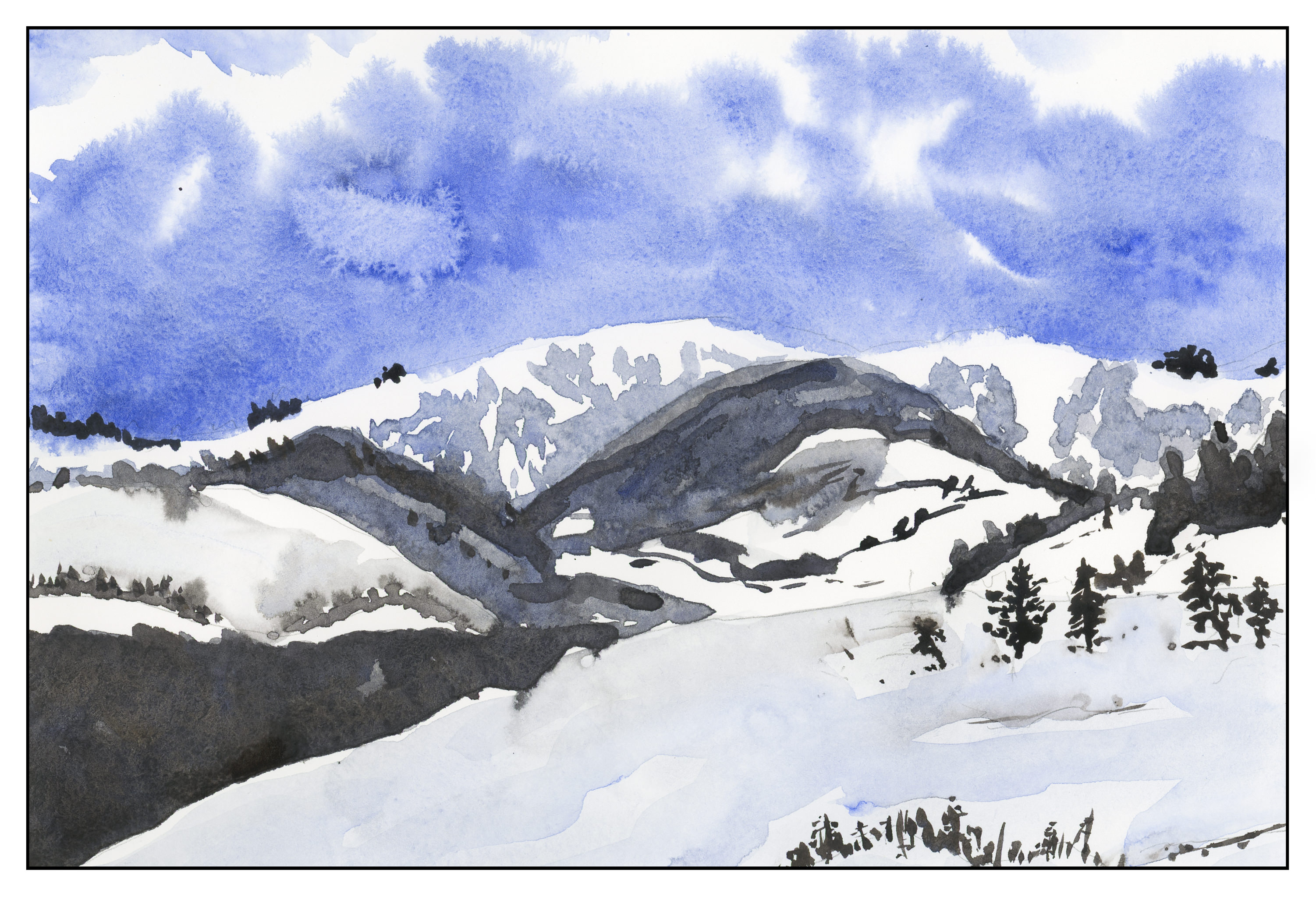
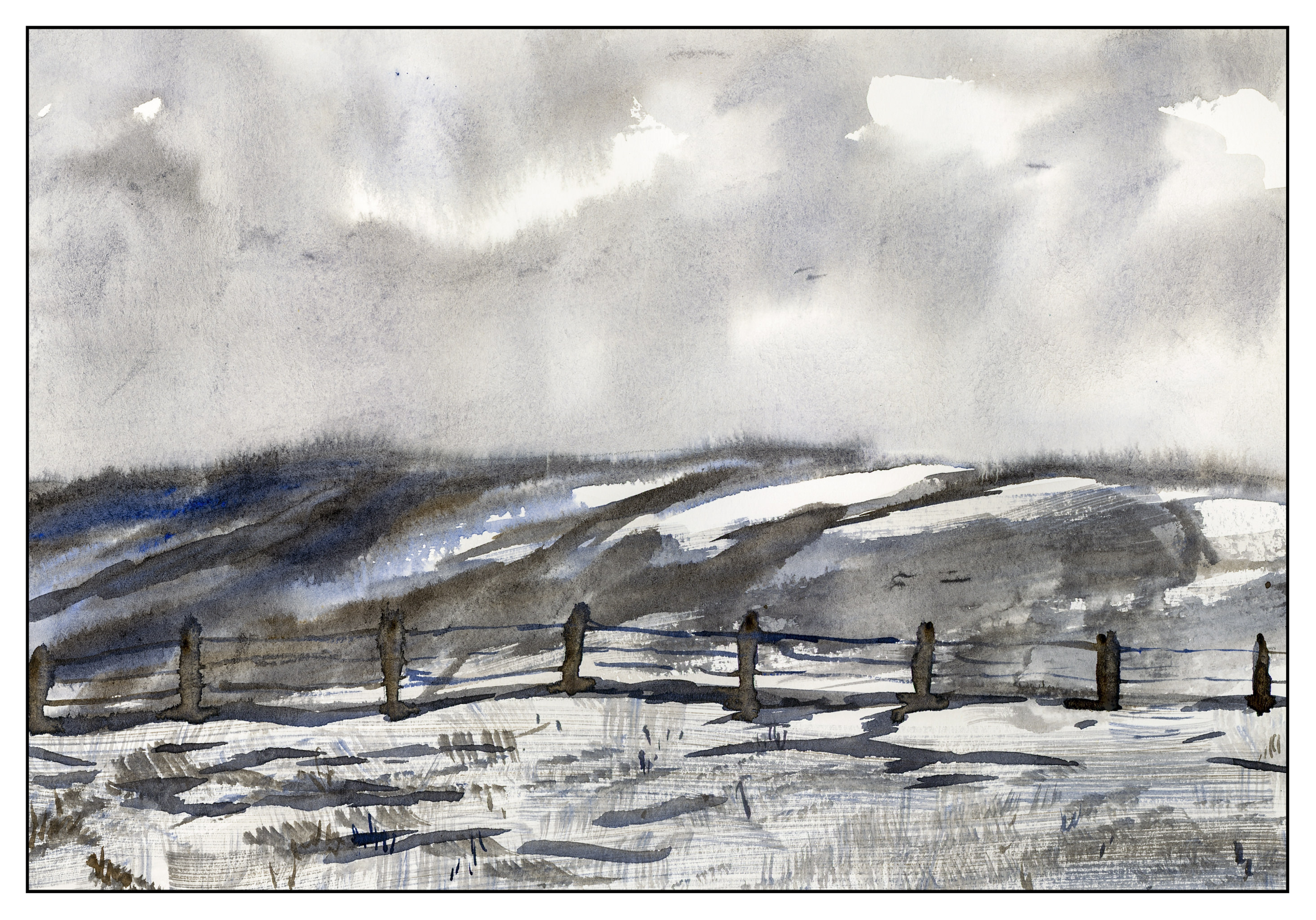
Last summer we drove through a lot of the wild west.  The loneliness of Wyoming always gets me – vistas of open space, few cars, fewer people.  Taking a picture during the summer is much different than what you see in winter, so I looked at some of the photos I took out of the window as we drove from Laramie to the Tetons.  I tried to imagine how barren and cold it could be.  Always the sky, always the distance, always the barbed wire fences.  Again, in Ultramarine Blue and Burnt Sienna.

Besides trying to imagine a scene, I also tried out a new brush.  It is a Cosmotop flat, by DaVinci brushes of Germany; it’s about 3/4″ wide.  I wanted to see how it would do on the Canson XL paper I use for practice, in particular to see if I could get a “sparkly” effect with a dry brush.  The paper is too smooth for that to work successfully, which is why there are fine lines in the foreground.  (Sigh.)  It did a pretty good job for wet-in-wet sky, and along the horizon line.

Two Color Studies: Incoming Storm

Another study in Ultramarine Blue and Burnt Umber.  These are really good colors for portraying cold and wintry conditions.  Brr!  Where I live, we have had weather in the 80s for much of January and February, so a break from the heat is much needed.  Today, though, it’s a whopping 52 F.