Life on Wonky River

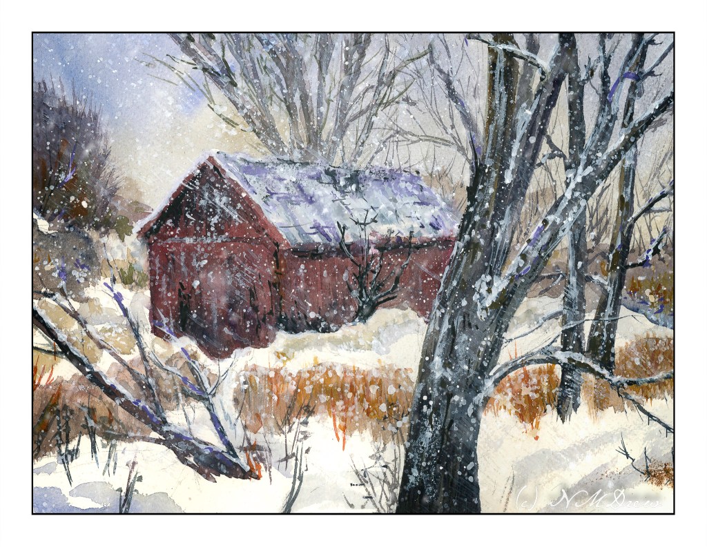
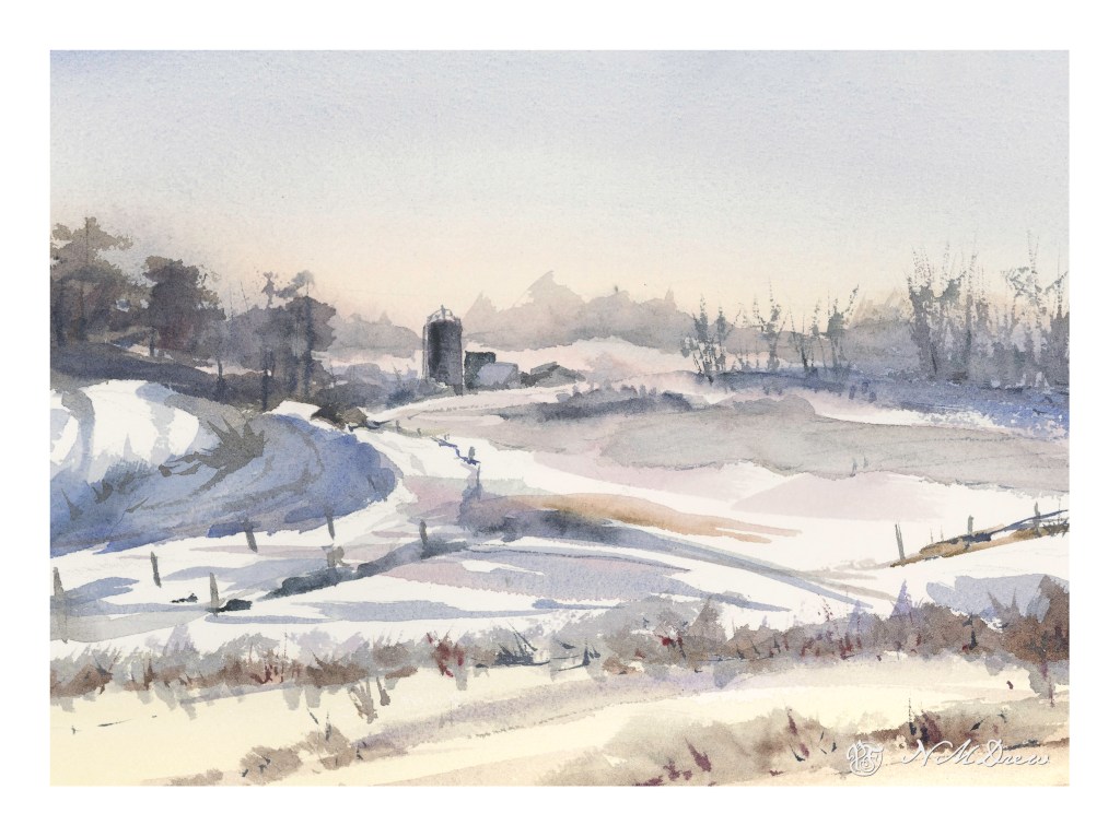
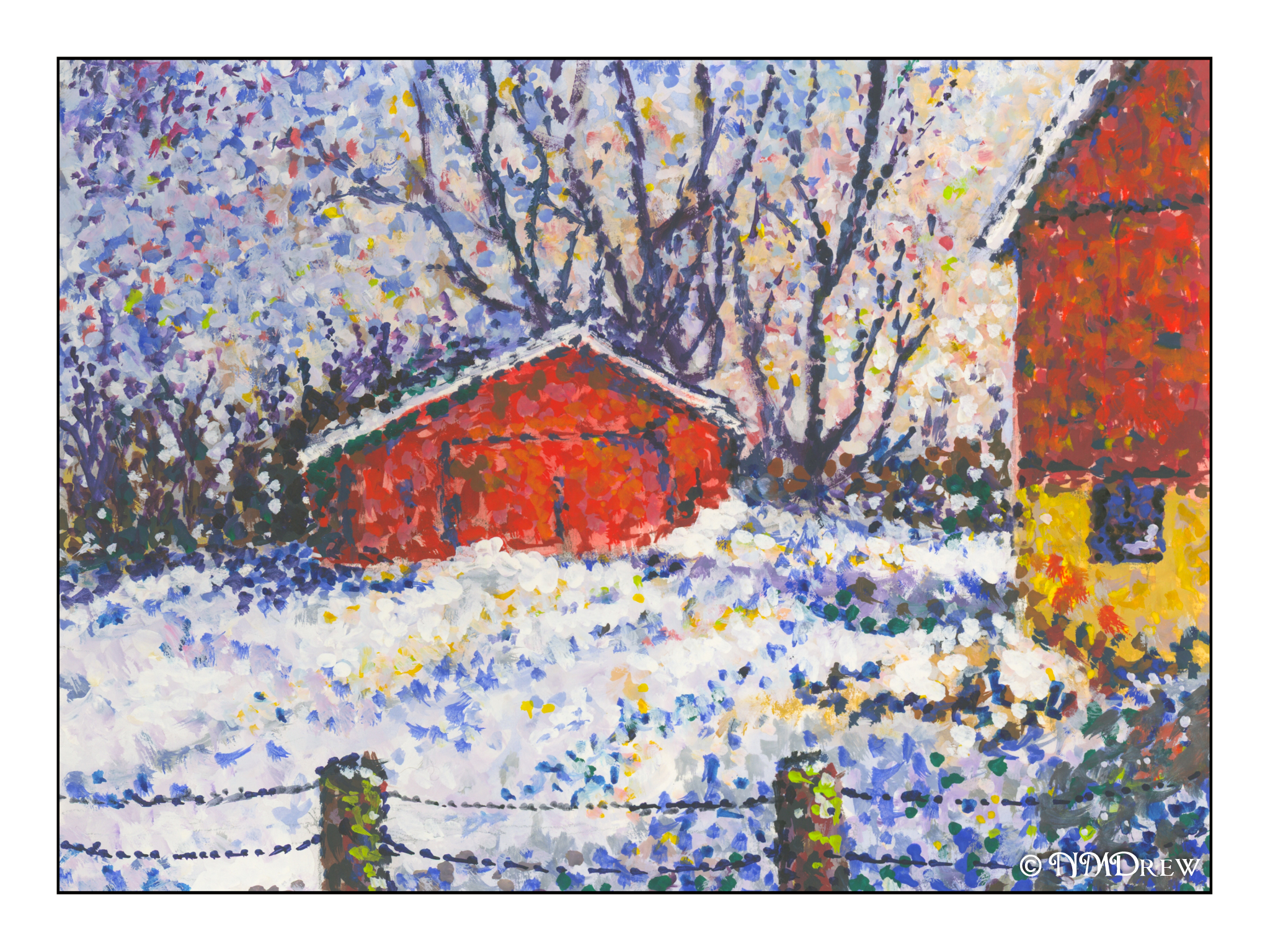
Scanning my watercolors shows me the flaws so readily – ones I don’t see when painting!

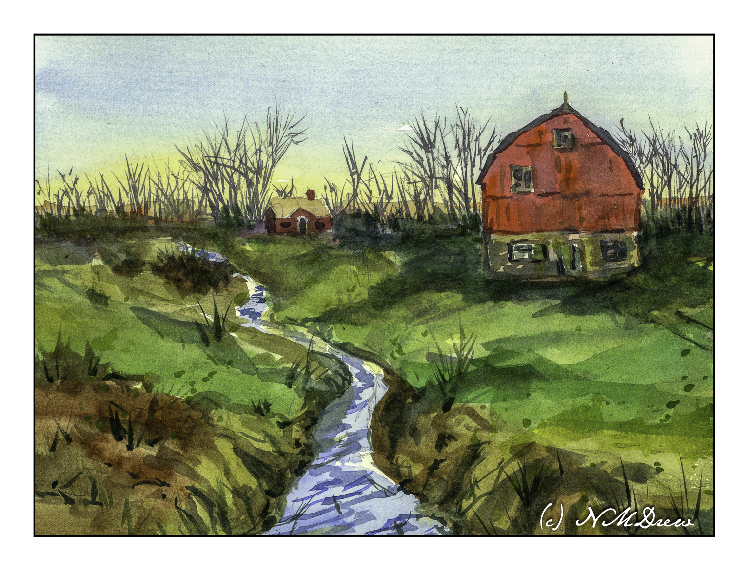
When I looked at this scan, the creek in the foreground looks definitely off! I went in and repainted it, and the second scan showed more wonkiness. Finally, just a heavy application of blue on the river / creek (whatever!) and some zinc white gouache in straight lines, and the geographical problems were somewhat solved.

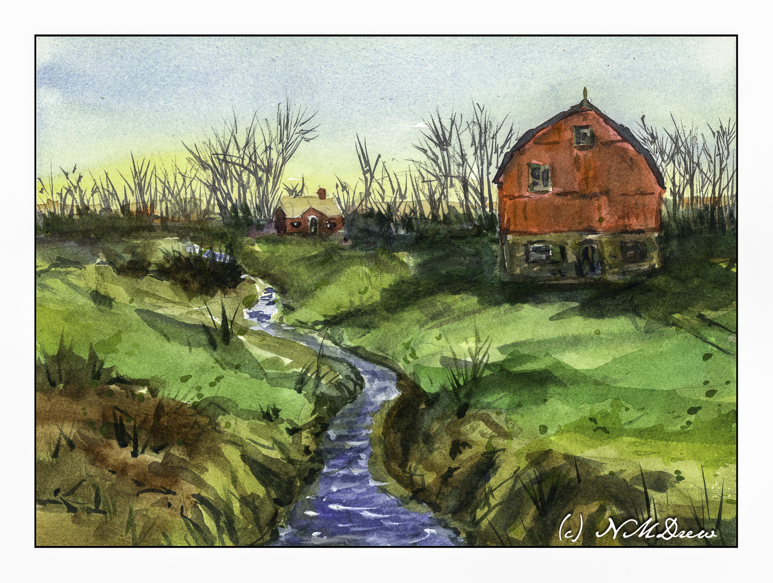
Overall, not really thrilled with this painting. I like my sky and the spindly trees in the distance. The barn and house were one of my rare attempts at buildings. The barn seems really out of place for the environment – too big or something. The little house is okay. I tried to show the banks of the creek and the terrain leading down to it using color swaths in directional lines, horizontally and vertically. Meh.

Fabriano 140# CP paper; watercolors; 9×12.

Abandoned in Winter

Well, this one sure had me going for a while! The idea was to avoid angles, and look squarely into the building, and so I did . . . and then came along the Esposo who said, “Nay! This does not work!” And, damn, if he wasn’t right! So, I had to pull out some gouache to overlay a roof on the tree in the background, and make the roof look rather beat up and weathered, with beams and such visible. Sort of a success.

And, I wanted to paint falling snow. Falling snow in a photograph varies from white, sharp dots to elongated shapes. Time to experiment. I used some gouache, diluted, and applied some streaks – I wanted a sense of wind blowing from upper left to lower right, with snow pushed by the wind. It was okay. So, I got a fan brush and made a wet mess of the white paint and splattered and splattered and splattered. I even got it my coffee. Luckily the paint isn’t poisonous, so I shall return.

Overall, this is not a great success as a painting, but it was fun. I rather like the composition with the tree in the very front of the painting. The barn is w-a-a-y off as far as believable perspective, but such is life. But, I have been sticking to my snow themes, and perhaps it is time to do one more and then move to a different season different subject, or put it away for a few days and get back to sewing or doing photography. I can now hobble forth on my partly healed broken toe.

Arches rough, 140#, 10×14. Watercolor with a splash (well, several splashes) of gouache.

Winter in Hill Country

I needed a change of pace – a way to relax – after yesterday’s very intense painting of buildings and people. It’s nice to visit familiar territory. But, I was not without goals. Here I worked on subtle gradations and color change in the sky; misty / soft trees in the horizon using moist paper to blur and indicate distance; a couple of buildings with subtle rooftops; snow. On Arches CP 140#, 9×12.

A Winter Morning

Still dreaming of snow and winter, but honestly glad not to be in the northeast! More snow dumped in 24 hours than was dumped all of last year. That is a lot of snow! Nothing like snow up to the roof, no electricity, and wondering how you are going to stay warm. When I was a kid, we burned oil for fuel, so heating the house wasn’t an issue as far as I can remember, but I do remember a few times when my youngest brother was in diapers, and there was no electricity to heat water. Frozen pipes, too, but that is usually easily solved by letting the water run gently through open taps.

I am continuing using gouache and Pointillism. Something in me just loves this, and I have started looking beyond Paul Signac and into contemporary artists. The graphic quality of Pointillism and the colors keep drawing my eye. Also, I am getting more “aware” (for want of a better word) of color interplay by using dots and mushing colors together.

Meanwhile, today in California it was a chilly 68F and I had to wear socks in the house.

Nowhere Barn

Addendum!

This is the second scan from the final one below.  I changed a bit of the elements after doing a preview scan – don’t know why the one on the bottom of this post is so, er, intense!

Now, let us continue . . . 

More perspective studies!  Today I did a single point study.

This time I created a single vanishing point.  This one is below the building, and above the road.  The idea for this is that the road ends up going over a hill or slope before the horizon, at eye level, is met.  I did a pencil sketch and erased it a billion times.  Finally, when I liked what I did, I erased most of the lines after inking it in.

Sort of a value study combined with a color study to see what I might like for color mixes in watercolor.  This paper is mixed media paper, so it is not the heavy Arches 140# cold press I like for most work.  I think the perspective works pretty well.

Well!  Aren’t these colors intense!  The scan for some reason just came out like this – the original is a bit more subtle – but I rather like it as I think it expresses the intensity of color that sometimes comes with lowering clouds and a storm.  Makes me think of my time as a kid on the plains of the midwest.

So, the final study does have decent architectural perspective, and perhaps even some atmospheric (lots of atmosphere, but more like pressure type!) insofar as I tried to simplify things.

I will continue my focus on perspective, and using it in different media.  Watching videos, referring to books, and just doing it is helping.